Skip to content

Color Hues #34

  • by

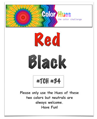
It’s my turn to be the hostess at The Color Hues Challenge. I chose Red and Black.

Color Hues #34-Red and Black.015

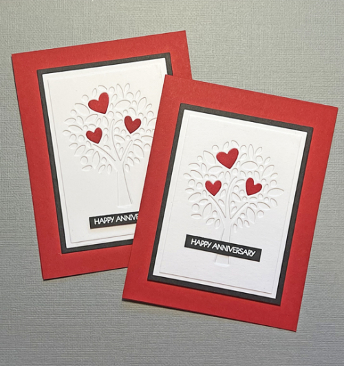
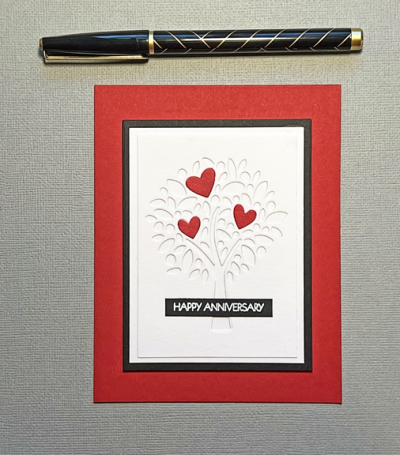
Since Red and Pink has already appeared as a challenge, I thought Red and Black would also work for Valentine’s Day which isn’t all that far away. Valentine’s Day was my father’s favorite holiday, and I have continued his tradition of sending a gift to the members of my family which means a fair number of valentine cards as well. Much to my surprise, I ended up making an anniversary card since I had not one, but two anniversaries coming up. 

RedBlackX2

The card would certainly work for Valentine’s Day as well.

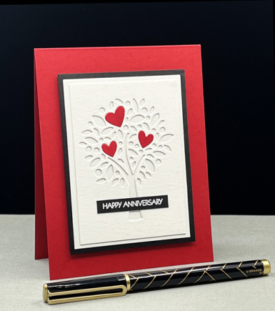
RedBlack

This is another of my pre-holiday purchases from My Favorite Things during a site-wide sale. I love this “Heart Tree,” and think it has many possibilities. This time I took just the three largest hearts from the die and colored them with Copic markers before inlaying them onto the tree. 

RedBlackClose

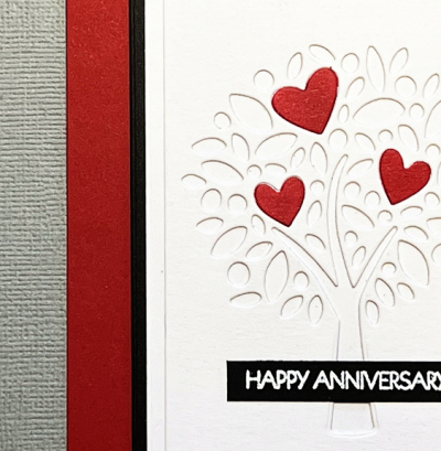
There are two white mats and a narrow black one, all layered on a red card base.

RedBlackFlat

The sentiment, embossed in white on a scrap of black card stock is from Pink and Main’s “Special Day” sentiment set—one I turn to over and over. 

Be sure to check out the fabulous card by the Design Team, and our Guest Designer,  Michal,  and join with a card of your own!

Nancy

Hannelie

Cindy

Carol

Julie

 Sheri

Kristie

Lindsey

Tracey

Color Hues #33

  • by

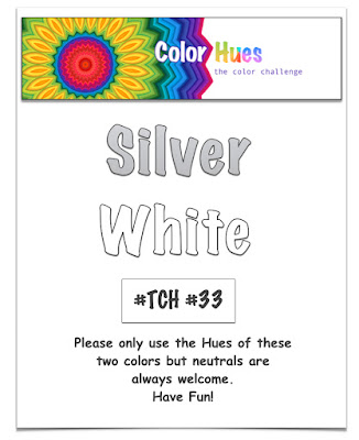
Julie has a sparkling challenge for you at the Color Hues Challenge this time around.

Color Hues # 33.014

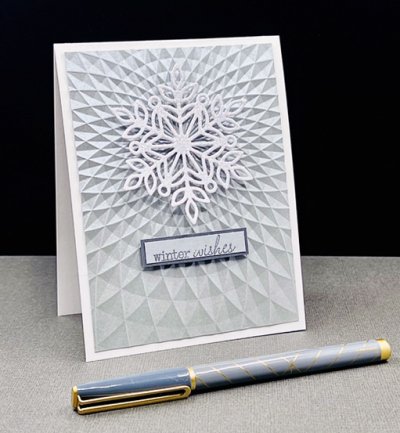
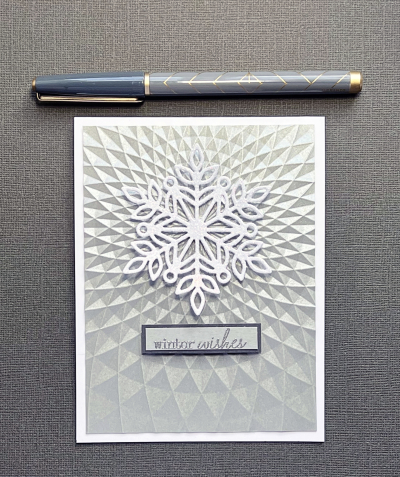
My card evolved during the rush of making holiday cards. I had recently purchased the Simon Says “Triangle Burst” 3-D embossing folder, and embossed this silver paper after seeing two cards, one Instagram and one on a blog, using this embossing folder. Finding just the right focal point to add to it took me longer than I expected, but this snowflake was just right.

SiverWhite

I immediately thought of this upcoming color challenge and abandoned any idea of creating a holiday card. I have several January birthdays and this card will soon be on its way to one of my best friends. 

SilverWhiteClose

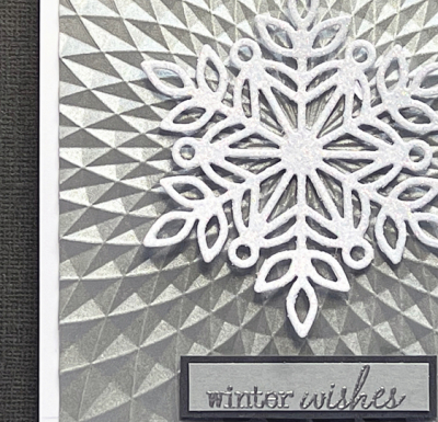
The beautiful snowflake is Simon Says’ “Marie Snowflake” and is cut from white glitter paper. The sentiment is from one of my oldest Papertrey Ink sets “Vintage Picnic Sentiments.” I embossed it in silver on the same silver paper I used for the embossing folder.

SilverWhiteFlat

Although you can see some of the glitter and shine in the photographs, this card is much more beautiful in person. 

I hope this wonderful color combination inspires you to make a card and join us at Color Hues this time around. Check out all the inspiration the Design Team and our Guest Designer, Stephanie, have in store for you.

Nancy

Hannelie

Cindy

Julie

 Sheri

Kristie

Lindsey

 Tracey

Color Hues #32

  • by

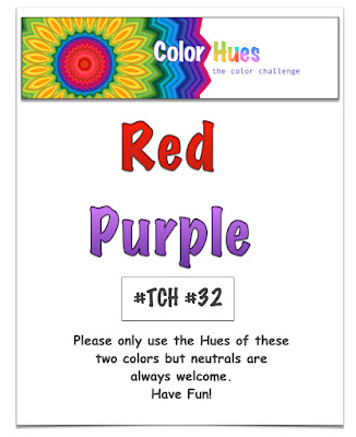
Hannelie has chose Red and Purple for the first Color Hues Challenge in 2022.

Color Hues #32.013

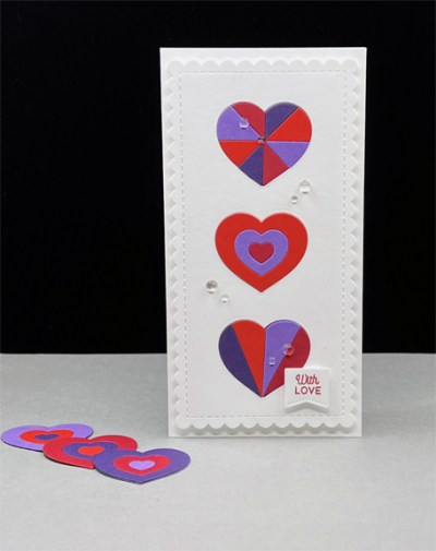
I have quite a few stamps and dies that arrived thanks to sales during the last months of 2021, and I am determined to make good use of them. The Simon Says “Geometric Builder: Hearts” came to mind when I saw this color combination. 

RedPurple

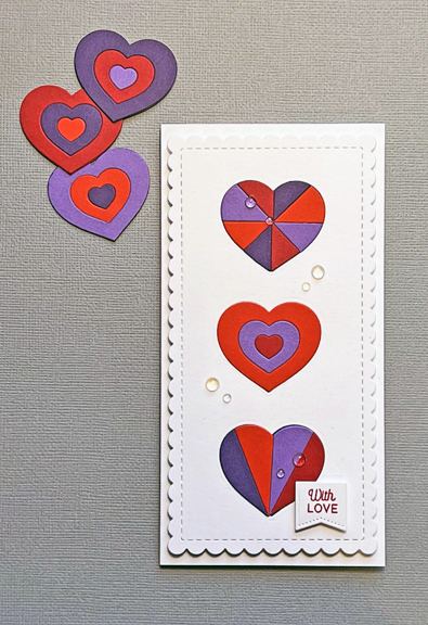
I chose three different designs and die cut each from two shades of red (Gina K’s Red Hot, Concord & 9th’s Poppy) and two shades of purple (Papertrey Ink’s Amethyst Allure, Concord & 9th’s Eggplant), and then assembled the  hearts on a solid heart shape.

RedPurpleFlat

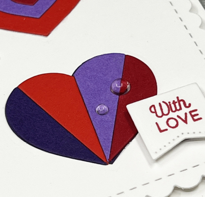
I knew I wanted a mini slimline design and die cut the scalloped die from Trinity Stamps'”Mini Envelope Builder.” Then I cut three hearts from that panel so I could inlaid the red and purple hearts.

RedPurpleClose2

The sentiment is from The Greetery’s “Sentiment Suite: Love” which I die cut with one of the “Sentiment Suite Basic Dies.” I chose the sentiment thinking this could be an anniversary card, a valentine, or just a thinking of you card.  I added dimensional adhesive to the scalloped panel and adhered it to a white card base, and added a few transparent gems.

I hope you’ll hop over to the Color Hues Challenge and join in the fun, checking out the cards made by my awesome Design Team members, and our Guest Designer, Tenia.

Nancy

Hannelie

Cindy

Julie

 Sheri

Kristie

Lindsey

 Tracey


Color Hues #31

  • by

There’s just one challenge this month leading up to the holiday season. And not surprisingly, Cindy has chosen the traditional colors of Christmas: Red and Green.

Color Hues #31 Anim.

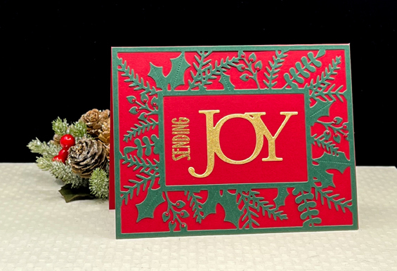
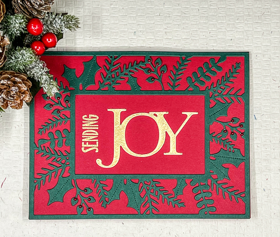
I’ve had two of Papertrey’s Bold Borders: Yuledtide in my stash that I die cut during a crafty session before the pandemic, but never used. They worked perfectly for this challenge. They’d been die cut with PTI’s Pinefeather paper which I layered on cards made from Concord & 9th’s Cranberry cardstock.

RedGreen

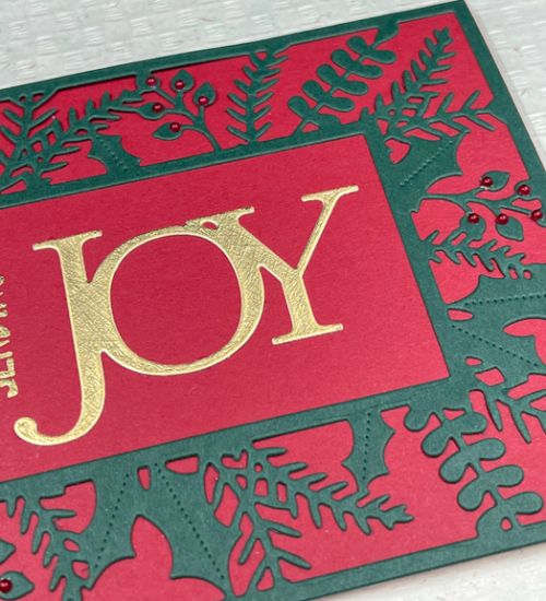
The sentiment is a combination of a die cut and a stamp. The Savvy “Joy” die cut has been in my stash for years, and has appeared on many of my Christmas cards. I never tire of it. I added a stamped sentiment from PTI’s “Big Hugs” stamp set.

RedGreenClose

I debated for a time about whether to add any embellishments but decided the tiny red pearls from A Muse would work well here. The pearls are another item that I’ve had in my stash for many years. Years ago, A Muse decided to become an online company, and I was afraid I’d run out of the red pearls. I purchased multiple packs of them, and still have plenty, but no unopened packages are left. I have some other colors as well, but the red ones are my favorite.


RedGreenFlatR

Thank goodness classic items don’t go out of style! I’d label this a pretty classic Christmas card, and would love to have had enough borders to make a whole set. I hope this color combo inspires you to create a few holiday cards, and I hope you’ll share them with us in the gallery at Color Hues. Please check out all the inspiration from my Design Team members and our fabulous Guest Designer, Michele Ferguson.

Nancy

Hannelie

Cindy

Julie

 Sheri

Kristie

Lindsey

   Tracey


Color Hues #30

  • by

Carol picked an elegant combo for our next Color Hues Challenge: Silver and Gold. 

Color Hues #30.011

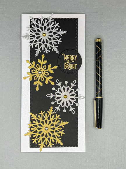
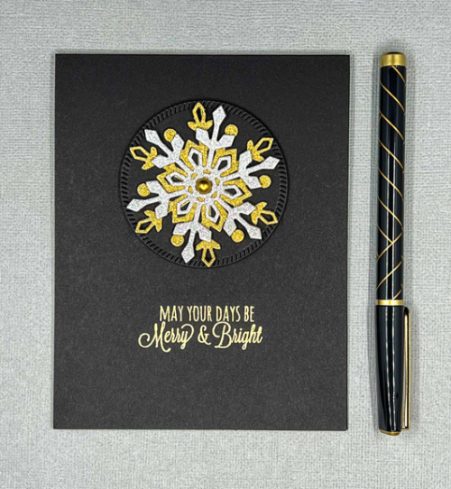
Last year I acquired several new snowflake dies, so I knew right away what I wanted to use for this challenge. I chose a group of snowflakes from Gina K, “Snowflake Trio,” which I believe were part of a kit last year. Recentl,y I’ve ended up with more than one card for these challenges, and this is no exception. Here’s the card I set out to make:

SilverGoldSL

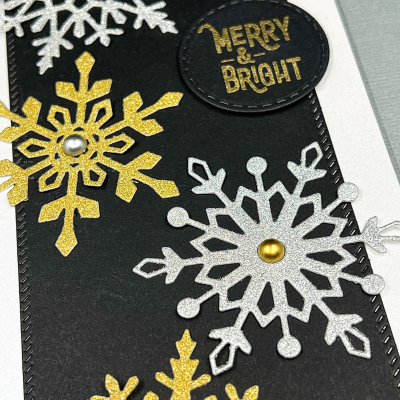
I die cut multiple snowflakes from silver and gold glitter paper and arranged four of them on a black die cut mat (by Pinkfresh Studio). Once I had them carefully glued down, I decided the card base would be best in a shimmer silver (Papertrey Ink). That left just the right space for a circular mat and embossed sentiment from The Greetery’s “Speed Tagging Christmas.”

SilverGoldSLClose

The final step was to add gold and silver gems by Trinity Stamps.

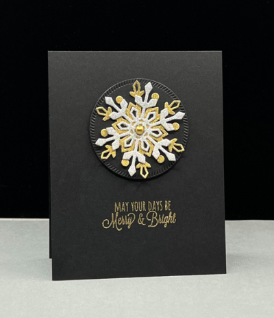
I still had quite a few snowflakes laying on my desk, and thought I could layer silver and gold snowflakes for an A2 card.

SilverGoldA2

This, of course, appealed to my CAS heart. I die cut a diagonally stitched circle from the Pinkfresh Studio “Slimline Essentials,” and layered the snowflakes on top of it and added another gold gem.

SilverGold A2Flat

The gold embossed sentiment here is from Papertrey Ink’s “Rustic Wreath,” a purchase made many years ago. 

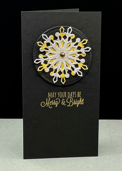
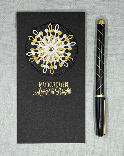
Once I finished the A2 sized card, I realized that really the best size just might be a mini slimline, and luckily, I still had some snowflakes to spare. 

SilverGoldMSL

All the products used here are the same as those used on the A2 card, just in a different format.

SilverGoldMSLFlat

In the end, the mini slimline is my favorite. I definitely prefer CAS cards, although I do like the multiple snowflakes on the slimline. Since it’s a larger card, it can carry the weight of four varied sized snowflakes. I’d be curious to know which one is your favorite.

The new Just Us Girls Challenge was posted on Saturday. It’s Trend Week, and the challenge is for mini slimlines. Perfect timing!

JUGS

But, most importantly, go check out the gorgeous creations made by the Design Team and our Guest Designers, Carol and Hilary, and join in the fun. 

Nancy

Hannelie

Cindy

Julie

 Sheri

Kristie

Lindsey

  Tracey


Color Hues #29

  • by

October flew by for me, and here it is—November 1st! The good news is it’s time for a new Color Hues Challenge. Sheri’s choice this round is Brown and Orange, and I had quite a good time with it.

Color Hues #29 Anim.

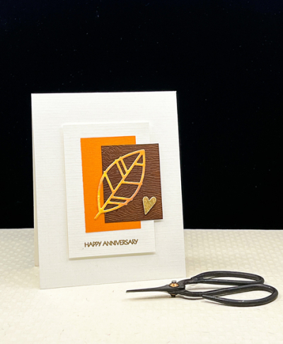
I find it interesting how frequently I end up creating two cards for the Color Hues challenges. The first card I made was CAS on steroids, and I was was pretty happy with it. It didn’t end up being the one I posted on the Color Hues Challenge site, however. Here’s Card #1:

BrownOrange

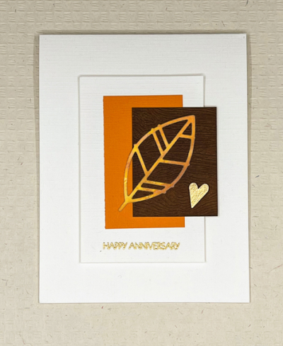
There are a couple of fall anniversaries to celebrate and I thought this did the trick. I started with the Papertrey Ink “Leaf Silhouette” die and cut it from a piece of Bristol that I had watercolored in shades of orange. I die cut the white rectange and cut two rectangles, one from a scrap of orange cardstock and one from a piece of Ellen Hutson’s Woodgrain paper that I darkened with Distress ink.

BrownOrangeFlat

The sentiment from Pink and Main’s “Special Day” was embossed in gold and I used a very old punch to cut a heart from metallic gold paper. I glued it to three additional hearts cut from cardstock to give it some dimension. I also added dimension to the white rectangle with dimensional tape.

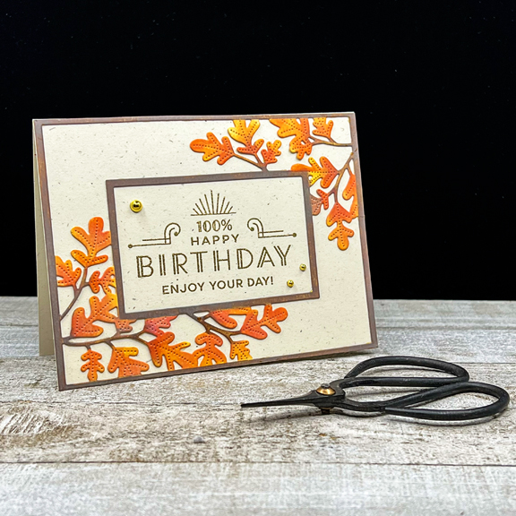
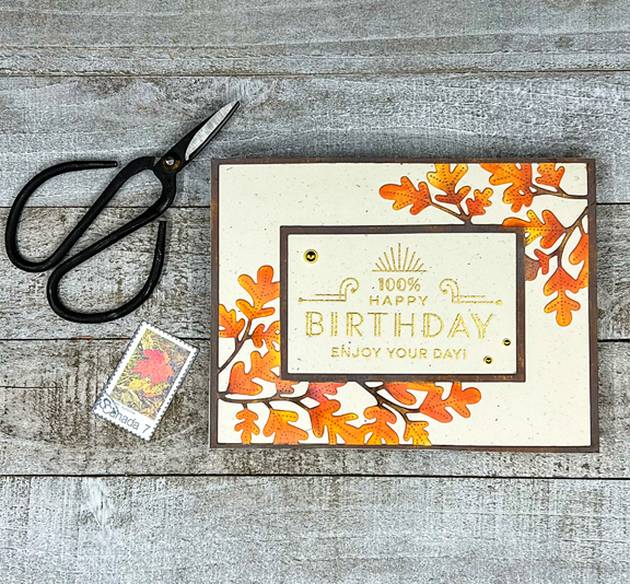
And then I was lucky enough to spend a crafty afternoon with two friends, one of whom had the Papertrey Ink “Bold Borders: Foliage.” I die cut a couple of them from white cardstock. Once I was home, I wondered what would happen if I tried to ink blend the entire frame. It worked quite well, and here is Card #2:

BrownOrange2

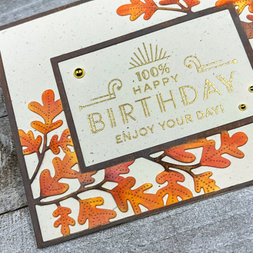
I used the Distress Oxide inks Spiced Marmalade and  Carved Pumpkin for the leaves with a bit of Catherine Pooler’s Orange Twist toward the bottom. The branches and the frame were ink blended with Vintage Photo Distress Oxide ink. 

BrownOrange2Close

After carefully gluing the frame to a piece of Papertrey’s Rustic White cardstock, I gold embossed one of the sentiments from The Greetery’s “Everyday Labels.” The open space in the frame was just the perfect size.

BrownOrange2Flat

It took some time to get the frame and leaves ink blended, but I think it was time well-spent, and I’d do it again. The only embellishment are three gold gems from Paper Studio.

I hope you’ll hop over to the Color Hues blog to see what the rest of the Design Team and our Guest Designer, Åsa, have come up with . . . and join in the fun!

Nancy

Hannelie

Cindy

Julie

 Sheri

Kristie

Lindsey

Tracey


Color Hues #27

  • by

We have the perfect color combo for the first of October’s Color Hues Challenge:  Orange and Green. There’s still a lot of green on the trees here, but each day we see a bit more color. I know there are lots of folks who are not a fan of orange, but it ranks up there in my top five color choices.

Color Hues #27-Anim_

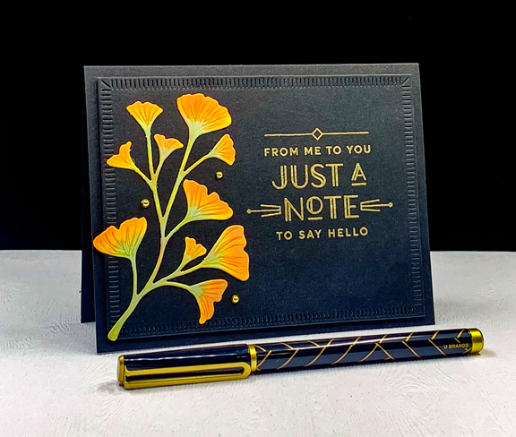
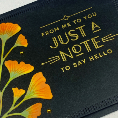
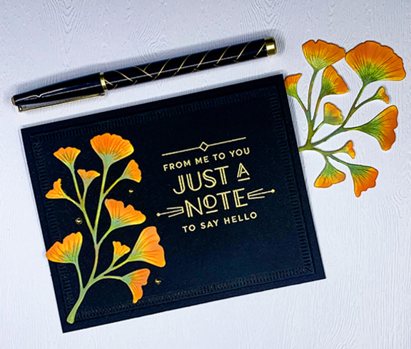
 I recently acquired The Greetery’s “Botanic-cut: Ginkgo” dies, and couldn’t wait to put them to use. I also used the new Greetery sentiment set: “Everyday Labels.” I love the font and the art-deco appeal of these sentiments. 

OrangeGreen2

After die cutting the Gingko leaves, I used Spiced Marmalade, Carved Pumpkin, and Bundled Sage Distress Oxide inks to blend color onto the stems and leaves. I followed up with some Polychromos colored pencils for some detail.

OrangeGreen2Close

I die cut the largest of the “Crimped Frames” (also The Greetery) from black cardstock, embossed the sentiment in gold, and added the Ginkgo leaves.

OrangeGreen2Flat

I added three small gold pearls as a final accent after adding the framed piece with dimensional adhesive to a black card base.

I hope you’ll hop over to the Color Hues Challenge and join in the fun, checking out the cards made by my awesome Design Team members and the two Guest Designers, Jacinda and Marcia – the winners of the birthday challenge.

Nancy

Hannelie

Cindy

Julie

 Sheri

Kristie

Lindsey

Tracey


Color Hues #26: Purple and Pink

  • by

Time is flying by and it’s already the middle of September! I need it to slow down a bit, or find a way to add a few more hours to my day! Before we get to the new challenge, be sure to stop by the Color Hues Challenge site to see the winners of the first birthday party challenge! We had a wonderful gallery of cards, and it was not an easy task to choose the winners and runners-up.

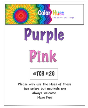
The new Color Hues Challenge is Purple and Pink!
Color Hues26.001

Purple and pink go together so well, I thought I’d have no trouble getting a card created. I first did a watercolored floral, but in the end, I decided the colors blended together so much it was hard to separate them. Then I acquired a couple of the Spellbinders “Large Die of the Month” dies, and found that they took care of the problem nicely. I ended up making two cards, one a CAS card (and the one I posted on the Color Hues site) and a more elaborate one which you’ll see here. 
P&P1

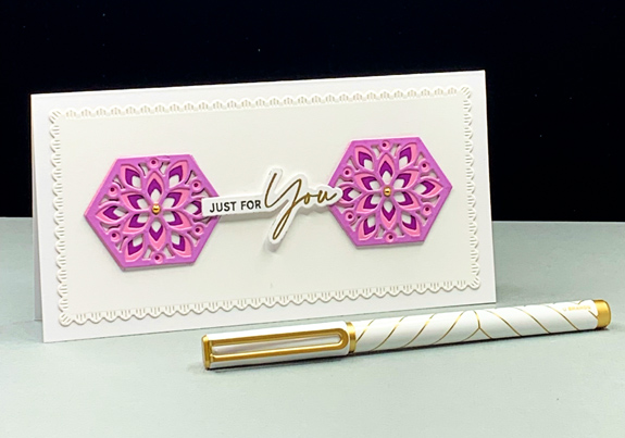
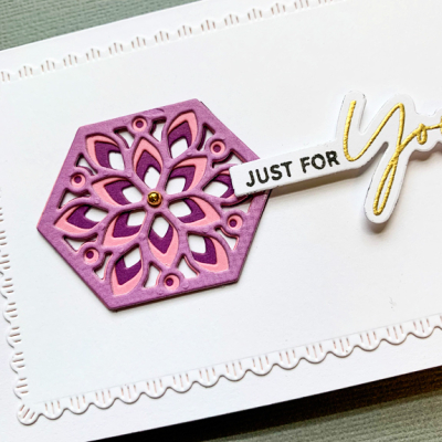
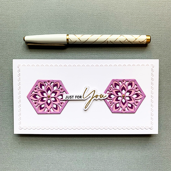
This card is a mini-slimline and uses dies from both Spellbinder sets: “Slimline Card Creator” and “Hex Kaleidoscope. To create the beautiful hexagon designs, I die cut each of three dies from three colors of card stock – two shades of purple and one pink. Once you line up the hexagons, you get this gorgeous design.
P&P1Close

The “Slimline Card Creator” comes with a set of dies in different sizes and in two designs–one simple stitched rectangle, and the scalloped border I used here. I added a simple gold gem to the centers. 
P&P1Flat

Once again, I found the perfect sentiment in The Ton’s “Easy Expressions: Birthday” set. There’s a bit of dimensional tape in the center to balance the dimension of the three die cuts.

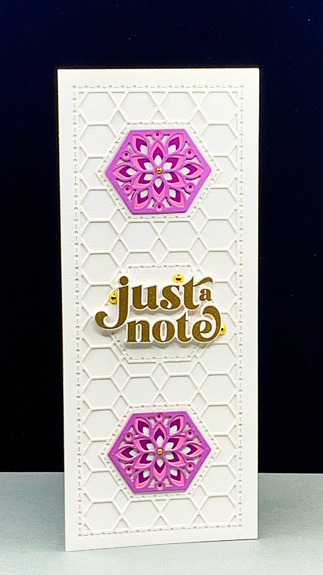
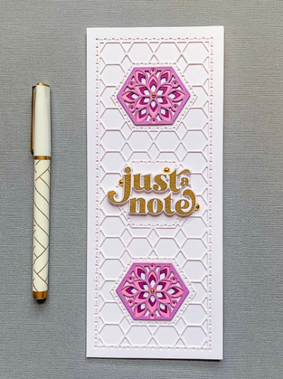
My second card is a true slimline card and I used the more ornate background die from the “Hex Kaleidoscope” set.
P&P2

Again, I chose the same design for the hexagon embellishments, but instead of using three of them, I used the center hexagon for my sentiment.
P&P2Close

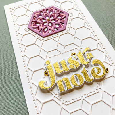
The sentiment from The Greetery’s “Opposites Attract” was gold embossed on white card and adhered with dimensional tape. I tucked three large gold gems around the sentiment, and small ones in the center of the hexagons.
P&P2Flat

One thing I like about the “Just a Note” sentiment is that it can serve as a lead-in to many inside sentiments from “Thinking of You” to “Wishing You a Happy Birthday” as does the sentiment “Just for You” on the first card. It’s good to have some flexibility for the cards in my stash.

As always, I hope you’ll join in the fun, and take a look at the wonderful creations from the Design Team and Guest Designer, Janet

Nancy

Hannelie

Cindy

Julie

 Sheri

Kristie

Lindsey

Tracey

I’m throwing one of these cards in the ring at Happy Little Stampers-Dies: Anything Goes, and in the gallery at Darnell’s NBUS gallery.

HLSDies NBUS

Happy 1st Anniversary to the Color Hues Challenge

  • by

Despite the many challenges of 2021, the year is flying by, and here we are at the first anniversary of the Color Hues Challenge! To celebrate there are prizes this month—see below! The other great news is an addition to our Design Team: Tracey McNeely. Some of you may already be familiar with her beautiful work on her blog and for a variety of companies. We’re so lucky to add her to DT. Welcome, Tracey!

I was the lucky DT member who got to choose this month’s colors and my choices were Yellow and Orange–a good combination of a summer vibe (yellow) and the coming autumn (orange) for those of us where the seasons change. 

CH #25 Anim.

My card design is one I created quite some time ago. I never posted the card, and when I found it recently, I was amazed at how much my ink blending had improved since I’d created the first one. There’s no way I’d post the original card now, but I’m much happier with the ink blending this time around. I’m quite sure that in addition to practice, some new tools contributed to the improvement as well. I really like the Taylored Expressions ink blending brushes as well as the Altenew brushes—particularly the larger one. It took me awhile to invest in both brushes as they are more expensive than the ones I purchased originally.

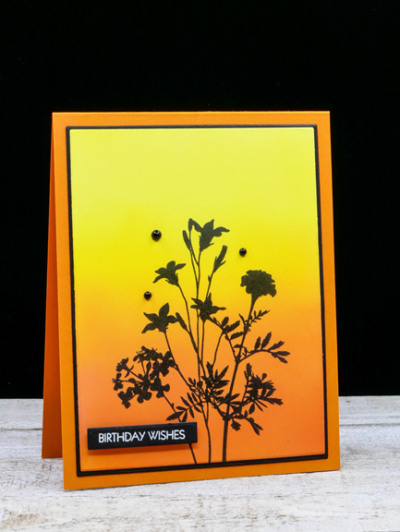
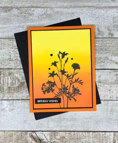
YellowOrange2

I used a combination of Distress Oxide Inks for the background: Squeezed Lemonade, Mustard Seed, Carved Pumpkin, and Spiced Marmalade. I added a touch of Concord & 9th’s Marmalade ink which is a bit deeper to the very bottom of the panel. 

YellowOrangeFlat

I die cut the ink blended panel with the smaller of Gina K’s Master Layout dies, and stamped the floral silhouette is Obsidian Black (Altenew) from Gina K’s “Natural Silhouettes” set. Next was to use the larger of the dies in the layout set to cut a narrow frame of black. The sentiment is from Pink & Main’s “Special Day” set. Finally, it was all assembled and added to a card base of Orange Zest (Papertrey Ink.)

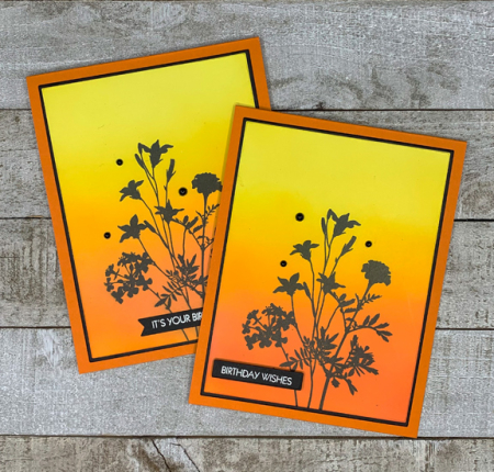
Since I had ink blended a couple of panels, I made a second card–it’s always good to have a stash of birthday cards!

2YellowOrange

To celebrate the Color Hues anniversary, there will be TWO winners chosen for this challenge both of whom will receive a $25 gift certificate to Simon Says! Hope you’ll join in the fun, and be sure to check out the DT and Guest Designer, Angie’s, card right here. And at each individual blog here:

 Nancy

Hannelie

Cindy

Julie

 Sheri

Kristie

Lindsey

Tracey


Color Hues #23

  • by

July passed in a blur. We were away most of the first two weeks, and I’ve been recuperating from my fall for the last two weeks, but here we are at the beginning of August. August is likely to pass by in a blur as well since my daughter and her family will be here for a week, we’ll share a cottage on a lake in Michigan for a week, and then spend the last week traveling back and forth to a cottage in the Finger Lakes to spend time with Tracy’s family. Fortunately, I’m back in the craft room and playing with some new (as well as some old) products.

The new Color Hues combo is such a pretty one:

Color Hues23

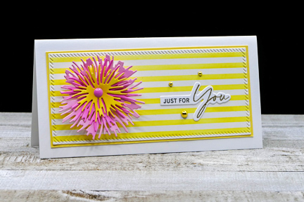
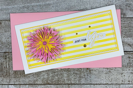
I knew right away I wanted to use my new Altenew “Classy Stripes” stencil which I saw Laurie Willison use during the recent Cardmakers Summit event. I already had some of the Ink to Paper’s “Into the Blooms II” dies cut from pink paper so it was just a matter of adding a yellow layer and doing some ink blending with my (also new) Detail Blending Brushes from Altenew. 

YellowPink

I settled on a mini-slimline format which I like a lot. Once I had the stenciled background prepared, I die cut a piece of it with one of the Pinkfresh “Mini Slimline Essentials” dies. I cut a narrow yellow border and then added it to a white cardbase.

YellowPinkFlat

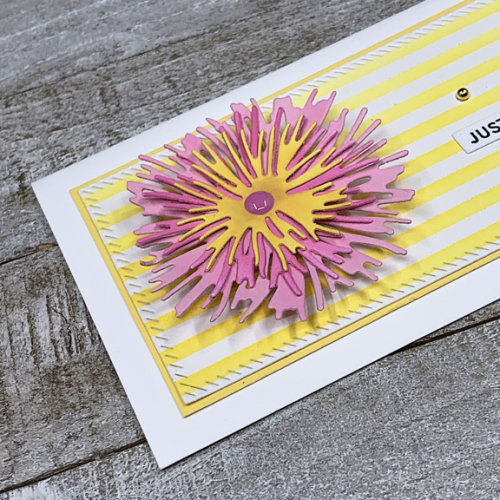
I shaped the floral pieces with the Tim Holtz “Shaping Kit,” (another new product,) added a pink enamel dot to the center, and adhered the flower to the card front with some dimensional tape. The sentiment is from The Ton’s “Easy Expressions Birthday” set stamped in black and embossed in gold. To pick up the gold accents, I added three gold dots from The Paper Studio. 

YellowPinkClose

I hope you’ll hop over to the Color Hues Challenge and join in the fun, checking out the cards made by my awesome Design Team members and our Guest Designer, Conil.


Nancy

Hannelie

Cindy

Julie

 Sheri

Kristie

Lindsey

Color Hues #22

  • by

The Color Hues Challenge has a new duo for you:  Lime Green and Aqua.


ColorHues#22Anim

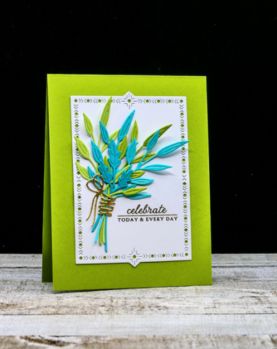
I love this bright and cheerful color combination, but it took me awhile to come up with a design I liked. As I often do, I turned to dies and ended up with The Greetery’s “Inside and Out Berry Branches.”

LimeGreenAqua

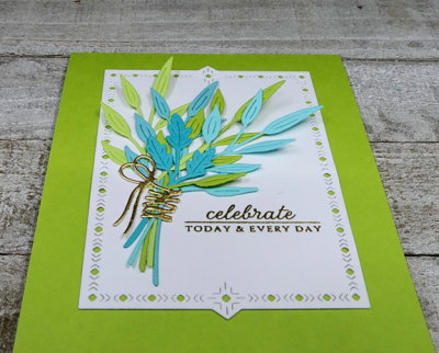
I die cut the branches in two shades of lime green and two shades of aqua, arranged them in a bouquet and “tied” them with a gold ribbon from the “Fit to Be Tied” collection, also from The Greetery. The next step was to find the right background and again The Greetery had the answer–a “Nordic Frame,” one of my favorites. 
LimeGreenAquaClose

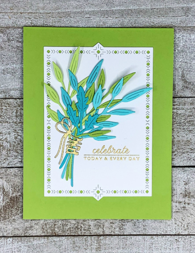
The sentiment from an old, and loved, set by Papertrey Ink “Autumn Abundance” was embossed in gold. Either lime green or aqua would have worked as a cardbase, but I liked the lime green better.

LimeGreenAquaFlat2

I hope you’ll hop over to the Color Hues Challenge and join in the fun, checking out the cards made by my awesome Design Team members, and our Guest Designer, Rosemary.


Nancy

Hannelie

Cindy

Julie

 Sheri

Kristie

Lindsey


Color Hues #21-Red and Blue

  • by

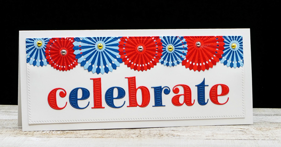
Independence Day is just three days away, and I’m guessing that Carol’s color choices for this round of Color Hues was influenced by the holiday. It’s always a great combination, and I have two cards to share.

ColorHues#21Anim

The first was the card design I had in mind, but the die cut letters (on #2) were too tall, so I had to substitute another alpha which I ended up liking even better. Luckily, I have two perfect occasions for these cards. The first one is going to my mother-in-law for her July 5th—92nd birthday. I had previously made a birthday card for her, but my husband thought this one was perfect the minute he saw it.

Pinwheel

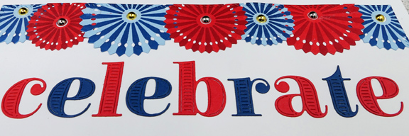
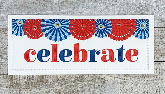
With the exception of the Slimline Diagonal Stitched Rectangle from Pinkfresh Studio, everything on the card came from The Greetery. I die cut the pinwheels in Blueberry Sky (Papertrey Ink) and Cherry Kisses (Gina K) and then stenciled the darker colors onto them. 

PinwheelClose

The letters are cut from the recent release of Bold Alphabets, die cut from Cherry Kisses and Enchanted Evening cardstock. I added some gold and silver gems to the center of the pinwheels. 

PinwheelFlat

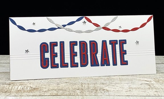
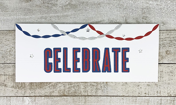
The second card is a congratulatory card for one of the sweetest, hardest working young ladies I know. I’ve been working with her for the last five years. I started helping her with her homework at a community center in the inner city. After two years there, she won a scholarship to the local Catholic all-girls school here. We’ve continued to work together at the school, Paneras, and at our house for the last three years.  During the pandemic we met much less frequently and virtually. She just graduated from 8th grade and is headed for high school at Mercy next year. Her grade point average is amazing, and she’s played soccer, run track, and been involved with other activities. I couldn’t be happier for her.

CelebrateStreamers1

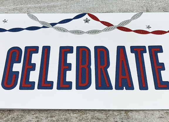
The letters from the Waffle Flower “Tower Outline Alpha” dies were cut from Pure Poppy and Enchanted Evening (Papertrey Ink) papers. I’ve been in the habit recently of using score lines for interest, and once again, I pulled out my scoreboard to add some dimension behind the letters.  I borrowed the “Twisted Crepe” dies (The Greetery) from a friend (thanks, Michelle!) and die cut those with red, blue, and silver glitter paper.

CelebrateStreamersClose

I think 8th grade girls are pretty interested in sparkly, so I added a few glittery stars to finish it off.

CelebrateStreamers Flat

I hope you’ll check out all the Red and Blue creations by my talented Design Team members, and our special Guest Designer, Carol.


 Nancy

Hannelie

Cindy

Julie

 Sheri

Kristie

Lindsey

And if you’re in the U.S. have a safe and fun Fourth of July! We’ll be arrived just in time to celebrate with Sarah and her family after an early birthday celebration here for Tracy’s mom.


Color Hues #20

  • by

It’s hard to believe, but we’re already at the 20th challenge for Color Hues. Sheri chose Aqua and Black for this round.

Color Hues #20

It’s not the first time that I’ve ended up making two cards for the challenge. Although I liked the first card, it really “wasn’t me.” Meaning, of course, not Clean and Simple enough. So here’s card #2, much more to my liking.

AquaBlack

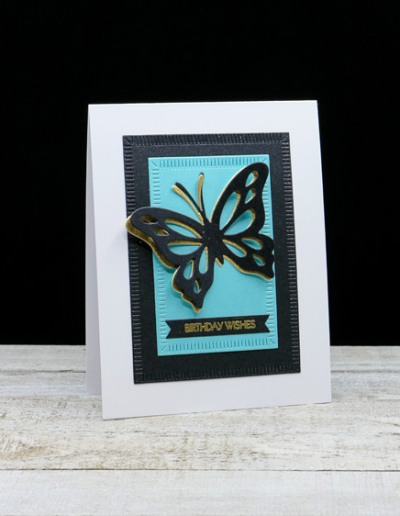
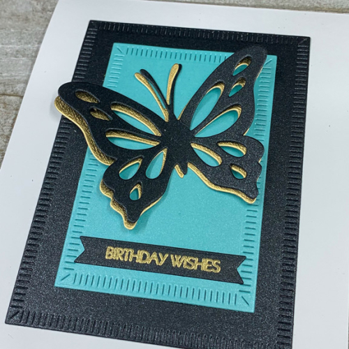
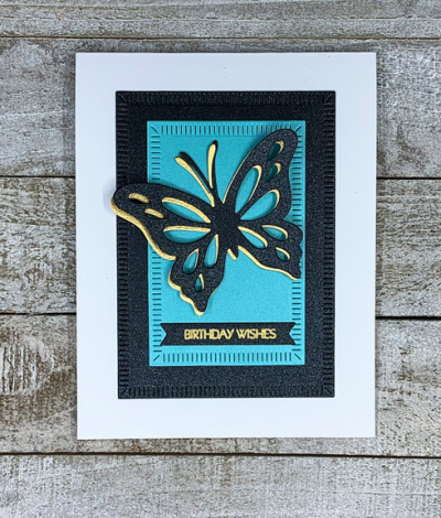
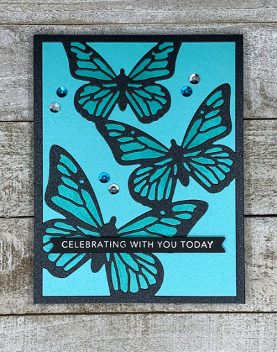
I knew right off that I wanted to use an older set by Papertrey Ink called “Life is Beautiful.” I thought the black butterfly against an aqua background would be striking. (And you’ll see that the first card I made has the same main elements, but different products.) I die cut the open butterfly die twice, once with black shimmer cardstock and once with gold. I off set the two of them and adhered them to a piece of aqua shimmer paper cut with The Greetery’s “Crimped Frames.” You can see the shimmer better here:

AquaBlackClose

Then I layered the aqua layer onto a larger Nordic frame in black shimmer before adding it all to a white cardbase. 

AquaBlackFlat

The sentiment is from Pink and Main’s “Special Day,” embossed in gold and die cut with The Greetery’s “Pretext Banners”–possibly the best banner set I’ve found.

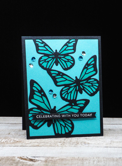
Here’s the first card I made. This time I started with the “Cover Plate: Butterfly” die from Papertrey, die cutting it from the same black shimmer paper I used above. 

AquaBlack2

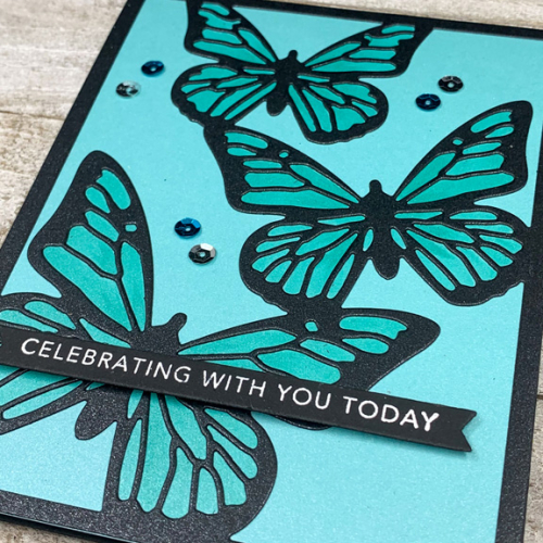
After adding it to a piece of the aqua shimmer paper, I colored the insides of the butterfly wings with a Copic marker to give them some contrast. 

AquaBlack2Close

The sentiment from Taylored Expressions was embossed in white and added with a thin strip of dimensional tape.

AquaBlack2Flat

Finally, I added some aqua and silver sequins. It’s a bit busier than the card above, but I’m quite sure I’ll find a recipient who will enjoy it.

Hop over to the Color Hues blog to see what our Guest Designer, Trina, and the rest of the Design Team has come up with . . . and join in the fun!

 Nancy

Hannelie

Cindy

Julie

Sheri

Kristie

Lindsey


Color Hues #19

  • by

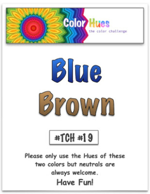
The weeks fly by and here we are with another great color combination for the Color Hues Challenge. This round it’s Blue and Brown.

Color Hues #19

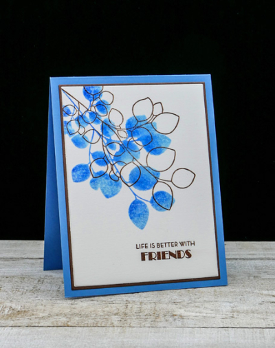
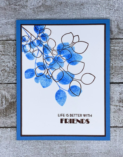
I cased myself for this challenge and returned to a design I used last September. I love the closed and open leaves of Altenew’s “Leaf Canopy” set.

BlueBrown

To color the closed leaves, I added two shades of Pinkfresh Studio blue inks directly to the stamps, spritzed them with water and stamped them onto a piece of Altenew’s watercolor paper. Once that had dried, I overstamped with the open leaves in Dark Chocolate ink from Papertrey Ink.

BlueBrownFlat

I stamped the sentiment from the same set in Dark Chocolate, and use my favorite Gina K “Master Layout” dies to cut a thin border of Dark Chocolate cardstock before adding it all to a Blueberry Sky (also Papertrey Ink) card base.

As always, I hope you’ll pop over to the Color Hues Challenge and check out the great cards by the Design Team and our Guest Designer, Michel.

   Nancy

Hannelie

Cindy

Julie

Sheri

Kristie

Lindsey

And please come join the fun!

Color Hues #18

  • by

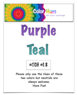
The new Color Hues Challenge is for Purple and Teal which ends up being a really lovely color combination.

Color Hues #18-Still.001

Pretty or not, it did take me awhile to come up with a design I was happy with. I started out with some stencils, but you can see that is not where I ended up!

CH18-2

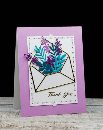
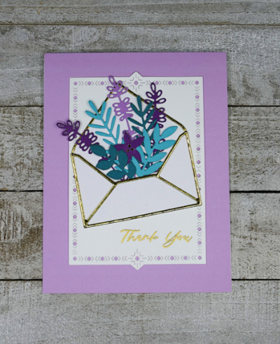
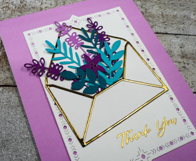
After the stencils didn’t work out quite the way I envisioned them, I headed to my die cuts. Almost immediately I came upon Mama Elephant’s “Botanic Envelope” and knew just what I wanted to do. I love the gold detail on the envelope, and filled it with a variety of die cuts in shades of purple and teal.

CH18Flat2

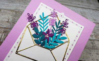
Some of the foliage came from the Mama Elephant die, but I also add some die cuts from Pinkfresh Studio’s “Delicate Blossoms” and Althenew’s ” Star Flower Pop-Up” die. All the colored cardstock is from Memory Box.

CH18CloseGold

Then I added a small piece of the reflective gold paper (from Tonic) behind the star flower, and attached the envelope to a “Nordic Frame” from The Greetery.

CH18Close

The sentiment was gold embossed from The Greetery’s “Sentiment Suite: Thank You.”

Hop over to the Color Hues blog to see what our Guest Designer, Janet, and the rest of the Design Team has come up with . . . and join in the fun!

 Nancy

Hannelie

Cindy

Julie

Sheri

Kristie

Lindsey