Skip to content

52 Christmas Card Throwdown-Guest Designer

I was chosen as the winner in the 52 Christmas Card Throwdown Technique Challenge: Foiling/Embossing.  And now I’m delighted to be Guest Designing for a new Technique Challenge: Teepee Card. 

Technique Challenge (13)

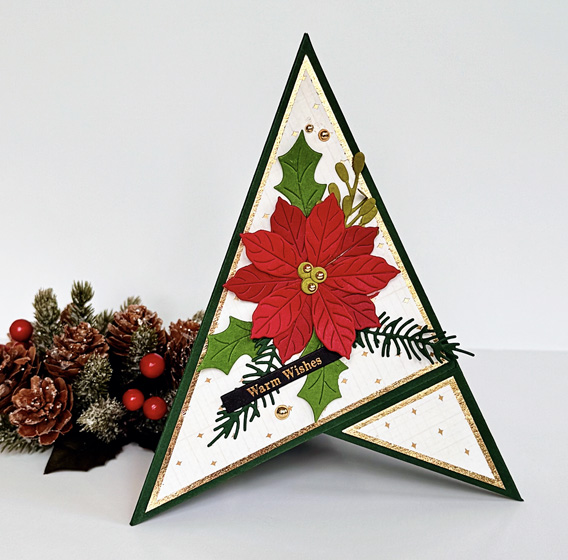
In all the many years I’ve been creating cards, I’ve never made a teepee card. It turned out to be a lot of fun. Not suprisingly, it wasn’t hard to find a good video with specific cutting and assembling direction. I chose some dark green cardstock from Concord & 9th for the base, and then used paper from two 6X6 paper pads for the additional layers. The shiny gold paper is from a very old American Craft pad–no specific name for the pad. The patterned paper is from Spellbinders Handmade Holiday pad.
TeepeeCard

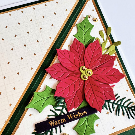
Once I had the card assembled, I could work on the decoration. I knew right away I wanted to use a new Spellbinder die set I found on sale not long ago, Christmas Bird Poinsettia. I didn’t use the bird or the candy cane that came with the set, but chose a variety of green scraps for the foliage and two slightly different reds for the poinsettia.
TeepeeClose

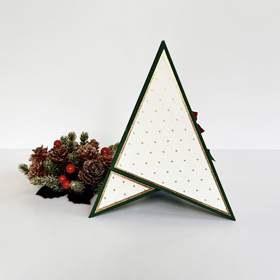
All three sides of the card are decorated with the two papers. On one of them, I will either stamp an inside greeting or write a holiday message. 
TeepeeCardBack

This is how the card looks when it’s ready to mail. It fits perfectly in a 5X7 envelope. 
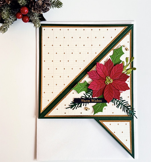
TeepeeEnvelope

I’m not sure I would have tackled this challenge had I not been the Guest Designer, so I’m not only honored, but delighted to have made my first teepee card. There will probably be another one–maybe for a birthday card next time. I’m anxious to check out the 52 Christmas Card Throwdown Challenge for teepee cards to see what the other designers have created. Come along, and give it a try yourself!
Color Hues #80

  • by

It’s an unusual occurrence, but this is my second post of the day. My post as the Guest Designer for the AAABirthday Challenge went live at 3:00 this morning due to a time difference in England. 

It’s February 1st and time for a new Color Hues Challenge. Sheri is our hostess this time and has chosen Red and Pink. Perfect for Valentine’s Day if you’re so inclined. And check out our new graphic–an awesome design!
#TCH80.001

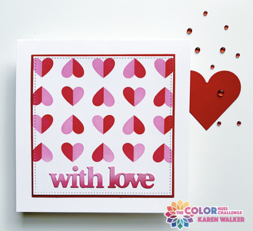
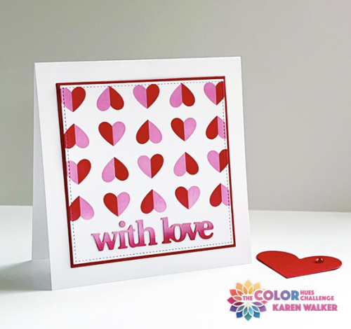
My card could easily be a valentine, but I was somewhat surprised to find I had several valentines left over from last year. I’m thinking this is more likely going to be an anniversary card for close friends of ours. I do have to make new valentines for the five grandchildren, but this one doesn’t seem quite right for any of them. 

CH#80watermark

I’ve kept my New Year’s Intention in a big way here. Every product I used was in my To Be Used Box of products purchased, but not used. I’m quite happy with all of them. I started by stenciling Papertrey Ink’s Happy Hearts with Kitsch Flamingo and Lumberjack Red Distress Oxide inks, masking off the bottom of the panel for a space for the sentiment. I die cut the panel as well as a slightly larger red panel with dies from Gina K’s Master Layout #3. I use her Master Layout #1 all the time, and purchased several more versions during sales over the past year. It’s way past time to put them to use.

CH#80FlatWM

The sentiment was die cut with a very recent purchase during the after Christmas sale at Waffle Flower. The Print and Script with Love die includes two versions of the words as well as shadows for all of them. I chose the block print ones and die cut them from a scrap piece of paper that I ink blended with the two Distress Oxide inks. 

I hope you’ll hop over to the Color Hues blog and check out all the amazing designs by our Guest Designer, Bobby, and the Design Team. We look forward to seeing what you create in the gallery.

If all goes as planned I’ll be on Day Four of a Tanzania Safari Tour when this goes live, and most likely will be checking out your creations on my return. Aside from lack of time, my understanding is internet service is hard to come by. Nancy, our fearless leader on Color Hues, has graciously offered to cover for me while I’m gone. It’s an incredible offer as she’s one of the busiest card makers I know as well as running two challenge blogs. Many thanks, Nancy!

AAA Birthday Challenge Guest Designer

  • by

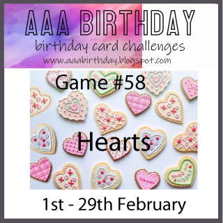
My card for Ella’s Birthday was one of two winners at the AAA Birthday Challenge in December. I am delighted to be a Guest Design for the new challenge which this month is Hearts.

#58 February

GD badge

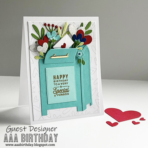
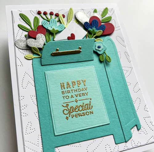
Although the theme is Hearts, the challenge requires a birthday card. I had the perfect stamp and die set for this–the Spellbinder’s Parcel and Post dies and sentiments. The sentiments come both as a stamp and as a hot foil plate. I purchased the stamps this time. I’ve had this set for well over a year, and this is the first time I’ve ever used it! It surely won’t be the last.

AaaBDWatermark

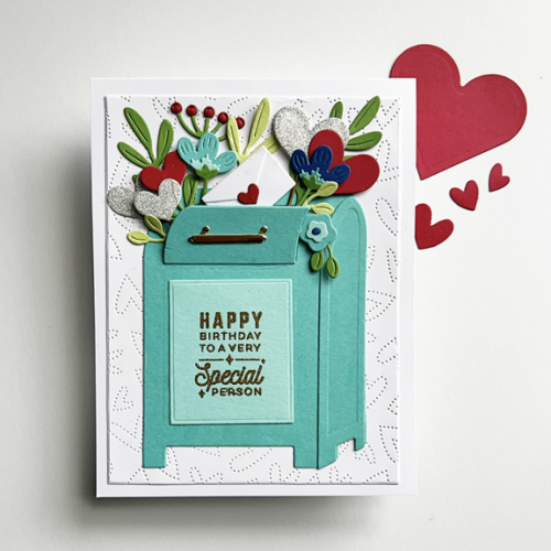
I first die cut and assembled the mailbox, and then die cut lots of the flowers and hearts from scraps of cardstock. I have lots left over for the next card. I decided on silver glitter paper for the hearts to add some sparkle to the card. Finally, the sentiment was embossed in gold and added to the front of the mailbox. I love the little envelope sealed with a heart popping out of the mailbox among the pretty florals and sparkly hearts.

AaaBDFlat

Once the mailbox was fully assembled I die cut a panel with Honey Bee’s Fluttering Hearts Pierced Cover Plate. Before adding the mailbox, I adhered the fluttering hearts panel to a white card base.

AaaClose

Since there was so much dimension with the florals and the heart in the mailbox, I decided not to add any more dimension behind the panel.

The AAA Birthday Challenge is open until the end of the month, so you have lots of time to join in. I have several February birthdays so finding a recipient for this card will be no problem.

I’m sending this card to Darnell’s NBUS to celebrate the use of this fun die and stamp set.

NBUS


January Woodblock Wednesday

  • by

Woodblock Wednesday graphic

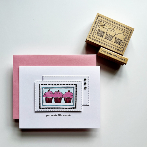
It’s the last Wednesday in the month, so it’s Woodblock Wednesday hosted every month by Amy Tsuruta. I was delighted to be asked by Amy to be a guest this month. I chose one of my favorites: three little cupcakes by Lockhart Stamp Co. I still have a small collection of Lockhart Stamps; they are a favorite of mine. 

Sweet2

The first thing I tackled was to make the checkered border. It’s so tiny it can be difficult to get a clean look. The best thing I’ve found for that is to use a Staedtler triplus fineliner. I bought a pack of them over 15 years ago, and they’ve come in handy so often when I need to color a tiny space. The rest of the image was colored with Copic markers. I die cut the image using one of Simon Says Stitched Rectangles, and cut a second one to layer behind it. 

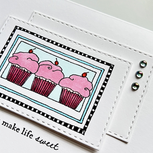
SweetClose1

I added some glitter to the cupcake papers (difficult to see) and some Nuvo Crystal Glaze to the cherries on top of the cupcakes. The sentiment is from A Muse Artstamps–another favorite woodblock manufacturer. Finally, I added three Pinkfresh Studio Iridescent Drops to the back panel. 

Thanks, Amy, for inviting me to be your guest today!

Surprise Party Guest!

  • by

I’m honored and surprised every time I win a challenge, but I was super-excited to win at Seize the Birthday! Although I don’t participate as often as I could, it’s always been one of my favorite card challenges and is run by one of my favorite card makers. So this win was a special one, and now I’m thrilled to be the Surprise Party Guest for the current challenge!

STB-SurprisePartyGuest copy

The challenge this round is a great one–right up my alley:

01-11-EmbossingWetOrDry

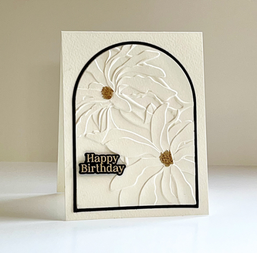
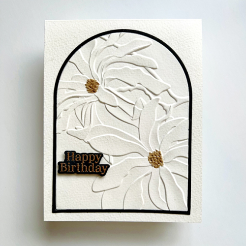
It didn’t take me long to come up with a plan. One of my favorite embossing folders (dry embossing) is Altenew’s 3-D Magnolia Ballerina. I chose to emboss an arch die cut from Ellen Hutson’s Essential Arches. I die cut the arch and then placed it in the embossing folder exactly where I wanted the design to be. I used Fluid Cold Press watercolor paper which I dampened slightly using a baby wipe before embossing. I love the way it came out.

SeizetheBD

I then recut the arch from black cardstock and added just the frame when I adhered the floral to a card base created with the same watercolor paper. I embossed the greeting from Pinkfresh Studio’s Nothing But the Best with rose gold embossing powder (wet embossing) on black paper and die cut it, adding it to the card with a bit of dimensional tape.

SeizeTheBDFlat

I love the depth of 3-D embossing folders ,and this one is especially gorgeous. I used a Jane Davenport Golden Age Ultimate Colour pen to add some gold to the centers of each flower. Although the floral takes up most of the card, I think this turned out to be a very Clean and Simple design–one I’m sure to use again. I’m also a fan of the watercolor paper–thanks to Cécile Ribon who kindly answered my question about what kind of paper she uses. It has a beautiful, though subtle, texture. 

Be sure to hop over to Seize the Birthday and add a card to the gallery! If you’re like me, birthday cards are one of the most frequent cards you make.

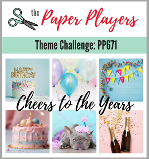
I’m sending this one on to two other challenges where they are looking for birthday cards: Double D and The Paper Players.

DD BD jan24Pp671

Guest Designer at Tic Tac Toe

  • by

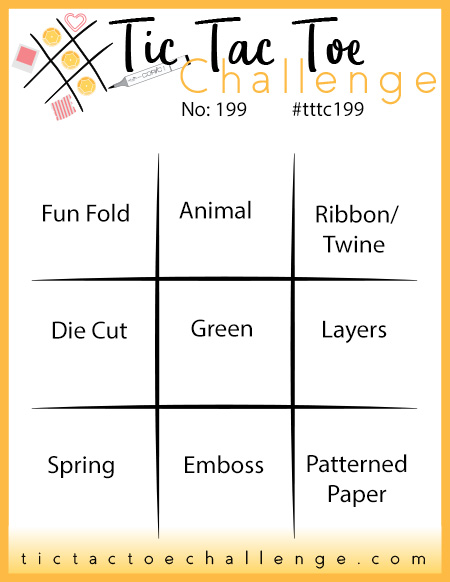
In November, my entry into the Tic Tac Toe Challenge was the Designer’s Pick, and today is my turn at guesting with them. As soon as I saw the new Tic Tac Toe board, I knew I had a perfect opportunity to create a birthday card for my husband.

Tttc-challenge-board -199

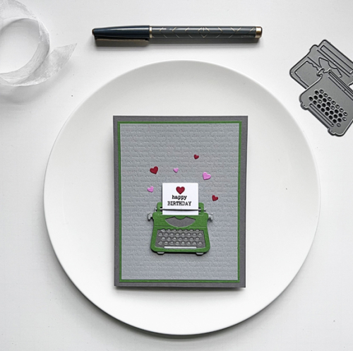
Tracy was born on St. Patrick’s Day, so the middle row (Die Cut, Green, and Layers) worked perfectly. I had already settled on the die and stamp set I wanted to use before I saw this board, but it worked out perfectly.

TOW

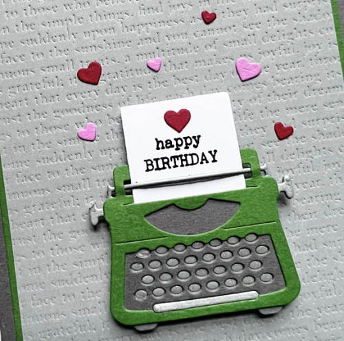
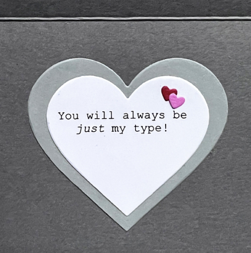
I’ve owned this You’re My Type from Sugar Pea Designs for several years. A friend borrowed it once and made a card, but I’d never used it before. I die cut the typewriter in three colors: green, gray, and matte silver. 

TOWClose

After assembling the typewriter and message, I remembered an old Impression Plate, Book Plate, by Papertrey Ink. You can see the typewriter style words embossed on the light gray layer. I opted for a narrow green border before adding the main panel to a darker gray card base. The hearts were added to coordinate with the inside greeting:

TOWInside

The stamp set didn’t come with quite the message I wanted so I used the computer to generate the sentiment which I die cut with Hero Arts Infinity Heart dies.

There are lots of ways to play Tic Tac Toe this time, and I hope you’ll join it. 

Just Us Girls Challenge 668

  • by

Time usually goes by quickly for me, but it seems amazing that today is my last post as the February Guest Designer for Just Us Girls. It’s been a real pleasure, and I received such a warm welcome from their Design Team. The last challenge of the month is a Clean and Simple Challenge asking for coloring.

JUGS #668

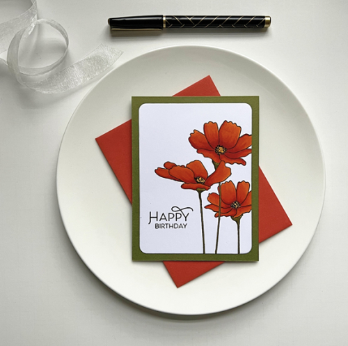
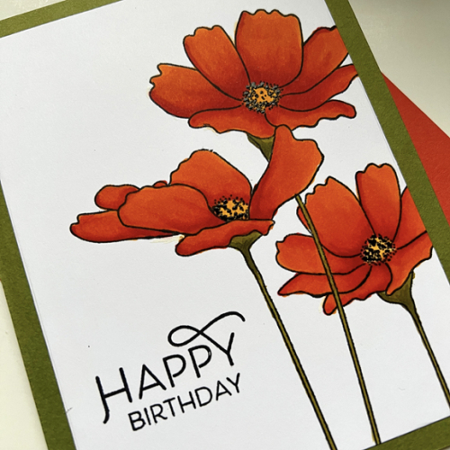
And that’s right up my alley! The only decision was what to choose. Another of the stamps I discovered as I was working on an inventory of my stamps was Flowers in Bloom from My Favorite Things. I love these poppies, and it’s been a long time since I colored them. They lend themselves beautifully to a CAS design.

JUGS#4Poppies

I love poppies and especially the red/orange ones that grow in the George Eastman gardens during the summer. We don’t get enough sunshine for poppies in our yard, but I’ve photographed the ones at the Eastman Garden multiple times. 

JUGS#4PoppiesClose

I pulled out my Copics for this one, and I’m very happy with the results. I added some black gel pen to the stamens which give just the slightest bit of dimension. The beautiful sentiment is from The Greetery’s Spring Mix. All that was needed was adhering it to a card base created with Gina K’s Asparagus cardstock—another favorite of mine.

I’m quite sure there will be a lot of great inspiration from the Just Us Girls Design team. This is really a very open challenge–so many ways to interpret it. I hope you’ll find just the right thing and join in the fun. Thanks again to the JUGS team for inviting me to play along this month! I’ve had a great time.

I’m also entering this in the CAS on Friday Challenge: Flowers.


Christmas 52 Card Throwdown

  • by

I’m honored to be the Guest Designer at the Christmas 25 Card Throwdown Challenge this time around. The challenge is their Technique Challenge, and it is a bit of a challenge since I don’t often made pop-up cards. 

9 TECH

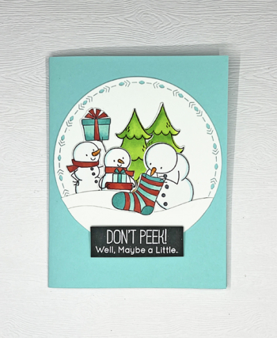
As usual, I tried a couple different things and had a pop-up card I thought I’d share, but then I tried something totally different which I like so much better! I turned to My Favorite Things, “Present Time.” One of the things I particularly like about this set was how well two of the sentiments worked for the outside and inside of the card. 

Don'tPeek

I used the largest of The Greetery’s Nordic Circles for the front of the card. I started by coloring all the snowmen and the trees with Copic markers and die cutting them. I used three of the snowmen for the front and arranged them behind two snowdrifts die cut with Papertrey Ink’s “In the Meadow–Snow and Hill” dies. The white embossed sentiment is adhered with some dimensional tape.

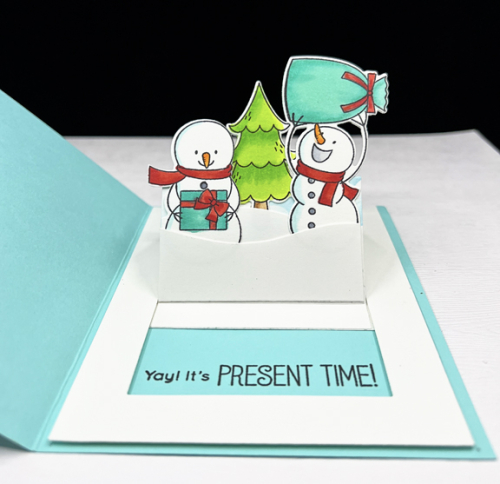
Don'tPeekInside

I love the inside sentiment–finally!–the presents can be opened! These happy snowmen and the tree were arranged behind some snowdrifts as well. When the snowmen are popped up, the inside sentiment appears. I’m quite sure this card would appeal to any one of my five grandchildren, but I think I’ll need four more interactive cards if one of them gets this one.

Thanks to the DT at Christmas 52 Throwdown for the opportunity to guest with them. It’s been a lot of fun.

Tic Tac Toe Challenge – Guest Designer

  • by

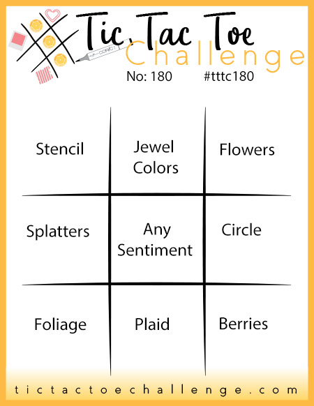
I’m delighted to be the Guest Designer for this week’s Tic Tac Toe Challenge. Here’s the board for the challenge:

Tttc-challenge-board -180

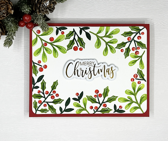
I chose the diagonal from top left: Stencil, Any Sentiment, Berries. I had the perfect stencil for this: Pinkfresh Studio’s  “Holiday Botanical Background.” I actually made three versions of the card before I arrived at this one, my favorite:

TTTC2

I used four different green inks for the leaves and holly: PFS Fresh Pear, Key Lime, and Olive. The darkest green was Papertrey Ink’s Pinefeather. For the red berries I used PFS Berrylicious and added a touch of Candy Apple. After stenciling, I die cut the panel with one of the nested dies in Hero Arts “Infinity Rounded Rectangles,” and layered it onto a red card base.

TTTC2Close

Neither photo truly shows the pretty shine and dimension of the translucent Glaze that I added to the berries. The last touch was to take a white gel pen and add some details to the berries and the leaves. In fact, the photo almost makes it look like some of the gel pen was streaked across the berries–not! that’s the reflection from the light. The beautiful sentiment is from Waffle Flower–a premade foiled sentiment from the set “Essential Christmas.” I purchased two sets in gold and two in silver–one of the best investments for holiday cardmaking I’ve made so far this year.

Thanks so much to the TTTC team for choosing my card as a Designer’s Pick and the honor of guesting for this challenge!

Just Us Girls: Wild Card

  • by

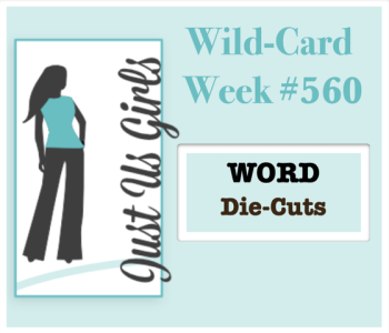
It’s the fifth Saturday of the month, so it’s Wild Card Week at JUGS, and my last week as Guest Designer. Thanks to the DT at JUGS for giving me this honor. I’ve truly enjoyed it!

Screen Shot 2020-06-03 at 4.51.35 PM

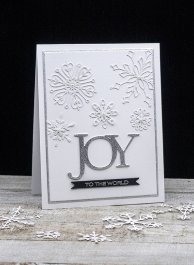
They’re looking for WORD die cuts, so I turned to one of my all-time favorites from Savvy Stamps. I think I’ve had this in my Christmas collection for over five years—maybe a lot longer than that. 

JOYBlog

As usual, capturing the glitter on a card is difficult. JOY is die cut with some beautiful silver glittery paper, and each of the snowflakes was coated with the Spectrum Noir clear glitter pen. Clicking on the image should enlarge it, so the glitter might be easier to see. 

JoyAngled

The beautiful snowflakes are from My Favorite Things “Stylish Snowflakes,” and the silver embossed sentiment is from Papertrey Ink’s “Sending Joy.” Once again I used Gina K’s “Master Layout 1” dies to cut the snowflake panel and the narrow silver border. 

Hop on over to the JUGS blog to see what the Design Team has to share!


Photo Inspiration at Just Us Girls

  • by

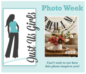
I’ve become a fan of the rotating challenges at JUGS: colors, trends, words, photos, and occasionally a wild card week. This week is the photo challenge:

Screen Shot 2020-06-03 at 10.06.01 AM

I was inspired by the color of the flowers and the wooden tray and table.

PhotoFlowersBlog

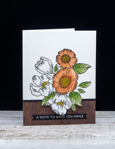
The cluster of flowers on Simon Says “Thankful Flowers” seemed to be a good fit. I stamped them on Arches Cold Press watercolor paper and watercolored them with my Daniel Smith watercolors. I decided to fussy cut just around the bottom flower and then carefully cut to the edges with a craft knife. That allowed me to layer the woodgrain paper beneath the flowers.

PhotoFlowerClose

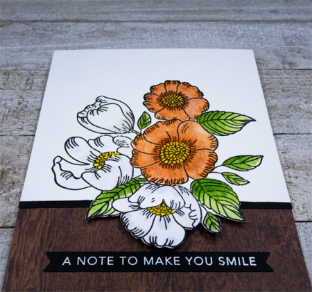
I added a narrow strip of black cardstock to separate the watercolored flowers from the woodgrain paper.

PhotoFlowerFlat

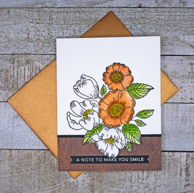
A sentiment banner from Taylored Expressions “Sentiment Strips” finished it off. I found a bronze metallic envelope from a Simon Says kit which goes well with the card, so the recipient will get a little glitz along with the card. 

Take a look at what the Design Team has created at Just Us Girls this week.

Guest Designer at Just Us Girls!

  • by

I am thrilled to be the Guest Designer for the month of October at the Just Us Girls Challenge. Ever since I discovered it in August, it’s been a favorite challenge site, so it’s going to be lots of fun to play along as the GD for a month. 

This week’s challenge is:

Screen Shot 2020-06-03 at 5.26.51 PM

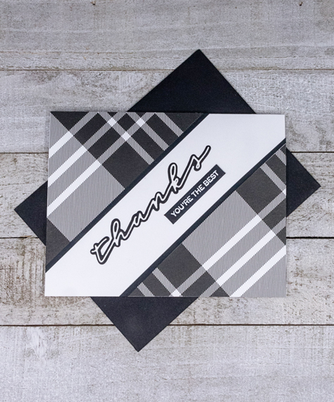
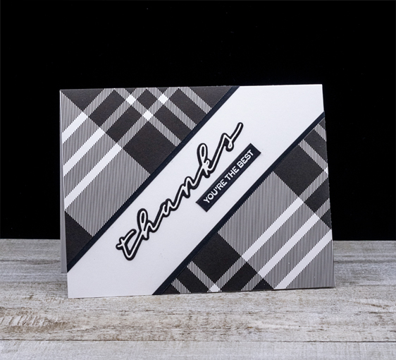
I figured I had lots of plaid patterned papers to choose from, but I was wrong! I had very few, and although my initial idea was to create a Christmas card with a red plaid background, you can see that I didn’t end up there at all. I am, however, really happy with what I found.

PlaidBlog

This awesome black and white plaid came from The Stamp Market’s “Color Crush” collection. Once I got the triangles cut out, I added a narrow strip of black cardstock along the edges. 

PlaidFlat

The die cut sentiment is also from The Stamp Market, “Handwritten Hellos,” and despite the very thin die cut word, it’s remarkably easy to attach to the black shadow. The white embossed sentiment is from W+9’s “Handlettered Thanks.” The plaid is so bold that I decided against any embellishments, which will also make the card masculine-friendly.

Do hop over to the Just Us Girls blog to see what the Design Team has come up with!