Skip to content

Color Throw Down

  • by

Swatch594

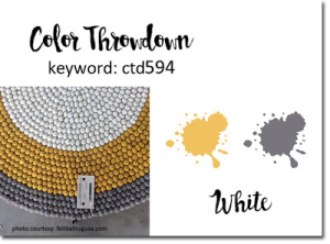
I follow The Color Throw Down challenge and often intend to create a card for it, but it rarely happens. By the time the challenge shows up in my Feedly account, the end date is just five days away. You would think that during this stay-at-home time, five days would be plenty of time to get a card made. It just doesn’t happen, but today after I finished my earlier post, I worked on my #100DayProject. I deliberately chose the colors yellow, gray, and white for this week’s Color Throw Down challenge. Three colors, I might add, that I really love together. So I was not totally surprised when I check the date for this week’s challenge to discover it ends tomorrow, so here is a second post in one day—a rarity to be sure.
ColorThrowDown

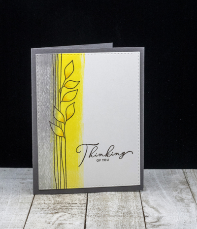
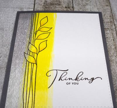
Day 18 of the Spring Card Camp 2 was about ink swiping backgrounds. Being a CAS fan, most of the backgrounds were a bit busy for my tastes. But Seeka created a series for part 2 of the lesson that I loved, and this is one of the designs I particularly liked. I swiped down the side of Bristol cardstock with two ink cubes in gray and two ink cubes in yellow from Pinkfresh Studios.  It’s easier to see the ombre effect in this photo:
ColorThrowdownClose

Then I used a Y35 Copic marker to add just a touch of dimension to the leaves. After die cutting the panel with a stitched rectangle die, I mounted it on Simon Says Smoke cardstock. 
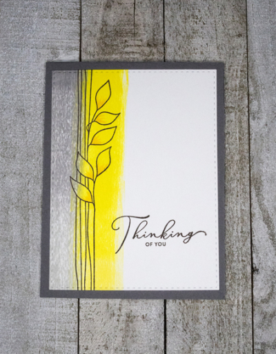
ColorThrowdownFlat

The beautiful vine is from Simon Says’ “Stronger Together” set and the sentiment from Simon Says “Sketched Flowers.” Both sets were part of the Simon Says Card Kit series, and have wonderful images and great sentiments. 

Off to link this up before the challenge closes!
Spring Card Camp Fun

  • by

I’ve been sharing my cards and coloring on Instagram as part of the #100DayProject (coloring) and the #30DayColoringChallenge, but it’s time to share one of finished projects here. I wasn’t quite sure ink blending counted as a coloring technique, so I’ll catch up today with that. I’m definitely counting these as part of my 100 Day Project.

SPRSCC2020-participantParticipationbadge


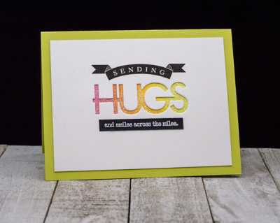
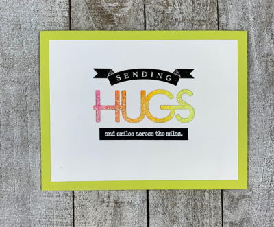
Yesterday’s lesson by Cathy Zielski was one of my favorites. (Today’s lesson with Laura Bassett is equally great; there will be more on that later.) One of Jennifer and Kristina’s objectives in creating this card class was to showcase techniques that create multiple cards. Cathy’s resulted in four cards—one of them went in the mail this morning to Caleb and Hannah!

SendingHugs1

SendingHugs1Flat

Cathy used a “Thanks” die cut for her cards, but once I found the Papertrey Ink “Big Hugs” stamp and die set in my collection I knew exactly what I wanted to do. After ink blending a piece of cardstock to put behind the die cut word, I stamped the sentiments, and then mounted it on a Limeaid Ice card (PTI),

SendingHugs2

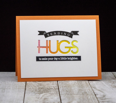
For the next card I found a piece of glittery cardstock I purchased at the Broadstreet Paper store in Milwaukee during our last trip to Wisconsin. The second sentiment on the next two cards is slightly different as they’ll be mailed locally.

SendingHugs3

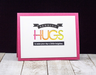
This is another piece of the glittery cardstock. 

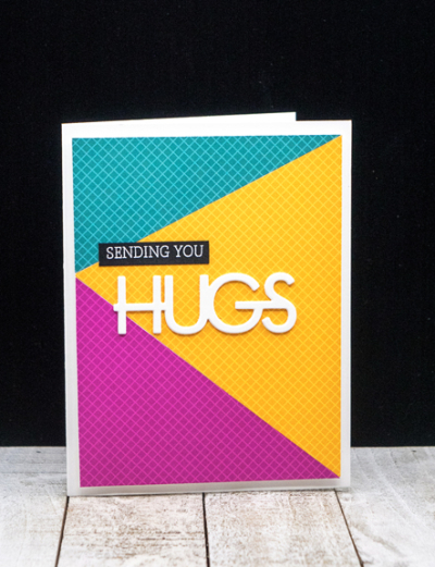
After die cutting three pieces for these cards, you’re left with three die cut “HUGS” which I stacked together for the fourth card. Cathy used a piece of patterned paper for her’s, and despite my rather extensive collection of patterned paper, I couldn’t find just what I wanted, so I returned to an earlier class by Kristina Werner who provided two patterns for paper piecing, and found three sheets of coordinating colors from Sunnyside Studio’s pack of “Gingham Jewel Tones.” I have two more backgrounds from that process to use on future cards as well.

SendingHugs4

I have a couple more projects completed to share here soon, and a list of several more I hope to try. Spring Card Camp has been a good diversion during these unsettled times.