Skip to content

Two Challenges

  • by

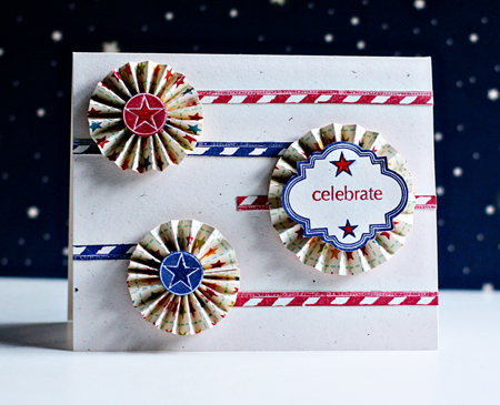
I’m back with a second post today as promised. First off, a card for the Simon Says Stamps challenge. I placed my first order with them last week and was amazed at the fast service. I’ve never looked at their blog before this week, and there’s lots of inspiration there. This week’s challenge is for Stars and Stripes. I had several new products I was anxious to use and was able to use some favorites as well. As I created the card, it occured to me that it would be a perfect birthday card for my MIL. She doesn’t read my blog, so it’s safe to post it here. Her birthday isn’t until July 5th, but it’s nice to be ahead!
Stars&stripes

One of the products on my list when we were traveling was the Tim Holtz mini-rosette die. I never found it so it was one of the goodies in the Simon Says package. I love how easy it is to create these fun rosettes and they are much flatter than the ones I’ve tried on my own. I stamped the stars for the centers with a Teresa Collins stamp, Free Style. The sentiment frame is also from that set, and the sentiment is from the new Papertrey set Tag-its #4. The Tag-it stamps are just $5 and I get a lot of used from the sentiments as well as the tag frames. The striped pieces are from a new stamp set, “Daily Junque,” by Pink Paislee. I saw Danielle use it on three fabulous cards last week, and when I saw that Simon Says carried it, that pushed me to click on the purchase button!

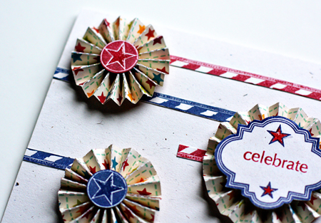
Here’s a closer look at the rosettes which I cut from some cute October Afternoon papers from the Campfire line.
CelebrateDetails

There are some great stamps in the Daily Junque set, so I decided to stamp an envelope as well. All the stamps except “July” are from that set.
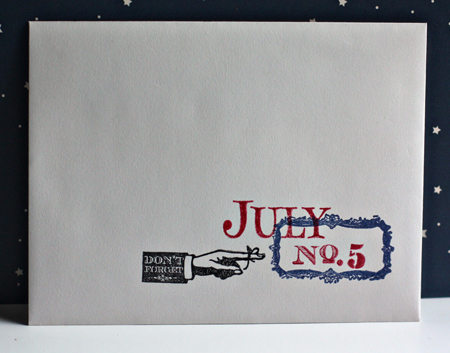
Envelope

And now to Amy’s photographic challenge. She asked us to photograph five things we think will be gone from our homes in five years. It turned out to be pretty easy.

First off, my cook top from the 1950’s. It is probably the only live pilot cooktop in our town. But it will definitely be gone as we purchased a new stove on Friday. These green counters will also be gone.
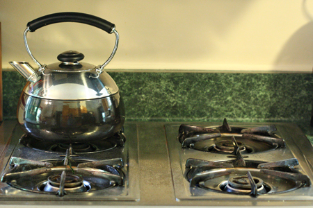
StoveTopw

My relatively recent refrigerator will also be gone from the kitchen, but probably moved to the basement. We’re waiting for the final estimates, but expect to have a new kitchen by the end of the year. I’ve never had room for a full-size refrigerator, and I am absolutely thrilled with the one we bought this weekend (on close-out at a great price, to boot)!
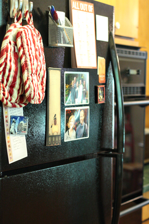
Fridgew

So, in fact, my whole kitchen will be gone. These cupboards will be replaced as well. It’s not a terrible kitchen, but the cupboards are over 50 years old and hard to keep clean. I stripped and refinished them 20 years ago, but it’s time for a new look. The best part is we’ll have a new arrangement, and it should be much more efficient, and I hope to have lots more counter space, even though we’re not expanding the size of the kitchen.
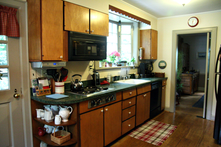
Kitchenw

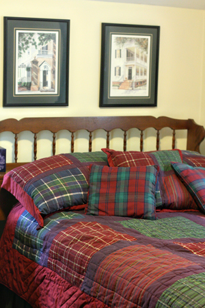
Matt’s room, now the guest room, will also have a new look. Hopefully, that won’t take five years. I’m on the lookout for new bed linens and when Tracy has worked his way upstairs with his painting project this room will no longer have dark green woodwork, which I notice now doesn’t appear in the photograph.
Matt'sRoomw

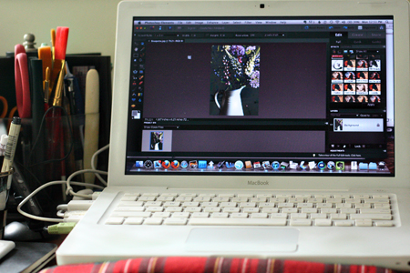
And, finally, my laptop. It’s already several years old and is used enough that some of the letters are wearing off the keys. I’m not anticipating replacing it in the next year or so, but I doubt it will last five more years.
Laptopw

This was fun, Amy! Thanks for throwing down the challenge.
Vacation Recap

  • by

Warning this is a long post and there are a lot of photos!

We’ve been home just a week, and it’s time for a vacation recap. I’ve finally been through all the photos once and chosen those I think I might want to print. I deleted a few, but must go back again and get rid of all the duplicates. Yesterday I managed to edit the ones you’ll see here.

We were gone nearly 3 weeks. I took over 1100 photos, we drove through four states (Tracy drove clear across the country, but I flew from NY to Colorado), we visited three national parks, four sets of friends and family. I read five books, but sadly missed meeting up with three blogging friends I hoped to meet. Aside from serious pain issues, it was a great vacation. As some of you know, I had surgery in early March and was left with some serious, undiagnosed, and untreatable pain which made walking very difficult. It went on for 10 weeks, and really impacted my lifestyle, and sadly, our vacation. Miraculously, the day we left to come home it disappeared, and I’ve now been painfree for a little over a week. I have new appreciation for chronic pain, and don’t know how you get accustomed to it. I never did, and I was worried that this would be a lifetime affliction. The surgeon has now diagnosed it as an impacted fibroid, but the truth is none of us are quite sure what it was. But yeah, it’s gone!

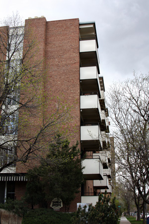
So, on to vacation. We started in Denver where Matt has taken a new job, which thankfully, he seems to love. We found him an apartment, but weren’t there to help him move in, but our friends did. I’m still waiting to see photos! But here’s the apartment building. He’s on the fourth floor and on a clear day, can see the mountains.

M'sAptw

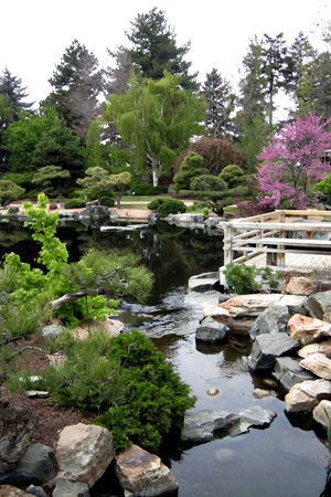
He’s just two blocks from the Denver Botanic Gardens where we spend a couple of hours one afternoon.

DenverBotanicGardenw

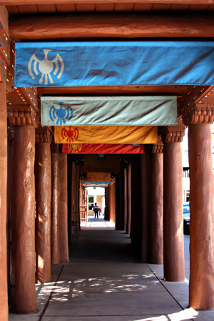
When we left Denver, we drove to Santa Fe and spent an afternoon in the downtown area and visiting a fabulous photography gallery. We were here ten years ago, and would love to spend more time again.

SantaFew

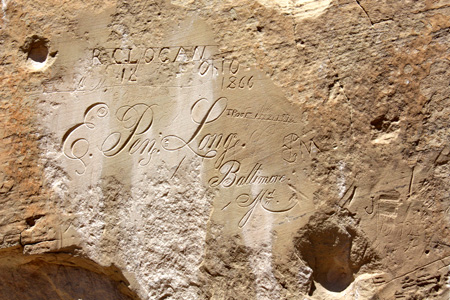
Tracy much prefers state roads to interstate highways, so on our way to Phoenix to visit family we took the long way and got to see El Morro National Monument where Native Americans and pioneers left their marks on the rocks. The earliest are petroglyphs, but I was amazed at this beautiful script carved into the rock.

MorroNMw

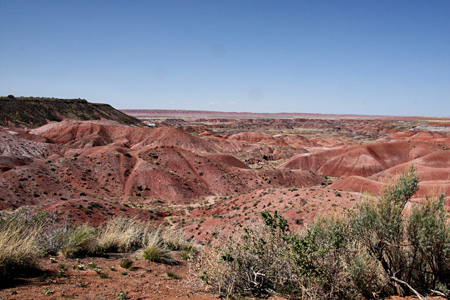
And we drove around the Painted Desert and Petrified Forest National Parks:

PaintedDesertw

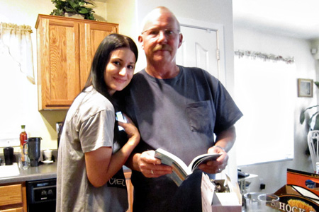
In Phoenix, we visited Tracy’s brother, here with his beautiful daughter, Lena. I was terrible about getting photos of family and friends. Not like me, I’m blaming it on the pain, but I’m so sorry I don’t have better photos. (Or in some cases, any.)

Scott&Lenaw

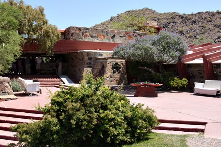
We also got a chance to visit Taliesin West, Frank Lloyd Wright’s western home. Thanks to Deb, I also did a little shopping at Scrapbooks, Etc. and sent myself a box of scrapping goodies which I can’t find locally.

TalisienWestw
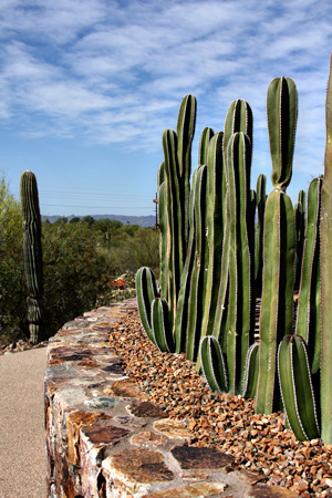
From Phoenix, we drove to Tucson. We’d never been here before, but had a lovely time. We visited Saguaro National Park . . .

SaguaroNPw

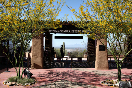
the absolutely fabulous Desert Museum . . .

Entrancew

Tohono Chul . . .

TohonoChulw

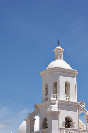
the beautiful San Xavier Mission . . .

Missionw

and the fabulous Center for Creative Photography as well as having dinner with old book group friends from Rochester.

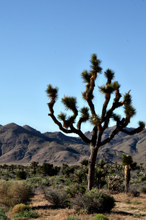
On our way to California to visit Sarah and Adam, we stopped for a day at the Joshua Tree National Park,

JoshuaTreew

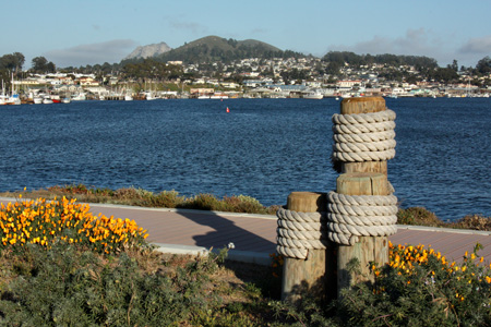
Spent a night at Morro Bay:

MorroBayw

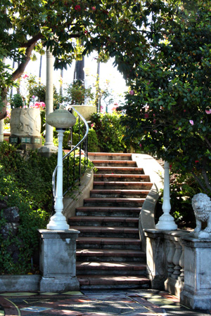
And visited San Simeon, William Hearst’s castle on a hill overlooking the Pacific. The gardens and walkways were my favorite part.

HearstCastleStairsw

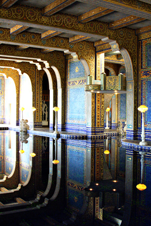
But this shot of the indoor pool, gives you a better idea of the ornate and elaborate house.

IndoorPool1w

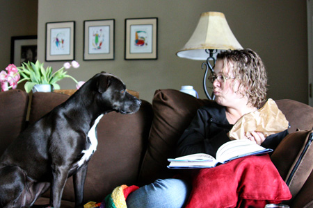
And finally, we ended up with Sarah and Adam for five restful days of family visiting. I did get a great family photo here (and you’ll see it later), but I love this one of Sarah and her dog, Sadie.

SarahSadie1w

If you made it to the end, you deserve a treat!

Project 64: Asparagus

  • by

This is my second post today. For the Papertrey Ink Blog Hop, scroll down one post.

Project64

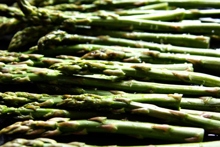
This week’s color at Project 64 was asparagus. Of course I had to photograph the vegetable since roasted asparagus is probably my favorite vegetable.

Asparagusw

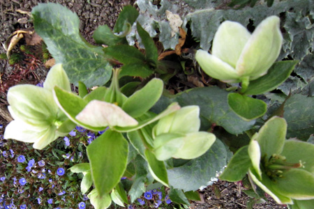
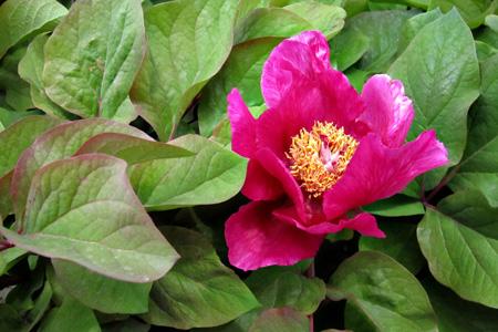
And then I have two photos from the Denver Botanic Gardens. All three plants have asparagus green leaves.

Heleborusw

Heleborus


Peonyw

Peony

You can find a  lot of photographic inspiration on the Project 64 blog.


Project 64: Cerulean Blue

  • by

  Project64

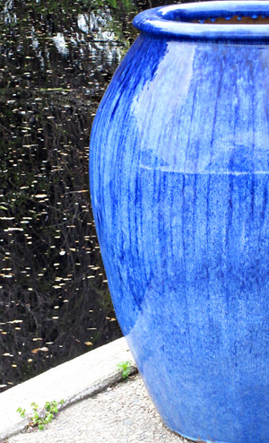
Time is definitely getting away from me this week. There’s been so much to do and so many appointments/obligations on the calendar since we got back. Last week’s color for Project 64 was Cerulean Blue. I found two good examples on our trip.

BlueJarw

This beautiful blue jar was at the Denver Botanical Gardens.

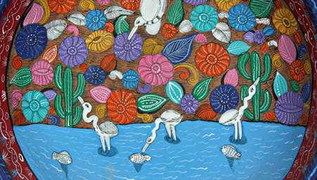
GuatemaleanPlatew

Sarah bought this gorgeous dish in a Guatamalan shop in Boston the year she went to B.U. It’s prominently displayed on their shelves. I’ll be back tomorrow or Monday with the next color:  asparagus green.

Project 64: Pacific Blue

  • by

Project64

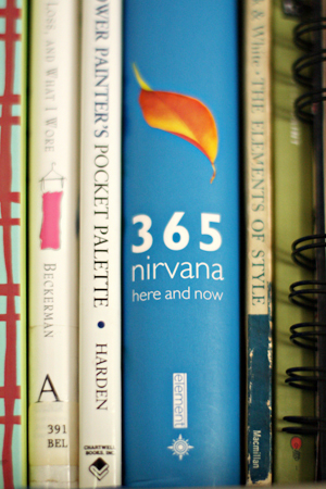
I wasn’t too hopeful about finding much Pacific Blue this week, but actually there was a lot more than I expected and I never had to leave the house.

  Wk16 pacific blue copy

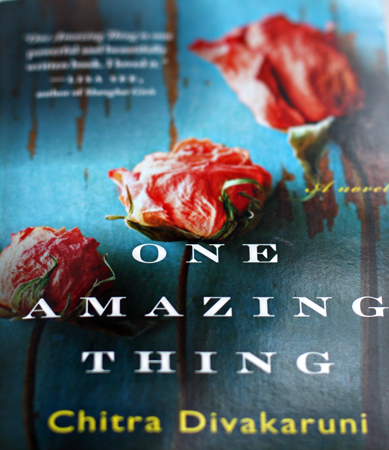
Books

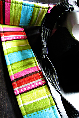
CameraStropw

OMT

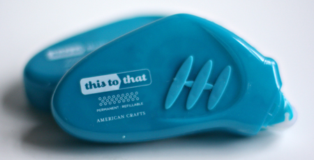
ThisToThat 

They were all right here in my studio. Who knew? Just another reason why I like this challenge—it encourages me to look more carefully everywhere.

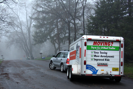
For the next couple of weeks, I’ll be on the road, and I’m hoping to continue to participate. I’ve never tried to post from an iPad and the photos will definitely be SOOC. If need be, I’ll do a catch-up post when I get home. Tracy and Matt rolled out of here a day late due to major car repairs on the way to Denver. Matt’s new job starts on Monday. I’ll be joining them on Thursday.

U-Haulw

Team-up Thursday: Yellow & Kim’s Texture Link-up

  • by

Teamup

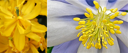
Nancy and I are back again with a Team-Up Thursday diptych. This week’s theme was yellow, and we both went for flowers. Neither of us took them outside in Rochester, though, as it was still snowing here this morning. We’ve gotten lots of rain and several days of snow showers recently. Fortunately, not enough to cover the ground, but still . . . it’s April!!! Mine (on the left) was taken at the Highland Park Conservatory and Nancy was lucky enough to visit Longwood Gardens outside of Philadelphia on her recent trip.

YellowDiptych

I’m playing along with Kim Klassen’s texture link-up again this week. Playing with textures always seems to end up low on the list of thing to do, so this is a good incentive.

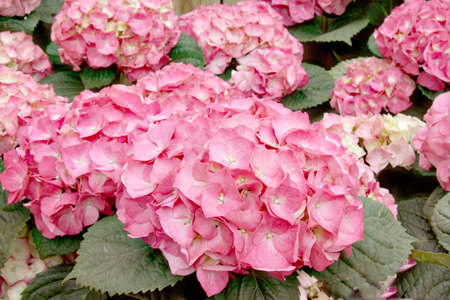
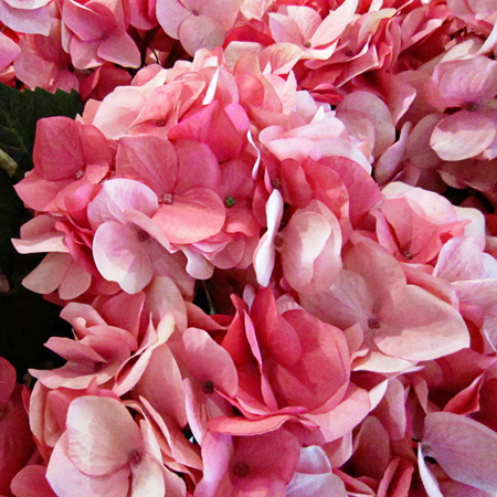
PinkHydrangeasTexturew

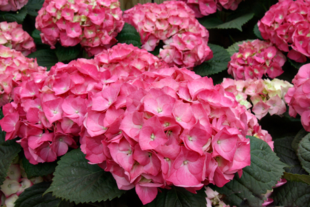
I actually used the recipe Kim listed on her blog last week for this:  Silence/Soft Light at 100% opacity, SweeTreat/Soft Light at 100% opacity, and a very slight adjustment to the midtones in Levels.  Here’s the original. The texture seems to do more to the saturation of the image than anything else. Just a softer look.

PinkHydrangeasw

Project 64: Burnt Sienna

  • by

Project64

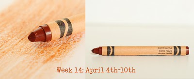
This week’s color was Burnt Sienna.

Wk14 april 4_10_Burnt Siena

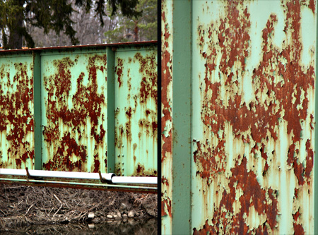
Brooke added another challenge to create a diptych this week. I found quite a bit of Burnt Sienna right here at home, but for my diptych I chose to use these two photos of a bridge crossing the Erie Canal.

BridgeDiptych

Here are the photos from around the house:

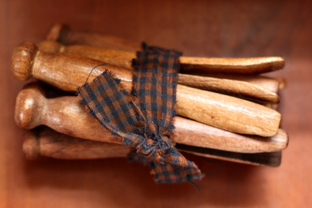
Clothespinsw

Clothespins from a vintage shop that I keep in my studio.

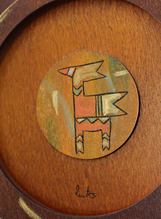
DecorativePlatew

A wooden “plate” from Guatemala given to my husband by our daughter. It hangs over his dresser.

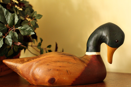
Duckw

A duck decoy that sits on top of our media center in the den.

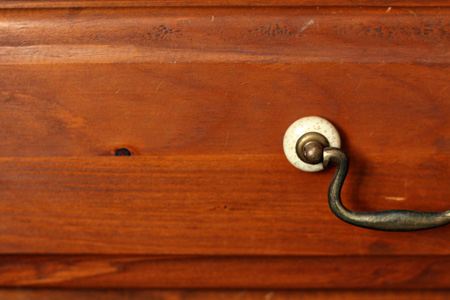
Drawerw

My bedside table drawer.

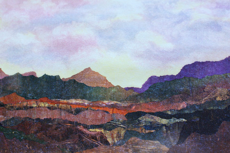
Paintingw

A painting given to me by Sarah that hangs in my studio. The frame is also close to Burnt Sienna, but didn’t photograph particularly well.

I’m trying to figure out how to participate in this challenge while we’re on vacation. I know better than to take my box of crayons which will surely melt in the Arizona heat. I suppose I can try to guess the color by the posted prompt and the first few examples posted on the site, or I can do catch-up when I get back. None of those choices really appeal to me, however. I like carrying my crayon around; it’s become a habit.


Team-up Thursday: Design & Kim’s Texture Link-up

  • by

Teamup

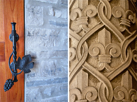
Nancy’s been on the road, but she sent this perfect shot for this week’s Team-up Thursday, “Design,” taken at the Biltmore Estate in Asheville, NC. Although I’ve been to Asheville at least four times in my life, I’ve never made it to the Biltmore, and it’s on my list of places to see. I was in Canada on Saturday and found this lovely door handle at the Meglamania Winery in the Vineland area near Niagara-on-the-Lake.

DesignDiptych

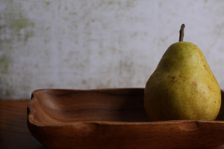
I also wanted to play along with Kim’s Tuesday Texture Link-up (just two days late!) Here’s the image SOOC, no cropping or editing.

   PearSOOCw

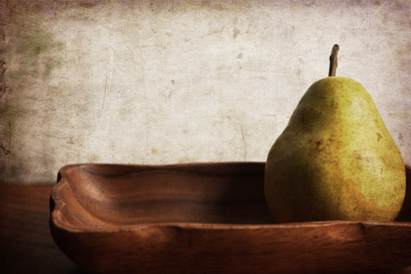
And here’s the new photo with texture.

PearTexture2w

The challenge was to use the new “warm sun” texture, which I did. Then I used the “overlay” blending mode at 100% and decreased the saturation. I thought it needed more contrast so I used the “multiply” blending mode at 35%. I think I like the warmer, textured version, the best.

Project 64: Spring Green

  • by

Project64

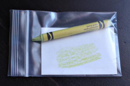
Another week has flown by and it’s time to link up with Project 64. (You can check out the other entries with that link.) This week’s color was Spring Green. Instead of using the project’s crayon image, I thought I’d take a photo of the way I package my crayon for the week.

Crayonw

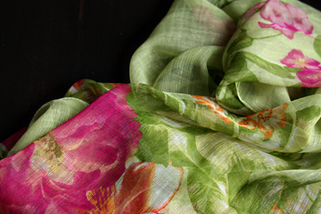
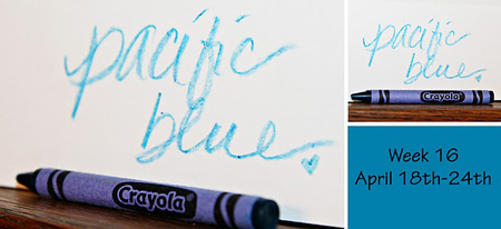
As usual, everyone gets involved in looking for the color of the week. Yesterday we were in Canada with good friends and we were all keeping a sharp eye out for spring green. Sadly, we didn’t find any good candidates. Like western New York, not much has begun to bud in Ontario. When I came home with a new scarf this week, however, Tracy noticed right away that it was spring green. I bought it because I loved the spring colors, never considering at the time that it was also perfect for the challenge.
Scarf2w

Today I decided to join the Lamberton Conservatory in Highland Park. It’s just a few blocks from here, and now I can go over and take photos without having to remember to put some money in my pocket! I found several candidates for spring green.

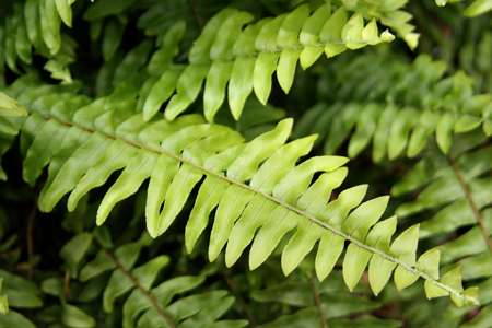
BostonFernw

A Boston Fern

Palmw

The ribs of the palm leaf

And my favorite:

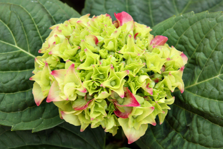
HydrangeaBloomw

A hydrangea bud that will eventually turn bright pink.


Picture Inspiration: Infinity (and a card)

  • by

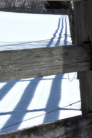
This week’s prompt was to work with diagonal lines that lead the eye to infinity. It was not an easy task. I went out shortly after we got the prompt. We had just had several inches of snow (again!) and I was hoping to find a good fence to photograph. I found one, but couldn’t position myself so the line would go into the negative space. My favorite shot from this outing uses the shadows rather than the fence to lead your eye through the photo.

  DiagShadowsw

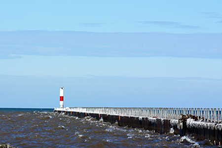
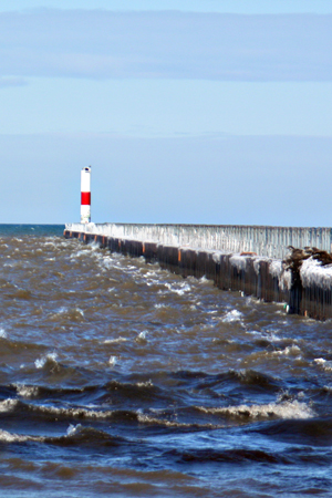
Nonetheless the diagonal is not a strong one, so yesterday I drove up to Charlotte Beach to take a photo of the pier. It’s closed to pedestrians now, but I was able to get a couple of decent shots from the beach. (Let me say, however, it was really cold out there!) This one is the best for the diagonal line.

Lighthouse1w

But the next photo shows the waves caused by the stiff breeze that made it so cold.

Lighthouse2w

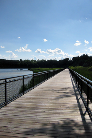
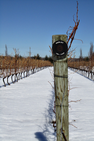
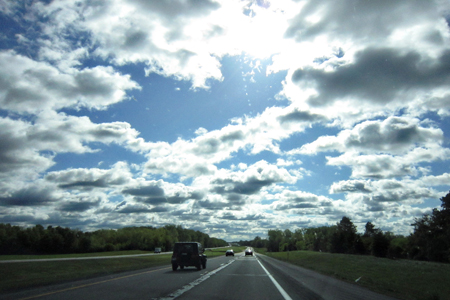
And here are a couple of shots from the archives.

RiverWalkw

GrapeVinesw

OnTheRoadw

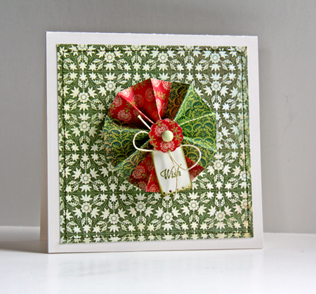
Yesterday I found a tutorial on making the paper medallions I see so frequently. So this morning, rather than just bookmark it (and forget it) I decided to try it. I just got a 6X6 paper pad called Hello Luscious which I used for both the medallion and the mat on the card. I like the card, but it would be nearly impossible to send through the mail (and I think too thick for a scrapbook page as well.) Fortunately I have a friend who will get this card hand delivered on her birthday in May.

Wish

Other products: Cardstock:  Vintage Cream (PTI); Stamps: Tiny Tags (PTI); Brad: Sassafrass Lass; Dies: Big Scalloped Circles (Spellbinders) and Tiny Tags (PTI); Twine from my stash


Photography & Card Making–Two Challenges

  • by

MIM&Proj64

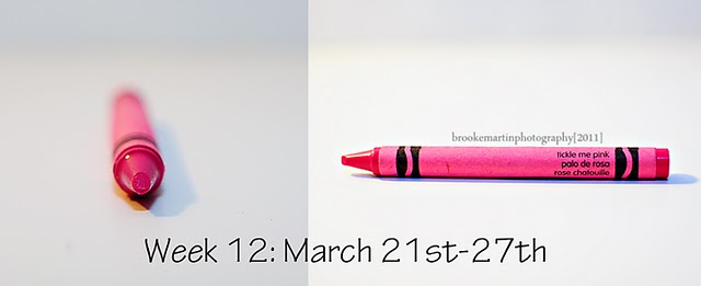
It’s not often I can combine a photograpy challenge with a card making challenge, but this week was easy. As soon as I saw the new color at Project 64, Tickled Pink, I knew it was a perfect match for Papertrey Ink’s Hibiscus Burst.

Wk12 March21_27 TicklePink
 

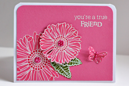
The challenge for Make It Monday was to use Copic Markers on colored cardstock. So I pulled out one of my favorite stamp sets, Friends Til the End, and embossed the flowers with Filagree White Embossing powder. I use the Hibiscus Burst Copic Trio (RV10, RV13, Rv14) and YG03 & YG05 to shade the Simply Chartreuse leaves. A few Memory Box pearls and a Martha Stewart butterfly from Bitty Dots finished it off.

MIMFriendw

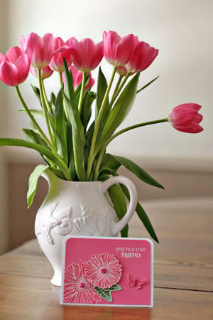
The card wasn’t the only find for Tickled Pink, however.

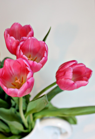
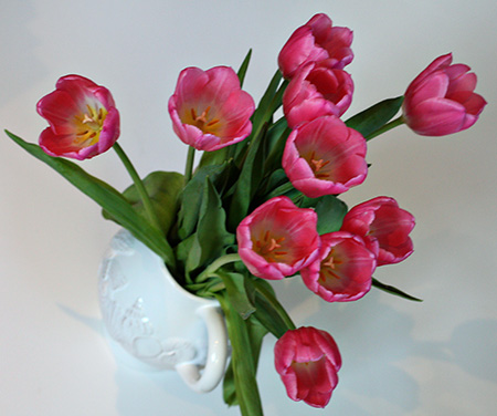
Card&Tulipsw

Trying some new perspectives:

Tulips1w

Tulips2w

Pottery Barn flowers I noticed as I walked by the entrance this week:

PBFlowersw


Team-up Thursday: Spring & Picture Inspiration

  • by

Teamup

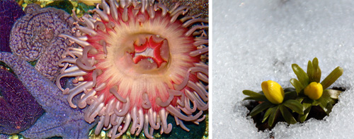
It’s Team-up Thursday. Nancy and I have missed the last couple of weeks. She’s traveling, but I’m the real culprit. Our photos couldn’t be much different, but then our environments are much different right now. She’s in sunny (and hot) Florida. I’m in snowy Rochester. In fact, she says it’s a lot more like summer than spring where she is. Her photo was taken at the Florida Aquarium in Tampa. The colors reminded her of spring. Mine was taken here and represents the HOPE of spring despite the several inches of snow we got yesterday. These are winter aconites. They’re the first flowers in our yard to bloom. Sadly, they’re in the back so we don’t get to enjoy them much. By the time, we’re out in the yard, they’re gone.

TUT_Spring

I got behind with Picture Inspiration as well, but I’m really enjoying this class at BPC with Tracey Clark. In addition to motivating me to take photographs, the gallery is a constant source of inspiration. I’m also taking Kent Weakley’s Photography Composition e-class which is wonderful. Yesterday’s lesson talked about how to look at the images you admire to discover those elements of composition that contribute to your love of the image. As I have long recognized, each of us see images very differently, and what appeals to one person may not have the same appeal to another. The key to good composition in photography is to figure out what you love so you are happy with the images you create. After all, most of what we photograph is for our personal pleasure or memory books.
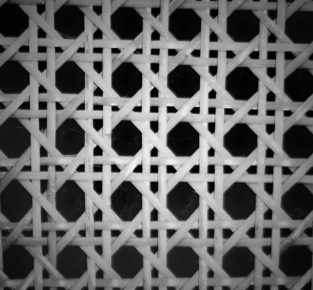
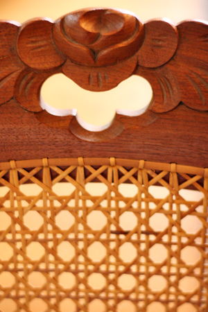
A week ago the prompt was motif. Tracey’s continued with her exploration of pattern and rhythm. Here’s part of the definition–“a distinctive and recurring form, shape, figure, etc, in a design, as in a painting or on wallpaper.” I immediately thought of our hand caned chairs that belonged to my great-aunts.

CaningBWw

MotifChairw

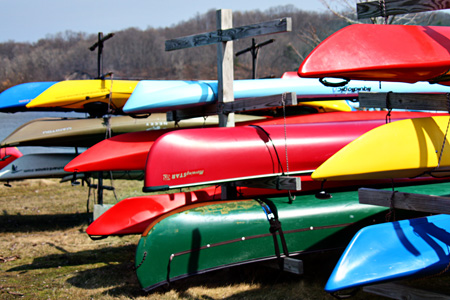
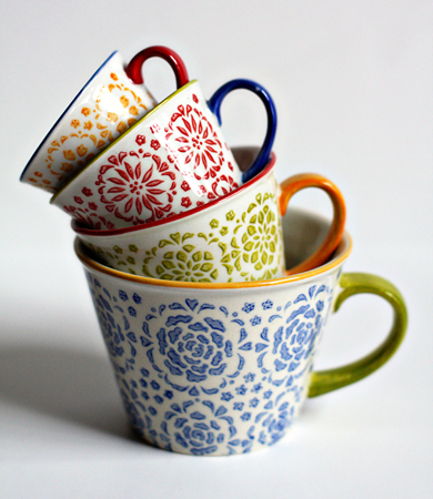
This week’s prompt was “stacked,” which was already a prompt for Team-up Thursday a while ago. I did post my cheerios photo again, but also two new ones.

Stacked Kayaksw

The kayaks stacked up along Irondequoit Bay last week before our recent snow. The bay is still covered with ice in many places, so it will still be awhile before they’re in the water.

StackedMeasuringCupsw

And these gorgeous measuring cups from Pier One that I first saw on Deb’s blog and then found on sale. They’ve found a permanent spot on my kitchen counter where we can enjoy them as well as use them.


Project 64: Scarlet

  • by

Project 64

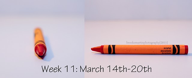
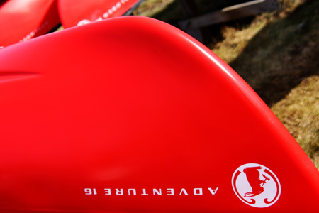
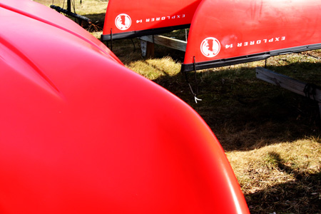
I didn’t get out much this last week, but my first foray outside the house was last Thursday when Tracy took me to the lake for lunch. I knew I wanted to make a quick stop to take a photo of kayaks along Irondequoit Bay for the prompt this week at Picture Inspiration. (That post is coming.) As we were pulling out of the parking lot, Tracy noticed these three kayaks–all scarlet–a much more orangish red that I would have imagined.

Wk11 March 14_20_Scarlet

I always think of Snow White’s evil stepmother with scarlet lips which (in my picture book) were a deep and bluer red. So this week I have just two offerings for scarlet. Hopefully, this week will be a bit better and I’ll be up and running again.

Kayaks2w

Kayaks1w


Super Moon

  • by

Since the full moon tonight was supposed to be the largest in the last 20 years, Tracy and I decided to go out and see what we could do to capture a photo. It was freezing (just a little over 32°) so we weren’t willing to stay out too long. I had some notes from my friend Barbara about good settings to try. Another time I would use the remote, but I didn’t have the camera set for it and it was so dark in the field near our community garden that I just stuck with the tripod. It would also be nice to have a longer lens, but that’s not happening! Nonetheless I’m pretty happy with this shot, and most of all, I’m glad I saw it. As we drove over the moon appeared HUGE and bright yellow, but quickly diminished in size.

FullMoonw

Project 64: Plum

  • by

Project 64

This week’s color at Project 64 was plum, actually a color I like quite a lot.

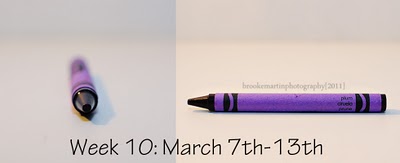
Wk10 March 7_13_Plum

Fortunately, I looked around and found some things that matched the crayon (and its scribble) before I went off for surgery. Today I managed to get shots of most of them. The first one is a newbie.

Ribbonw

A good friend who brought dinner over the other night, also brought a lovely arrangement of flowers for my dinner tray. Tracy said, “I think we ought to save these in case they match one of the crayon colors.” Good thing he was thinking about it, because one of them is a pretty good match for plum.

IPhonew

So is my iPhone cover.

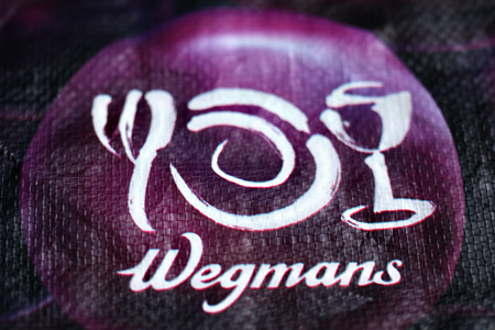
WegmansBagw

And my favorite reusable grocery bag from my favorite grocery store.  And here’s my shot for the week:

Amythest2w

This is one of my favorite necklaces. I wear it on several different chains and have two pairs of earrings that go with it as well. I grabbed the lid from one of my vintage Mason jars for the photograph. Check out the other entries. I love looking through all the other photographs to see what folks have found and to “collect” ideas for composition.