Skip to content

Happy Father’s Day and More

  • by

We’ve had a busy day. I was a participant in this morning’s worship service where we welcomed a new member. I’m co-chair of the Membership and Evangelism Committee, and this is one of the pleasures of that commitment. It was quickly followed by a fabulous brunch at Betsy’s father’s house. Her dad was in NYC, but the rest of the family, Leon’s parents, and friends of the family were also there. The food was delicious, and the star of the buffet was a smoked brisket Leon prepared. He was up past midnight before it was finished. 

I walked down to visit a friend afterward. The weather here has been absolutely perfect, albeit a bit windy. It’s sunny and warm, great for getting out for a walk.

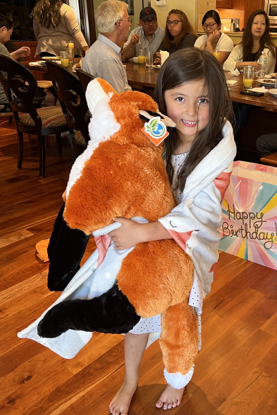
Later this evening we’re headed to Maddy’s sixth birthday party. She’ll not turn six until early July, but they will be in Nantucket, so she’s celebrating with friends (and us) tonight. Actually I took her gifts to her this morning since she asked for a giant stuffed fox. I ordered it online and lucked out. Not only was he cute, but soft and cuddly. She was thrilled.
MaddyFox

Here’s Maddy’s card for 2022. Her party theme tonight is mermaids, and I just happened to have the perfect stamp set from a Simon Says card kit from several years ago.
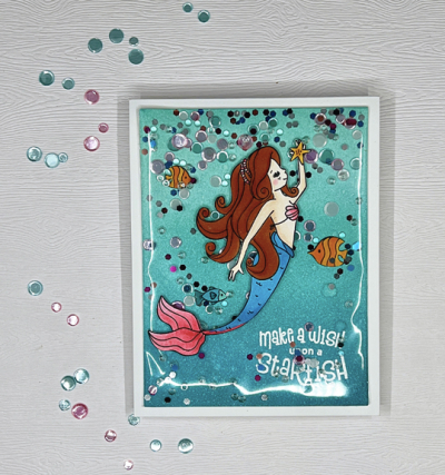
Mermaid

It’s an edge to edge shaker card which is always a hit with kids. I inkblended a panel with a trio of the new Simon Says “Pawsitively Saturated Inks” which I’m quite sure were a good investment. The inks blended beautifully with little effort. Thanks to an Instagram friend, I found my Shimmer Spray and gave the panel a good spray of sparkle before I added some fish that I colored with Copic markers and fussy cut. The sentiment was white embossed before adding the confetti and sequins to make the shaker. I think embossing the sentiment on the outside would have been a better plan, but there was no way I was starting all over.
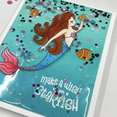
MermaidClose

The mermaid was also colored with Copics and fussy cut but added to the outside of the shaker. I do love how the inside looks like a beautiful aqua sea. Here’s a peek at the inside of the card. I had a left-over turtle I didn’t know what to do with, so I popped him up on dimensional tape on the inside.
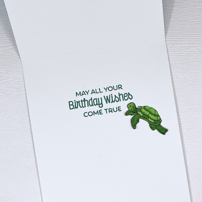
InsideMermaid

I’m adding Maddy’s card to the Time Out Challenge: Tropical. I think this card fits the theme pretty well.
TimeOut216

Today is Father’s Day in the U.S. and all three of my Father’s Day cards are a CASE of one by Laurafadora for My Favorite Things. I used her recessed die technique and the same die. I recently won a $25 gift certificate to My Favorite Things, and this die was one reason I spent it quite quickly. I changed up the colors and the sentiment. In fact, all three cards were variations on the same design.
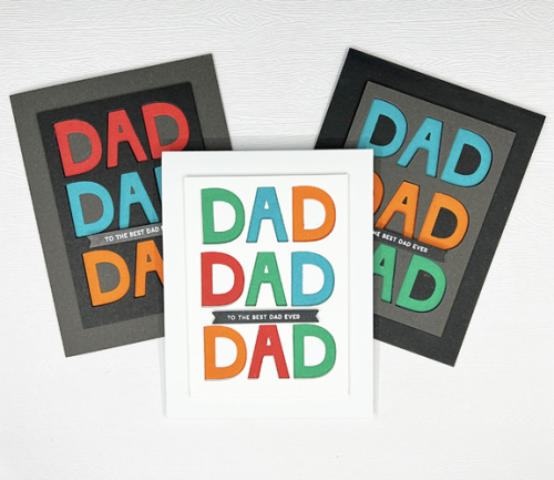
DadX3

It’s hard to see the recessed letters, but Matt thought it was a very cool design! The first one was for Matt, then Adam, and finally Tracy.
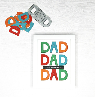
DadWhite

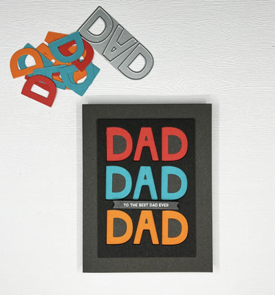
DadSmoky

The recessed letters are a little more apparent on this card. The inner panel was die cut and then added to the card base with lots of dimensional tape. Then the letters were added to the card base.
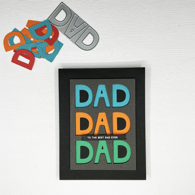
DadBlack

The sentiment, “To The Best Dad Ever” from The Greetery is true for each and every one of these dads—they are the greatest dads ever! I can’t imagine more caring and involved parents than the three of them. 

And these cards are another entry to the NBUS June gallery. I’m doing a pretty good job of using the dies and stamps that haven’t seen any love yet, but there’s still a pile to go!

NBUS

Signs of Spring

  • by

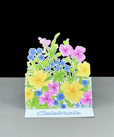
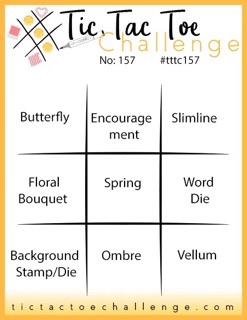
There are finally enough signs of spring here to take hope, although today is once again breezy and rainy. I made this bright floral easel card a week ago, thinking I had plenty of time for the two challenges in mind. But actually, the Tic Tac Toe challenge closes today at noon, so I’m just sneaking it in at the last minute.

Tttc-challenge-board-157 Small 2022-04-14-SignsOfSpring

I chose the middle row across: Floral Bouquet, Spring, and Word Die for my inspiration. The Seize the Birthday inspiration is clear!
SpringMixEasel

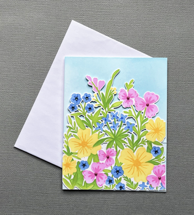
I don’t have a lot of success with layering stamps, but layering stencils work just fine, so this wonderful bouquet of flowers called “Spring Mix” was a sure purchase for me during the last Greetery release. I used an assortment of Pinkfresh Studio inks to blend the colors. Then there is a set of stamps to use to create the centers of each flower. The possibilities are endless and there will be another of these cards to share very soon. The sentiment was die cut with a Pinkfresh Studio die. When Betsy did the intro video for this set, she created an easel card. I hadn’t made one in years, and it was so easy that I’m sure that will show up again as well.

SpringMixFlat

This card went in the mail yesterday to a good friend who’s celebrating her 70th birthday. She’s one of two friends who planned a trip to New York City for my 70th birthday. We’re not going to NYC for their birthdays but we’ve scheduled a lunch in early May to plan some kind of get-away.


Happy Birthday!

  • by

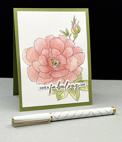
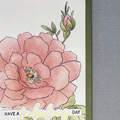
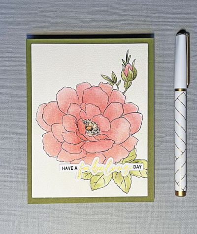
I’m celebrating the birthday today of one of my longest and best friends. Her birthday was last week, but we weren’t able to get together. This morning, we’re sharing a take-out breakfast at her home. Since she periodically visits my blog (but never comments!) I decided not to post her card until today. The main image of her card was actually one of my birthday presents a year ago. It comes from the Altenew Watercolor Coloring book.

MaryBD

This floral provided me with an opportunity to do some mixing of colors using both some new Winsor & Newton watercolors and some Daniel Smith watercolors. When I was immersed in Sarah Simon’s watercolor class, I purchased a few small tubes of Winsor & Newton watercolors. I had previously tried to mix this color with my yellows from Daniel Smith, but I could never get the peachy color I wanted. The Yellow Ochre is just enough different to easily mix it.

MaryBDClose

I’ve also learned to walk away and let the watercolors dry before adding a new layer. Being someone who is used to completing a card in one session, it takes more patience than I usually exhibit!

MaryBDFlat

After attaching the panel to a green card base, I added the sentiment from The Ton – “Easy Expressions: Birthday.” I considered adding a few pearls, but decided to leave it very CAS.

I’m sending this off to two challenges: Seize the Birthday: Anything Goes and Happy Little Stampers: Watercolor.

STB-AnythingGoes HLSWatercolor


Foiling and a First Valentine

  • by

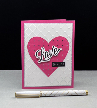
For Christmas I received a Spellbinder’s Hot Glimmer foiling machine. I knew it would be under the tree, so during sales events after Thanksgiving and Christmas I purchased a few foiling plates (all 50% off). Then I won the grand prize at Pinkfresh Studios which included several more. Traveling right after Christmas and devoting a lot of time when we returned to the watercolor class, it took me until this week to break out the machine. I’d seen some very helpful videos on Jennifer McGuire’s blog*, but I’d also read on Instagram and elsewhere that the foiling process could have a rather steep learning curve. Luckily, the first two foiling projects were a success which resulted in the valentine below. Afterwards, I tried a couple other plates that didn’t turn out so well, so I think it will be a process with mixed results for awhile.

Love

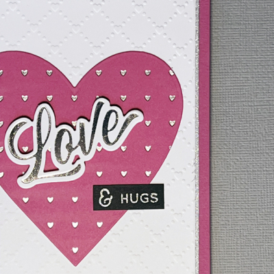
The foiling is much easier to see here:

Loveclose

I foiled a piece of Raspberry Fizz cardstock with silver foil using the Pinkfresh Studio “Heart Grid” foiling plate and die cut it with one of MFT’s “Nested Hearts.” The foiled sentiment is one from Pinkfresh Studio’s “Brush Sentiments.” That set includes the foiling plate, the stamp set, a die, and a stencil you can use to color the dies. Lots of options and I would never have spent the money to purchase them all. Truthfully, when I saw the release I thought the sentiments would all be larger than I would like, so I wouldn’t have any of them had I not won the whole release. I see now that they will get quite a bit of use. 

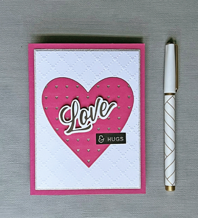
LoveFlat

I used the Sunny Studio ” Quilted Hearts” embossing folder for the background and a piece of silver glitter paper to frame it. To save on the glitter paper, I cut it the size I needed, and then die cut the middle of it with a smaller rectangle die and put that piece in my metallic paper folder. The small sentiment is from an old Simon Says stamp set “Love” which I use frequently. 

I’m sending this off to two challenges: Time Out’s: In Love and Happy Little Stampers Dies: Anything Goes

Timeout205 HLSDies

*If you’re a cardmaker and aren’t aware of Jennifer McGuire’s site, she provides wonderful videos showcasing all kinds of techniques as well as process videos. I rely on her advice for so many things.


OLW: Balance

  • by

Happiness is not a matter of intensity but 
of balance and order and rhythm and harmony.
Thomas Merton

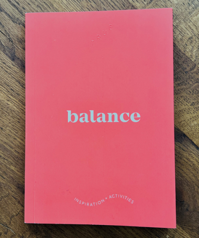
This post has been percolating for several weeks now, and the middle of January is quickly slipping by so it’s time to take a look at my OLW for 2022.  I had no trouble finding my word this year. In August we were in a lovely gift shop in Traverse City, MI and I spotted a series of books with single word titles. The one that jumped out at me was Balance, and I was pretty sure that described what I needed in my life. Interestingly, it turned out to be a repeat of the word I chose exactly 10 years ago. Time to revisit it again.

Balance

I’m prone to going all in on a project and by the time I’m done, I’ve let lots of other creative pursuits fall to the wayside. A blogging friend has decided to choose a word quarterly, and I’m wondering if that’s not also a way to balance the things you hope to do. I’ve just begun Atomic Habits after hearing references to it all over. I’m only a couple of chapters in, but already one of the big take-aways is that setting goals doesn’t help you create habits; it’s the process that changes who you are. And that change is what you’re really after. 

When I started thinking about balance I was looking for ways to incorporate learning, practice, and self-reflection into my days. I recognize that it’s an ongoing process. It’s the day-to-day, moment-to-moment choices you make for yourself. Creating balance means understanding that you can’t do it all.

So I’m going to practice balance—staying open to opportunities and reminding myself of the things that bring me joy.When we returned home from visiting Sarah and her family, I downloaded a Habit Tracker and laid out some of the things I’d like to pay attention to this year. I’m quite sure the list will change from month to month, but it’s already helping me find time for things that might fall off my radar. Although I divided some of them into weekly and monthly categories, that’s not really working the way I wanted. For example, this month I want to explore some possible photography projects, but I don’t expect to start working on one until next month. The one very important omission on the Habit Tracker is a list of all the things I do without thinking: household chores, errands, meal planning, volunteer work several times a week, and work for my three church committees. But, in fact, I’m looking for balance in my creative time. 

As I often do, I’ve made lists of ideas for things I’d like to do, and truthfully, most years by the summer I’ve stopped going back to the lists to review them. I think my friend’s idea to look at the OLW quarterly is a great idea. Although I’ve enrolled in Ali Edward’s OLW class a couple of times, doing a deep dive into it each month was really overload for me. 

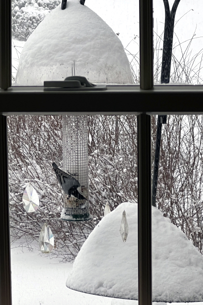
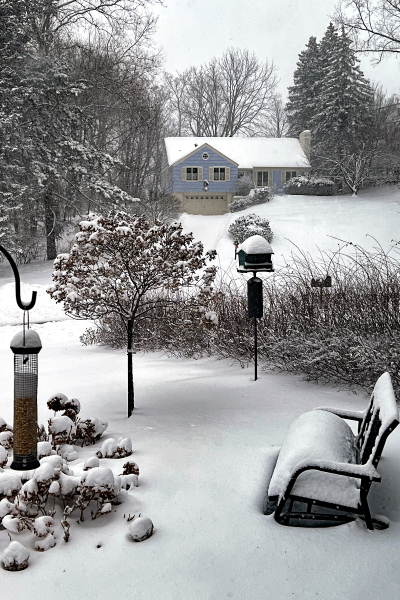
As a “reward” for sticking with me for a very word-heavy post, here’s a look at a cute little nuthatch at our feeder this morning, and a broader look at the landscape outside our kitchen window. By noon we had well over a foot of snow. Tracy went out to do the driveway this afternoon (fortunately neither of us had any reason to leave the house), and just as he finished our snow blower quit working. He did the sidewalk by hand, but our long and steep driveway requires a machine. Matt’s coming over tomorrow with his truck to get it to the service provider. 

IMG_1592ed

IMG_1594ed

If you choose a word for the year, I’d love to hear about it. 

Condolences

  • by

Losing someone at holiday time always seems harder since so many family traditions and gatherings happen during the late fall and early winter. Sadly, we have lost several more friends in the last several weeks, and in fact, I have another three sympathy cards to make this weekend. Two of them are for the children of one of our dearest friends who died very suddenly last week. She was 87, so had lived a long life. But as far as anyone knew, she was in good health, and was certainly as sharp as ever. We were just devastated when we heard the news.

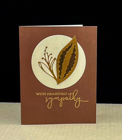
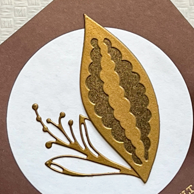
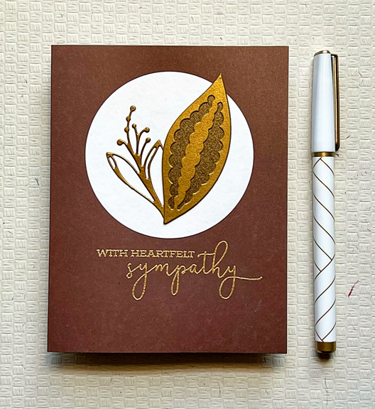
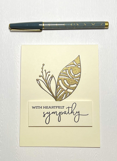
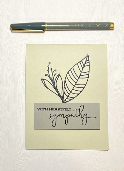
But here are three sympathy cards that have been sent in the past two weeks. For all of them, I’ve relied on the Altenew’s “Leaf Mix” dies, and a sentiment from Papertrey Ink’s “Warm Regards” set. This one has a different design which is my favorite. I’m throwing it into the challenge at Addicted to Stamps and More: Any Occasion. I imagine a sympathy card is not quite what they’re expecting during this busy Christmas crafting time!

Sympathy

SympathyClose

SympathyFlat 

These two are very similar in design, but different in color.

SympBronze

SymBlk

AnyOccasion


Color Hues #28

  • by

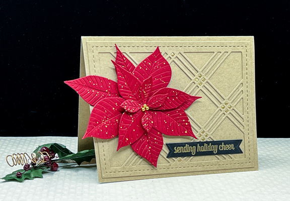
A new Color Hues Challenge is live. Nancy chose Red and Kraft for this round.

Color Hues #28.009

It’s not a color combo I typically use for Christmas, but I love the way this ended up.

RedKraft

It’s really past time to start thinking about Christmas cards so I used this opportunity to create one using two dies I’ve never put to use. I purchased Altenew’s “Poinsettia 3D Die Set” last year at the end of the season after all my Christmas cards were made. The Waffle Flower “Triple Line Diamond Panel” die is newer, but it’s been in the stash for a couple of months.

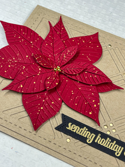
I die cut the “Triple Line Diamond” panel from Kraft cardstock (Papertrey Ink) and added it to the card base. It needed a festive touch, so I die cut a second panel from gold and inlaid the tiny squares. Sadly, the poinsettia covers up quite a few of them. The bonus is that I’m left with a lovely gold panel you’re likely to see soon.

RedKraftClose2

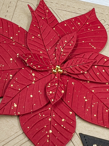
The poinsettia was die cut from red cardstock (Concord and 9th) and splattered with gold watercolors from Gansi Tambi’s “Starry Colors.” I added some dimensional tape under some of the bracts of the poinsettia.

RedKraftClose

The sentiment from The Greetery’s “Sentiment Suite: Christmas” was gold embossed and die cut with one of the “Sentiment Suite Basic” dies. Instead of using the tiny die from the poinsettia set for the center, I chose some gold pearls from The Paper Studio.

I hope you’ll hop over to the Color Hues Challenge and join in the fun, checking out the cards made by my awesome Design Team members and our Guest Designer, Ma-Mi.

Nancy

Hannelie

Cindy

Julie

 Sheri

Kristie

Lindsey

 Tracey


Celebrate: Autumn Challenges

  • by

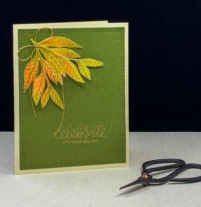
I’m back with another CAS Autumn themed card. 

CH27

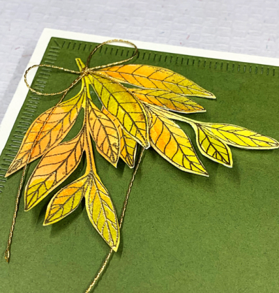
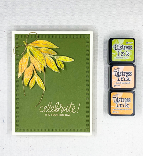
More leaves, this time from Papertrey Ink’s “Lovely Leaves” which has not had anywhere near enough love! I smooshed Distress Inks in Crushed Olive, Dried Marigold, and Spiced Marmelade on my glass mat, added a spritz of water and then laid down a piece of watercolor paper. Once it dried, I gold embossed the leaves and fussy cut them out.

CH27Close

The colors weren’t quite as bright as I wanted so I used a small paintbrush and added a bit more of the oranges to the leaves.  I used my well-loved “Crimped Frames” from The Greetery to die cut a piece of Gina K’s Asparagus cardstock. It’s become my favorite green. The sentiment from Pretty Pink Posh was embossed in gold in the lower right corner and I arranged the leaves in the upper right corner, leaving plenty of open space. I added thin gold bow and attached it to a cream card base. 

CH27Flat2

This is my first entry to the Addicted to CAS Challenge: Autumn, and my second entry into the Inspired By . . . Colorful Fall Challenge.

CAS Inspired By IB188 Colorful Fall August 23

Autumn Wishes

  • by

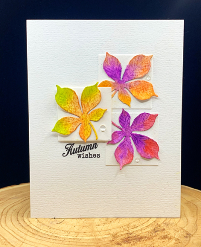
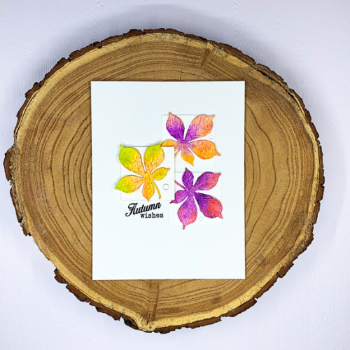
Getting back into the craft room has taken me longer than I hoped. Earlier this week I finished a very important birthday card which I’ll be sharing later this week. Today, however, I finally had time to make a card for several challenges all focused on fall colors. While we were in Wisconsin, an order from The Greetery arrived, and in that order was the “Curio: Autumn” collection of dies. I pulled it out this morning and die cut quite a collection of the leaves and other fall items. I pulled out my Altenew 36 pan watercolor set and painted them in a variety of colors. Today, you’ll see just three leaves, but I have an envelope with others that I hope you’ll also be seeing soon.

AutumnWishes

The design of this card comes from last week’s Freshly Made Sketches. It was designed by Cécile whose card designs are among my very favorites. I had hoped to get this card made in time to enter it in her challenge, but there was no way I could manage that. But I’m happy to adapt it here. The three squares were die cut with Ellen Hutson’s “Essential Dies: Squares.” Her Essential shape dies are among my most used dies. I adhered two of them directly to the card, and added dimensional tape to the third. The colorful leaves are from the Curio set and the sentiment from a very old Papertrey Ink set “Friendship Jar: Fall Fillers.” (Another good investment!)

AutumnWishesFlat

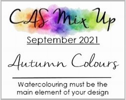
I’m entering this into four challenges all focusing on fall colors:  Inspired By: Colorful Fall, The Paper Players: CAS Fall Fun, and a second entry into Addicted to CAS: Leaf, and CAS Mix-up: Autumn Colors and Watercolor.

Inspired By IB188 Colorful Fall August 23Pp559

CASSeptember 2021


Color Hues #24

  • by

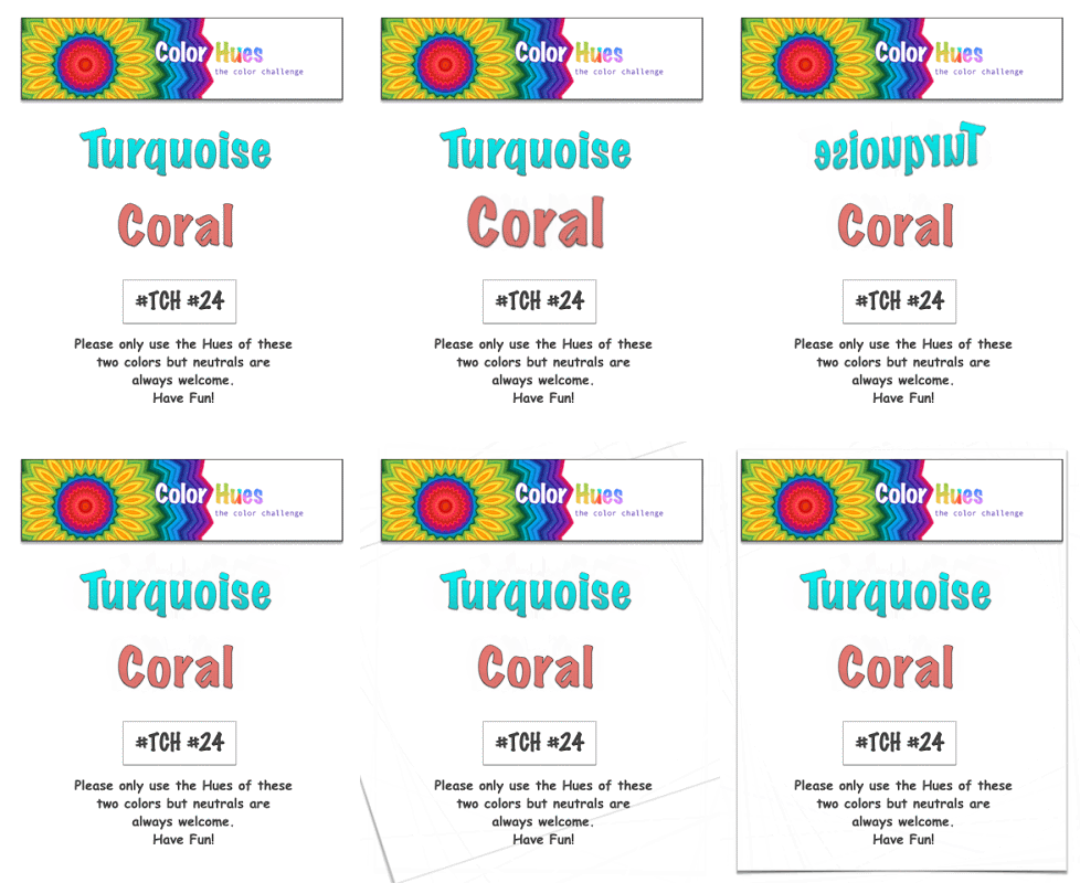
It’s a very vibrant color combo this time around at Color Hues:

Color Hues #24 Anim.

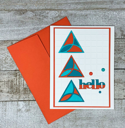
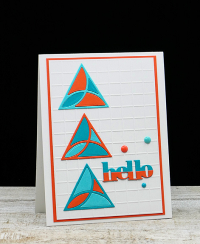
Coral is a tricky color. I “Googled” it to see what shades might come up–some look pretty orange, and my husband thought my choice was definitely orange. I, however, chose a Gina K cardstock called “Coral Reef” so I was able to defend my choice without question! For the turquoise, I chose two papers: Papertrey Ink’s “Hawaiian Shores” and Concord & 9th’s “Oceanside.” I have to thank Kristie Goulet, one of my DT teammates for the inspiration for this card. After seeing several different designs she created with the “Mosaic Tiles” die from Catherine Pooler, I had to order it. 

TurquoiseCoralDie

There must be hundreds of possibilities with this die set, and I love that it’s easily customized for males or females.

TurquoiseCoral

I dry embossed the background with an Alexandra Renke embossing folder, and die cut three sets of the Mosaic Tiles–one with each color. Then I had to decide which triangles I would use. The one above is one of my favorites, but you’re sure to see this die show up here again and again with different designs. 

TurquoiseCoralFlat

The sentiment is a Simon Says die that arrived with a kit. I die cut it twice, cutting the coral piece in half to create the half-and-half look. Amazingly, I found three enamel dots–one matching each three of the cardstocks I used to finish the card off.  

I hope you’ll take a look at the fantastic designs the DT and our Guest Designer, Linda Snodgrass, have created:

Nancy

Hannelie

Cindy

Julie

 Sheri

Kristie

Lindsey

And come join the fun!


Grateful

  • by

I’m participating in Kathy Racoosin’s 30 Coloring Challenge by doing just a little bit each day.

30Day_challenge_Aug2021-01-3-768x769

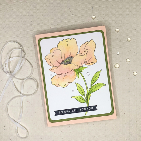
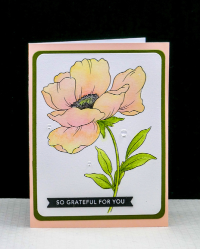
I’m focusing on watercoloring and adding new layers each day to deepen the colors. Patience is not always my virtue–especially when approaching watercolors. And that is a mistake. Letting each layer dry completely makes a huge difference. This card represents three days of coloring. I posted each day’s progress on Instagram, but after posting the finished card there, decided to add three raindrops to the card which I like. 

Floral1Flat

To expedite matters, I used a page from Altenew’s Watercolor Coloring Book. I also used Altenew’s 36 pan watercolors. 

Floral1

The images in the coloring book are larger than I’d like them to be, but I was able to die cut the floral and then a narrow frame with Hero Arts “Rounded Rectangles Infinity” dies. The frame is one of my favorite greens from Gina K called “Asparagus.” The card base is a “Pale Pink” from Memory Box which has a white interior–great for writing a thank you note. The sentiment strip was in my “already stamped and die cut” basket, and I’m not sure which of the many sentiment stamps I used for this one.

I’ve watercolored the past two days as well, but probably won’t share any of it here or on Instagram as I’m hoping to use it for a future Color Hues post. 

Need to get back to the cleaning and organizing I want completed before Sarah and her family arrive this weekend. We’re having absolutely perfect summer weather here. I hope it continues.

Happy Birthday, Sarah!

  • by

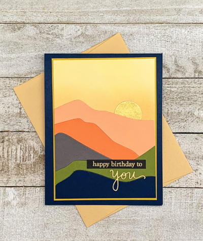
Sarah turns 41 today, and that fact is almost as perplexing as celebrating our 48th wedding anniversary. Sarah will get this card when she arrives here on Saturday with Adam, Caleb, and Hannah. They’ll be here a week, and then we’re all headed to a cottage on a lake in Michigan for a week. She doesn’t read my blog, so I’m not worried about her seeing the card online before she receives it. Even if she did, her day is so busy that’s it’s unlikely that she’d have time for blog reading anyway. Shortly after they return home, they’re moving to a “new” house. Actually, it’s a much older home in a lovely area in downtown Racine. It’s a much friendlier neighborhood with sidewalks, lots of kids nearby, and just a block and a half to Lake Michigan. It’s a good move for the kids—and for the adults who already have friends in the neighborhood. Getting ready for a move before a two-week vacation was not what they planned for when their vacation dates were set.

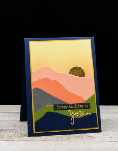
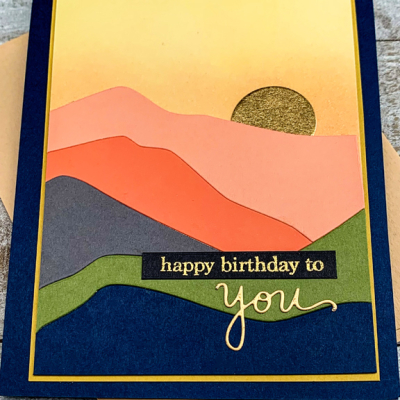
This card was inspired by (and is a very close CASe) of one by Carissa Wiley. It was created when Ellen Hutson released two new die sets–“Abstract Sunset” (which I used here) and “Abstract Mountain.” Most of the cardstock used is from Concord and 9th.

HBMountain

I’m hoping it will remind Sarah of her two summers working at The Ghost Ranch. She absolutely love it there, and we were lucky enough to visit her for a few days the first year she was there. If you click through to the link, be sure to click around so you can see some of the beautiful landscapes. Georgia O’Keefe lived at The Ghost Ranch for part of many years, and painted some of the landscapes.

HBMountainsClose

I love these colors together and chose a gold metallic paper for the moon (or sun depending on your inclination). Both the gold embossed sentiment and the die cut “you” are from Simon Says.

HBMountainFlat

I did some ink blending on the top die cut pieces but decided not to to any on the other layers. I made several of these cards, and they are all just a bit different. 

My blogging was erratic in July, and likely to be again in August as most of my time for the next two weeks will be spent with family and friends. I’m working on Kathy Racoosin’s 3o Day Coloring Challenge, so there’s likely to be a few new cards–as well as some for challenges if I can get some time in the craft room. The day to day posts for the challenge are beinf posted in my Instagram account. One of the options for the challenge is to do a little bit each day. So far I’ve done some watercoloring on a floral for the past two days, and expect to finish it tonight. 

Happy Anniversary!

  • by

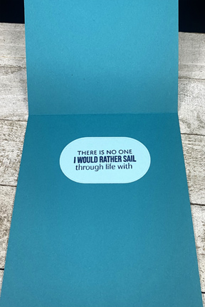
Amazed at the number and amazed by my great good fortune–today is our 48th anniversary! The inside sentiment (shown below) says it all. We have a quiet day planned at home with dinner out at our favorite Mexican restaurant in Canandaigua which means  a walk along the lake afterwards I’m sure. 

TOWAnniversary

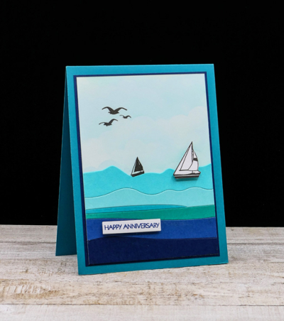
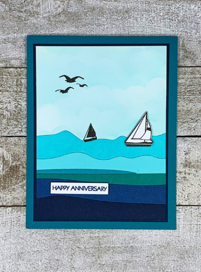
About a month ago, I ordered the Ellen Hutson “Abstract Sunset” and “Abstract Mountain” dies. I used the “Abstract Sunset” die here turning it into an ocean (or lake). The MFT Cloud stencil was used on the largest piece from the die, and I die cut the rest of the pieces from various blues found in my scrap folders. 

TOWAnniversaryFlat

The stamps are from W+9’s “Dockside” set. I fussy cut the two sailboats. The sentiment is from my fave Pink and Main “Special Day” set—today certainly is special!

The inside sentiment is from the newer Papertrey Ink (Ink to Paper) set “Seas of Life,” and not only fits the theme of the card but expresses exactly how I feel about spending nearly half a century with one of the kindest, most loving men I know.

TOWInside

I’m entering this in the Card Concept Challenge:Long Summer Days–the inspiration is, of course, the nautical theme, but also the color scheme. It wasn’t as easy to decide on the design style this time, I think it’s closest to Clean and Layered–though most of the layers are flat. The description of the styles are here, and I’d love to know what others think!

TCC158 062321

Reverse Confetti-Stock Your Stash

  • by

I’ve kept my eye on Reverse Confetti’s “Stock Your Stash” for some time now, but this is the first time I’ve played along. Being away half of  April has meant that crafting time was very limited. Now we’re home, unpacked, and trying to get back into our regular routines (such as they are.) The challenge this month is for “Moms, Dads, and Grads. So I took some time this afternoon to make another Mother’s Day card. (Two down, three to go!)

RC Stock

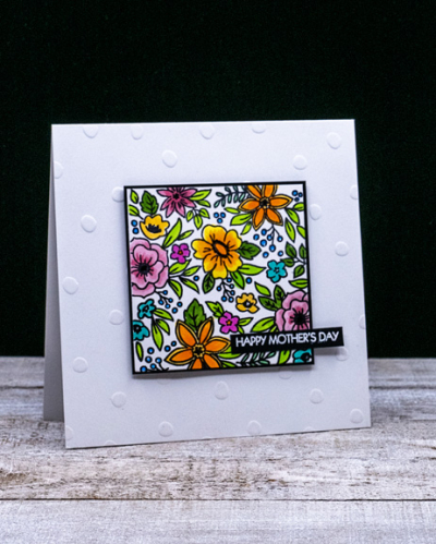
I don’t own any appropriate stamps for dads from Reverse Confetti, and I don’t know anyone graduating this year. I do, however, have several floral stamps and chose one I don’t believe I’ve every used called “Pattern Blocks.”

ReverseFlowers

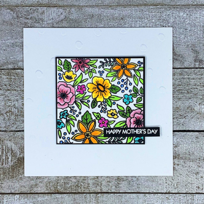
Once it was stamped, I colored it with some bright, happy Copic markers. I added some gel pen accents in white and black, and then matted it with a thin black frame.

ReverseFlowersFlat

I added it to a premade square card with embossed polka-dots (easier to see in the first photo), and an embossed sentiment from Pink and Main. 

It was good to be away after being home-bound for so long, but it’s also nice to be home, although I’m missing the warm weather from South Carolina. Photos from the month coming soon.


Birthday Butterfly

  • by

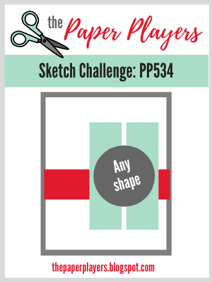
In the midst of packing to go away, I had an idea for the current Paper Players Sketch Challenge and I needed a birthday card. So this afternoon, I used my Paul Rubens metallic watercolors to create a “patterned” paper. After dinner, I had time to do the die cutting and assembly. Here’s the sketch:

Pp534

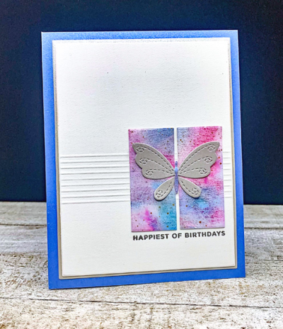
For the horizontal stripe on the sketch I decided to do a group of score lines. Photographing them at night turned out to be a bit of a challenge. I die cut two small rectangles from my watercolored paper with Ellen Hutson’s “Essential Rectangles” for the vertical shapes and used my favorite Gina K “Master Layout” dies to cut the focal piece and a thin border of metallic silver paper.

BDButterfly

I die cut the Simon Says “Stitched Butterfly” from silver metallic paper (so much prettier IRL than in the photograph.) The body of the butterfly was die cut from the watercolored paper as well. Finally I silver embossed the sentiment from The Stamp Market’s “Tons of Type.” The card base is a shimmer paper from Papertrey Ink.

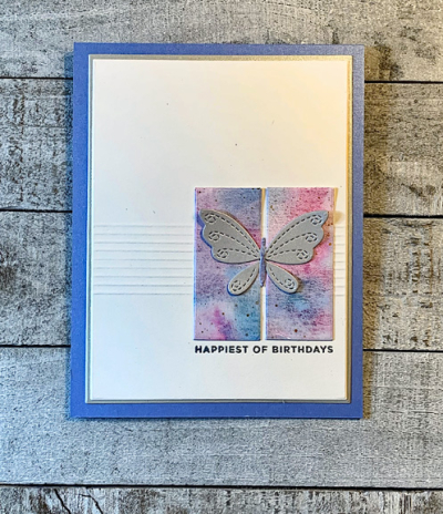
BDButterflyFlat

I had to use a desk lamp to get the lighting right to show the score lines. If we weren’t leaving first thing in the morning, I’d be waiting until tomorrow to try again! I’m not sure if waiting until I get to Sarah’s would help or not, so I’m posting it as is!