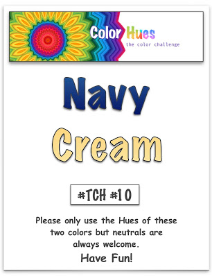
Times flies, and here we are with the tenth Color Hues challenge:
One of my intentions for this year, is to make sure I’m using all the stamps and dies I have accumulated since the pandemic started! One of the dies is the “Altenew Circled Greetings.” I have all four of them, but today I used “Thanks.” I’ll start with the card I posted on the Color Hues Challenge post.
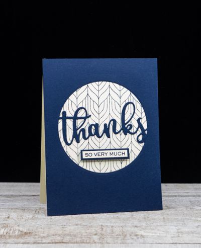
You can see that the die creates a wonderful focal point for an A2 card. I backed the open circle with a piece of cream cardstock on which I’d stamped with another new purchase, My Favorite Things “Peacock Pattern Background” in Dark Indigo ink.
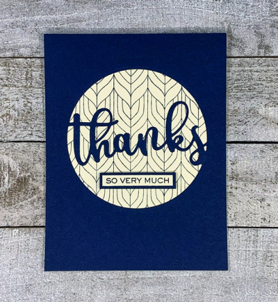
I used a stamp from W+9’s “Hand Lettered Thanks” for the small sentiment strip, and bordered it with a bit of the dark navy cardstock. The front panel was then added to a cream colored card base which is perfect for writing a thank you note.
The second card is very similar, but I chose to dry emboss a series of narrow score lines on the cream card base before adding the navy panel which I trimmed down to expose a narrow cream border.
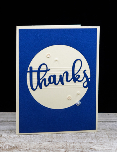
This time I chose a brighter hue of navy cardstock that has a subtle texture to it.
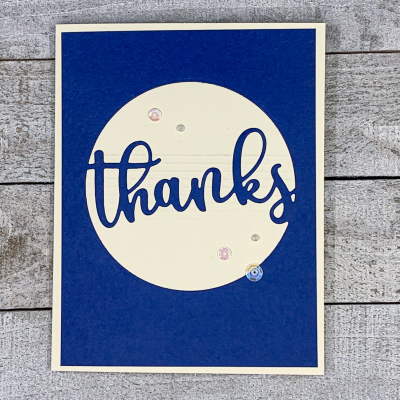
I added a few sequins and pearls from Lucy’s Cards: “Pearl Necklace” collection.
Hop over to the Color Hues blog to see what the rest of the Design Team and our Guest Designer, Julie, have come up with . . . and join in the fun!
Both are really smart but the second one makes me smile as it reminds me of a musical stave!
I really like both cards and how you are following through with your intentions! We get to se the beautiful results. I like the second one best too – wish I had used a brighter shade of navy, it makes a huge difference. Lovely idea to dry emboss the lines, and of course! I love and sequins.
autocorrect gggrrr. I love the pearls and sequins.
These are both so stylish. That subtle background in your first one just sings to me; and there’s something lovely about those textured lines which anchor the sentiment. You are alsways so clever in your placing of little pearly/translucent drops.
Two beautiful cards! Both are so classy and elegant. Brilliant idea to add the scored lines to back the sentiment for your second card.
Love the cleanliness of these cards Karen. They would make a great gift set too. I really like the first one with the peacock pattern. I am not sure I have seen that stamp before! You really made the colors shine this week!
I really like the script of “thanks”. I like the score lines on the 2nd card – brilliant idea to add without bulk.
Both cards are beautiful!!! Lovely design as well.
Two very elegant cards Karen, well done you for using your new purchases. I must admit that I haven’t indulged much in new stash, I’m trying to use what I have as getting supplies from the US involves a trip to the collection office at an ungodly hour in the morning! I did get a voucher for Christmas from an online UK retailer so I did get a few bits and bobs from there.;)
Beautiful inspiration for the new color duo. I like the clean look of the windows and large sentiment. Somehow I’ve totally missed this set of Altenew dies. Looks like I need to hunt for some cream card stock.
Comments are closed.