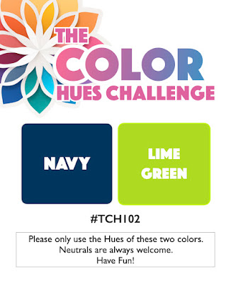
Stef has chose the new colors for the mid-January Color Hues Challenge:

Typically when I see a color combo like this one I reach for one of my geometric stamp or die sets. I really wanted to branch out this time and have an Altenew collection I’ve been wanting to use for months. I rarely purchase one of Altenew’s kits, but I had some points to use and fell in love with the Craft Your Life Project Kit: Chocolate Flowers. It includes a Zero-Waste die cut, layering stencils, a background stamp set with sentiments, and a 3-D embossing folder. I die cut the Zero-Waste flowers and leaves from white cardstock with no firm idea of what I wanted to do with it.

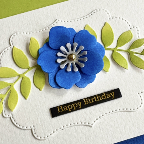
I started by choosing two navy inks (Pinkfresh Studio Sapphire and Stargazer) and two lime inks (Papertrey Ink Limeade Ice and Green Parakeet) and set about ink blending some of the flowers and leaves. After coloring the ones you see above, I already had an ideas for the card. I added a center die cut ink blended with Honey Bee’s Metallic Silver ink and put the flower together. While we were away, I purchased some Artpop Watercolor paper at Dick Blicks specifically for using as card bases. When I was creating some card bases, I miscalculated on one and ended up with a narrow edge that extended beyond the card.
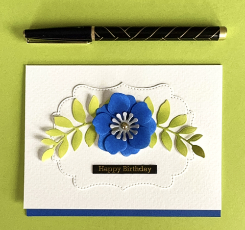
The Pinkfresh Studio Fancy Dotted Frames looked to be a great base for the flowers and the leaves, and I was happy with how they fit on the frame which I added to the card base. I die cut a narrow strip of blue paper for contrast at the bottom of the card.

The sentiment is from Memory Box and is one of their Black Greeting Tabs–this set is all birthday greetings. Because the lettering is gold, I added a PFS gold pearl to the center of the flower.
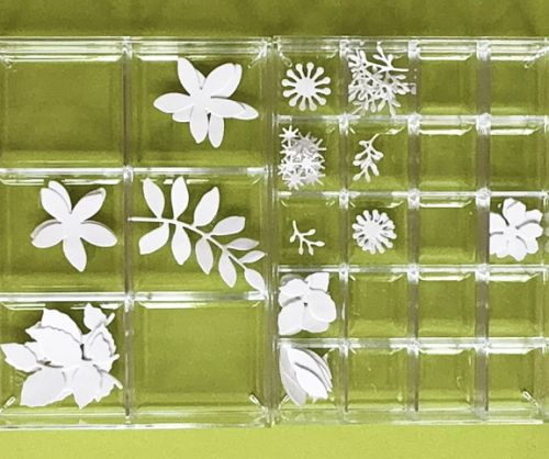
I took a photo of the leftovers from the Zero-Waste Die Cut so you can see how much restraint I used to get a CAS card! You’re certainly going to see more cards soon! (I love these small divided acrylic boxes from The Container Store. They stack and I also have one with just two compartments for larger dies. The work great to sort the die cuts as you cut them as well as when you are ink blending and assembling the pieces.

I hope you’ll join us for this new challenge. You’ll (as usual) find lots of inspiration from the Design Team as well as our Guest Designer, Esther Asbury. I’ll be adding this to the gallery at A Cut Above where die cuts are always the main event.
Karen this is so so pretty. I love the bold bloom and the greenery is the perfect cap off! Lovely birthday card!
It’s very pretty. I don’t know if zero waste is a brand or whether maybe their dies are specially made to be used with little offcuts that you might otherwise throw away. Anyway, the results are lovely and I will wait to see what you make with the rest of the pieces you have in stock.
I’m impressed with your restraint, Karen, given all those lovely little die cut pieces waiting to be used! But you are one of the best at CAS and using the single bloom in that gorgeous shade of navy looks amazing atop the stitched frame die cut. Such a beautiful card!
Karen, I’m smitten with the clean, fresh, simply sensation design of your card. Your flower and greenery are the stars of the show, as well they should be. Eye-catching!
hugs~carol
Such an elegant design Karen, less is certainly more, and you have all those other die cuts for another project. Win win. 🙂
Simple & elegant. The pretty flower sets off the greeting
This is so pretty, Karen! I love this blue flower with the lime leaves and can’t wait to see what you do with the rest of those die cuts! The pretty label and strip of navy at the bottom of the card make this so elegant!
You are very good at knowing when to say when, Karen. Another beautifully executed clean and simple card!
This is so pretty. I love the simplicity of the design. All that white space makes that pretty flower POP!!
CAS and absolutely beautiful Karen!! Your flower is so striking in the 2 shades of blue inks and the leaves compliment beautifully too! Love the little grounding strip of blue at the bottom too! Lovely, lovely card my friend!! Hugs. :0)
The inks really made for beautiful and bold florals. The blue strip was a great touch too. Beautiful card Karen!
Comments are closed.