It’s March first, and time for a new challenge at Color Hues. I have to admit March is one of my least favorite months. When travel is safe again, I expect to spend the month of March in a location much warmer and sunnier than Rochester! Here are the new colors:

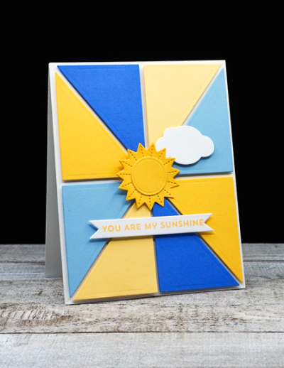
These bright and cheery colors gave me permission to create a card that celebrates sunshine.

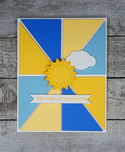
This is actually the second card I made. Both cards started with The Stamp Market’s ” Color Block” die. For this card I chose two hues of yellow and two of blue. Each piece is popped up with dimensional tape on a white card base. Then I searched through my stamps looking for a sunshine die, and ended up with Reverse Confetti’s set “Over the Rainbow.” I added a bit of ink blending to the edges of the sun to set it apart from the yellow panels.

I added a white puffy die cut cloud (from Papertrey Ink), and a sentiment from a new stamp set from My Favorite Things, “Bitty Hugs and Kisses.”
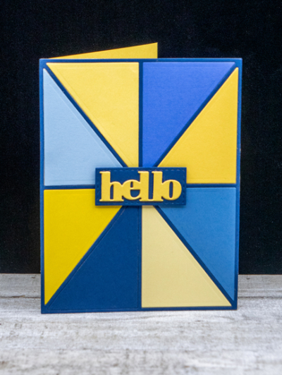
Here’s a look at the first card I created. For this card I used four hues of yellow and blue.

I do like this card as well, but doesn’t meet the I. need. spring. requirement. I inlaid the panels from the “Color Block” die this time, and added a die cut sentiment from Simon Says, “Bold Hello,” that was included in one of the monthly card kits.
Hop over to the Color Hues blog to see what the rest of the Design Team has come up with . . . and join in the fun!
Love your sunny take on the colours Karen.
Its been another sunny day here but the wind was biting this afternoon so no gardening for me today! We have our first lambs, they couldn’t wait to arrive so are in the shed next to the house whilst here mates are up in the lambing sheds! 🙂
I am in agreement with you about March to which I believe its only saving grace is that we are moving into spring! Your choice of yellow & blue is such a cheerful colour combination.
Ah yes, February and March. And of course this March has such a delightful one-year anniversary. So your sunny card is absolutely perfect! I do like your hello card, too – and does have a bit of sunshine vibe as well!
I think the white division lines around your blue and yellow sections makes your first card so much lighter and fun than the hello card. The hello is snazzy but the first one gets my vote.
I can’t wait till it is safe for you to travel and you head my way so we can meet up in person! Something sure to look forward too! As for your amazing cards! What I notice about your graphic cards Karen is how precise they are! It blows me away! Love the size of that sunshine die too! Extremely well done! Have a great day!
These are indeed so cheerful – the colors of a sky on a lovely day :). Hoping you get to pack up and head off to warmer climes for next year.
Both very clever but I like the top one better. The triangles remind me of rays of sun against the sky. I think these would work well for men and women.
Both cards are a wonderful blend of the color hues this time around and I’m a big fan of color blocking to begin with! The sunshine and little cloud is a warm nod to spring, while the 2nd card is a bit more suited to the masculine side with darker colors! Nice job on both!
Comments are closed.