It’s hard to believe, but we’re already at the 20th challenge for Color Hues. Sheri chose Aqua and Black for this round.
It’s not the first time that I’ve ended up making two cards for the challenge. Although I liked the first card, it really “wasn’t me.” Meaning, of course, not Clean and Simple enough. So here’s card #2, much more to my liking.
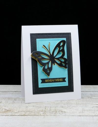
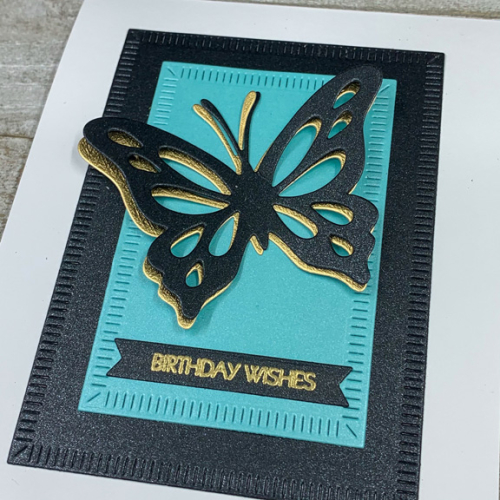
I knew right off that I wanted to use an older set by Papertrey Ink called “Life is Beautiful.” I thought the black butterfly against an aqua background would be striking. (And you’ll see that the first card I made has the same main elements, but different products.) I die cut the open butterfly die twice, once with black shimmer cardstock and once with gold. I off set the two of them and adhered them to a piece of aqua shimmer paper cut with The Greetery’s “Crimped Frames.” You can see the shimmer better here:
Then I layered the aqua layer onto a larger Nordic frame in black shimmer before adding it all to a white cardbase.
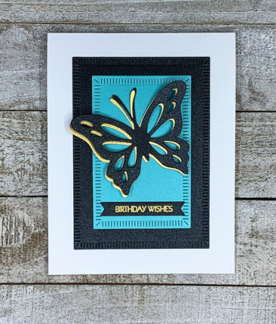
The sentiment is from Pink and Main’s “Special Day,” embossed in gold and die cut with The Greetery’s “Pretext Banners”–possibly the best banner set I’ve found.
Here’s the first card I made. This time I started with the “Cover Plate: Butterfly” die from Papertrey, die cutting it from the same black shimmer paper I used above.
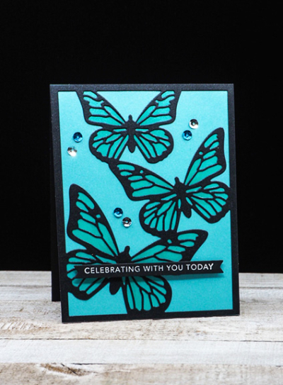
After adding it to a piece of the aqua shimmer paper, I colored the insides of the butterfly wings with a Copic marker to give them some contrast.
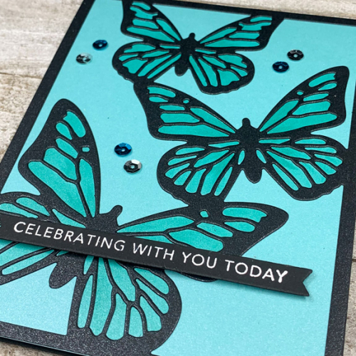
The sentiment from Taylored Expressions was embossed in white and added with a thin strip of dimensional tape.
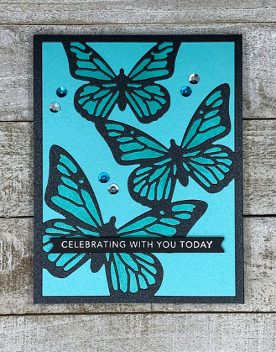
Finally, I added some aqua and silver sequins. It’s a bit busier than the card above, but I’m quite sure I’ll find a recipient who will enjoy it.
Hop over to the Color Hues blog to see what our Guest Designer, Trina, and the rest of the Design Team has come up with . . . and join in the fun!
Both these cards are very striking & the gold undercut for the first card’s butterfly really sets it off.
Two beautiful cards! I think they both work perfectly.
You’ve inspired me to make three butterfly cards today! I love your second card and especially like the gold offset. I didn’t realize by looking at IG that your Nordic Frame panels were shimmer papers. They must be stunning in real life.
I love both of these cards Karen. I think the triple butterfly card came out so well and I bet it is really sparkly in real life. As for your second card, I think the gold underlay was a perfect touch! I saw on IG that you were having some neck pain. I sure hope you are feeling better soon. I can relate to how that feels that is for sure! Take care!
Love both of your cards Karen. The gold adds a bit of class to the first and the Copic colouring of the wings works so well. Sorry to hear you’ve been suffering too, getting old is c***!! 🙂
These are both beautiful. I do love the touch of the underlayer being done in gold and the sparkle nordic mat.
These are both beautiful, Karen!! I love the touch of gold on the first card!
Both are beautiful and the recipient of any of them would be so lucky. The sparkle and shimmer must look amazing IRL.
Beautiful cards, Karen! Love them both!!!
Comments are closed.