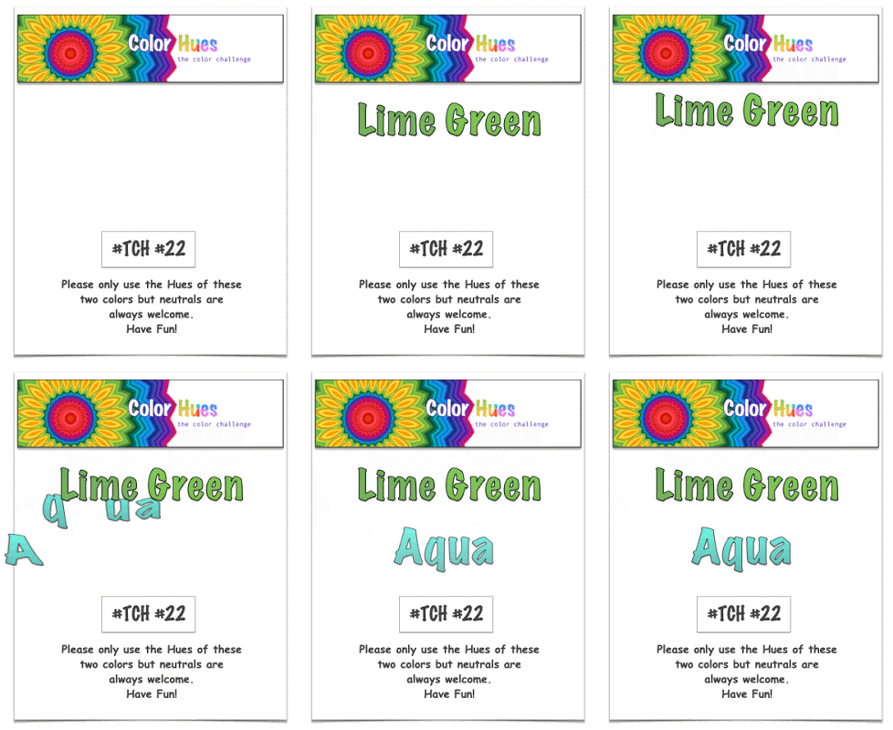
The Color Hues Challenge has a new duo for you: Lime Green and Aqua.

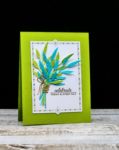
I love this bright and cheerful color combination, but it took me awhile to come up with a design I liked. As I often do, I turned to dies and ended up with The Greetery’s “Inside and Out Berry Branches.”

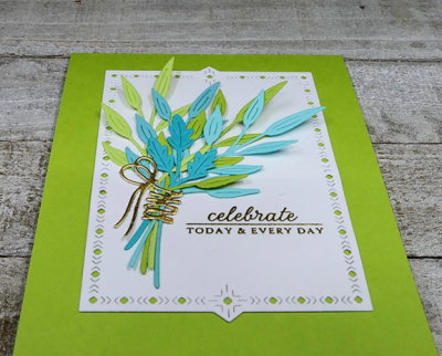
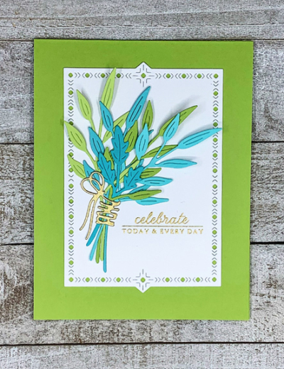
I die cut the branches in two shades of lime green and two shades of aqua, arranged them in a bouquet and “tied” them with a gold ribbon from the “Fit to Be Tied” collection, also from The Greetery. The next step was to find the right background and again The Greetery had the answer–a “Nordic Frame,” one of my favorites.

The sentiment from an old, and loved, set by Papertrey Ink “Autumn Abundance” was embossed in gold. Either lime green or aqua would have worked as a cardbase, but I liked the lime green better.

I hope you’ll hop over to the Color Hues Challenge and join in the fun, checking out the cards made by my awesome Design Team members, and our Guest Designer, Rosemary.
your card is gorgeous! thanks so much for the lovely comment on my card!
A very vibrant card
My favorite of the design team! The gold bow completes the look beautifully.
Karen, this card came out so well! You have the best cover-plate dies in your stash. You have been really making some beautifully framed cards with bold bright colors and this one is just as lovely! Have a great day!
Oh my goodness, I have trouble figuring out one shade of each of our colours, and you manage two! It’s an absolutely beautiful card – bright and classy at the same time.
I love your bright and cheerful spray of foliage, it lights up the page. The little touch of gold for the sentiment is the perfect addition. 🙂
This is so lovely.
Your lime and aqua shades are gorgeous together.
Comments are closed.