October flew by for me, and here it is—November 1st! The good news is it’s time for a new Color Hues Challenge. Sheri’s choice this round is Brown and Orange, and I had quite a good time with it.
I find it interesting how frequently I end up creating two cards for the Color Hues challenges. The first card I made was CAS on steroids, and I was was pretty happy with it. It didn’t end up being the one I posted on the Color Hues Challenge site, however. Here’s Card #1:
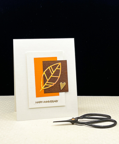
There are a couple of fall anniversaries to celebrate and I thought this did the trick. I started with the Papertrey Ink “Leaf Silhouette” die and cut it from a piece of Bristol that I had watercolored in shades of orange. I die cut the white rectange and cut two rectangles, one from a scrap of orange cardstock and one from a piece of Ellen Hutson’s Woodgrain paper that I darkened with Distress ink.
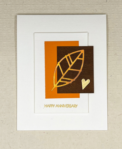
The sentiment from Pink and Main’s “Special Day” was embossed in gold and I used a very old punch to cut a heart from metallic gold paper. I glued it to three additional hearts cut from cardstock to give it some dimension. I also added dimension to the white rectangle with dimensional tape.
And then I was lucky enough to spend a crafty afternoon with two friends, one of whom had the Papertrey Ink “Bold Borders: Foliage.” I die cut a couple of them from white cardstock. Once I was home, I wondered what would happen if I tried to ink blend the entire frame. It worked quite well, and here is Card #2:
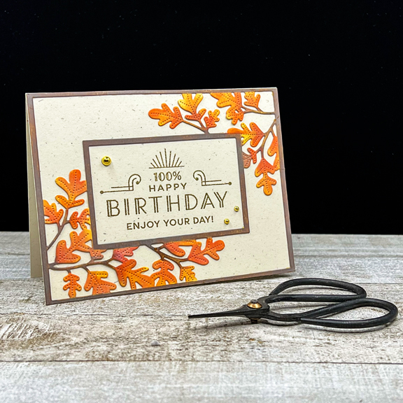
I used the Distress Oxide inks Spiced Marmalade and Carved Pumpkin for the leaves with a bit of Catherine Pooler’s Orange Twist toward the bottom. The branches and the frame were ink blended with Vintage Photo Distress Oxide ink.
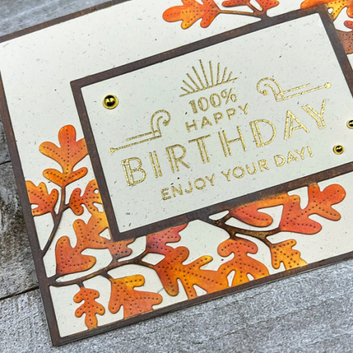
After carefully gluing the frame to a piece of Papertrey’s Rustic White cardstock, I gold embossed one of the sentiments from The Greetery’s “Everyday Labels.” The open space in the frame was just the perfect size.
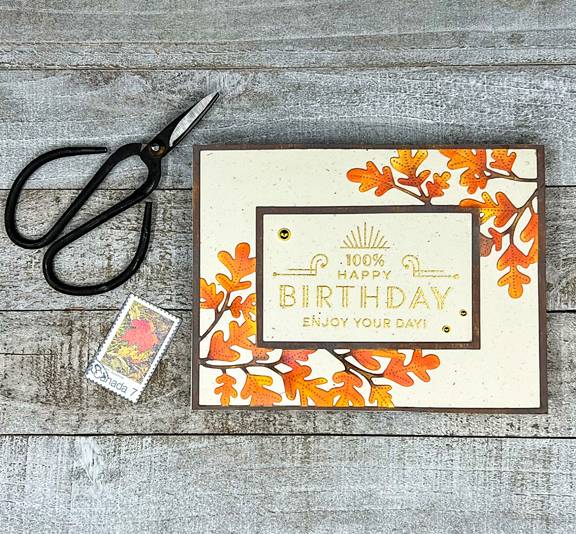
It took some time to get the frame and leaves ink blended, but I think it was time well-spent, and I’d do it again. The only embellishment are three gold gems from Paper Studio.
I hope you’ll hop over to the Color Hues blog to see what the rest of the Design Team and our Guest Designer, Åsa, have come up with . . . and join in the fun!
So pretty. I love the Happy Birthday one. I love orange, brown and gold for fall. Perfect!
Both cards are lovely; I particularly like the Happy Birthday card & normally I’m not an orange kind of card maker.
I love both of your cards! Very pretty! Have a great week!
Certainly the right colours for the time of year and you put them to fantastic use as always. Who with an autumn birthday or anniversary wouldn’t be thrilled to receive one of these? The coloration of the leaves on the second card is SO realistic!
I agree, where did October go to? Two fab cards, I love the leaf branch frame though. 🙂
Both wonderful, Karen, but this second card is a masterpiece! Thoroughly worth every fiddly second of blending time!
=]
Oh, I agree! Your ink blended leaves are beautifully done and add so much depth to the card. I love the elegance of the sentiment panel in gold too! Your CAS card is lovely too.
Karen both of these cards are beautiful. I think you made a wonderful choice for this challenges colours!! Wonderful designs and how can you go wrong with leaves this time of year!
Your cards are wonderful in these fall colors. I love the simple lines of the first featuring one of my favorite PTI leaves. The second is a masterpiece in coloring!
Two lovely cards using the challenge colors. I really like the 2nd one with that wonderful sentiment and your lovely ink blending on the leaves.
I enjoyed this post so much, Karen! It is so nice to hear that you got together with your card friends. It truly does boost the creativity in my opinion. I love both of these cards, but especially like that on your second card you inked the panel after you cut it out. Had to be a bit tricky not to rip it. I love the end results! Have a great weekend.
At least both of your cards seem to end up equally beautiful every time! 😉 Of course I like the uber clean and simple one, but the blended branches for your second are totally gorgeous!
Great fall colors & cards!
(I had to replace my laptop last month & it’s taken me a while to get everything setup & installed & configured, so I’m just getting around to catching up with everyone. I’ve enjoyed seeing all your lovely cards over the past weeks!)
Comments are closed.