One thing I love about the Color Hues Challenge is the challenge to use colors I would never think to use. Nancy’s choice of Yellow and Pale Teal would never occur to me, but as it often turns out, I’m a new fan. In fact, I ended up with two quite different cards.
The card I started out to make ended up being the second card I created. I just couldn’t get the elements to come together, so abandoned the multiple pieces and went on to make my signature CAS card,
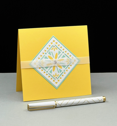
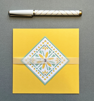
I started out with the “Shape Shifter Square #4” by Papertrey Ink. The entire design includes another frame with a more intricate design which I eliminated, using an Ellen Hutson “Essential Squares” die to cut it off for a cleaner look. I die cut it three times: once in white, once in yellow (Papertrey’s Harvest Gold), and once in pale teal (Concord & 9th’s Sea Glass). I punched out all the die cuts in the white image, and inlaid them with yellow and pale teal. I used a neutral brown on the centers of the four small daisies.
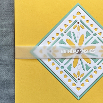
I left the outermost border empty so the yellow card base would show through. It also adds a bit of dimension to the design. Deciding on the sentiment took while, but I decided on a white embossed greeting on vellum which doesn’t detract from the design.
When I sat down the next day at my desk, I saw all the pieces for the first card I intended to make. A new day made all the difference. The “Lovely Layers” set from Papertrey Ink has always been a favorite and that’s where I had started. Arranging it the second day came pretty easily. Who’s to understand the creative process? And in the end, I chose this one to post on the challenge site.
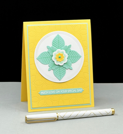
Layering the Lovely Layers pieces on a “Crimped Circle” from The Greetery worked well. Then I decided to use my new “Detail Petal Plate” from Simon Says for a subtle background.
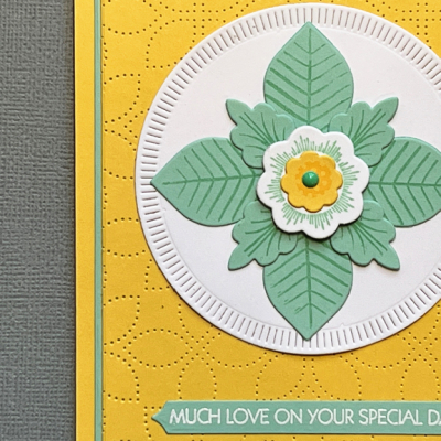
I used my favorite Gina K Design “Master Layout #1” dies to cut that panel as well as one from the soft teal to create a narrow border. The sentiment also comes from a favorite set from Pink and Main: “Special Day” which I embossed in white and die cut with Papertrey Ink’s “Skinny Mini Banners.”
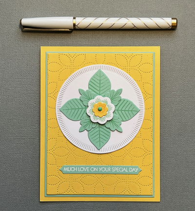
I hope you’ll end up finding this combination inspiring as well, and join us at Color Hues. Be sure to take a look at all the wonderful creations by the Design Team as well as our Guest Designer, Kerry.
I’m determined to use new products as often as I can, so I’m sending the second card over to Darnell’s NBUS Challenge.

Lovely cards!!! The second one especially.
My art teacher told me never throw away a project as when you come back to it you’ll see it in a different light! Both are fab, so I’m glad you slept on your first try. 🙂
These are both beautiful and very gently Spring-like – I just lovely this colour combination! The tracery of your top card is so delicate and intricate, and being combined with the “white space” makes it perfect. So clever to add the translucent ribbon to tie it all together. And the second is equally pretty – I love that edging on the white circle. Just lovely …!
The yellow & aqua combo on both cards is so very fresh & spring like & all the finishing details lift the cards to star production!
I’m so glad you shared both of these, Karen. Your soft aqua is soothing and so pretty. I’m sure glad I came to have a closer look at the exquisite details. Yes, I know just what you mean about seeing creative things differently the day after.
The color combination is beautiful on both cards! I like your adaptation on the first one. The Lovely Layers card is outstanding and a reminder to get out my set again. It’s interesting how our minds channel when left to mull over the possibilities.
Two beautiful cards, Karen! I love them both! Have a great week!!!
Karen both of your cards are so beautiful. I love the mosaic and that lovely layer die cut is stunning!
Well, these will perk up the person on the receiving end. So happy and fun!
So happy you liked my color combination. Both your cards are really pretty!
Comments are closed.