
It’s time for the fourth Color Hues Challenge, and the colors this week are:
This is a favorite color combination for me, and I actually made two cards. The first one is the one you’ll find on the Color Hues Challenge blog.
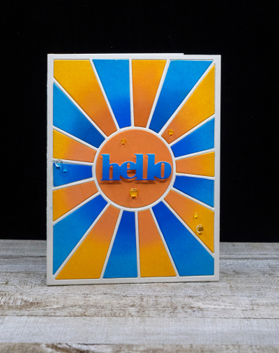
I started by ink blending two pieces of cardstock with Distress Inks—Salty Ocean and Blueprint—for the blues, and Carved Pumpkin and Spiced Marmalade for the oranges. I used the darker colors toward the center. Then I die cut both pieces with Pinkfresh Studio’s “Pop-out Sunburst” die, and pieced the card together.
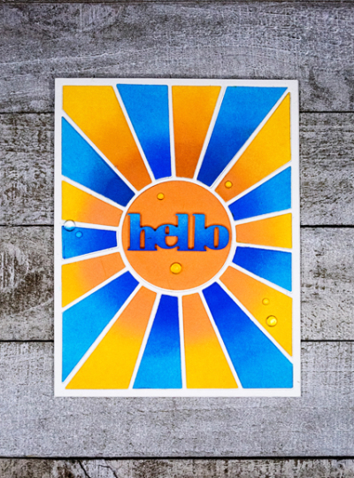
I did a bit of ombré ink blending on a scrap of cardstock, and die cut the greeting from Simon Says “Bold Hello,” adding it to a circle of orange die cut with the Pinkfresh Studio die. A few Rainstones from Papertrey Ink finished off the card.
The card above was not the card I started to make. Originally, I planned for a floral image but after coloring it with Copic markers I couldn’t decide on a design for the card. That came somewhat later.
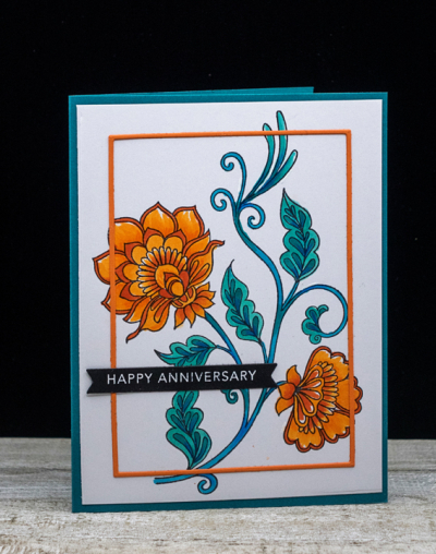
In the end, I liked this card as well, so decided I’d share it as an alternative. It also points out that you may choose any number of hues of a given color for the challenge. The image is from Altenew’s “Needlework Motifs” which I colored with Copic markers.
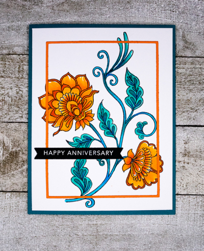
I finally wondered what it would look like if I added a thin frame over the focal image, and die cut one from Orange Peel cardstock (Simon Says) with the Simon Says A2 Thin Frames. It wasn’t as difficult to adhere as I thought it might be, and I’m quite happy with the overall look. The sentiment is one from Taylored Expressions “Sentiment Strips.”
Lucie is our fabulous guest designer this week. Hop over to the Color Hues blog to see what she and the rest of the Design Team have come up with . . . and join in the fun!
Your needlework motif is so very pretty – those colours and hues really vibrate with one another. I think your frame is a stroke of genius and love the way the image is escaping from it.
Yes, I too think the frame is a great touch. Orange and blue wouldn’t be a combination I’d say I loved but these cards are beautiful.
We both had too many ideas for this colour choice Karen. Love the bold graphic quality of the first and the softer hues of the second. Couldn’t choose either as a favourite
Just love both cards, Karen – so much inspiration here! Just love your ink blending and the fun rays die on card one and the gorgeous shading on your flowers on card two!!
The design of your second card, Happy Anniversary, reminds me of needlepoint. I think the blue softens the hardness of orange, as does purple with orange.
Both cards are beautiful! I love the ink blending of the first, and the second is so classy.
Kudos to all you who made TWO cards with these hues. Yours are both lovely, Karen! I love the first best, the bold design and shading are perfect ways to sho off these colors!
BOTH of your cards are just gorgeous, Karen!!!
Comments are closed.