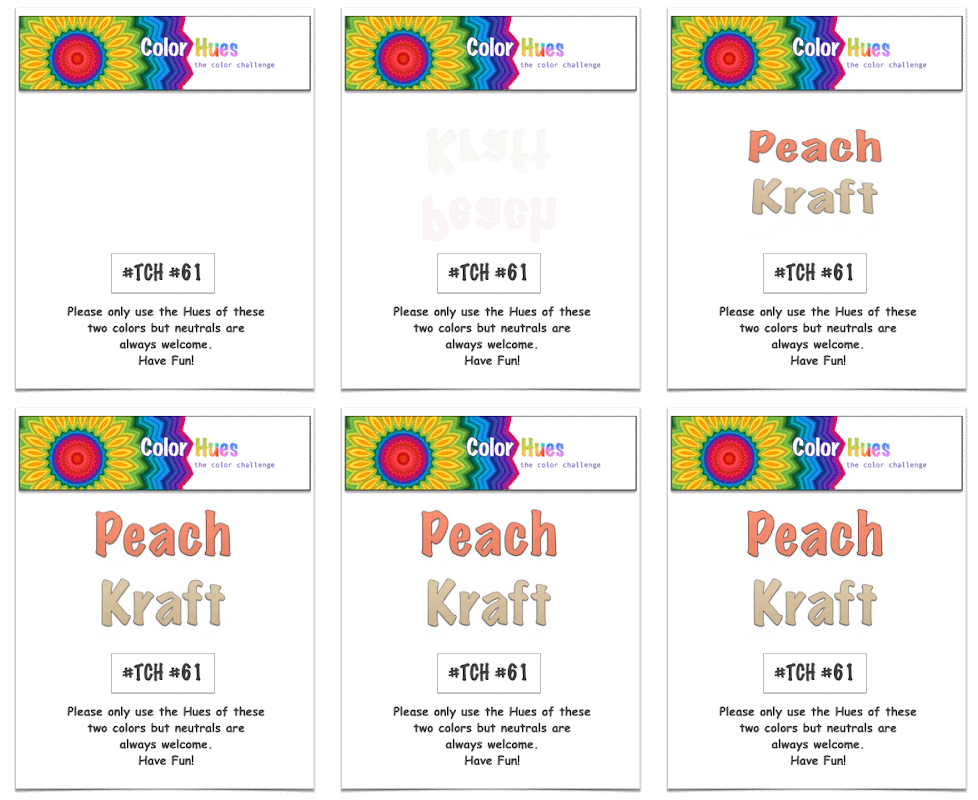
It’s April first, and there’s no fooling around here! I’m back to share the next Color Hues Challenge chosen by Stef:

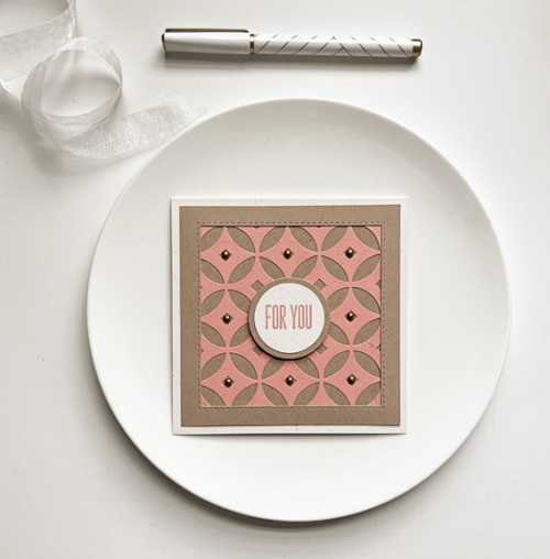
One of the things I love most about this challenge is working with color combinations I would never think of myself. This is one of them, and I turned to a new favorite coverplate of mine, Decorative Circles by Papertrey Ink. I waited a long time for this to be back in stock, and it was worth the wait. It covers an A2 sized card, but this time I cut it down to create a square card.

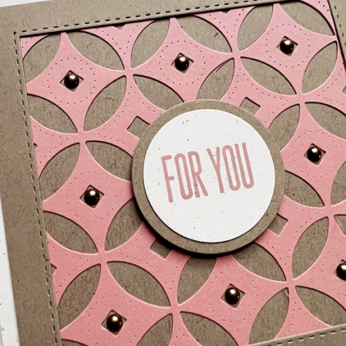
My best match for peach cardstock was Concord & 9th’s Grapefruit which I paired with Classic Kraft and Rustic Cream, both by Papertrey Ink. I created a frame using Simon Says “Stitched Squares” die.

I wanted a simple sentiment on a circle die to coordinate with the coverplate, so used Ellen Hutson’s Essential Circles die. The sentiment is from Waffle Flower’s Classic Sentiments. Finally I added some Pinkfresh Studio Metallic Enamel Dots to the center of each circle.
Please hop over to the Color Hues blog to see what our Design Team has created with this color combo. It’s sure to inspire you, and I hope you’ll add your cards to our gallery in the next two weeks!
Karen your die cute card is just beautiful and I think that C9 Grapefruit was an excellent choice!
What is it about square cards that are so appealing? This came out great, Karen! That coverplate is super fun and I am sure will get lots of use!
Oh, yes, that coverplate was definitely worth the wait, it looks spectacular all framed up on yout square card! Thanks for making something so lovely with these colors Karen – I know it’s not always easy to do! 😉
Oops! Hit post too soon lol! What I left out was that it’s not always easy to do when the colors aren’t ones you would typically use.
Love the graphic look of this Karen, waiting for the coverplate was definitely worth it! 🙂
This is so beautifully done, Karen … And a great colour combination too. So clever to pop those enamel dots in the centres.
I’m in the midst of discovering Concord & 9ths colors and grapefruit is one of my favorites! I love how you paired it with the classy cover plate for your clean graphic style. The enamel metallic dots add just the right touch!
You chose some wonderful cardstock colors!!! PTI happens to be my all time fav to use. I need to try my hand at some square cards as this is just so eye catching!
Aren’t you crafty with the kraft!!
Comments are closed.