It will already be July when this post goes live, and I guess I shouldn’t be too surprised. We spent a week going to Wisconsin, flying with our 12 year old grandson to Washington, D.C. for a few days, driving home, and then a week of commuting between home and a cottage on Conesus Lake Tracy’s family had rented. I was glad to be home for a week before we leave again for Chautuaqua Institute. We’ve been there before but never just the two of us. It’s sure to be relaxing, inspiring, and informative. This week’s theme is Artificial Intelligence.
Nancy, our fabulous leader at Color Hues, has chose a wonderful color combination:
I knew almost at once what I wanted to try. Some time ago I purchased Matte White foil from Spellbinders and wanted to try it out on aqua cardstock. Concord & 9th’s cardstock foils beautifully, and their Aqua Sky cardstock was the perfect color. It’s not often a card ends up looking exactly as I imagined it, but this one did.
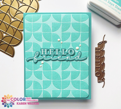
I chose an old favorite from Pinkfresh Studio, Quadrant Backdrop and ink blended it with the coordinating stencils with Simon Says Sea Foam ink. I chose Concord & 9th’s Oceanside for the cardbase and sentiment. I love Waffle Flower’s “Hey There” sentiments, and this one fit perfectly.
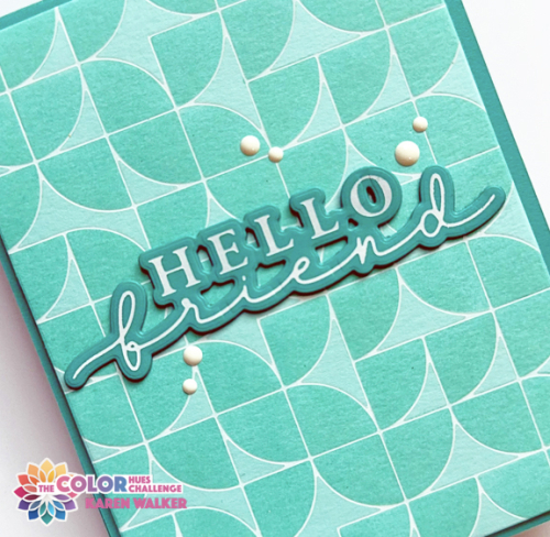
I added a piece of dimensional foam behind the main panel, and stacked three of the sentiments together for a bit more dimension. Adding some white enamel dots was the final touch.
Edited to add: In my attempt to work through my NBUS box, I created a second Aqua and White card with a new-to-me stencil, Frosty Lace. By the name, I’m thinking it was meant to be a winter-themed stencil but it looks like it could be a sea foam stencil as well.
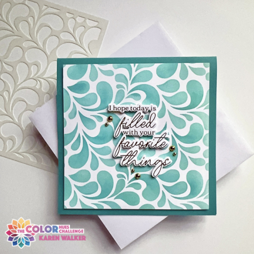
Like my first card, I used Concord and 9th cardstocks and Simon Says inks to ink blend, primarily Seafoam again, adding some Surf ink to add some dimension. I decided to cut the piece down to a square card.
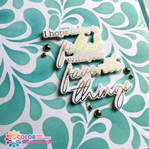
This time I used a gold foiled sentiment from Pinkfresh Studio’s Favorite Things Betterpress plate, and added some gold pearls to finish it off.
As always, you’ll find lots of inspiration from our guest, Nance, and the Design Team on the Color Hues Blog. Please join us in the gallery!
I’m sending the second card off to Just Us Girls: Anything Goes Stencils and to Darnell’s new July NBUS gallery.

Karen, you know I LOVE your Quadrant Background card. I recently purchases some white foil, so you’ve inspired me to case you! Your second card…swoon! Gorgeous!
hugs~carol
Both are stunning cards. I like the sentiment on the stenciled card.
Your first card is absolutely beautiful Karen, and now I want to try my never before used white foil on colored cardstock!! (Mine came in a 4 pack of assorted foils and I remember thinking “why would I ever use “white” foil”??!! Thank you for opening my brain!!) I love your hello friend sentiment too and how you finished it so simply with the white enamel dots…fabulous card Karen!! Your 2nd card is gorgeous too and I love the gold foiled sentiment on top…really POPS! Lovely, lovely cards my friend! Hugs. :0)
You two are always on the go, girl! I love that you are living life to the fullest and somehow you still manage to make really sensational card designs! I am a little lost with all the foiling talk, but I certainly crush over all the fabulous results like these! Happy 4th, enjoy the Institute, and stay safe with your travels! Thank you for inspiring everyone to use their NBUS! Hugs, Darnell
White foil?! I want some!! I want that foil plate too, oh you do make it difficult for a girl to keep her spending under control!! A super make and a bonus design too. 🙂
Look at you with a Twofer! Both are as lovely as can be. I think using the white foil was a genius idea and I believe I have some so thanks for the reminder. As for card two, I love your stencil and it definitely says summer to me. Hope you have another good trip, you busy lady!
Karen what a gorgeous gorgeous card! That quadrant background has got to come home to me, even though I told myself to stop buying and start using–😂 You are probably one of the busiest people I know, you are always on the go and I think it’s fantastic that you flew to DC with your grandson, how lovely. Enjoy your time, sans kids, I’m sure it will be very relaxing!
Karen, you have the best geometric designs and I love how you used this one with the white foiling on the aqua paper. Like I said on IG, great minds think alike ha ha. The stenciling really finishes off the design beautifully! I love that you took your grandson to DC, what a great age to share all that is there. Have a wonderful time relaxing with just the two of you.
White foil on this gorgeous aqua card stock? WOW! You have the best ideas! I love how this turned out. I love how almost translucent the geometric design looks. Both cards are stunning! I hope your happy travels continue to go well!
You have been one busy lady!!!! Your trips sound amazing. As for your card….between you and Carol I’m feeling the need for quadrants in my life. LOL! This is just beautiful.
I trust all your travels were enjoyable and went smoothly. You cram so much in! I like both these cards, but the lower one is specially nice.
Comments are closed.