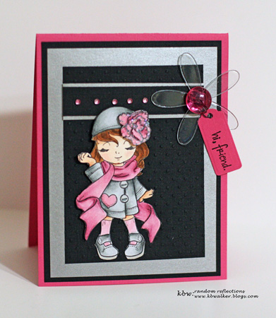
Saturday my friend and I drove to Buffalo to take a class on using Copic markers with Prisma colored pencils. I’ve been using Copics for about a year now after taking a Copic Certification class last February. I’ve had Prisma pencils for years. It never occurred to me to put the two together. The instructor was quite knowledgeable, but had a tendency to want to “do it for you.” Nonetheless I learned quite a bit. We completed two of three cards she had planned, and I have most of the coloring done for the third, but am waiting for an order with new Copic markers to arrive before I finish it. The images the instructor chose are very different from the stamps I use and own, but they were great practice vehicles.

I have no idea who the manufacturer of this stamp is. If anyone knows, please leave a comment.

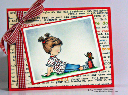
I actually really like this image. I changed the ribbon on the card when I got home. These are October Afternoon papers, but again, I don’t know who makes the image. I was quite pleased with how these came out. The basic coloring was done with Copic markers. Then we added very small highlights with the Prisma pencils and blended them with Gamsol.
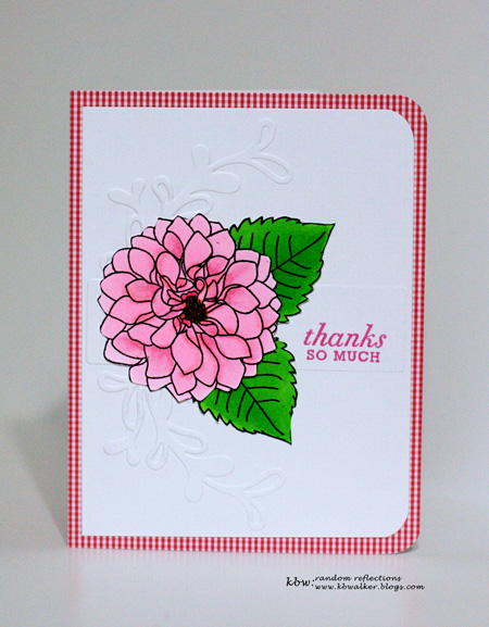
Yesterday I tried this technique on one of my new Papertrey Ink stamps, Delightful Dahlia. I think over time, I will get better at this and will enjoy blending these two mediums together in an image.
Cardstock: PTI Spring Rain, Select White; Cuttlebug embossing folder: Swiss Dots; sentiment: PTI Mega Mixed Messages; ribbon: Offray; ink: Brilliance.

Patterned paper: A Muse; Quickutz embossing folder: Vine Label; sentiment: PTI Mega Mixed Messages
Beautiful coloring – I think you did a fantastic job in the first card especially!
Rinda
I love your coloring and your cards. I have used Copics with Prismacolor pencils to highlight, but haven’t tried it with gamsol. I can’t wait to give it a try.
I really enjoyed looking through your blog. Your photography is amazing! Loved the flowers.
Ooh, these are gorgeous! Love the coloring! I have no idea how to use copics with prismacolor pencils. Oh, the first stamp is Madelynn from “The Greeting Farm”. I don’t know where the 2nd stamp is from.
Beautiful!! I have both Copics and Prisma pencils and would never of thought to put them together either. You have inspired to pull both out and see what I come up with…won’t be anything as beautiful as your cards.
You did such an amazing job with your coloring-just beautiful!!
Your colouring is wonderful,Karen….and I love copics myself…am slowly building up my collection.Your first stamp is from The Greetings Farm….they have some great stamps….I love the way you’ve coloured her…..and the way this card has turned out.
You have done a beautiful job with these Karen, how long does each one take? These seem unfathomable to me, always so detailed and intricate – really beautiful!
So beautifully done! I’d love to know how long something like this takes too because the detail is amazing.
these are gorgeous! And looks like something I wouldn’t begin to have the patience for! Kudos!
Oh wow, Karen! Your coloring on these is absolutely gorgeous!!! Looks like I might need to take some lessons from you! 😉
Your coloring is beautiful…really really nicely done. And I love that gingham ribbon with the O/A bookprint paper.
Wow, STUNNING colouring technique – love the detail on all these cards.
Hugs,
Caryn xxx
Wow, Karen – stunningly beautiful cards as ever 🙂 That second coloured image has come out so well! xx
The cards are great, I see what you mean about the stamps being different to what you would normally use but they turned out beautifully. I particularly like the way you’ve made the second card – very cute! x
Hi Karen! I’m so glad you enjoyed your class! Your cards are great! I love my Copics but haven’t tried Prisma pencils at all! Can’t wait to see more of your work with the two! Katie
Neat! I didn’t know one could use the two coloring mediums together. Lovely cards, Karen, keep it up!
Wow! Your coloring is amazing! your cards all turned out so pretty!
Your coloring is awesome! I especially love the second card because of the background – I struggle with coloring the background in a way that isn’t overpowering but still gives color.
Comments are closed.