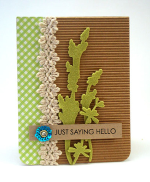
It’s a rare day that I put up two posts (my Papertrey Ink Blog hop post is below), but one of the challenges for this card ends tonight. I missed one of the challenges on Tuesday by two hours because I wasn’t paying good attention. When I saw the new CASE Study challenge this morning I had an idea that I thought would work for the Embellish Paint Color Trends challenge. Here’s the card to case:

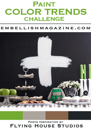
And here’s the Embellish challenge:

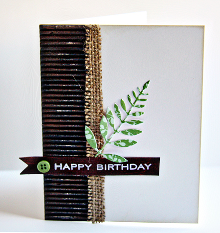
I have to admit I don’t think I’ve ever used paint on a card, but when I saw Julia’s card on CASE Study, I thought I could apply some paint to a piece of black corrugated cardstock and go from there. I had a new bottle of Dick Blick Brown acrylic paint so I randomly applied it to the black cardstock and then distressed it a bit more with a file. I adhered that to a card of Soft Stone which I distressed around the edges. I cut a thin piece of burlap and die cut the leaves from New Leaf Patterned paper (which just arrived this week.) I also painted the sentiment banner. I had a white one laying on the desk, and decided I could just paint it. I was a bit surprised at how easily the Vintage Cream ink stamped on the painted surface. I added a New Leaf button and was done.

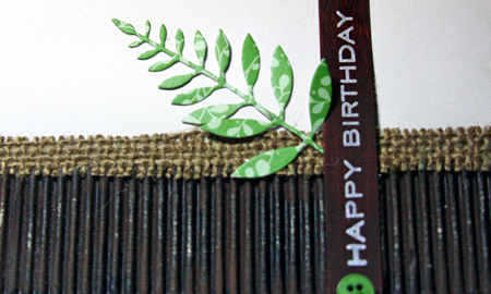
Here’s a closer look at the painted corrugated cardstock:

I think paint may show up again on a card or two! I’m posting this on the Moxie Fab canvas, cork, and burlap challenge, too.
Wow – you stamped that sentiment onto a painted background? It shows so clearly and cleanly! The whole card is just lovely 🙂
Karen, it’s perfect! I love the colours and the look. A lot.
Fabulous! Lovely texture on this beauty!
Thanks for studying along with us this week on CASE Study! 🙂
Hugs!
x
Gorgeous – the green fern really pops!
I love the mix of textures
Stunning! Much better than the original (though is is also pretty). But yours has panache :). I love that corrugated card: the contrast with the green is so sharp and clean. I think this might be my absolute favourite – though I keep saying that!
This is just beautiful Karen. I love the mix of textures too and the green with the dark colour of the corrugated card…genius!!!!
Love the distressed look of the paint on the corrugated panel! Such a great way to incorporate texture and the fab challenge colors. Thanks for joining us this week at CASE Study!
Comments are closed.