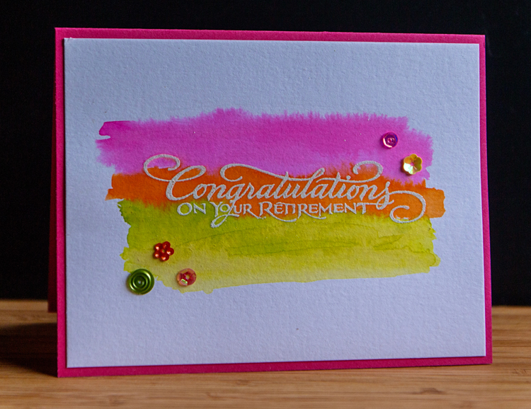
It’s that time of year, and two people I’ve worked with are retiring in June. The first is the program secretary at the Presbytery office. Jan has been a huge help to me during the six years I’ve served on Presbytery committees, and especially the three years I was chair of one of the committees. A group of us took her out to dinner a week or so ago, and I made this card for her.

Embossing and then doing a watercolor wash is becoming a favorite (and quick to do) technique. This time I used Dylusion sprays. I dipped my brush into the spray and applied it to the watercolor paper. I love how bright (almost neon) they are. The sentiment is an old wooden stamp by PSX. It’s been in my collection for a very long time. The assortment of sequins came in a kit, but I’m not sure which one. I’m entering this card in the Less Is More challenge: Watercolour.

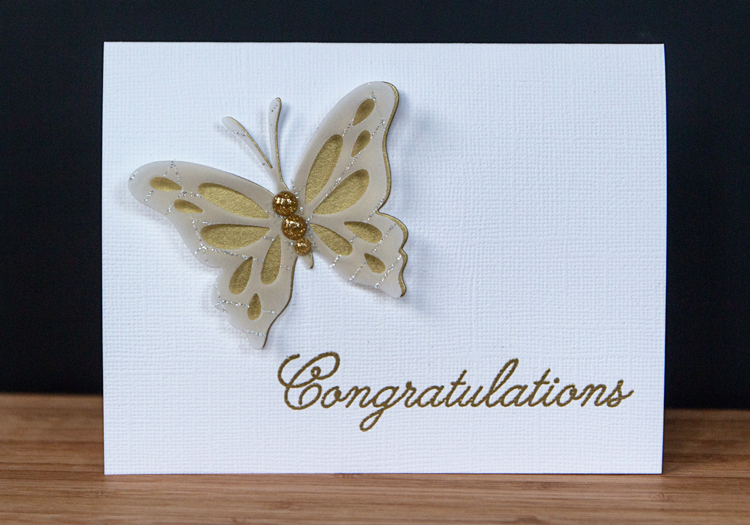
The second card is for our Assistant Music Director at our church. I was on the hiring committe that chose Chris nineteen years ago! My original idea for this card didn’t work out, but the end result is one of my favorites in quite some time. Totally CAS, but elegant.

I almost didn’t purchase the “Life is Beautiful” stamps and die from Papertrey Ink, but they are already a favorite. The sentiment is from a Papertrey set, “Congratulations,” that I’ve never used before, but it was the perfect size and font.

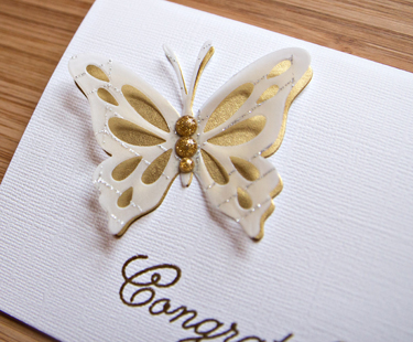
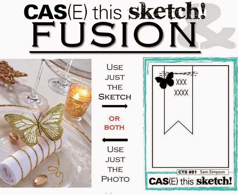
Here you can see the beautiful vellum, streaked with silver glitter from Cosmo Cricket’s “Simple Surfaces” paper pack. The glittery enamel dots are from MME. The gold paper has been in my stash for a long time. This is the perfect card for the Fusion part of the CAS(E) this Sketch collaboration this week.

I’m also entering both cards in the Simon Says Monday Challenge: Anything Goes.

Great cards, I’m sure both recipients will love them. My personal favourite is the first one, I love the zesty colour scheme. Thanks for joining us for this week’s Simon Says Stamp Monday Challenge!
The first one is so lively, and the second one is beautiful!
rinda
What I love about these cards is how individually though out they are. We all talk about having some cards put by ready to go; but you go that extra mile in making lovely one offs for the lucky recipients
Gorgeous as always Karen! The card companies should hire you!
Smashing makes and LOVE the colours of your first card
Kathyk
GDTM Simply Less Is More
These cards are wonderful – particularly like the colours in the first one.
What beautiful cards Karen!
The watercolour effect is lovely!
Thanks so much
Chrissie
“Less is More”
Stunning cards but love your LIM one with such gorgeous vibrant colours and great embossed sentiment
Thanks for taking part
Sarah
Leeds is more
Two beautiful cards, Karen! I had a giggle when I read your blurb about the cards, the first thing that popped into my head when I saw your butterfly card was “CAS elegance”! 🙂
Two lovely retirement cards Karen – the watercolor splash is so bright and cheery – and I just love the gorgeous layered CAS butterfly in gold and vellum – thanks for joining us at Fusion this week!
Oh, I do like that color wash & embossing together!
Two super cards Karen, love that vibrant watercolouring!
Thanks for joining us at Less is More
Anne
LIM Designer
simple yet striking! I love the velum with the touch of sparkle on the butterfly card. So glad you joined us at Fusion this week!
Two beautiful cards! LOVE card #2…. so perfectly CAS, with a bit of sparkle!
These are so pretty, I love the sparkly stripes on vellum combined with gold, it gives such a unique look 🙂 thank you for sharing with Fusion!
Such fabulous cards 🙂 Viv xx
Comments are closed.