I have two cards to share for challenges that end in the next 24-48 hours. The first is The Flower Challenge where the prompt is pink and brown. I love that color combination, and finally had time this afternoon to create a card for it.
This card will also get entered the NBUS Challenge. I’ve had this “Floral Fun Cover” die from The Stamp Market for months now, and today was the first time I’ve pulled it out. I’m not a huge fan of jigsaw puzzles, but putting this together was certainly reminiscent of trying to find just the right puzzle piece. Had I given it a bit more thought, a different technique would have made it much easier, so I’ll try again with other colors.
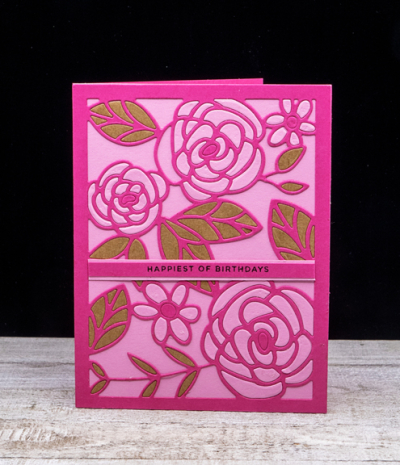
I used two shades of pink–Raspberry Fizz and Lovely Lady by Papertrey Ink, and a pretty brown that I found in my scraps folder. The card quite a bit brighter than my usual style, and I might have preferred a more subtle color combination. I do know, however, that it’s just perfect for one of my friends.
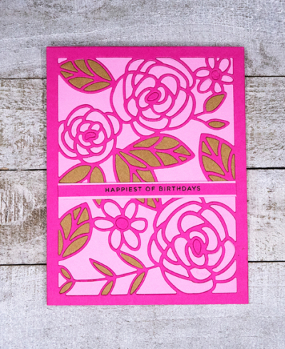
After running the die cut through with all three colors, the next step was to put the pieces back in where I wanted them. It’s hard to tell, but I chose to inlay only the flowers and leaves, and not the background. The sentiment is also from The Stamp Market, “Tons of Type.”
The next challenge is Less is More, and the challenge this round is Shades of Purple.
For Less is More the card needs to be very CAS. Often folks think that the expanse of white space for a CAS card must be white, but colors are also acceptable, and in this case it’s black.
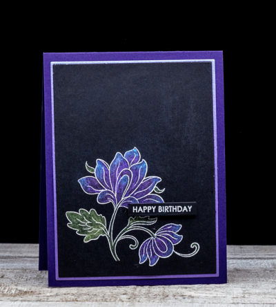
I love the metallic watercolors on the black cardstock, and the lilac shimmer cardstock border on the deep purple card base really shows it off. The beautiful floral is from Altenew’s “Persian Motif,” and the embossed sentiment is from Sugar Peas “Everyday Sentiments” which I find myself reaching for over and over again. I used the Gina K Master Layout dies to cut the focal image and the thin border before adhering it to the Royal Velvet card base.
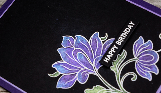
Here’s a closer look at the lovely metallic watercolors. It’s a set I bought after a class at a local stamp store, probably 20 years ago. It was put together by the class instructor so there is no indication of who the manufacturer is.

Those shimmery hues are wonderful against the deep black – you nailed the “Shades of Purple” challenge. Your description of the pink card reveals just how much work goes into making these – all kudos to you!
Both are beautiful..love the pink/brown color combination. It reminds me of working with negative spacing which I am playing around with. Love how the second card pops and the shimmer of the watercolors. Beautiful. Hope you are enjoying the same weather we are here.🥰
Yes, the top one is deceptively intricate, but it was worth it! The purple against the black works really well.
Beautiful cards & stunning colours. You know my feelings about pink – it’s always perfect. I have a die that is very similar to this rose.
Ah, that’s a great color combo, pink and brown. It looks sophisticated and fun with your die cuts! I love puzzles! Gosh, you showed us that we all need to use dark card stock more often. Excellent cards!
Wow! Your choice of metallics over the black really works stunningly. Thank you for joining in our colour challenge at Less is More.
Gorgeous Karen! I love the bright die cut flowers with their contrasting brown leaves and I absolutely love the purple shimmery watercolouring on the second card! Vicky x
Comments are closed.