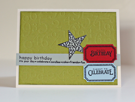
I need a few birthday cards for guys so thought I’d participate in Embellish’s latest challenge.

I must admit I would never put these colors together, and it was a bit of a challenge. I cased this card by Nicole Heady, and I’m pretty happy with the end result.

The green is showing up here on Typepad as much more muted that it is IRL (despite two efforts to correct it. It looks exactly right on my monitor). I used Pure Poppy, Spring Rain, Simply Chartreuse, & Vintage Cream cardstock from Papertrey Ink along with Light Morning Mist from Worldwin. I embossed the background paper with By the Numbers impression plate and distressed the edges with Peeled Paint distress ink. I used three different stamp sets (all Papertrey): “Simple Sentiments,” “Just the Ticket,” and “Star Prints.” This was an easy card to duplicate, so I made three of them.
It never ceases to amaze me how colours can show up in the wrong shade….I find this happens all the time!!
But the card is just right for a guy.
I would never have combined those colors either – but it works!
Very cute. I love tickets as an embellishment an use them often.
rinda
I really like the color combination… looks great!! A real “Man-card! You are so inspiring!
Hugs,
joni
I love that pop of green – so fresh
I always find male cards more difficult and also tend towards green! I like the pop of red on it too 🙂 xx
Love those little stamped tickets! You did well to get the colourway to work so prettily …
Ooh I like this, I never would have thought to put those colours together – it’s fab 🙂
It looks like a gorgeous green. Funny, it’s the green in my blog which shows up differently to different readers too – some see it as a fresh yellowy green and others see it a lot darker.
That would make a great Fathers Day card too
The green looks great on my monitor. The whole card looks great!! Thank you so much for playing along in the Embellish Challenge.
Comments are closed.