Skip to content

Zoom In, Zoom Out: Week 14

  • by

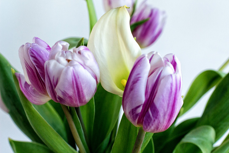
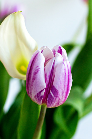
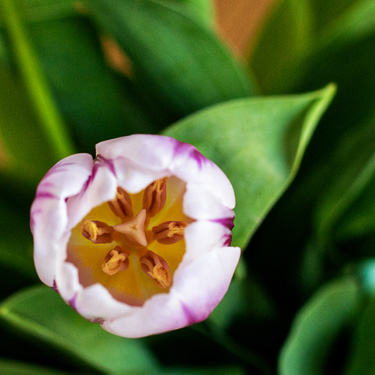
My brother-in-law and nephew came for dinner last night (along with Matt, Betsy, and Skylar) and Tom brought me a beautiful bouquet of purple striped tulips and calla lilies. It was the answer to the weekly question of what to shoot for ZIZO.

IMG_3857ed_blog

IMG_3856ed_blog

IMG_3870ed_blog

IMG_3860ed_blog

IMG_3868ed_blog

As you can tell, I had some fun playing around with different angles and getting closer and closer. Thanks, Helena, for providing weekly inspiration to get the camera out for a bit of experimenting!

Happy Birthday–Two Challenges

  • by

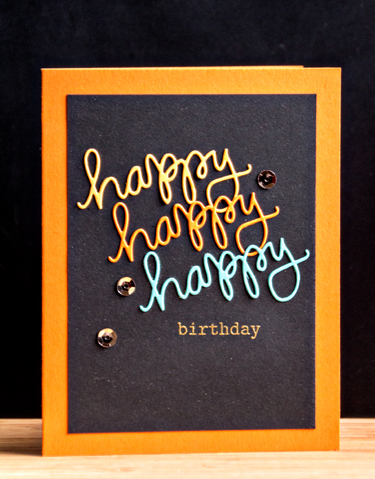
Today I have a card for two Simon Says challenges: The Wednesday challenge “Happy Birthday,” and the Work it Wednesday for bright colors.

Wednesdayblog-logo

Workitwedbanner


HappyClose

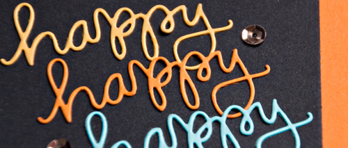
I love the Simon Stamp sets with die cut words and accompanying stamps. They work so well for so many occasions. Today’s card uses the “Happy” set. I die cut it three times in Summer Sunrise, Orange Zest and Hawaiian Shores, and layered them on a piece of True Black. I embossed “birthday” in gold, added a few gold sequins and layered it on a premade Memory Box card.

Happy

The sun is shining and the snow is melting so it’s a happy day here!

Happy Hearts

  • by

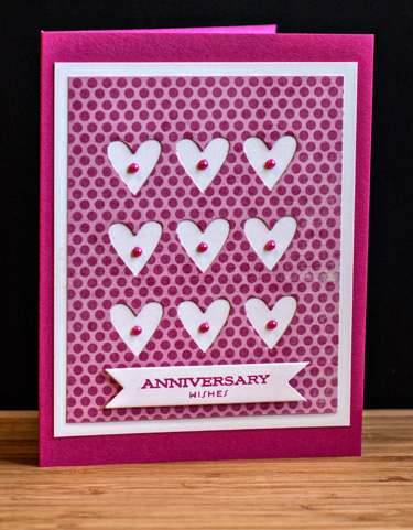
I used a nine heart die called Tic Tac Toe Hearts by Simon Says to get hearts for this card and this card. That left me with the negative die cut, and I couldn’t see letting it go to waste. 

AnniversaryWishes

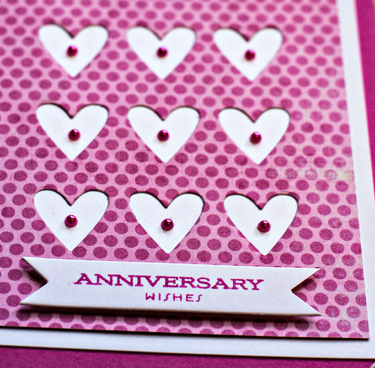
I mounted the die cut paper on a piece of Select White (Papertrey Ink)  and then on a card base created with Doll Pink (Simon Says). A tiny pearl from Michael’s was added to each heart, and the sentiment (from “Everyday Classics by Papertrey) was stamped on a trimmed Double Ended Banner die (Papertrey).

AnniversaryClose

I’m always happy to have an anniversary card in my stash. Usually I’m making one for the event right beforehand. 

IMG_3810ed_blog

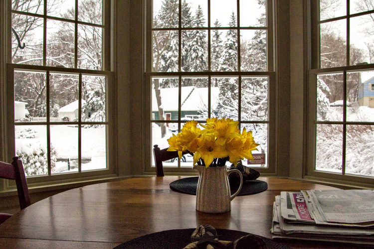
We got another foot of snow on Saturday night. Fortunately, I’d bought a few daffodils at Trader Joe’s on Friday so there was a spot of spring in the kitchen. It was warmer today, and tomorrow the forecast is for 60° so hopefully the snow will be gone before too long. Tomorrow is April 1st after all!

Spring? ZIZO

  • by

This is what spring looks like in Rochester right now.

IMG_3718ed_blog

But if you know where to go you can find the colors of spring. 

IMG_3719ed_blog

Zoom Out

IMG_3721ed_blog

Zoom In

IMG_3722ed_blog

Zoom In a little closer

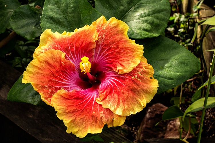
And for a  bit of exotic color, one of the most gorgeous hibicus I’ve seen.

IMG_3750ed_blog

Zoom Out

IMG_3752ed_blog

Zoom In

Spring brought to you from the Lamberton Conservatory at Highland Park. 

Color Fade

  • by

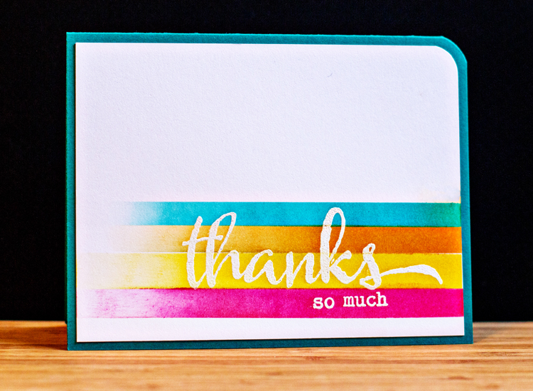
Recently I came across two cards, one by Julie Ebersole, and then one based on her card by Laura Bassen (two wonderful designers). I loved the look and since I had just gotten a new set of Winnie and Walter stamps (“The Big, The Bold, and You) I thought I’d give color fading a try.

After embossing the sentiment in white, I masked the stripes and added Distress Inks fading out to the side.

ThanksColorFade

As always, I learned a bit in the process so the next attempt should be a bit better, but overall I’m happy with another bright and springy card to add to Simon Says “Work it Wednesday” challenge.

Workitwedbanner


One More for the Online Card Class & Work It Wednesday

  • by

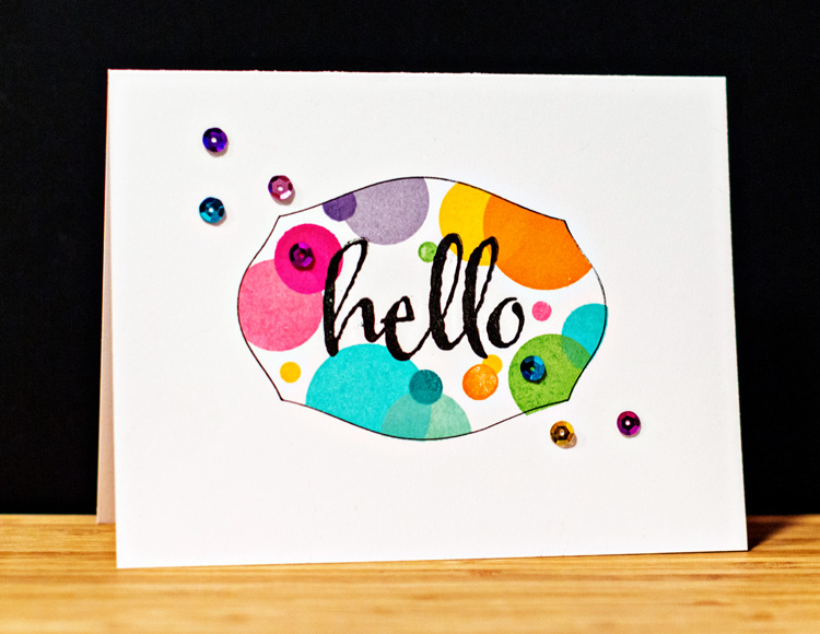
It’s been a long time since I played around with so many new (to me) techniques, but I tried another variation of masking cards that Kara shared on Day 4. This time I die cut a mask from Mat Stack #1 by Papertrey Ink and used the negative to try another series of stamped circles. When I removed the mask, I felt like it need something else, so I cut another frame from cardstock and traced around it with a fine lined pen. That was better, but I wasn’t really happy with it until I added the sequins. I think it still qualifies as a one layer card.

Hello2

I do love all these bright colors, and I’m entering it in the Simon Says “Work It Wednesday” challenge which is to “to create a card with bright colors, flowers, sunshine or anything else that makes you think of Spring!”

Workitwedbanner

Card Recipe:

Cardstock: Select White (PTI)
Stamps: Beautiful Blooms (PTI), The Big, The Bold, and The Happy (Winnie and Walter)
Die: Mat Stack #1 (PTI)
Sequins: Michaels


March 2014 Papertrey Blog Hop

  • by

It’s not often I post twice in one day, but in addition to the CASology challenge, today is the March Papertrey Blog hop.

BlogHop

The Papertrey March Blog Hop challenge is high gloss, which leads one directly to Glossy Accents. I have to admit I have an issue with Glossy Accents. I find it nearly impossible to get it to go on smoothly. I did a Google search and didn’t find any great tips, so if you have some, I’d really appreciate it if you’d share them.

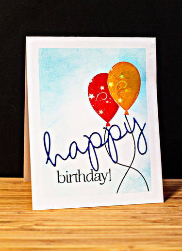
I combined an inspiration piece by Stephanie Klauck from the recent Online Card Classes for the Textural Effects Lesson–using Washi tape to mask off the edges of a card to create a frame with Distress Inks. Instead of glitter on the balloons, I used Glossy Accents. 

Birthday

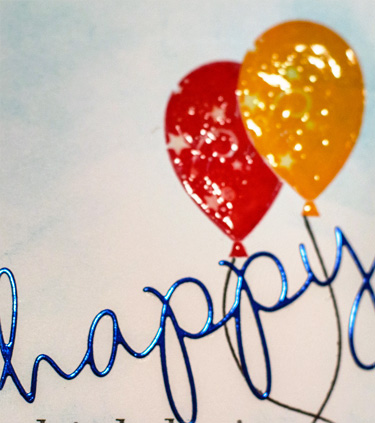
The “Happy” (“Wonderful Words”) was cut from high gloss metallic blue cardstock and the rest of the sentiment came from “Stylish Sentiments: Birthday.” The balloons are from “Balloon Bash.” Here’s a closer look at the gloss. (Excuse the glare; these photos were taken after dark last night.)

HappyBDClose

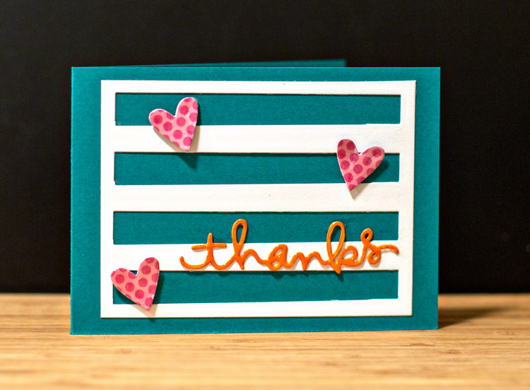
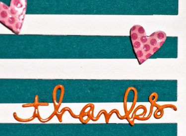
The next card was made from scrap pieces I had lying on my desk after playing around this weekend with cards for the Online Card Class: One Layer cards. The hearts and “thanks” are both Simon Says dies and I covered them with Glossy Accents. I do have an easier time covering the smaller pieces. I die cut and trimmed the “Building Blocks” die by Papertrey and adhered it to a Tropical Teal card.

Thanks

ThanksClose

You can find a lot of inspiration for card making on Nicole’s blog today.

Lucky!

  • by


Guest Designer Badge New

Two weeks ago I was honored to win the CASology challenge: Roots. That alone was exciting, but even more exciting was an invitation to be the guest designer for this week’s challenge:

Week 88 - Lucky

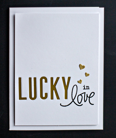
I had to think this one through since St. Patrick’s Day has come and gone, but it didn’t take long to come up with “Lucky in love” as a theme for the card.

Lucky

I die cut “LUCKY” with Papertrey’s Headliner Alphabet and used the negative. I backed it with beautiful gold metallic paper from Paper Source. Images from Winnie and Walter’s “The Big, The Bold, and the Happy,” and Simon Says “Love This” finished off the sentiment. I added three hearts die cut with Simon Says “Holiday Shapes” to finish the panel which I mounted with dimensional tape onto a white A2 card. You can find more inspiration for “lucky” here.

Online Card Class: Clean and Simple One-Layer Cards

  • by

CS3_paticipant

Despite a couple of hours of playing around with new techniques, I only have one more card to share from the Online Card Class. But I’m thrilled to have figured out how to selectively emboss using an embossing folder, and know the playing around will pay off in the future. (I also played around with a faux watercolor technique, but it wasn’t very successful.)

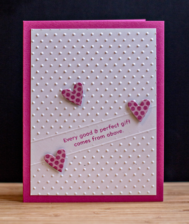
Baby

Two of the nicest ministers in our Presbytery are married to one another, and they just had a baby girl last week. I couldn’t wait to make a card to welcome Lydia Grace. (Isnt’ that a beautiful name?) I can’t wait to meet her.

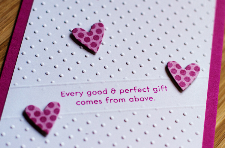
By using a shim made with a couple layers of chipboard, I was able to send my cardstock through the Cuttlebug with the embossing folder, and have a blank spot for the sentiment. Then I scored a line on each side of it. I like this look and know I’ll use it again. 

BabySentimentClose

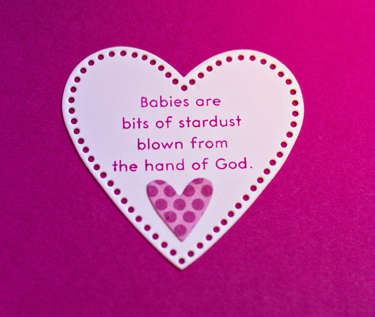
This cute heart was cut with Papertrey’s Stitched Heart die, and made a perfect way to highlight the inside sentiment.

BabyInside

Both sentiments are from “Bitty Baby Blessings” by Papertrey Ink. The ink and cardstock are “Doll Pink” from Simon Says, and the patterned paper is from an old MME paper pad, “Happy Go Lucky.”

Online Card Class: Clean and Simple One-Layer Cards

  • by

The Online Card Classes are among the best classes I take online. I always learn new techniques, have picked up some wonderful tips, bought some very useful tools, and gotten lots of inspiration from the instructors. This recent class was no exception. 

So how does one define a one-layer card? It’s quite evident from all the card samples that it’s perfectly OK to create your card on a slightly smaller card and then layer it on the card itself. It enables you to hide Copic markers that bleed through cardstock, and tape that holds a variety of inlaid dies together. 

Although I kept up with the videos each day, I didn’t have much creative time during the last two weeks. But today I was able to spend the day playing in the studio, and created three cards for class as well as several others. If I have time tomorrow, there are a couple more techniques I’d like to try.

This was the first card I created, inspired by a video and card by Laura Basson for Day 3:  Optical Illusions, layered stamping. My card very closely follows Laura’s design. The biggest problem I had was finding the right ink for the background. Even with all the ink pads I own, I didn’t have a pale beige or gray dye ink pad. I ended up using the Vintage Cream Hybrid pad by Papertrey Ink, but you can see the dots through the dye inks I stamped on top of it. I can live with it, but I’ll try this technique again once I get an appropriate dye ink pad.
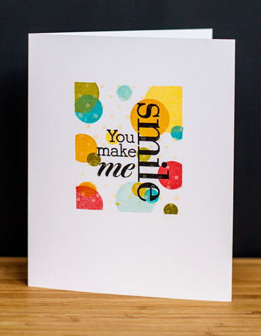
Smile

I used Post-it note tape to mask off the rectangle for stamping. The polka dots are from Papertrey’s Beautiful Blooms II, and the sentiment from Hero Arts “Made with Love.” The stamping on top of stamping creates an illusion of layers although there is only one.

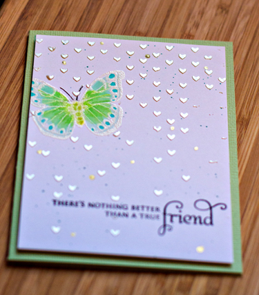
The next card is much busier than my usual card, but I wanted to try all the techniques Debby Hughes managed to pack into one video. This card was for Day 9:  Textural Effects. In addition to using mists to splatter, embossing and color with Copics, Debby also used embossing paste to add more dimension to her card. Once again, I stuck to her design very closely so I could concentrate on the techniques.
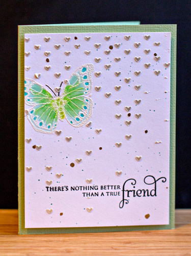
FriendUp

The butterfly is from an old Hero Arts set, “Antique Engravings” and the sentiment from “In Bloom” by Papertrey Ink. I think I’d use less of the Falling Hearts stencil if I tried this again, but overall it was a good learning experience. I used the Viva Modlier Creme embossing paste which I saw used during the Online Card Class: Stenciled. It has a wonderful silver gleam to it.
Friend

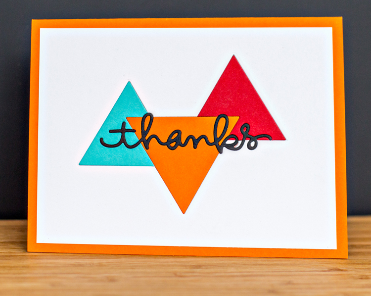
The last card for Day 2: More Faux Effects is my favorite of the bunch. I don’t have an engineer’s frame of reference, so it took two tries before I figured out in what order to do the die cuts. The trickiest part was getting all the little pieces in place once the sentiment was die cut. Again, the design of the card follows the sample by Heather Campbell.
ThanksDieCut

I used the “Two Triangles” die by Papertrey, and my go-to die “thanks” by Simon Says. I would have liked to add a few black sequins, but didn’t have any. (Hard to believe, actually.)

I’ll definitely incorporate some of these techniques into future cards, and I’ve learned some great tricks making inlaid die cuts easier to do. Hope you’re having a bit of creative time this weekend, too.
 

January Project Life

  • by

It’s the middle of March, and I’ve finally completed my Project Life pages for January. I’d think I was way behind, but I follow a couple of people who are still working on last fall’s pages, so I guess it’s not too bad.

JanPg1

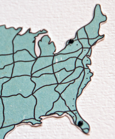
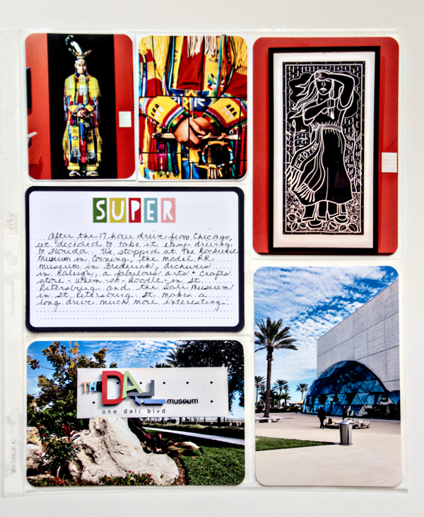
The first page backs up the Title page for 2014 which I posted here. It documents our last day with Sarah, Adam, and Caleb, our arduous ride home from Chicago as well as the start of our next road trip, just two days after we got home. The cute cork calendar is from Lawn Fawn, and is part of a two piece set. I’m saving the frame for another spot. I cut down a 3X4 card from the Project Life Travel set, added some Simple Stories letter stickers and a car from an Evalicious sticker set. The map was fussy cut from another journaling card, and I added two black pearls for the starting point and ending point of our road trip.

MapClose

I ended up using some different page protectors for the last four pages:  Design G by Becky Higgins. They’re about an inch narrower than the 12X12 pages, but since I’ve been combining different size pages in my albums for several years now, it doesn’t bother me at all.

  MuseumPageJan

The top two photographs would have made a great Zoom In, Zoom Out post, and may show up there some week when I don’t have anything new to share. The journaling tells the story about the two museums we visited and the other stops we made as we drove to Florida.

Ft.MeyersBeachJan

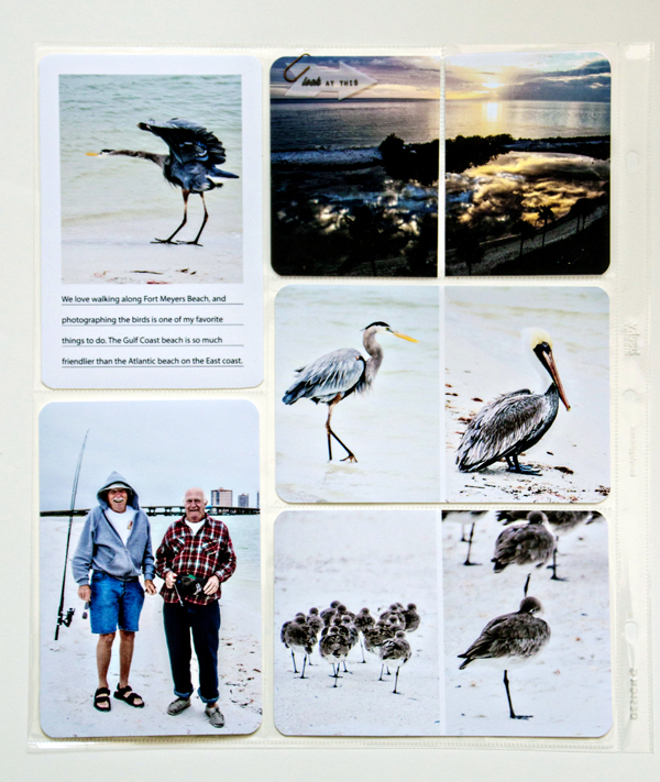
I love photographing the beach, and these were some of my favorites from this trip. The one of the sun set was taken out the window of the condo Tracy’s mom rents in Fort Myer’s Beach. The two fishermen at #11 of my 100 Strangers Project (more about that later.) 

SideTripsJan

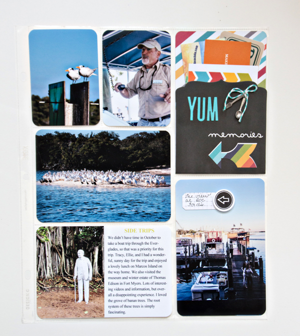
We took a couple side trips to the Everglades and the Thomas Edison Museum and winter estate with Ellie while we were in Florida, and ate out at some great restaurants both on the road and while we were staying with her. I found the fork and spoon charms when I cleaned out the studio in January and added the “YUM” with die cuts from Papertrey. The pocket is from Simple Stories. The arrow on the bottom photo is a Technique Tuesday stamp designed by Ali Edwards.

HomeJan

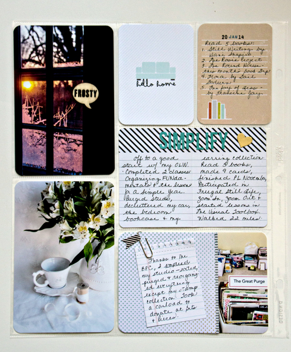
And then we were home, and the warm temperatures were no more. The “Frosty” wood veneer came in a kit (not sure which one), and I included one of my favorite photographs from the Frugal Still Life class. I wanted to put a label of some kind on it, but couldn’t find anything that didn’t detract from the composition of the photo. The “Hello Home” card was from the December Cocoa Daisy Project Life kit. Tracy gave me a three month subscription to these for Christmas. The cute journaling card with the books is from the January kit, and I stamped the date with the new Slide Frame set from Papertrey Ink. The rest of the page documents my progress with my One Little Word which I intend to do each month at the end of my spread.
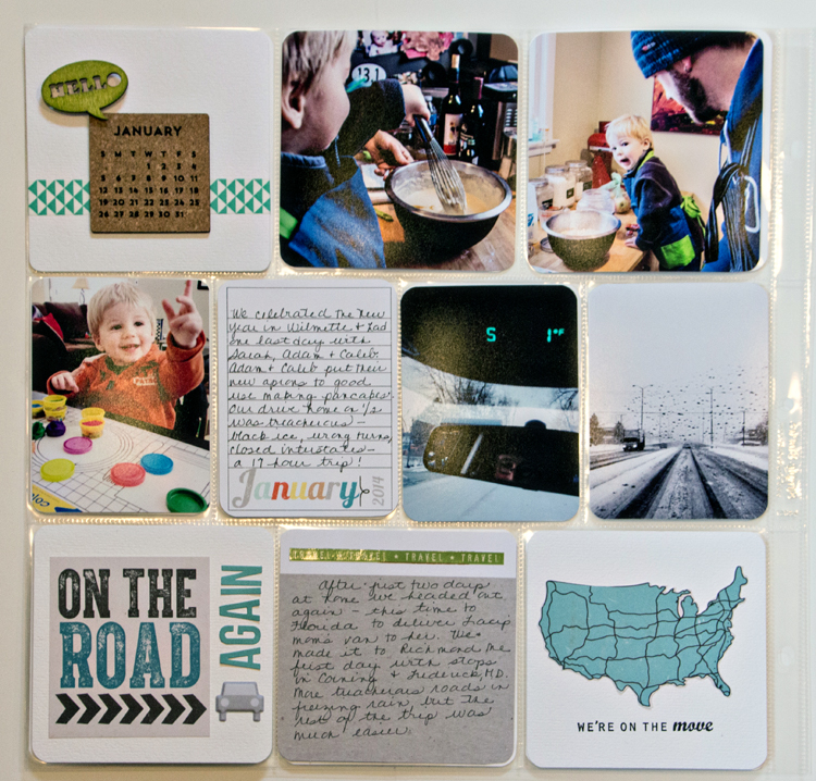
JournalingPurgeJan

Now to get February done before March ends.


Zoom In, Zoom Out: Week 12

  • by

This weekend we made our annual trip with Karen and Mike to Niagara-on-the-Lake to purchase our tickets for the Shaw Festival in the fall. Yes, we could buy our tickets online, but about five years ago we decided to make a day trip to NOTL. We purchase our tickets, have lunch at the Irish Harp, and go to a couple wineries before heading back to Rochester. The last couple of years, we’ve had breakfast at one of our houses before leaving, and dinner in Rochester before we call it a day. 

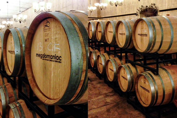
The week before our trip, I received an email from the Megalomaniac Winery inviting us to a wine tasting seminar. It sounded like a lot of fun, so we signed up. There were just three couples there, so it was a very intimate group, and we learned a lot about food pairings, how to get the most of the wine tasting experience, and how the different glasses can affect your tasting experience. The only drawback was how cold it was in the winery. This particular winery is just now constructing a building for wine tasting and events. Since it opened, the wine tastings have been held in the barrel room, dug inside a hillside. It’s chilly even in the summer, and downright cold in the winter. But it seemed like a good place for the ZIZO shots of the week.

ZoomIn12_blog

Usually I take my ZIZO shots with my Tamron 18-270mm lens, but this time I zoomed in with my feet and my iPhone.

Check out the other ZIZO photos on Helena’s blog.

Zoom-in-zoom-out-button


Happy St. Patrick’s Day Birthday

  • by

Today is Tracy’s birthday, and we had lots of fun celebrating tonight. I thought I’d share Tracy’s birthday card first since I’m linking it to the new (and timely) Addicted to CAS challenge: Lucky!

ATCAS - code word luck

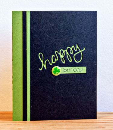
It’s another inlaid die with a shamrock sticker I found at Michael’s.

T'sBD

Both the die cut and the sentiment underneath are from Simon Says, “Happy.” Papertrey’s New Leaf card stock is the perfect color for St. Patrick’s Day, and I’m always drawn to a bright green and black combination.

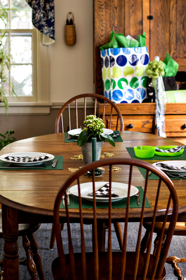
When I went to set the table I was surprised to find I had no green placemats. The last couple of years we haven’t been home for Tracy’s birthday, but I found great bright green ones on sale at Bed, Bath, and Beyond.

IMG_3572ed_blog


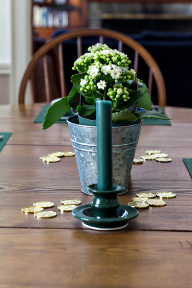
I found some lucky gold coins at Michaels. Skylar gathered them all up after dinner and put them in the toy box! 

IMG_3560ed_blog

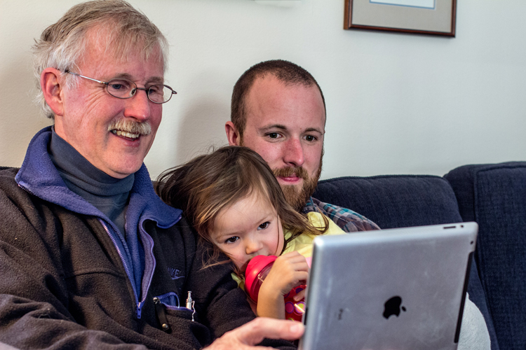
Matt, Betsy, and Skylar came for dinner. After we ate, we did Face Time with Sarah, Adam, and Caleb on the iPad. Technology is just the best!

IMG_3590ed_blog

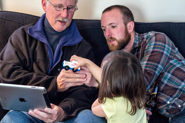
Skylar and Caleb started showing one another their cars. It went on for quite some time.

IMG_3594ed_blog

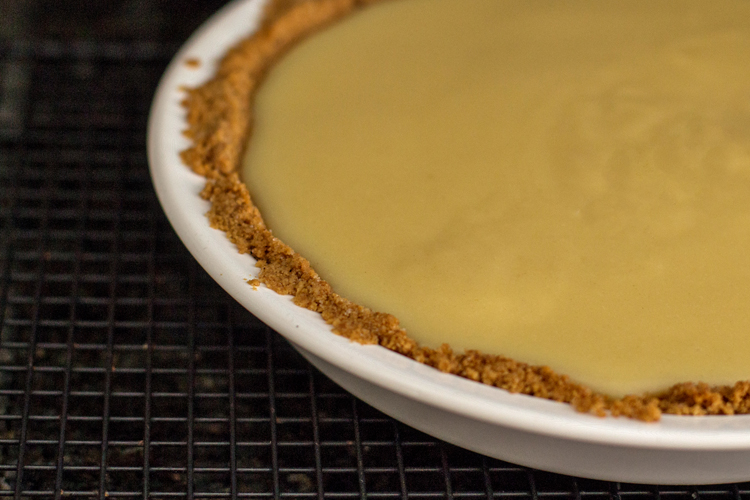
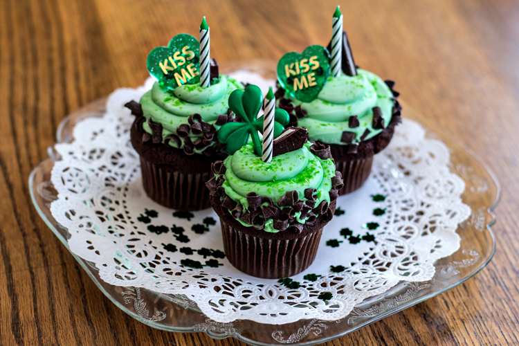
Afterwards we had dessert. Tracy had banana cream pie (his favorite) but I also bought some cupcakes for the rest of us so we’d have something to put birthday candles on. I was holding the cupcakes for the blowing out of candles so there are no photos of the event.

IMG_3575edblog

IMG_3581ed_blog

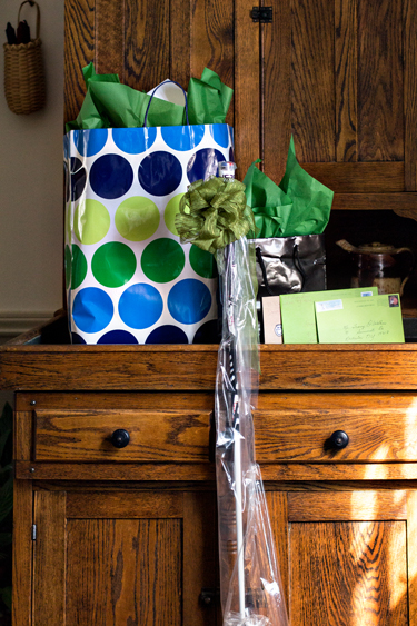
And opened up gifts.

IMG_3565ed_blog


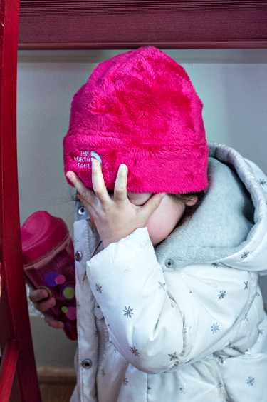
Initially Skylar wanted no photos on the way out.

IMG_3606ed_blog

But she relented, and Grandma was grateful!

IMG_3610ed_blog

Watercolor: Part 2

  • by

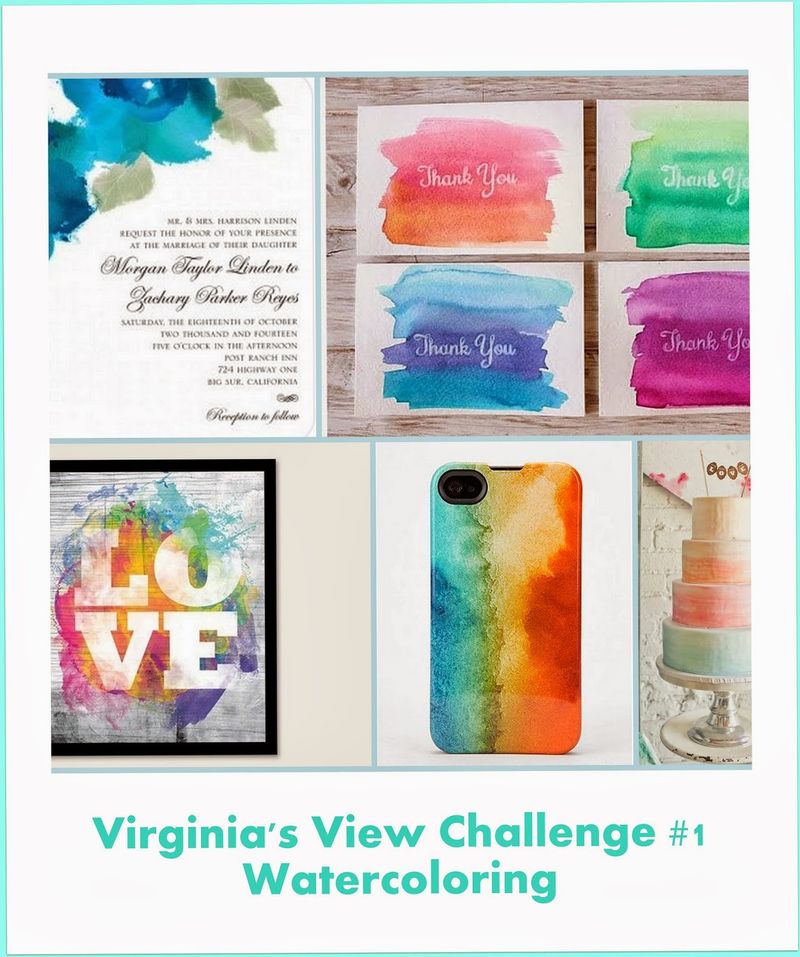
I’m back with another card created with my gelatos and some watercolor paper. And another entry to Virginia’ Water Color Challenge which closes today.

Watercoloring challenge

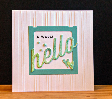
This time I die cut the sentiment from the watercolor background. I used the “Wonderful Words: Hello” stamp and die by Papertrey Ink.

Hello

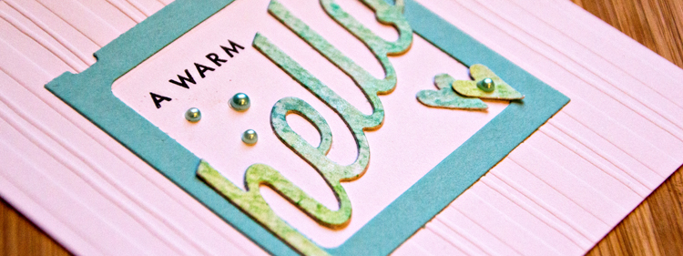
I also die cut the Slide Frame (Papertrey) and adhered both to a pre-embossed card by Lasting Impressions I’ve had in my stash for years and years. I loved the cards, and still have several versions of them. I punched two hearts from the watercolor paper and added some Doodlebug pearls.

HelloClose

Today is my sweet husband’s birthday, and I’ll be back tonight to share his card, and hopefully, some photos of our family dinner as well. 

Watercolor: Part 1

  • by

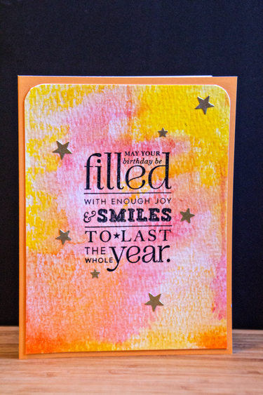
The use of watercolor for card backgrounds has been really hot for several weeks now. I finally sat down on Friday night with some watercolor paper and played around. After seeing a video today by Julie Ebersole, I would do this differently next time, but I’m pretty happy with some of the samples I created. There’s also a new challenge for watercolor by Virginia Lu that I’ve been wanting to play along with. 

Watercoloring challenge

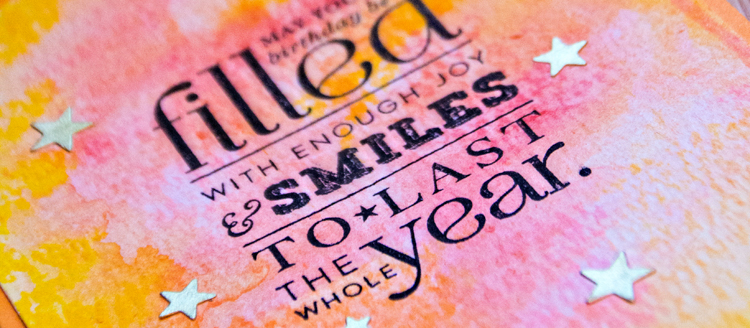
I started out with some Tim Holtz Distress Watercolor paper and my gelatos. I’ve hardly played around with them at all, and although it’s hard to see in the photographs, the gelatos create a wonderful sheen to the watercolor background.

Filled

After stamping the sentiment from Papertrey’s “Stylish Sentiments: Birthday,” I die cut some stars from a scrap of gold metallic paper with the Simon Says “Holiday Shapes” and “Large Holiday Shapes” to use as confetti. I rounded the top edges and adhered it to a Memory Box card I’ve had in my stash for a long time.

FilledSmilesClose

This is the first of two cards I made today, and I have a couple more watercolor backgrounds to play with and a lot more ideas to try!