Skip to content

Tanzania Adventure

  • by

Odysseys’ Tanzania Adventure tour was accurately titled. It met every one of our expectations and then some. There was additional “excitement” for me because my passport disappeared the very night we arrived. It’s a long story, but we do know I had it in my hand when I got on the van at the Killimanjaro Airport (thanks to the CCTV cameras at the airport,) but that was the last time anyone saw it. Needless to say, I got home, and Tracy and I had a couple adventures the rest of the group missed. Actually, they were wonderful adventures, and the biggest take-away I have from the trip is the kindness, coooperation, and empathy we received from everyone we encountered. The wonderful manager of Leopard Tours in Arusha who facilitated my trip to the American Embassy in Dar es Salaam said it all one day. “Karen, as long as you are in Tanzania, you are family.” And that’s how we were treated everywhere!

I’m posting a few of our favorite images from the trip here, but at the end of the post you’ll find a link to my SmugMug album from the trip. There were many, many more photos but we tried to organize the SmugMug album with some of the most interesting. Once thing you’ll see is the variety of landscapes in Tanzania. When I thought about a safari my vision was of the savannah or open plains. In Serengetti, that was true, but it was very different in the other three parks. If you view the SmugMug album you’ll see captions for many of the photos, as well as all the photos I’m sharing here. 

DSC01147Lg

You have to look closely but you’ll see several beautiful black and white Colobus monkeys in the Arusha National Park-the largest monkeys we saw.
IMG_2654Lg

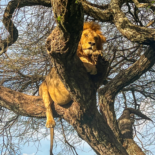
One of the first of many lions we saw. His full belly tells you he has recently eaten, is very sleepy, and won’t need another meal for several days.

IMG_4688Lg

Mt. Kilimanjaro was only visible in the Arusha National Park. On the day we were there, just the tip of the mountain was showing.

IMG_4855Lg

This was not the only time we waited for elephants to cross the road.

IMG_2713Lg

I didn’t know a group of giraffes is called a tower, but it makes a lot of sense, and I won’t forget it. We counted over 20 in this spot.
IMG_2783LgIMG_2787Lg

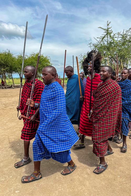
We visited a Maasai village on the trip and were introduced to their culture. The Maasai are one of the few tribes that have managed to retain their traditional way of life.
We had a chance later in the trip to talk to a Maasai doctor who trained in the United States. He spent 10 years working in Denmark, but has now returned to his village
and is working with a small group to improve their health card and develop some ways to make their lives easier without impinging on the culture.
Two of the men who who conducted our tour of the village had B.A. degrees from universities but have returned to their village.
IMG_2874Lg

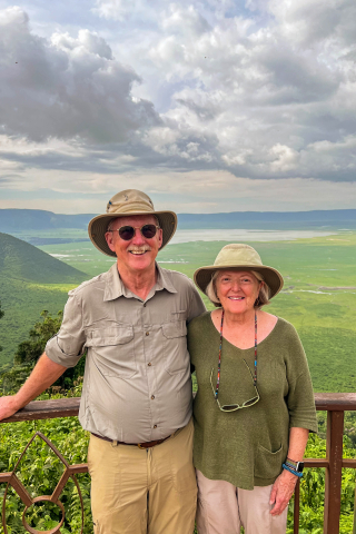
Our first view of the The Ngorongoro Crater. It was the area I was most excited to see, and it did not disappoint!
We spent one day in the crater and part of a second day in the Nogorongoro Conservation Area.

IMG_2901Lg

Sunrise over the Ngorongoro Crater. 

IMG_7026Lg

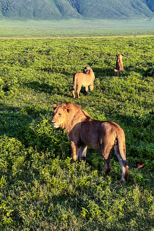
Getting up early to see the sunrise also meant that the light in the crater was perfect for taking photos.
IMG_2950Lg

DSC01598Lg

One of many, many Wildebeast 

DSC01679Lg

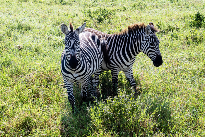
Both the zebras and the wildebeasts are part of the huge migration that takes place annually. A million wildebeasts and over 800,000
zebras migrate from Kenya to Tanzania and back in search of food during the dry season.

AIMG_3168Lg

Cape Buffalo with Cattle Egrets

IMG_3176Lg

A final view of the crater at the end of the day, taken from our lodge which sat on the edge of the crater. 

IMG_3322LgLg

It didn’t happen often, but if word got out to the various driver/guides that there was an excellent viewing, a traffic jam
ensued. Our driver was exceptional, and we never left without a good photo. See below.

IMG_3321Lg

IMG_3582Lg

Our last two days were spent on Zanzabar, the Spice Island. This is a traditional boat called a Dhow.
IMG_3668Lg

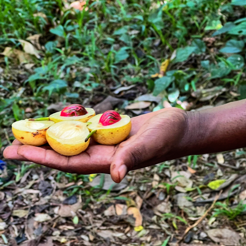
We visited a spice plantation. The red is nutmeg, and the surrounding yellow is mace. 

IMG_3629Lg

There was just one photo I wanted from this trip, and luckily I got it. A dhow with the sun setting in the background over the Indian Ocean. Tracy and I left one night ahead of the rest of the tour so I could get to the American Embassy to get my emergency passport. Thanks to one of the women in our group, we did not miss the farewell dinner because she asked to have it a night early before we left. It turned out to be a very lovely event, and we are so appreciative of being able to attend. Like the Tanzanian people, our tour group was wonderful, as was our tour guide, our driver/guide, and the two men we traveled with on each of the game drives. We had so much fun!

Thanks for sticking with me through the photo tour. If you still have an interest here is a link to the SmugMug album


Color Hues #84

  • by

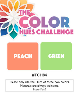
Peach and Green are the new colors for the April 1st Challenge at Color Hues. Cindy has chosen the duo, and I had a lot of fun with it.

CH #84 Peach and Green.001

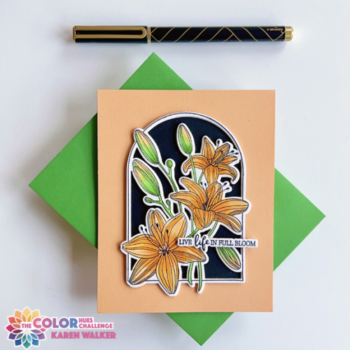
Rather impulsively I ordered the February Clear Stamp and Die of the Month from Spellbinders. I have no regrets. It was just perfect for this challenge, and I’m a big fan of lilies!

CH84

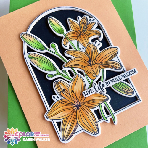
The feature that sold me on the set was the die cut which cuts the arched frame and all the inside areas at once. After coloring the image with Copic markers, I backed the arch with black cardstock, and the lilies just popped! Concord and 9th recently introduced a new set of colors. I usually invest in a sampler pack, and it arrived just as I was trying to find a piece of peach cardstock. Their Creamsicle paper was just what I needed. 

CH84Close

The stamp set included several lovely sentiments as well as the dies to cut them out. I added some dimensional foam behind the arched lilies, and then stacked several sentiments to provide more dimension. 

April usually hold some promise of consistent Spring weather in western New York, so hopefully we’ll soon see lilies beginning to peek through in the garden. In the meantime, hop over to the Color Hues blog to see the what the Design Team and our Guest Designer have created. We hope you’ll join us!

Thanks to this new stamp and die set, I’m likely to be one of the first in the gallery at Darnell’s April NBUS post.  I’m also posting this in the Seize the Birthday Challenge: Spring Florals, and The Four Seasons Challenge: Anything Goes

NBUS03-28-SpringFloralFour Seasons Spring 24

Woodblock Wednesday: March Edition

  • by

It’s the last Wednesday in March so it’s also Woodblock Wednesday, kindly hosted each month by Amy Tsurtua. 

Featured-woodblock-Wednesday-graphic-copy-1

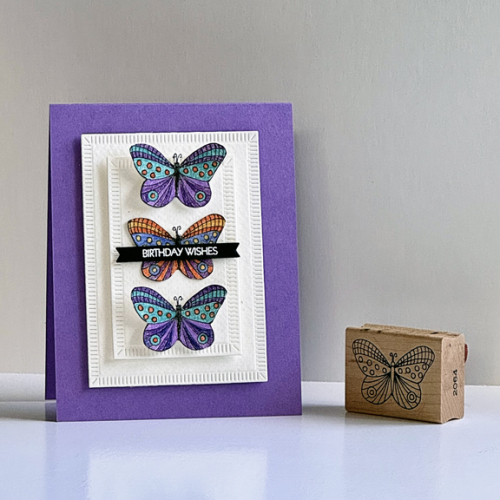
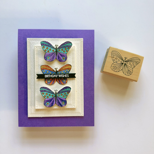
It’s still going to be awhile before butterflies appear here. Today’s another mild day, but the temps go down again tomorrow. I’m hoping that a month from now we’ll be in full bloom with Spring flowers and a few butterflies. This woodblock butterfly is from Lockhart Stamps. I gave away or sold a huge portion of my wooden stamp collection, so it’s interesting to me how many Lockhart stamps I saved. The copyright date on it is 2009.

WWMarch

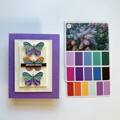
It had been awhile since I used my colored pencils, so I pulled out a sheet of Stonehenge White paper which works well with colored pencils. I also pulled out three cards from my Color Box 2. I knew I wanted to use purple, and the cards helped me choose the additional colors. I’m enjoying the Color Box. It gives me color choices I might not have chosen on my own.

WWMarchFlat2

Of course, I didn’t use all the colors, but it’s easy to find the ones I did use. After coloring the butterflies, I fussy cut them. I die cut two rectangles from The Greetery’s Crimped Frames, and added dimensional foam behind both of them before adding them to a purple card base. 
WWMarchFlat

I also added a strip of dimensional tape behind the body of the butterflies, so I could bend their wings a bit for more interest. The sentiment was white embossed on black with My Favorite Thing Itty Bitty Strips, also mounted with a bit of dimensional tape. Despite all the dimension, the card still fits in an envelope easily. 

In addition to Woodblock Wednesday, I’m posting this with two other challenges. When I enter The Triple B Challenge (Birds, Blooms and Butterflies) it’s almost always blooms. This time it’s a butterfly, and I could have entered a bird as well if I had only thought about it! I’m also sending this to the Simon Says Wednesday Challenge where it’s Anything Goes.

TB March 24 Wednesdayblog-logo

Special Day

  • by

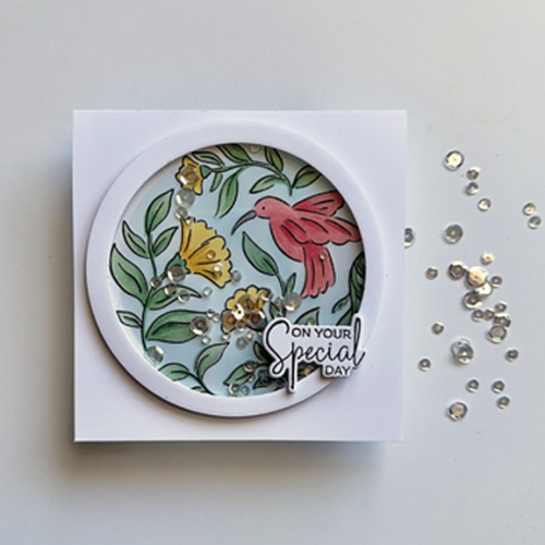
Just Us Girls and Time Out (two of my fave challenges) have joined together. “Birds” is the theme and I knew I had a great stamp set, Pure Joy, from Pinkfresh Studio that would fit the bill. Since it was a Pinkfresh Studio stamp set, I added a frame to the card to meet their March challenge: “Frames.” Finally, I have another entry to The Flower Challenge with my square card. I’ve been keeping up with my #100DayProject, and although I used this stamp set when I participated with my first Create and Connect event, it’s the first time I’ve used it on my own. 

SpecialDay

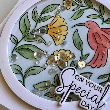
I used some Pinkfresh Studio inks to color the image with the accompanying stencil. Ellen Hutson’s Essential Circles worked perfectly to create the frame. To keep the clean look of the card I kept it all white and decided not to add any embellishments.

SpecialDayClose

I don’t often think to create a shaker card, but this seemed liked a good design for one. I frequently struggle with these, but this one came together so easily I may try this again soon! The clear sequins and drops were in my stash, but I’ve never been good about labeling such things so I have no idea who the manufacturer is. The sentiment was created with Betterpress using Spellbinders A Little Message. It’s always good to have another birthday card in my stash. 

Badge TO Challenge 259 Collaboration JUGS 0324-MonthlyChallenge-BlogTop_1100x copy 2024-3 March - Square Card-001

Color Hues 83

  • by

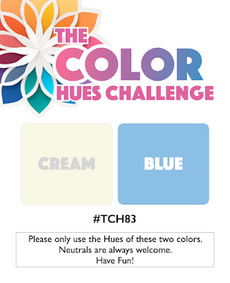
CH # 83 Cream and Blue.001

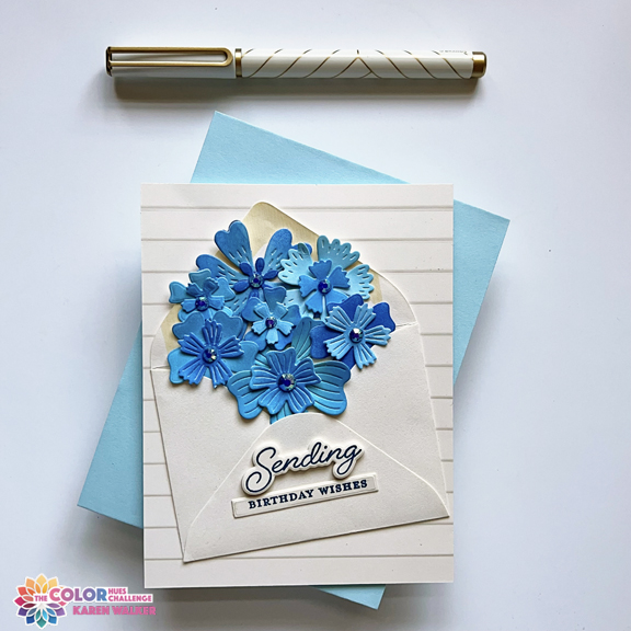
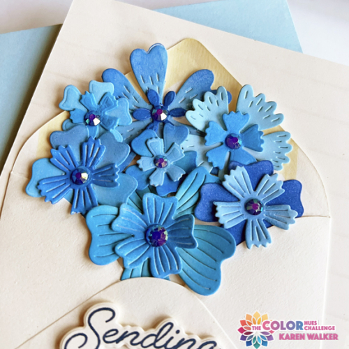
Carol has chosen Cream and Blue for the next Color Hues Challenge. I started out with one idea in mind and ink blended a group of white diecut flowers from My Favorite Things, Bold Blossoms, using two sets of Pinkfresh inks. The next morning, I totally revised my plan, but the ink blended flowers are still the centerpiece of the card. I decided to stuff an envelope with pretty blue flowers. The envelope die I own wasn’t nearly large enough, but I had exactly one small cream envelope in my stash, and it worked out perfectly.

CH83 copy

The sentiment stamp and die are new–part of the Greetery’s Love Letters release in January–Sent with Love Sentiments. To add some dimension to the greeting I stacked three of the diecuts under the stamped sentiment. Altenew’s Window Slats 3-D Embossing folder worked well as a background.

CH83Close copy

Instead of the die cut centers for the flowers I added a Pinkfresh Studio jewel to each. They add just the right amount of sparkle.

This turned out to be a fun challenge, and I hope you’ll think so, too, and join us in the gallery at Color Hues. You’re sure to find lots of inspiration from the Design Team members and our Guest Designer, Steph.

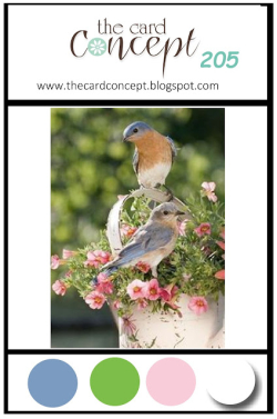
Since this is the debut of the new sentiment set, I’m sending this over to Darnell’s March NBUS Challenge. It also fits with her Dies/Die Cuts weekly “challenge” as this is the last day of Week 2. I’m also entering this in The Card Concept Challenge: Spring Has Sprung where a basket of flowers is a focal point of their inspiration photo. 

NBUSTCC205 March 2024


Lucky

  • by

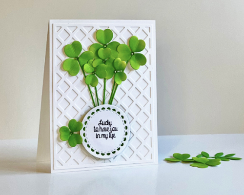
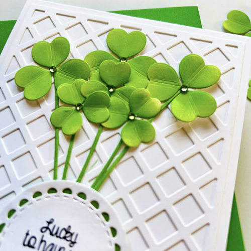
After seeing a couple of cards created with Papertrey Ink’s Into the Bloom: Clover, I thought it would make a great birthday card for Tracy, whose birthday is on St. Patrick’s Day. At the time, it was out of stock at Papertrey Ink, but luckily a friend had the die set and was kind enough to loan it to me.

Clover

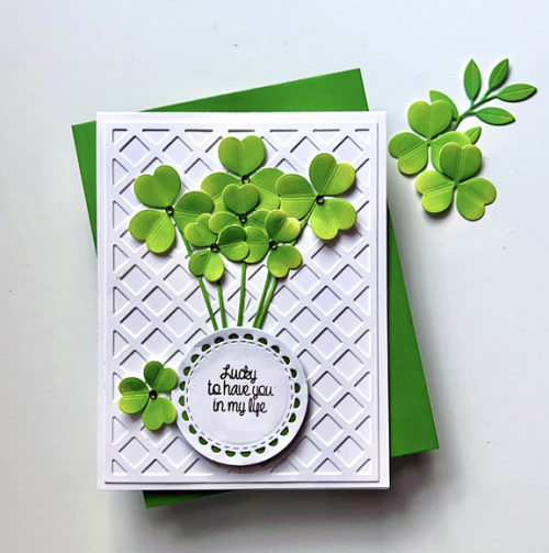
I die cut all the shamrocks from white cardstock and used finger daubers to ink blend them in two colors of green ink from Pinkfresh Studio. Ellen Hutson’s Lattice Background has become a favorite of mine, especially white on white. One of the designers for Papertrey Ink had used a circle to hold the sentiment as well as a place to tuck the stems of the shamrocks. I backed the circle from Reverse Confetti’s Lacy Scalloped Circle with a piece of New Leaf cardstock from Papertrey Ink to add some color to the bottom of the card.  The sentiment is from a new stamp set recently released by Simon Says, Lucky Horseshoe. 

CloverFlat

After taking the photos for this blog hop, one of the extra shamrocks landed on the card next to the sentiment. It was a lucky accident as the design is much improved with that added element, even though it did necessitate retaking some of the photos. 

CloverClose

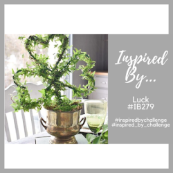
This card is off to Colorful Options: Green, Four Seasons Challenge with the great inspiration photo below, and Inspired By: Luck. I’m also adding this to Darnell’s site where her I.D.E.A. for the week is Dies/Die Cuts. In addition, it is the first time I’ve used the set where I got the sentiment. 

Colorful Options Website BadgeFour Seasons Spring 24IBLuck279NBUS


Birthday Shine and Sparkle

  • by

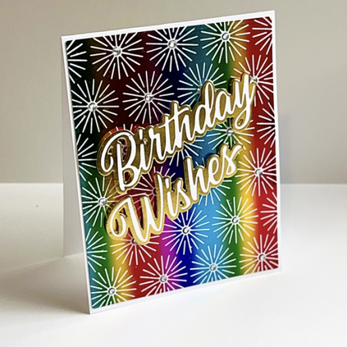
I rarely have a card with so much bling and sparkle, but I couldn’t resist using this reverse foiled panel to create a bold and bright birthday card. 

Wishes

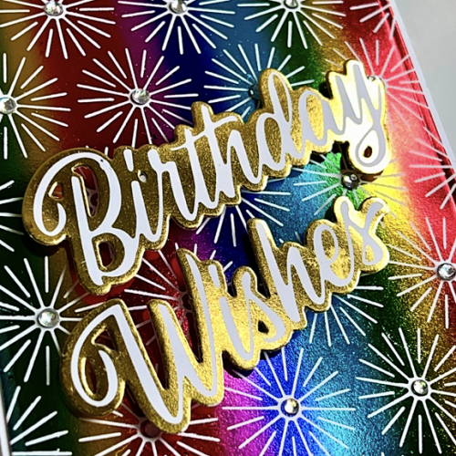
I had a free morning last week, and pulled out my foiling machine to create some backgrounds. This card uses Spellbinders’ Starburst hot foil plate. I made a couple of panels, one with gold foil and one with Rainbow Stripes foil. You’ll see those panels eventually, but when I pulled the foil off the Rainbow Stripes panel, I immediately pulled out my Solid Hot Foil Plate from Pinkfresh Studio which produced this panel which I love. 

WishesClose

The sentiment was also reversed foiled some time ago and die cut with Pinkfresh Studio’s Brushed Sentiments that came with a fabulous prize I won a year and a half ago. I don’t often use large and bold sentiments, but this card definitely called for one. I also added some Honey Bee Aurora Borealis Gem Stickers to each of the starbursts. 

I’m sending this one off to a new-to-me challenge, Word Power. It’s a challenge to showcase sentiments as a focal point on a card. It’s also going to Colorful Options where Rainbow is always welcomed. It’s another one for Addicted to Stamps and More: Birthdays. And, finally, it’s off to NBUS–it’s the Starburst’s debut on a card. 

WordPowerChallenge BadgeColorful Options Website BadgeBirthdays badgeNBUS


Birthday Basket of Flowers

  • by

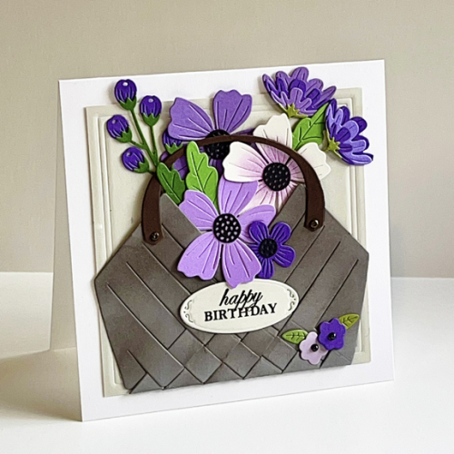
The Flower Challenge is looking for a square card. When my Seagrass Basket from the Greetery arrived this week, I decided to put it to use right away. I already had an envelope filled with die cut and assembled flowers and leaves from the Spellbinder’s Bold Blooms. 

Basket

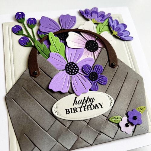
The basket can be assembled with or without weaving, but I opted to weave it together, it gives it additional dimension. It was die cut from Weathervane cardstock, and I added some ink blending to it to add some character to it. The most time consuming part of the card was getting the florals arranged–so many options! I dry embossed a square die from Ellen Hutson’s Essential Squares to create a frame on the Soft Stone square behind the basket full of flowers.

BasketClose

The pretty die cut label is part of the Seagrass Basket die. I found the perfect sentiment for it in Gina K’s Beautiful Baskets Additions which I need to put to better use soon!

With late March and April birthdays coming up, this card won’t be in the stash for wrong. Most of us in this area are anxious for some consistent Spring weather. I have to admit, however, that winter here has thus far been pretty mild. 

In addition to the Flower Challenge, I’m sending this off to the Triple B Challenge--this time for Blooms, and Addicted to Stamps and More: Birthdays.

2024-3 March - Square Card-001TB March 24         Birthdays badge


Colorful Thanks

  • by

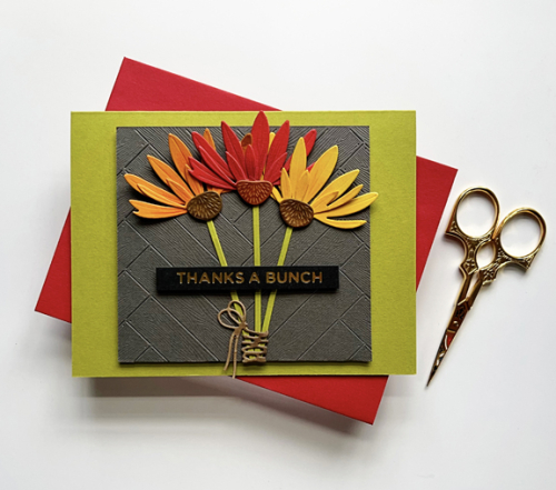
Quite some time ago, I was looking through an envelope with already die cut flowers, and came across the three on this card.

Bunch

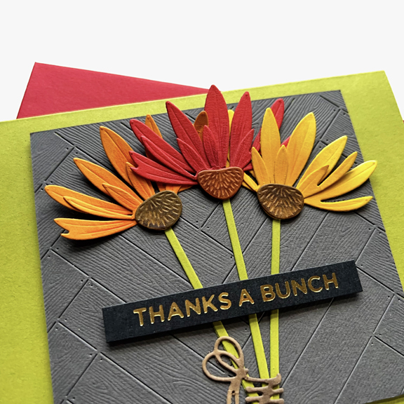
When it came to arranging them I tried all kinds of things, finally gluing them down on a card. When I looked at it, the balance on the card was way off. I hated putting it in the circular file. After waiting awhile, I finally chopped off the bottom half of the card and mounted it in this green card base that just happened to be sitting on my desk. I don’t know that I would have chosen this color, but I really do like it with the bright florals. They’re held together with a kraft wrap and bow from The Greetery.

BunchClose

The flowers are from the Papertrey Ink Into the Blooms. The background is also from The Greetery, the Herringbone Parquet, cut from Concord and 9th’s Mushroom cardstock. The sentiment is gold foiled with Spellbinder’s Everyday Sentiments II. 

My commitment to the #100DayProject is proving to be very helpful. Despite a busier than usual schedule (I’m now tutoring three days a week), I am managing to get at least 30 minutes a day in my craft room. I’ve been working on cards for the Design Team at Color Hues, finishing up cards started during the Pinkfresh Create & Connect event two weekends ago, and making sure I have the needed birthday cards for March. 

I’m also committed to editing our many, many photos from the safari for at least 30 minutes most days. The end is in sight. Meanwhile, getting things up on the blog and on Instagram is proving to be a bit more difficult.  

Although the mood board at the Triple B Challenge features soft pastel colors, anything goes as long as you have Birds, Blooms, or Butterflies. This blooms are off to the gallery.


Color Hues #82 – Two for One

  • by

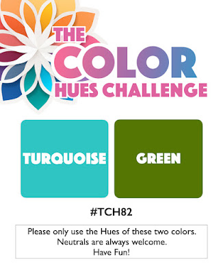
Tracey has chosen a beautiful color combination for the new Color Hues Challenge:

CH #82 Turq. and Green.001

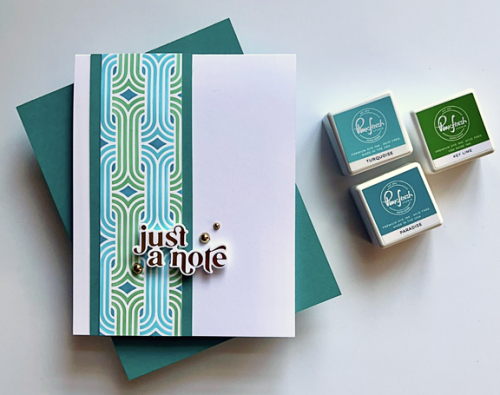
Right away I knew I wanted to use my new Alex Syberia stencil, Modern Weave. It’s a 6X6 stencil so I had two panels I could use for cards.

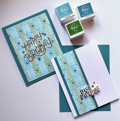
CH82X2

I started out by using the larger panel and adding it to a card base made with Concord and 9th’s Oceanside, a beautiful dark turquoise which matches the small diamond pattern in the stencil. You can see in this photo, the three Pinkfresh Studio inks I used to stencil the design.

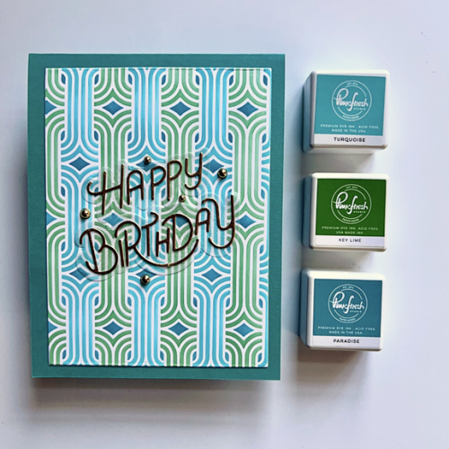
CH82Birthday

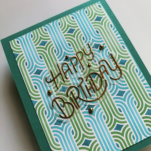
Here’s a closer look. The sentiment also new to me, My Favorite Things Stylized Happy Birthday, was die cut from gold metallic paper and layered on a vellum shadow die.

CH82BDClose

After die cutting the first panel, I was left with a narrow strip of patterned paper and wanted to make good use of this gorgeous stenciled design.

CH82Note

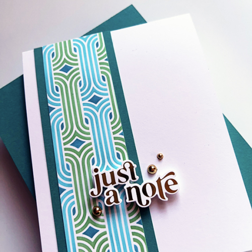
I backed the stenciled piece with some of the Oceanside cardstock and added it to a white notecard. 

CH82NoteClose

The sentiment, foiled in gold, is from Pinkfresh Studio’s Perfect Sentiments. Needless to say, this card pleases me with its CAS design. I embellished both cards with some gold pearls.

I hope you’ll check out all the great designs from the Color Hues Design Team and our Guest Designer, Tenia. Please join us for this bright and happy color challenge! 


There are two CAS challenges where my second card fits the challenge: AAA Cards: Anything CAS Goes and Addicted to CAS: Geometric. 

AAA259 ATCAS_253_Geometric


Happy Birthday, Matt!

  • by

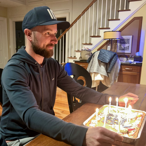
It’s hard to believe my youngest is now 41, but that’s a fact! Tracy and I celebrated with Matt and Betsy on Saturday night at his favorite restaurant. Tonight we joined them for cake and opening presents. 

IMG_3906

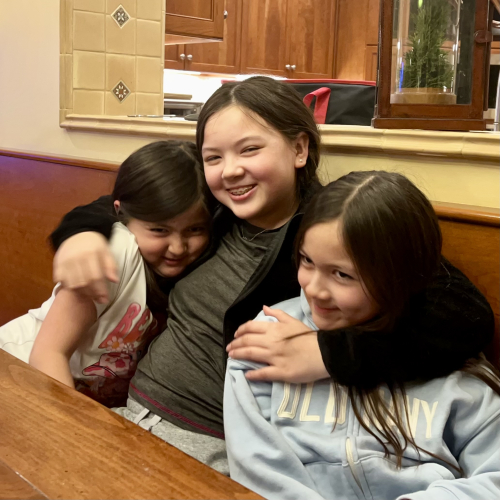
And a photo of my granddaughters being a bit goofier than usual. Their power was out due to high winds here so we celebrated at Betsy’s father’s house. I’m not sure that’s an excuse but they were more wound up than usual. No outage here, but we have a generator so we wouldn’t be without power for long.

IMG_3911

Here’s Matt’s birthday card:

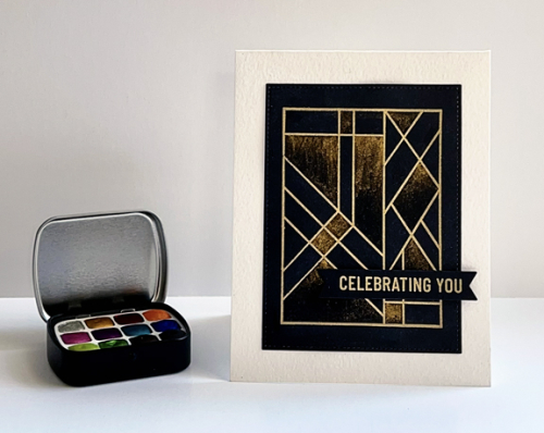
MattBD

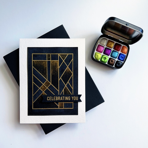
I embossed Uniko’s Block Arts Décoratifs in gold on True Black cardstock. I knew I wanted to use my Iuile metallic watercolors but knew I wouldn’t need a lot of water to do what I intended so went with standard cardstock instead of watercolor paper. 

MattBDFlat

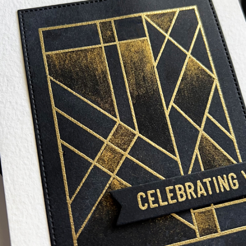
I wanted to try a “fade out” technique with the gold metallic watercolor. It turned out to be pretty easy to do, and I like the end result. 

MattBDClose

The Pinkfresh Studio Basic Banners: Celebrate was embossed with gold and die cut with the matching die. I started this card with a couple of challenges in mind, but in the end it wasn’t CAS enough to enter in any of them.


Woodblock Wednesday

  • by

It’s the last Wednesday in February (and our son’s birthday!), so it’s also Woodblock Wednesday hosted by Amy Tsuruta.

Featured-woodblock-Wednesday-graphic-copy-1

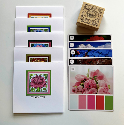
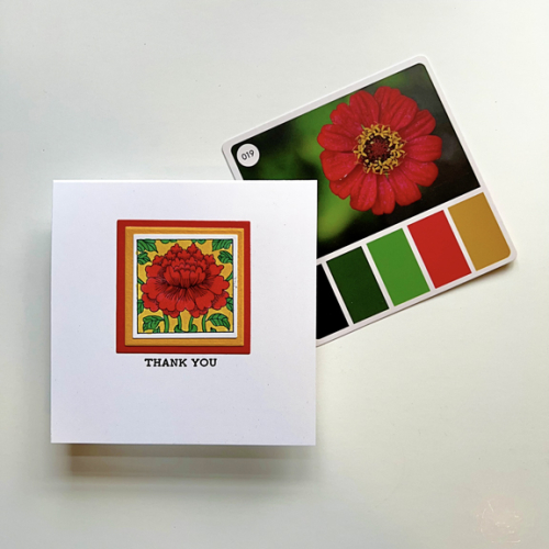
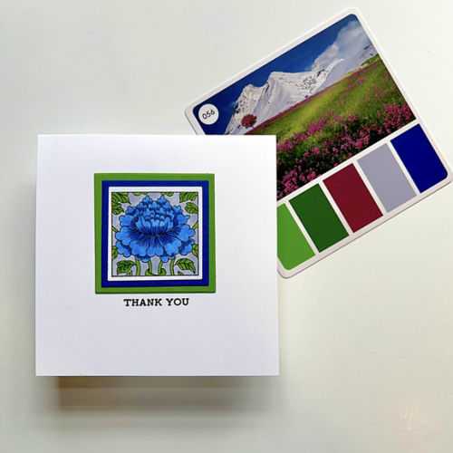
I’m in need of thank you cards, so I decided to pull out a favorite woodblock stamp by Paper Parachute and, for inspiration, five cards from the Color Cube which I’ve owned for several months but never used. As you can see, each card features a photograph (and inspiration for photography) as well as five colors drawn from the photo. I chose three of the colors from each card to color the floral design with Copic markers. I was a bit apprehensive trying to color such a small image with Copics but it actually went pretty well. I ended up with five thank you notes.

CardsColorCards

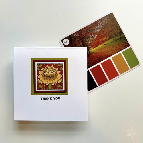
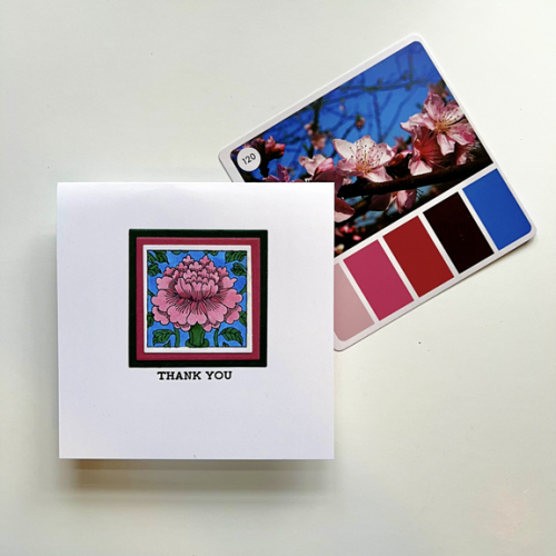
All five cards use the same products, so I’ll just share them one by one. Some of the different color schemes produce cards with a different vibe which is nice when deciding which one to use for a note.

Card1

Card2

Card3

Card4

Card5

I’ll be back later tonight with a birthday post for Matt. I’m hoping the girls will be receptive to a photo with their dad. Either way, I’ll be back to share his birthday card. 


#100DayProject-Day 2

  • by

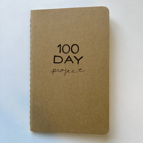
I really do enjoy how a project evolves as you work on it. Yesterday I decided to start a little notebook for the 100 Day Project.

Notebook

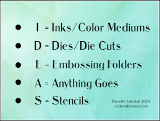
I set a 30 minute timer when I begin, and when it ends, I jot down how much I accomplished in that 30 minute period. Both yesterday and today I continued on and finished some cards. I can’t share yesterday’s cards yet but today’s is #1 for the stash. My internet friend, Darnell, has also started a project to help her work through her stash. Here’s her plan:

IDEAS2

Each week she choose one of the items on the list to focus on. She’s been working on one a week since the beginning of February so this week it’s Embossing Folders. No surprise, I had a new embossing folder in my NBUS box, so I pulled it out to play along.

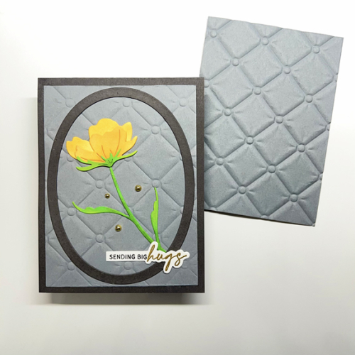
BigHugs

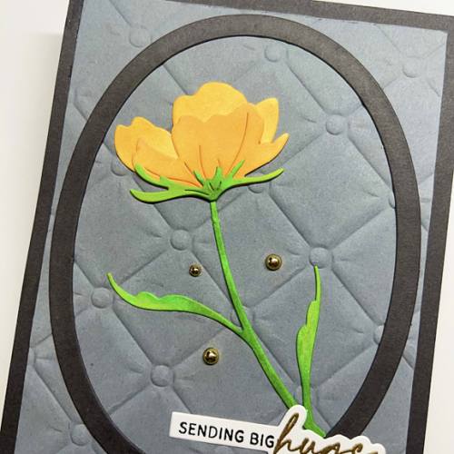
Spellbinder’s Tufted 3-D Embossing Folder is huge so I got two pieces from it. You can see both of them here. I ran the piece on the card through my die cut machine with Gina K’s Master Layout #1 and you can see how it flattened the pattern. I decided I was fine with that although I could have easily trimmed down the other piece to use. I used Smoky Shadow for the card base and the Waffle Flower Oval Frame. They appear a bit darker in the photo, but I’ve retaken the photos twice so I’m giving up on accuracy. Sadly, the card is much prettier in real life than in the photos. Some days are just like that.

BigHugsClose

The floral die cut is also new–Simon Says Morning Blossom. I die cut it from white card stock and ink blended it using two orange, one yellow, and two green  Pinkfresh Studio inks. The oranges are accurate in the photo but turned out to be a much more yellow hue than I anticipated. The sentiment is from an old set by The Ton, Easy Expressions.

Good photos, not withstanding, I’m sending this over to Darnell’s NBUS Challenge and to the Can You Handle the Pressure Challenge which always wants embossing as a focus of the card. 


#The100DayProject

  • by

100DayProject copy

Today is the first day of the 2024 #100DayProject. It’s been a few years since I participated, but I had an urge to find a project this year. It took me awhile because I wanted the project to move me ahead with one of my intentions for the year. On the top of that list is getting through all the unused, but beautiful product, I have in my craft room. I also know that my time from day to day varies a lot. I just started tutoring in an ESL Special Needs first grade two mornings a week, and continue to be involved in committees at church as well as other commitments. Finally, I think I’ve fashioned a project that should work for me.

GOAL: to use my unused stamps, dies, and stencils. Work a minimum of 30 minutes/day using unused products with the goal of creating“stash” of cards during the 100 Day Project.

I also know that it’s perfectly legitimate to make up the time if there’s a day I can’t commit to 30 minutes. But actually, they should be pretty infrequent. There will be at least one week when we are away before the end of the project (May 28th) but I can certainly take some supplies with me to work on while I’m away.

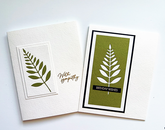
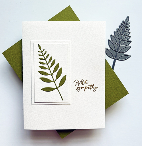
I do have some cards to share today. These were completed yesterday. One of my dear friends passed away on Valentine’s Day. I almost never have a stash of sympathy cards made ahead of time, so I needed one to send to her husband of 59 years after the service this morning. It ended up being a two-fer:

LeavesX2

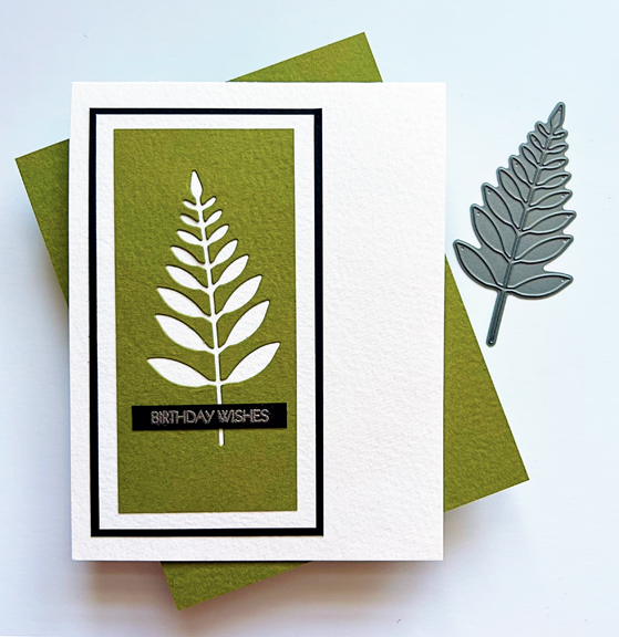
After I die cut the leaf for the sympathy card the green piece of Bazzil Prismatic paper looked perfect for another card.

LeavesSympathy

For the sympathy card, I die cut two rectangles from Ellen Hutson’s Essential Rectangle dies and layered them on top of one another. I then added the leaf before adding it all to the card base created with cold press watercolor paper. The gold embossed sentiment is from a new set from Honey Bee, Be Still.  I always love a CAS design, but I almost always rely on a CAS design for sympathy cards.

LeavesBD

The birthday card came together quickly. I trimmed the edges of the die cut piece and layered it twice-once with cold press watercolor paper and then with a piece of Bazzil Prismatic black cardstock. The Prismatic paper has a wonderful texture. I purchased it years ago, and rediscovered it when I redid my craftroom in the fall. This is the only piece of green I have, but I have a pretty large folder of it in different colors. I don’t know if it’s still available. 

The silver embossed sentiment was one that I had embossed earlier and was in one of my “sentiments to go” envelopes. It’s from Pink and Main’s Special Day sentiment set–one that’s seen a LOT of use. 

I’m sending the sympathy card to Simply Clean and Simple for my second entry this month, and to Time Out Challenge where they are celebrating their 10th birthday! (I’ll have another 
one for them later.) 

SCS blog headerTimeOut257

.)


Color Hues #81

  • by

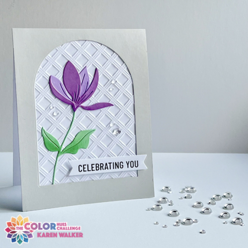
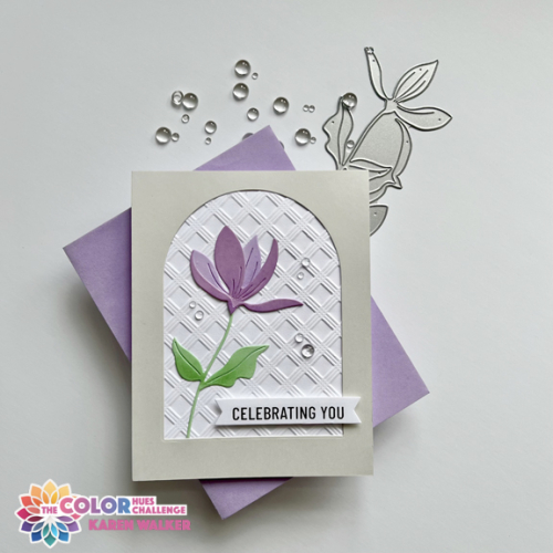
A new Color Hues Challenge is live, and Stef is our wonderful hostess. She’s chosen Lilac and Mint as our inspiration.

CH #81 Lilac and Mint.001

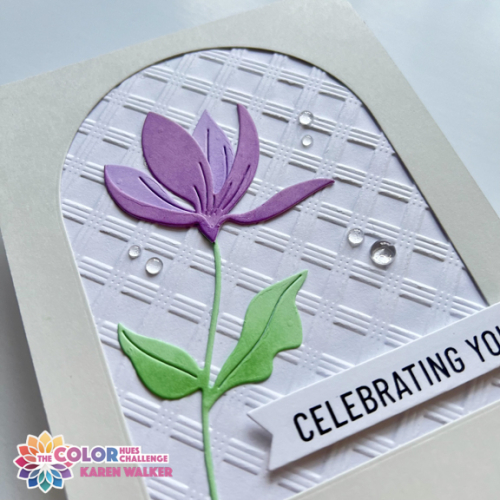
I’m continuing with my goal to use all my unused products this year and started out with an elaborate die set. About halfway through the process, I totally changed directions, choosing a new die from Simon Says and a new 3-D embossing folder from Altenew. I love the simplicity of the Fresh Cut Floral and the Basic Plaid embossing folder added wonderful texture to the background.

CH#81

The floral was die cut with “Lilac Grace” cardstock from Papertrey Ink, adding a darker hue from a 6X6 paper pack from Memory Box. The leaves were die cut from “Mint” by Paper Source. I wanted a bit more dimension so added some soft ink blending to the leaves and petals with Catherine Pooler’s “Wintergreen” ink, and Simon Says “Lilac” ink. 

CH#81Flat

The arched design is a CASE of a card by Joan Bardee that was posted on the Spellbinder’s blog. I die cut the “Soft Stone” cardstock with an arch from Ellen Hutson’s Essential Arches. The sentiment is from Pinkfresh Studio’s Basic Banners: Celebrate. I added some clear Raindrops by Lucy’s Cards to finish it off. 

CH#81Close

I’m always happy with a Clean & Simple card and glad to have another birthday card in my stash. I hope you’ll hop over to the Color Hues Blog and check out the wonderful cards created by our Guest Designer, Bonnie, and the Design Team. Hope to see your creations in the gallery in the next couple of weeks.

I’m sending this off to the Seize the Birthday: Anything Goes and the Simply Clean and Simple Challenge–Anything Goes.  And another one for NBUS! I’m hoping to fill Darnell’s gallery in the next few weeks with Never Before Used Schtuff!

STB-AnythingGoesSCS blog headerNBUS