Skip to content

Stamp It!

  • by

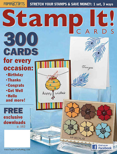
I got a preview copy of Papercraft’s new special issue this week.

Stamp It cover

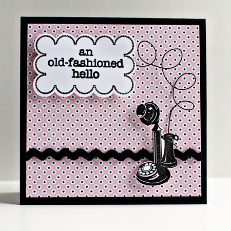
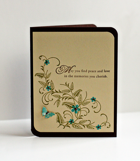
I was lucky enough to have two cards published in this issue. I’ve missed the last several submission calls, so it was fun to see themin print. Here are the two cards that were published.

Hello

PeaceLovew

Supplies:

Old-fashioned Hello
Cardstock: True Black, Select White (Papertrey Ink)
Patterned Paper: Happy Spots (Papertrey Ink)
Stamps: Just Saying Hi (Hero Arts) & Fillable Frames #5 (Papertrey Ink)
Rickrack and black wire from stash

Sympathy Card:
Cardstock: Fine Linen & Dark Chocolate (Papertrey Ink)
Stamps: With Sympathy (Papertrey Ink)
Gems: A Muse Studios
Specialty Ink: Illuminate (Clearsnap)


Papertrey June Blog Hop

  • by

Bloghoplogo

It’s the 25th of June already, and that means the Papertrey Blog Hop. This month’s challenges was a color inspiration challenge.

PapertreyInk

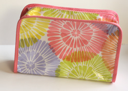
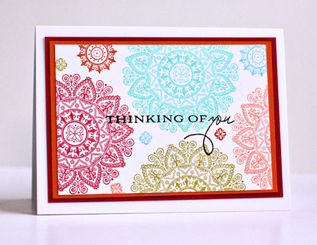
All these beautiful colors inspired me to create a card with the new Mehndi Medallion stamps that arrived this week. I was also inspired by the design of the little bag I got as a bonus at the Clinque counter this week.

Clinque

I started with the color palette from the Papertrey inspiration piece and pulled out a pile of Brilliance inks, most of which have a sheen to them which adds to the look of the card IRL. Then I used the design from the cosmetic bag, but rather than overlap the images I left some space between them and filled in with some of the smaller designs. The sentiment is from Botanical Silhouettes and I love how it just seemed to enhance the overall design of the card. So, finally, here’s my interpretation of the two.

ThinkingOfYou

Cardstock:  Select White, Pure Poppy & Orange Zest

A Scrapbook Layout!!!

  • by

Yes, I do scrapbook, but it sure seems to be sporadic. I still haven’t edited all the photos from our trip and we’ve been home seven weeks. It’s only four more weeks until we leave for Vancouver and Alaska! I did, however, get one photo from our trip scrapped for a Scrap-Mart blog post.

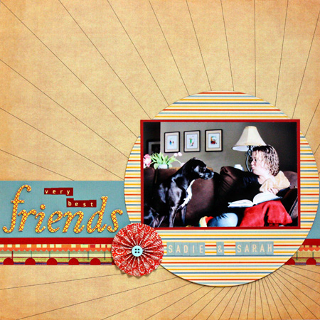
I love watching Sarah and Sadie interact. Sadie is the sweetest dog I’ve ever known, and she gets along with everyone. But she and Sarah have a special relationship.

Sadie&Sarah

I loved this Sassafrass Lass paper which came in a Studio Calico kit. The radiating lines prompted me to mat the photo on a circle from October Afternoon’s Rocket Age line. I used some American Craft Thickers for the title along with October Afternoon and Cosmo Cricket letter stickers. The paper flower is from American Craft, and the border is the edge of the Sassafrass Lass paper.

The Blue Hour

  • by

I’m loving the Night Photography class with Kent Weakley. I’ve learned so much in just the first three lessons. Our first assignment was to take a photo during the Blue Hour–that time after sunset before true darkness. Here’s a set of five photos I took the other night of the Rochester skyline with the time each photo was taken. The middle photo is the one I posted for the Blue Hour assignment.

NPPhoto1w

Taken at 8:34 pm

NPPhoto2w

Taken at 8:37 pm

BlueHour4X6w

Taken at 8:40 pm “The Blue Hour”

NPPhoto3w

Taken at 8:46 pm (The sky is still very blue.)

NPPhoto4w

Taken at 8:52 (The blue is fading. This shot was taken from the bridge instead of the park along the river.)

Happy Father’s Day

  • by

In the U.S., today is the day to celebrate dads. I’m biased, of course, but I think my kids have the absolutely best dad around. He’s patient, kind, generous, intelligent, handy, and fun to be around. This year is the first year neither child was nearby for either Mother’s Day or Father’s Day. We hear from them, of course, but it does seem different.

We’ve already had a busy day. We took a longer walk than usual this morning, and clocked just about three miles. We’ve been to visit friends, the grocery store, the farmer’s market, and to the garden to water our plants. In a bit, we’re off to the pool with friends and will grab a bite to eat with them. Then we’re off to the movies. The rest of the week looks equally busy, so although I have things to share, I’m not sure how much time there’ll be for blogging.

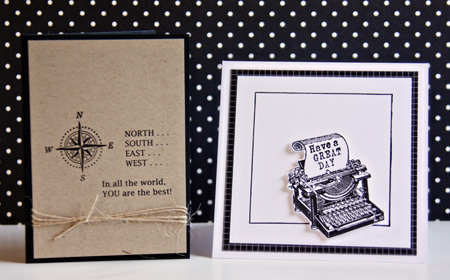
Here are the two Father’s Day cards I made this year. For Tracy on the left (based on the inside of a card by Betsy Veldman in a Card Creations magazine), and for his stepfather on the right.

Father'sDayCards

Supplies:

Compass Card:
Cardstock: True Black and Kraft (Papertrey Ink)
Stamp: Father Knows Best (Papertrey Ink)
Computer generated sentiment (Lucinda Fax font)
Twine (Papertrey Ink)

Typewriter Card:
Cardstock:  Select White (Papertrey Ink)
Patterned Paper: 2008 Bitty Box Basics (Papertrey Ink)
Stamp: Office 101 (Clear Art Stamps & Framed (Papertrey Ink)


Hats Off to the Grad!

  • by

I needed three graduation cards this weekend, and was able to combine them with three different challenges. I used the same stamp set on all three, one reason why I love stamping. Just one set can give you quite different looks. The first card is for the Moxie Fab Tuesday Trigger and the Casual Friday color blocking challenge.

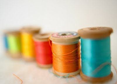
Here’s the Tuesday Trigger called Rainbow Bright:

RainbowBright

And the Casual Friday challenge:

FotoFlexer_Photo-CFC7

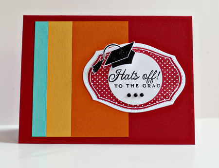
And the first of the graduation cards:

ColorBlockGrad

And a peek at the inside:

InsideColorBlock

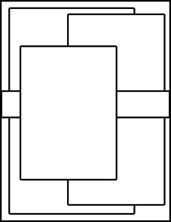
The next card, for my nephew, is based on the CPS Sketch for this week.

222

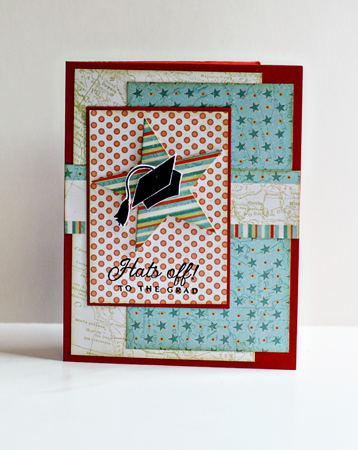
And my card:

RoadTripGrad

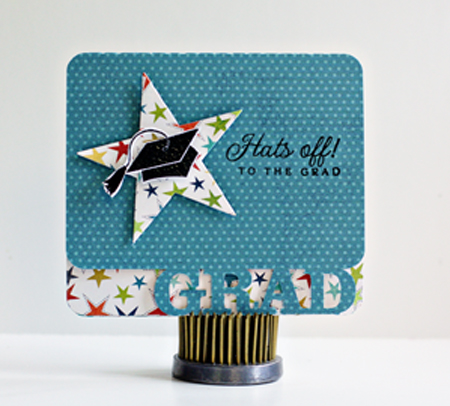
The last card is probably my favorite, and it’s not for any challenge. I cut the card itself on the Silhouette, and then finished it off with my stamps and dies.

SilhouetteGrad

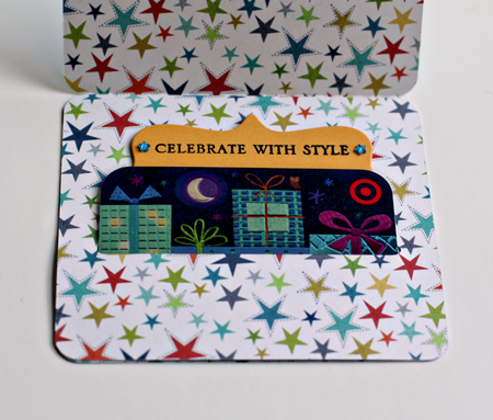
And the inside which holds a gift card. The message pulls out for a handwritten wish for the graduate.

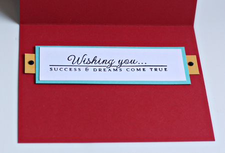
InsideSilhouetteGrad

I’m posting this late tonight instead of tomorrow morning because my friend and I are off to Buffalo early in the morning to the CKC Convention. I wasn’t planning to attend, but Mary was interested in going, so it didn’t take much to convince me. I’m taking one scrapbook course, one technique course, and one products-based course, all by companies that I admire. There’ll be a recap in a few days!

Supplies:

Colorblock Card:
Cardstock: Pure Poppy, Hawaiian Shores, Summer Sunrise, Orange Zest (Papertrey Ink)
Stamp:  For the Graduate (Papertrey Ink)
Die: Mat Stack 1 (Papertrey Ink)
Gems: Kaiser

CPS Card:
Cardstock: Terra Cotta Tile (Papertrey Ink)
Patterned Paper: Road Trip (Papertrey Ink)
Die: Seeing Stars (Papertrey Ink)
Stamp: For the Graduate (Papertrey Ink)
Chamomile Tea Dye Ink (Papertrey Ink)

Gift Card Holder:
Silhouette
Cardstock: Summer Sunrise (Papertrey Ink)
Patterned Paper:  Lime Twist Out of the Blue (My Mind’s Eye)
Stamp: For the Graduate  & Big and Bold Wishes (Papertrey Ink)
Die:  Seeing Stars & Fillable Frames #1 for the top of the inside sentiment (Papertrey Ink)


CR84FN Color Challenge

  • by

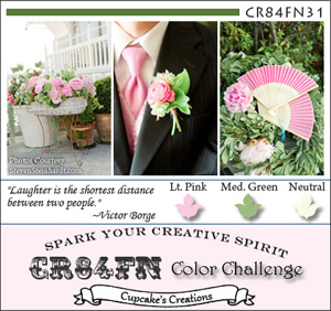
I love this week’s color combination for CR84FN. I’m getting this challenge in just under the wire, but missed the Waltzing Mouse Sketch challenge by just an hour or so! Here’s the color challenge:

CR84FN31 Graphic

And the sketch, even though it’s too late for the challenge:

WMSC51_thumb[1]

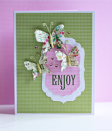
Here’s the card. No one specifically in mind for this one, so it will go into the stash. I pulled out a thank you note and a sympathy card this morning and sent them on their way. It’s good to have cards ready to go when you need them.

Enjoy

Supplies:

Cardstock: Select White (Papertrey Ink)
Patterned paper:  A Muse
Dies: Labels Four (Spellbinders)
Butterflies: Prima
Gems: Reflections (Michaels)
Sakura Jelly Roll Clear Glitter pen (for butterflies’ bodies; hard to see in the photograph)


Project 64: Guest Blogger

  • by

Project64


I’m so honored to be a Guest Blogger at Project 64 today. You can find my captures for Olive Green here.


In Appreciation

  • by

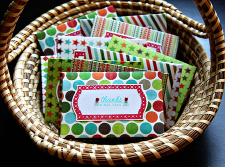
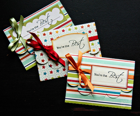
It’s that time of year here to express appreciation for all the work people do throughout the school year. Although I no longer have kids in school, I’m still involved with the Youth Ministry program at our church and have become the designated creator of gift card holders. The first batch I made with the new Papertrey Ink die “Seed Packet” after I saw these darling ones at Lime Doodle. The papers are all from MME’s Lime Twist “Fly a Kite” paper pad. Bright and cheerful, and good for both men and women. I cut the Fillable Frames #11 die and then stamped it with the coordinating frame. The sentiment came from Autumn Abundance, all Papertrey Ink products.

ThanksForAll

Then I made another set which I posted on the Scrap-Mart blog. These were cut on my Silhouette which makes short work of  projects like this. You can cut two at once from an 8.5X11 piece of cardstock. I used papers from October Afternoon’s Campfire papers, labels from the same line, and stamped them with a sentiment from Heartfelt Creations. On these I added a bit of ribbon.

GiftCardHolders

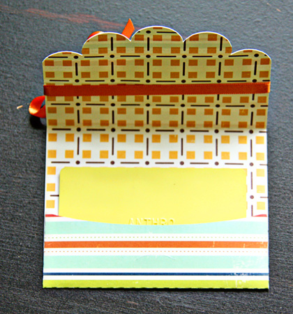
Both sets are cut from two-sided papers so the inside is pretty cute, too.

InsideGiftCard

Thanks!

  • by

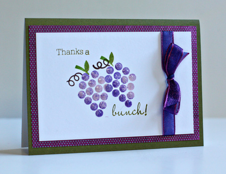
I have two thank you cards to share tonight. The first one is for two challenges, first a “fruity” challenge at the Simon Says Challenge blog and also for this week’s Make It Monday at Papertrey Ink. It’s been a few weeks since I’ve been able to play along there, and I’ve missed it. The technique this week is rock ‘n roll stamping. You can check out the video here.

ThanksABunch

I stamped the bunch of grapes (Fruit Fusion: Grapes–Papertrey Ink) first with Lavender Moon ink and then “rolled” it in Memento Grape Jelly ink. (How appropriate is that?) I painted on some Glossy Accents to give the grapes dimension and finished it off with the sentiment from the same set. The cute paper is from the MME’s Lime Twist “Happy Go Lucky” paper pad and the ribbon is from my stash. The premade card is from Memory Box. I love these cards because they have a white inside which makes it easy to write your note.

The next card isn’t for any challenge. I had some scraps laying around on my desk a week or so ago, and decided to put them to good use. It’s always good to have thank you notes in your stash.


ManyThanks

Cardstock: Pure Poppy (PTI); Patterned paper: Circa 1936 (Cosmo Cricket), journaling card (Jeni Bowlin); flower (Prima), sprayed with Mr. Huey mist (Studio Calico); star pins (Maya Road), one colored with Copic R29; die: small scallop (PTI); rick rack from stash.

One Layer Framed

  • by

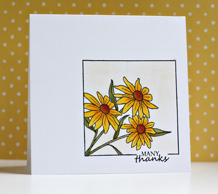
I needed a thank you note, so I thought I’d join in at Less is More with this week’s challenge for a one layer card with a framed image. The Friendship Jar series at Papertrey Ink has several wonderful flower images that are easy to adapt to a frame. The last time I used this technique I used the tulips, this time I picked the daisies. Mine in our garden are budded, but not quite in bloom yet. They’re one of my favorities because they bloom for a long time, and last a long time in a vase.

ManyThanks

This is my second post today. You can find my shots for Project 64 here.

Cardstock: X-Press It Blending (Copic)
Stamps: Friendship Jar Additions, Framed, Take Three: Summer (Papertrey Ink)
Copics: Y15, Y17, YG 93, YG 95, YR 24, E 09
Ink: Memento, Chamomil Tea Dye (Papertrey Ink)


Project 64: Timberwolf

  • by

Project64

This has been an interesting color. My husband and I have been walking every morning in Highland Park and a couple of mornings I’ve taken my camera and colored card with me on our walks. When I threw the card on this bench, it was a near perfect match.

ParkBenchw

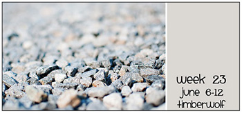
And it’s not a bad match with Brooke’s sample, though it tends to be a bit more brown. And that’s how several of the photos looked when they went up on the computer.

Week23 timberwolf

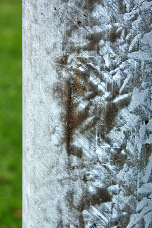
These, however, are a perfect match with my colored card, but seem a bit gray with the swatch above. It’s a puzzle.

LightPolew

A light pole. I’d never give this a second glance on an ordinary day, but the texture is quite interesting.

Squirrel&Benchw

The squirrel’s fur around his neck is a good match and so is the bench behind him.

RockWallw

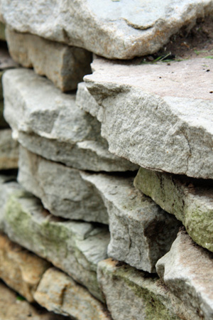
A rock wall along someone’s garden.

DBRocks&Flowersw

And the rocks and the flowers, my favorite.

DYI Smashbook

  • by

I said I wouldn’t (twice, even), but I broke down and made a Smashbook, and I’m already glad I did. I first saw this on Rinda’s blog and then on Mel’s. Both times, I said, “not me.” But after watching some of the videos linked on Rinda’s blog and the Counterfeit Kit site, I had an idea for a somewhat different version to meet my somewhat different needs. So here it is. I decided I wanted a three-ring version so I could add, subtract, and move my pages around. I started with a lovely binder that I bought nearly five years ago, and never found a good use for. I kept the cover simple, add some American Craft Thickers and stickers from my stash. (In the spirit of the Counterfeit Kit Challenge, all the supplies were from my stash.)
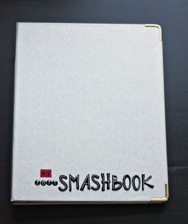
Cover

Then taking a selection of bright, cheerful Papertrey Ink papers, I created dividers and tabs. The tab punch I had was way too big, so I die cut six tabs from a Nestability Labels Eleven die, and adhered them to the back of the dividers. Most of the divider headings came from one of the Smashbook videos.
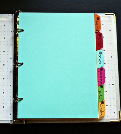
Dividers

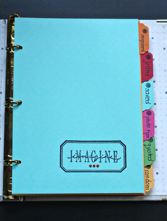
Next I raided my stamps for images that seemed to fit the divider topics. Inspired (Stampers Anonymous; Labels–Jeni Bowlin):
InspiredDivider

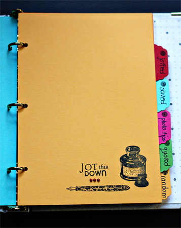
Jotted (Take Note-Papertrey Ink; Alice in Rubberland; Stampa Rosa):
JottedDivider

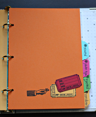
Saved (Odds & Ends–Tim Holtz; Daily Junque–Pink Paislee);
SavedDivider

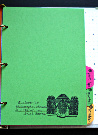
Photo Tips with an Ansel Adams quote (A Girl & Her Camera–Unity):
  PhotoTipsDivider

Quoted (Labels–Jeni Bowlin; Daily Junque–Pink Paislee; Take Note–Papertrey Ink):
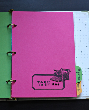
QuotedDivider

And Random (Freestyle–Teresa Collins; Postage–Papertrey Ink):
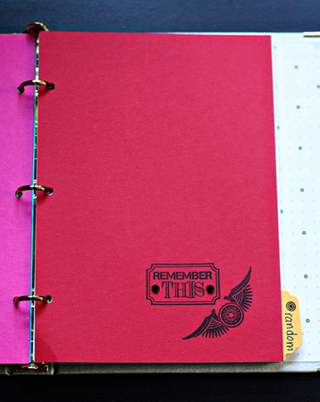
RandomDivider

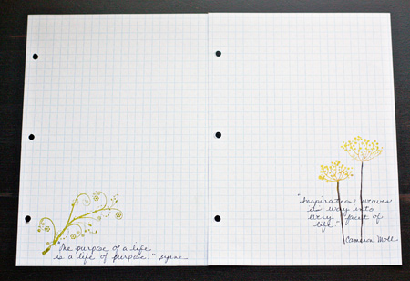
The notebook came with lined paper, but my favorite paper is graph paper so I cut and punched a lot of graph paper to use as well. I stampd a few pages and added some quotes to get started. (Stamps: Insightful Meadows & Authentic Man; Kit of the Month–Unity)
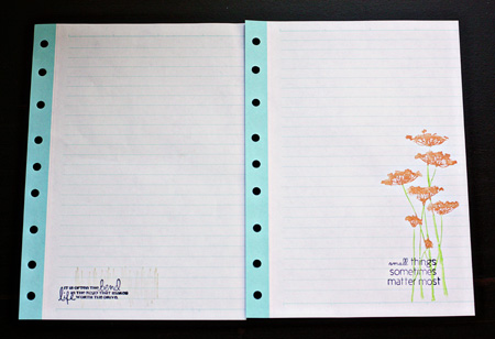
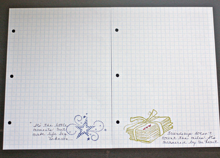
LinedPaper

GraphPaper1

GraphPaper2

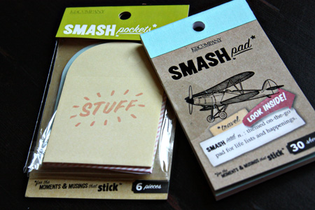
And then look what showed up in this month’s Studio Calico kit. I’m sure I’ll be able to incorporate some of this into the notebook as well.
SCSmash

One of my reasons for creating the notebook this way was to have a place to record information I don’t want to forget. I always carry a tiny Moleskin notebook in my purse and keep one by my computer. I have two filled notebooks and need to go through them to see what I need to hold onto. I’ll just add the information in the correct section. Today when I started going through the beautiful cards on the Papertrey June Release blogs, I started a page in the Inspiration section with ideas for little details to include on cards. Here’s a look at one of them.
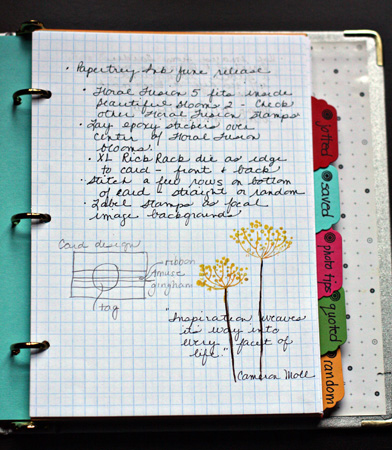
CompletedPage

So thanks, Mel and Rinda, for giving me the inspiration to get organized.
Kent Weakley Course Review

  • by

My resolve about not taking more classes vanished in an instant when I saw that Kent Weakley was offering his night photography class this month. I’ve wanted to take this class since I first read about it last November. I think I can count on one hand the night shots I’ve taken that worked out well. But as much as I wanted to take the class then, I knew I was unlikely to venture out in the cold at night. Now the weather is perfect for night photography and Kent’s class begins tomorrow. Earlier this spring I took Kent’s e-class on composition, so now I am even more excited about this new class.

Kent’s classes work a bit differently than other online photography classes I’ve taken. Rather than getting a new lesson once or twice a week, you get access to all the lessons and galleries when the class begins. For the night photography class, there are 15 lessons and student galleries in the course, and you have 60 days to go over the material, get your shots, and post in the galleries for comments. The course material is presented so you can copy and paste the lessons into a document and refer back to it, even after the class is completed. I read and reread the lessons in the composition class, looked at the photos in the student gallery and learned even more by reading Kent’s comments about the student photos. There’s a good video and description of the Night Photography class here.

I’ve done a lot of reading about composition so there wasn’t a lot of brand new material in Kent’s composition class, but it was presented in a way that helped me internalize the principles of composition. I got lots of time to practice on our recent road trip. Despite the fact that I wasn’t feeling all that great, every time I picked up the camera I automatically started thinking about composition. There are a lot more photos from this trip that need no cropping, and to my mind, are well-composed. Kent repeatedly reminded us that we are responsible for everything in the photo! If you see something you don’t like, don’t just take the shot and hope to photoshop it later, do something about it in the field. I found that almost every time, I could improve the composition before I took the photo. The other noticeable improvement I’ve seen is in the responses I get from the photo critique I attend once a month at a local photography gallery. I’m also better able to look at others’ photos and see the compositional elements that make a photo great. Kent’s blog is a gold mind, too, if you’re looking for great advice on a wide variety of photographic topics. His short, concise videos are winners!

A couple of my favorite photos from the trip were posted here, but I’ll leave you with a couple others I like as well.

Coastw

The Pacific Coast

SculptureVieww

Denver Botanic Gardens

ViewSanSimeonw

The Pacific from the Hearst Castle

Moxie Fab Tuesday Trigger

  • by

Classically Modern

I just loved this Tuesday Trigger at Moxie Fab this week. I think I’m too late to post it over there, but by the time I realized I’d missed the deadline, I was well into making this card. (Edited to add: It seems I wasn’t too late, the linky was still active, and I’ve already had a comment!)

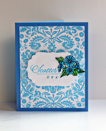
ScatterSeeds

The blue is a bit different but as close as I could get with the inks I have, but I think this Hero Arts background stamp mimics the beautiful floral design in this bedroom.

Supplies:
Stamps: Classic Fabric Design (Hero Arts), Year of Flowers Collection (PTI)
Cardstock:  Neenah Solar White, Blueberry Sky (PTI)
Die:  Labels Four (Spellbinders)
Pearls:  Amuse Creative Candy
Ribbon from stash