Skip to content

The Home Album

  • by

I’ve been working on our Home Album this week and finished five layouts about a little house we lived in for just a year. It was fun to look through the photos (we moved from there nearly 26 years ago) and see what items of furniture we still have (quite a bit), what art work is still hanging on our walls (not much), and how very young Sarah and Matt were. I know we have a photo of the outside of this house, but I can’t put my hands on it, so the first page is a photo-less page. Should I ever find it, I’ll add it to the page.
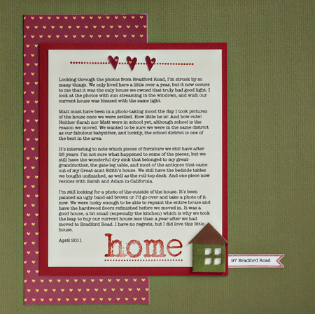
IntroPage
Cardstock: unknown (green–would love to find more of it) & Light Totally Tan (Worldwin), Patterned Paper: “Honey I’m Home” (Bella Blvd); chipboard house (Maya Road) inked with Tim Holtz’s Distress Stains (love these!); Stamps: “Home is Where the Heart Is” (Technique Tuesday), Faux Ribbon & Banner Builder (Papertrey Ink).
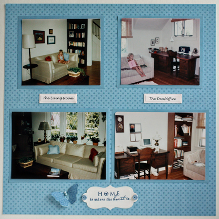
LivingRoom:Den

Cardstock: Bazzill (cream) & light blue from stash; Patterned Paper: Bo Bunny; Stamps: “Love Lives Here” (Papertrey Ink); Brads: Making Memories; Dies: Grommet Tags & Happy Everything (Spellbinders) and Butterfly (Papertrey Ink)
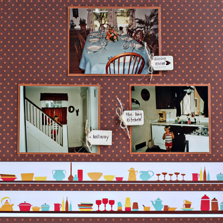
KitchenDining

Patterned Paper: “Abode” (American Craft); Tiny Tags die (Papertrey Ink), Stamps: “Bitty Background Blocks;” Antique Linen Distress Ink, and twine (Papertrey)
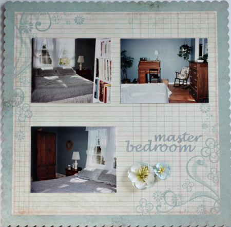
MasterBedroom

Patterned paper: “So Sophie” (My Minds Eye); Cardstock: Medium Heritage Gray (World Win); Silhouette (for the title); Flowers: Recollections (MIchaels)

KidsRooms

Patterned paper: Mia Collection (Crate Paper), “Wander” (Basic Grey) & Dude Collection (Prima Marketing); Chipboard Alpha: Cosmo Cricket

Project 64: Magenta

  • by

Project64

This week’s color is magenta:

  Photo-751112

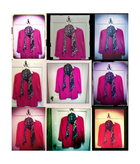
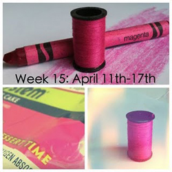
Due to some medical issues and rainy, cold spring weather, I wasn’t out to take photos this week. I own exactly ONE item that is magenta–a sweater set. Since Brooke threw down the challenge to take this week’s photos with your phone, I took her up on it. I have a variety of camera apps on my iPhone, and truthfully don’t know much about any of them. But here’s a collage of some of the ones I took of my sweater using several different apps. The apps sometimes change the color of the object, but the middle photo shows that the sweater’s a pretty good match.

MagentaCollage

If you’re here looking for the Alphanumeric Blog Hop, just scroll down one post.

The Alphanumeric Blog Hop

  • by

Alphanumeric hop badge

Welcome to the Alphanumeric Blog Hop hosted by the fabulous Mel! You should have arrived here from the beautiful Peonies and Pennies.

TopTenTiles

It’s easy to see what number I drew. I thought it would be fun to share three Top Ten Lists.

First of all Ten Great Reads. I loved all of these books. It’s a mix of fiction and nonfiction. Hopefully some will be new to you, and worth adding to your “To Read” list.

Top Ten Reads

This I Believe

Undaunted Courage

The Happiness Project

People of the Book

True Notebooks

Intuition

Water for Elephants

Bel Canto

Three Cups of Tea

(Our local paper featured an article yesterday saying 60 Minutes would be showing a segment disputing the claims made in this book and the sequel, “Turning Stones into Schools.” I hope they’re wrong. This was a really inspirational read.)

Into the Beautiful North

(I recently heard Luis Urrea speak, and he was one of the most engaging speakers I’ve heard in quite a few years. I thought his book was equally engaging, and he was an author I had not heard of before.)

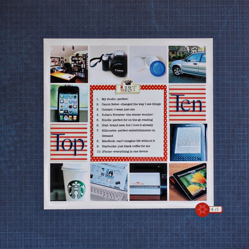
It’s been a few years since I did a “things I love” scrapbook page, so this seemed like the perfect opportunity to make a new one. It’s interesting how things have changed since my last one. The car and the computer are a bit newer, but essentially the same, but my camera and cell phone are much improved and many items on the list didn’t even exist when I did my last one. You can see that I kept the list to things. There’ll all things that make each day more interesting or much easier. If you click on the layout, you’ll be able to read the journaling.

TopTenLO
The background paper is Scenic Route, the photo template by Kitty Designs, the small patterned papers by Collage Press and October Afternoon, and the two stickers from Echo Park’s For the Record.

And finally, a list of Ten Great Cardmaking Blogs, for although I love photography and scrapbooking, at heart I’m first and foremost a card maker. If you’re ever looking for inspiration for creating a card, you can usually find it somewhere on one of these blogs. They embrace every style from Clean and Simple to totally Vintage and Shabby Chic.

Ten Great Blogs by Card Makers

My Paper Secret
Inspired By

Jennifer McGuire Ink

Capture the Moment
Simply Stamped

Thinking Inking

Paper, Scissors, and Superheroes

Lime Doodle

Just Made From Paper

Lily Bean’s Paperie

Thanks for stopping by. You should be off now to Carrie’s “Rosalind Revival,” and I know you’ll have a great time there. And in case you’re lost in this wonderful hop, here’s a complete list of the blogs in the hop.

I Speak Melsh
BE Glorious

Captured On Film

Chatty Crafty Arty Pig

Creating Room

Curiouser and Curiouser

Daily Life – Bits and Pieces
Deb’s World Den’s Crafty Diary
From High In The Sky
Gallo Organico
Ginger’s Life Of Spice
Handmade By Kirsty
Havoc and Mayhem
Heather’s Scraps
Helena’s Creative Maven
Holaday’s Happy Hearts
Jeant-Jinnag
Just Jimjams
K’s Crafty Corner
Life…As I See It
{Life Behind The Purple Door}
Lisa E Design Blog
Living Life One Blessing At A Time
Mary’s Musings
Michelle Loves…
Obstinate Pursuit
Over At Our Place
Paper Turtle
Peonies and Pennies
Random Reflections
Rosalind Revival
Scrap Dreams
Scrappyjacky
Scrapworthy Lives
Staring At The Sea
Surefiredaisy Says
This Kalil Life
This Little Life Of Mine
Xnomads’ Blog

Make-It Monday 10

  • by

Make-itMonday

This week’s challenge at Papertrey Ink was to use a die as a mask. It’s not something I think to do often and it took me the better part of the week to come up with an idea. I ended up liking the card quite a bit, and think I’ll try the technique more often. It occurs to me that this also fits the challenge for a collage card at Mark’s Finest Papers.


MIMDressForm

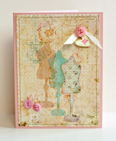
I’m in love with these beautiful “Butterfly Garden” papers by Pinkpaislee which I stitched around and adhered to a piece of Sweet Blush cardstock. I cut a mask with the dress form die and inked it twice, overlapping the images. I used Tim Holtz’s Distress Inks, “Antique Linen” and “Milled Lavendar” on the first, and “Broken China” on the second. Then I die cut another dress form from the patterned paper and layered it on top inking around the edges with “Broken China Distress Ink”. The buttons and silk ribbon are from Papertrey as is the “Tiny Tag” with the sentiment.

Card Patterns Challenge and a Heads Up!

  • by

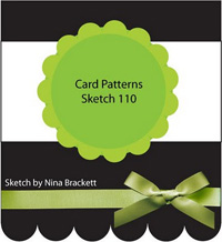
I really enjoy sketch challenges. They give you a direction, but don’t dictate too much. Once I saw the current sketch challenge on Card Patterns I knew what I wanted for the focal image, and I knew I wanted to use my new paper pad “Butterfly Garden” by Pinkpaislee. I love the soft colors and they just say “spring” to me. Here’s the sketch:

Sketch110

And here’s my take on it:

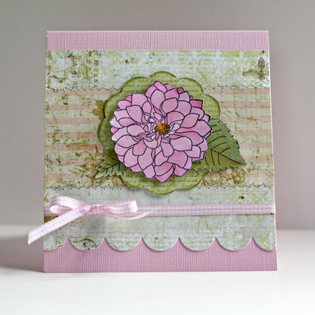
CardPatterns110

The focal image is from the Delightful Dahlias set by Papertrey. I colored it with Copic markers on the new X-Press Blending cardstock that Copic put out this year. I love this paper for coloring; it’s very smooth, very white, and the colors blend beautifully. I’ll be keeping a folder of it in my drawer. I stamped some text on the patterned paper cut from the Big Scalloped Circles die by Spellbinders with Background Basics: Text Style (Papertrey), stitched the patterned papers together and cut the scallop with Papertrey’s medium scallop border punch. The gingham ribbon is from my stash.

And a head’s up! This Sunday the fabulous Mel is hosting a blog hop! Be sure to come back and check it out.

Alphanumeric hop badge

I’m off with a friend tonight to hear Alice Hoffman speak. I love her novel “Story Sisters,” despite the fact that magical realism as a genre has never appealed to me. Nonetheless, I had a hard time putting the book down, and I’m anxious to hear her.

Emboss Resist–A Challenge Card

  • by

I just recently discovered the challenges at Mark’s Finest Papers. This week’s challenge is to use the emboss resist technique. It’s been a long time since I used this technique, but on Monday I purchased a few bottles of Tim Holtz’s Distress Stains and thought it would be fun to try them. The card came together really quickly.

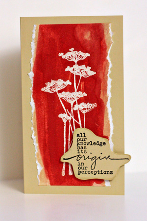
EmbossResist

I started by stamping the floral image from Unity’s Insightful Meadows with Top Boss ink and embossing it with clear embossing powder. Then I applied Antique Linen Distress Ink, but wanted more color. Fired Brick certainly solved that problem! I tore the sides of the image and adhered it to a card made from Fine Linen (Papertrey Ink). The sentiment is also from Insightful Meadows. I hand cut it and used Papertrey Ink’s Chamomile Tea Dye ink to distress it before adhering it with dimensional adhesive.

Project 64: Burnt Sienna

  • by

Project64

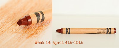
This week’s color was Burnt Sienna.

Wk14 april 4_10_Burnt Siena

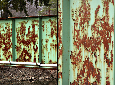
Brooke added another challenge to create a diptych this week. I found quite a bit of Burnt Sienna right here at home, but for my diptych I chose to use these two photos of a bridge crossing the Erie Canal.

BridgeDiptych

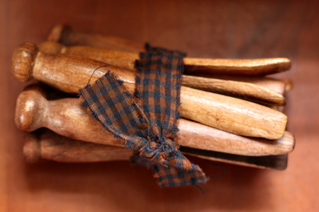
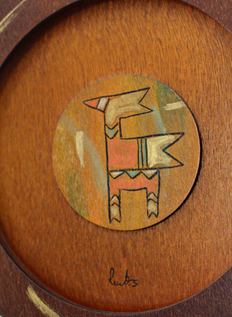
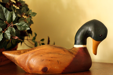
Here are the photos from around the house:

Clothespinsw

Clothespins from a vintage shop that I keep in my studio.

DecorativePlatew

A wooden “plate” from Guatemala given to my husband by our daughter. It hangs over his dresser.

Duckw

A duck decoy that sits on top of our media center in the den.

Drawerw

My bedside table drawer.

Paintingw

A painting given to me by Sarah that hangs in my studio. The frame is also close to Burnt Sienna, but didn’t photograph particularly well.

I’m trying to figure out how to participate in this challenge while we’re on vacation. I know better than to take my box of crayons which will surely melt in the Arizona heat. I suppose I can try to guess the color by the posted prompt and the first few examples posted on the site, or I can do catch-up when I get back. None of those choices really appeal to me, however. I like carrying my crayon around; it’s become a habit.


Picture Inspiration: Weeks 6 & 7

  • by

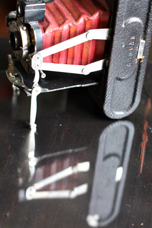
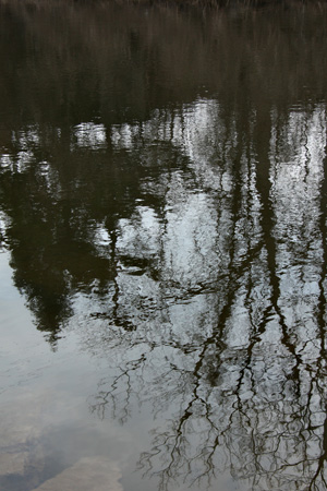
The last two prompts for Picture Inspiration have dealt with reflection. Week 6 was “Seeing Double” and the task was to capture both an object and its reflection. I looked all week and never found anything despite the fact that I had my friends looking for me as well while we were in Canada that week. Finally, right before the end of the week, I took the situation into my own hands. Tracy had a piece of glass that had been cut to replace a cracked one in our window. I put one of my favorite vintage cameras on it and put it on the lateral file in my studio.

SeeingDoublew

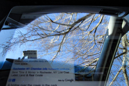
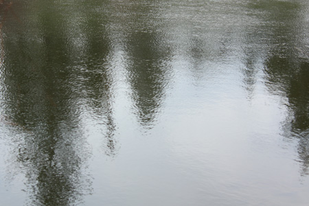
This week’s prompt was “The Shape of Surprise” and we were looking for unexpected reflections. I found several. Tracy recently purchased an iPad and I had it on my lap trying to look up some information while he was driving. The reflection through my sun roof was so strong, I couldn’t read the iPad, but I did get this photo. I like that you can see a bit of the text from the iPad as well as the reflection.

IPadw

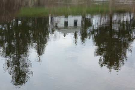
This afternoon I was out and about. I stopped at a little park on the Erie Canal outside Palmyra, NY. There’s an old bridge, the remains of a lock, and a brightly painted little house that must be used for some kind of maintenence.

House&Treesw

Just for fun, here are couple more from the canal.

TreesPortraitw

Treesw

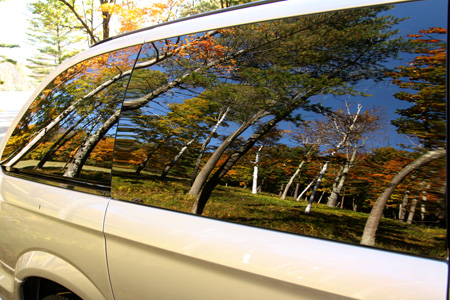
But my favorite image is one I dragged out of the archives. I took this a couple of years ago in Vermont. I’d gotten out of the van to take some photos and as I walked back to the car, this is what I saw.

Vanw

So much beautiful fall color. It’s finally beginning to feel like spring here, but it hasn’t been warm enough, long enough for the trees to bud or the daffodils to bloom. I’m hoping by the end of the week, there’ll be some color in my photos again.

Make-It Monday 7

  • by

Make-itMonday

I missed participating in last week’s Make-it Monday at Papertrey Ink. I had this beautiful patterned paper from Emma’s Shoppe by Crate Paper laying on my desk after finishing a scrapbook layout so decided to get busy with this week’s challenge:  heat embossing. The card is so simple, you’d think it came together in no time, but it was one of those cards that had multiple iterations before I ended up with this:

MIMSoSweet

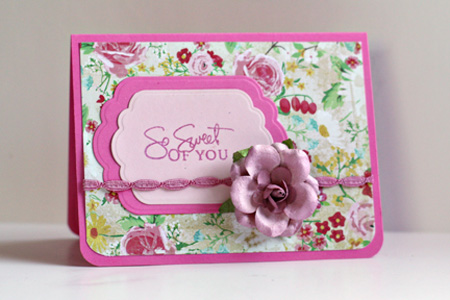
I heat embossed the sentiment from Signature Greetings, one of my all time favorite sets from Papertrey Ink. The cardstock is also from PTI–Hibiscus Burst and Sweet Blush. I found a jar of these beautiful roses on clearance at Michaels last week. It needed a bit of color so I misted it with Tattered Angels Creme de Rouge. The trim is from my stash and colored with a RV32 Copic marker.

Two Cards; Three Challenges

  • by

This is my second post today, for the Team-up Thursday and Kim Klassen’s texture photography challenges, scroll down.

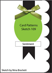
I’m on a roll this week with card challenges and enjoying it! For my Mother’s Day card, I used a sketch from Card Patterns . . .

Sketch109

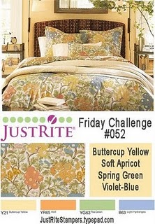
and the Just Rite Color Challenge.

Justrite inspiration


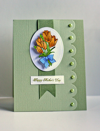
Here’s my take:

HappyMothersDay

I used two Just Rite stamp sets, “Breath of Spring” and “Happy Everything.” The two yellows and the blue in the challenge show up on the tulip image which I colored with Copic markers. The green became the card base and scallop. The dies were from Papertrey (medium scallop) and Spellbinders (tag), the ribbon from my stash, and the pearls are Hero Arts. We’ll be away for Mother’s Day so I’m happy to have this ready to put in the mail to my MIL.

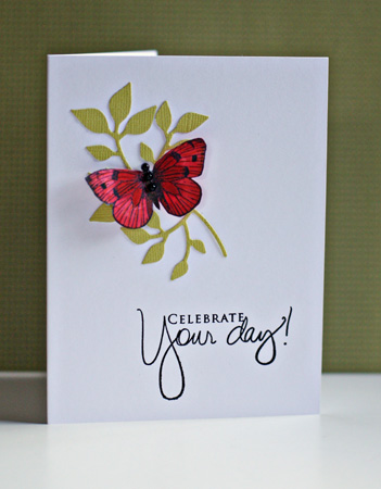
The next card is for the Less is More challenge, “a touch of red.” I had a red butterfly left from a previous card this week, so this card came together quickly. I’m very happy with it, and think it’s a design I’ll use again.

CelebrateYourDay

The cardstock is Select White from Papertrey, and a green textured cardstock from American Craft. The brand of leaves is a Sizzix die, and the stamp are Hero Arts (butterfly) and Papertrey (sentiment.)


Team-up Thursday: Design & Kim’s Texture Link-up

  • by

Teamup

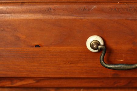
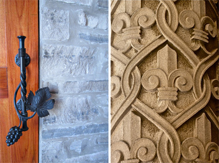
Nancy’s been on the road, but she sent this perfect shot for this week’s Team-up Thursday, “Design,” taken at the Biltmore Estate in Asheville, NC. Although I’ve been to Asheville at least four times in my life, I’ve never made it to the Biltmore, and it’s on my list of places to see. I was in Canada on Saturday and found this lovely door handle at the Meglamania Winery in the Vineland area near Niagara-on-the-Lake.

DesignDiptych

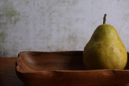
I also wanted to play along with Kim’s Tuesday Texture Link-up (just two days late!) Here’s the image SOOC, no cropping or editing.

   PearSOOCw

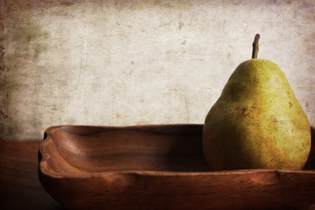
And here’s the new photo with texture.

PearTexture2w

The challenge was to use the new “warm sun” texture, which I did. Then I used the “overlay” blending mode at 100% and decreased the saturation. I thought it needed more contrast so I used the “multiply” blending mode at 35%. I think I like the warmer, textured version, the best.

Celebrate

  • by

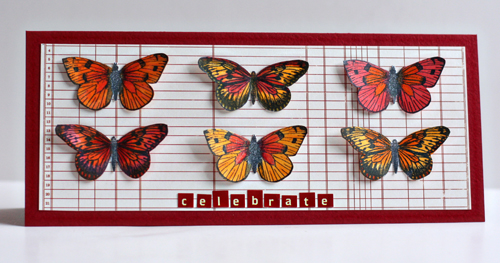
I have a blogging friend who excels at combining card challenges. Yesterday’s post was simply luck, but this time I set out to combine the sketch from Clean and Simple with the Challenge to “spotlight an animal” on a card at Mark’s Finest. Here’s the sketch which I stretched out so all my butterflies would have enough room. This card fits into a buisness style envelope perfectly.

FTL134

Here’s my take on the challenges.

Butterflies

I’m really happy with this card, and it’s in an envelope ready to send off to a good friend for her birthday later this month. The cardstock is Bazzil Blush Red Dark. It has a slight texture to it, and next time I’m at an Archiver’s I’ll be looking for more of it. The patterned paper is from October Afternoon’s Road Map series, and the tiny stickers are Cosmo Cricket. The butterflies are from an older Hero Arts clear set. Somehow I lost the name of the set, and I don’t think it’s available any more since I couldn’t find it on the HA website. All the butterflies were colored with Copic markers and then enhanced with Spica glitter pens. The photograph doesn’t pick up the sparkle very well but it’s definitely there IRL.

We are celebrating here as Matt got word yesterday that he has a full-time job with benefits in Denver, CO starting May 2. We’ll be leaving the end of the month to help him with the move, and then extending our trip to visit friends and family in Arizona, and Sarah and Adam in California. Can’t wait!

Card Set–Three Challenges

  • by

It’s not often that there are two challenges looking for the same kind of project. But the Waltzing Mouse Stamps challenge this week is to create a card set.

41-Sketch_thumb5

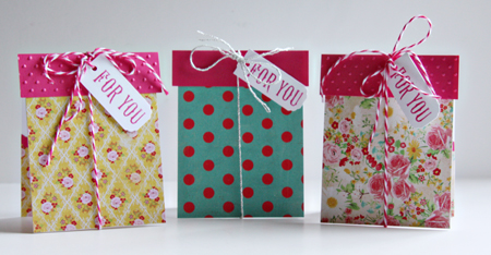
And yesterday Moxie Fab World posted a similar challenge for a card set. Today Cath posted a second challenge for Gift Card Holders, and as it happens, my card set is a set of gift card holders!

GiftCardSet

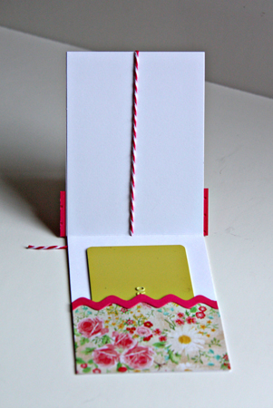
These 3X4 inch cards were designed as tiny packages that open to reveal another gift:

InsideGCHolder

I recently got the new Crate Paper “Emma’s Shoppe” paper pad, and all the patterned papers are from there. The cardstock is Neeah Solar White, and the bright pink came out of my scrap folder. I used a Sizzix embossing folder, the Papertrey Ink rickrack die, and some twine from Paper Source (silver) and The Twinery. The sentiment is from Waltzing Mouse Rescue Remedies Additions. I couldn’t find a tag die the right size so I cut them myself and used an old decorative corner punch from Carl.

Embellish Trim & Color Trend Challenge

  • by

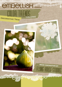
I wanted to make a thinking of you card to send to Deb’s mom, and thought I’d combine it with the current Embellish challenge. Here’s the Embellish color  inspiration:

DecorativeTrim_ColorTrimsChallenge

In addition to the color challenge, decorative trim also needed to be added to the card. Here’s my take on the challenge:

SendingYouEmbellish

Once again, the green seems much duller looking on Type Pad than IRL or on my monitor (which is color calibrated, to boot!). So frustrating! The card base is PTI’s Ripe Avocado and the sentiment panel is PTI’s Spring Moss. The patterned paper is from the Gertie pad (Stella and Rose by My Mind’s Eye). I’m loving these paper pads for card making! The stamp is Sending You by PTI. The first time I saw it, I didn’t think I’d add it to my collection, but I’m so happy I did. The sentiments and “frame” are so versatile, I know I’ll be using this again and again. The ribbon is from Paper Source and the pins came with a scrapbook kit, but I think they might be Maya Road. I also added some sage Flower Soft to the middle of the flower.


Project 64: Spring Green

  • by

Project64

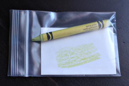
Another week has flown by and it’s time to link up with Project 64. (You can check out the other entries with that link.) This week’s color was Spring Green. Instead of using the project’s crayon image, I thought I’d take a photo of the way I package my crayon for the week.

Crayonw

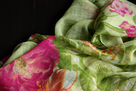
As usual, everyone gets involved in looking for the color of the week. Yesterday we were in Canada with good friends and we were all keeping a sharp eye out for spring green. Sadly, we didn’t find any good candidates. Like western New York, not much has begun to bud in Ontario. When I came home with a new scarf this week, however, Tracy noticed right away that it was spring green. I bought it because I loved the spring colors, never considering at the time that it was also perfect for the challenge.

Scarf2w

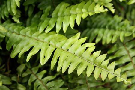
Today I decided to join the Lamberton Conservatory in Highland Park. It’s just a few blocks from here, and now I can go over and take photos without having to remember to put some money in my pocket! I found several candidates for spring green.

BostonFernw

A Boston Fern

Palmw

The ribs of the palm leaf

And my favorite:

HydrangeaBloomw

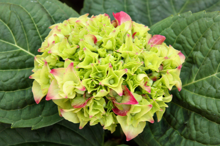
A hydrangea bud that will eventually turn bright pink.