Skip to content

Project 64 and Sweet Shot Tuesday

  • by

Project 64

It’s time to post photos for last week’s Project 64 color and Sweet Shot Tuesday. Brooke made a comment about the purpose of Project 64 this week that sums up why I enjoy these challenges. “After all,” she said, ” . . . this project is all about having fun, learning and improving though practice!” I took 106 photos one day this week. I probably looked closely at about 30 of them, and edited many fifteen for a variety of projects, but I’m learning more and more about my macro lens and having a good time thinking about composition and struggling (as always) with lighting in my very dark house. In winter, especially, photographic projects are essential or I would only have my camera out to take photos of papercrafting projects.

Wk5 Jan31_feb6_Gray

Papersw

Gray Papers

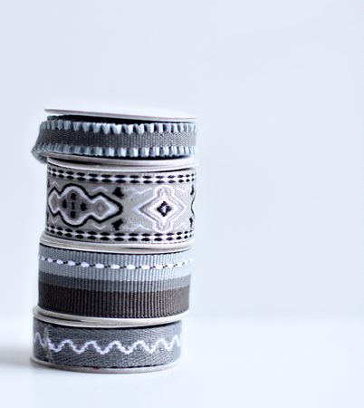
SpoolsofGray2w

Spools of Gray

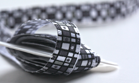
GrayRibbonw

Gray Ribbon

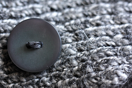
GrayButtonw

Gray Sweater (the photo I chose to submit)

And Sweet Shot Tuesday (as well as Project 52):

    Sweetshotbutton
P52-125

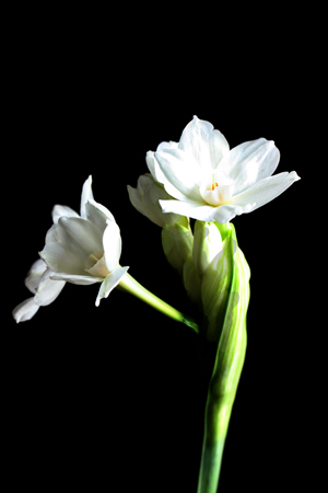
I think this is turning out to be the Year of the Flowers. They’re my favorite thing to shoot this time of year. I bought my first paperwhite kit from Target just after Christmas, and they’ve started to bloom this week. Here’s my favorite shot of the week:

Paperwhitew

And a different view:

Paperwhites2w


Thanksgiving Mini-Book

  • by

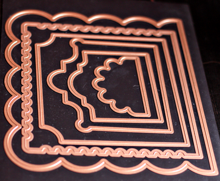
The week before CHA I received some great new dies from Scrap-Mart so I could develop some projects for their blog. As soon as I saw these Grand Nestibilities–Creative Book Pages–I knew just what I wanted to document.

CreativeBookDies

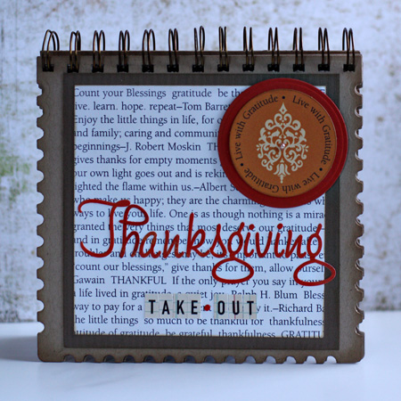
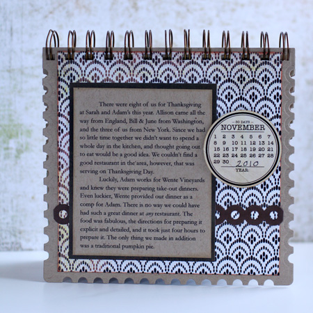
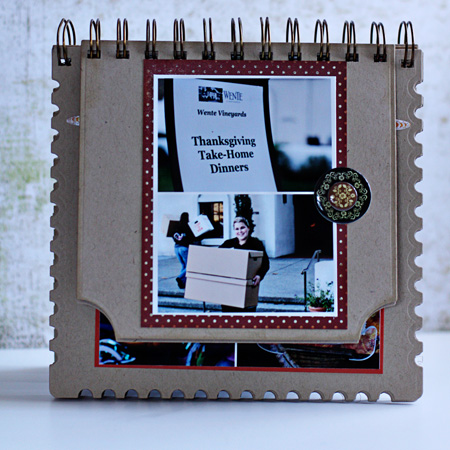
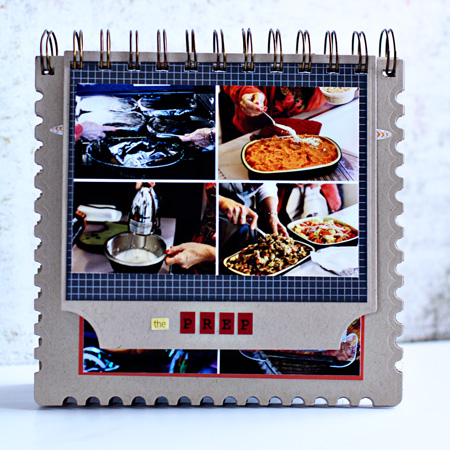
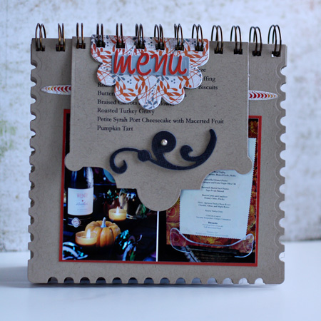
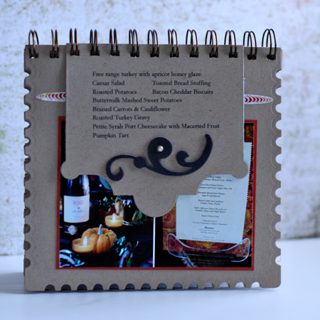
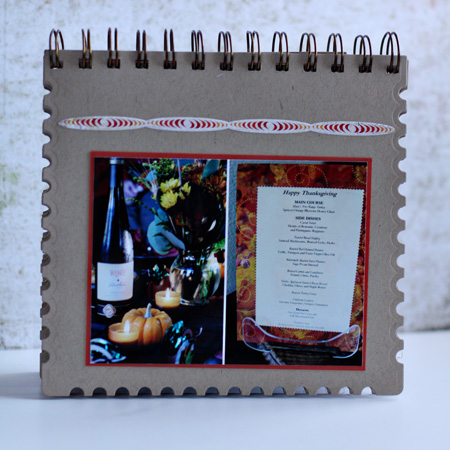
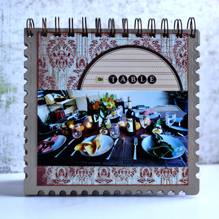
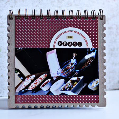
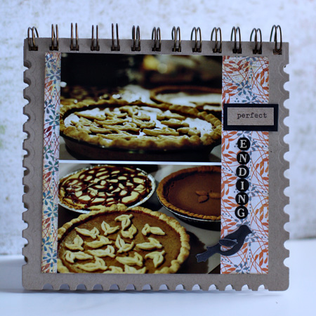
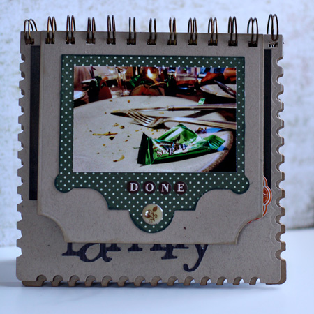
I used all but the largest one to make the mini-book and documented the amazing take-out dinner we had for Thanksgiving. One of the best things about the dies is they were designed to be bound with the Bind-it-All. I bought one with a coupon several months ago, but hadn’t had a chance to use it. I was delighted to find out easy it was. Here’s the book in pictures:

MBCover

MBJournaling

MBPick-up

MBPrep

MBMenu1

I really like these cascading pages. I started using different sized page protectors in all my scrapbooks a couple years ago, and like the flexibility and the way it looks.

MBMenu2

MBMenu3

MBTable

MBFeast

MBPerfectEnding

MBDone

MBFamily

I’m not sure why these photos seem to have a bluish cast on the blog. They seemed to be fine in PSE when I processed them. Sigh. All the materials for the album came from my stash. Most of the patterned papers are Teresa Collins or Basic Grey, and the Kraft is all Bazzill. Thanks for looking!

PTI Anniversary Party: Day 2 with Lisa Johnson

  • by

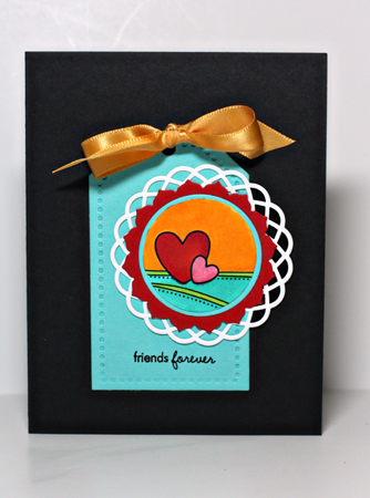
My favorite tag in today’s download as part of Papertrey Ink’s Anniversary Party was this one by Lisa Johnson. I know I’ll use it again and again. (Scroll down for today’s other posts.)

FriendsForever

All products by Papertrey Ink unless otherwise noted. Cardstock: True Black, Hawaiian Shores & Pure Poppy; Dies: Limitless Layers & Tag Sale #3; Stamps:  Tiny Treats: Valentines; Ribbon: Summer Sunrise; Copic markers; Doiley: Martha Stewart

PTI Anniversary Party: Day 2 with Maile Belles

  • by

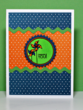
Here’s my second project for today’s anniversary party at Papertrey Ink. Maile Belles is one of my favorite designers and I’m thrilled she’ll be designing stamps as well as projects for Papertrey this year.

CelebrateYouMaile

All products by Papertrey Ink except the gems from my stash. Cardstock: Select White & Enchanted Evening; Patterned paper: Bitty Dots; Dies: Limitless Layers and small rickrack; Copic markers.


PTI Anniversary Party: Day 2 with Ali Miles

  • by

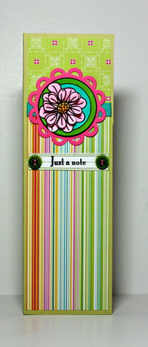
Papertrey Ink’s at it again today with great challenges. Today nine designers created tags that could be downloaded, printed, and used to create a project. My first project is a notepad which I need for an upcoming blog giveaway.

Notepad

All products by Papertrey unless noted. Tag designed by Ali Miles; Cardstock: Spring Moss, Select White; Stamps: It’s Official, Mat Stack Collection #3; Dies: Limitless Layers; Button: New Leaf; Copic markers; Patterned paper: DeLovely (Cosmo Cricket); DMC floss

Embellish Color Trend Challenge with Hearts

  • by

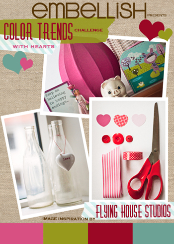
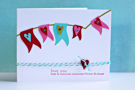
It’s been a while since I’ve played along with any of the many card challenges available on the web, but as soon as I saw the current Embellish challenge I knew what I wanted to do with it. As a member of the Scrap-Mart Design Team I was lucky to receive quite a few new Lifestyle (Quickutz) dies that have just been released at CHA. I love this pennant set which comes with two different “clotheslines” and three different styles of pennants. They are designed so you can use them on a scrapbook layout, but they can easily be adapted for a card. Here are the colors for the challenge–not ones, I admit, that I might choose, but they definitely work together.

Hearts_ColorTrends

And here’s my card. It’s not specifically a valentine, but I think it’s going to be used as one.

EmbellishPennant

Cardstock: Pure Poppy, Select White, Simply Chartreuse, Hawaiian Shores, & Hibiscus Burst (Papertrey Ink); Stamp: Simple Sentiments (Papertrey Ink); Twine: The Twinery; Dies: DIY Banner (Lifestyle Crafts); Heart punch: EK Success; Gems: Hero Arts, KaiserCraft, Reflections; Button from stash.


Papertrey Ink’s 4th Anniversary Party

  • by

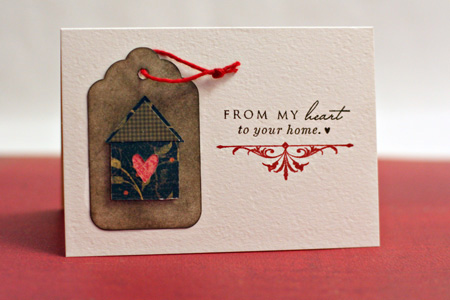
It’s Papertrey Ink’s 4th anniversary, and in typical Papertrey style they’ve started celebrating big-time! You can check out the details of the contest here. Despite the odds against winning this fabulous prize package, I knew I’d find it interesting to go back through the year (February to February) and look at what I created with Papertrey products. I found several I like more than others. This, this (the first card), this, and this. But I finally decided on this thank-you card that I created for all my Christmas thank-you notes. I love the simplicity of it, and the colors. And it uses one of my favorite stamp sets, Love Lives Here, that was released in the last year. Details are here.

HeartHomeThanks


Team-up Thursday: Behind

  • by

Teamup

This week’s prompt for Team-up Thursday was “behind,” and our photos couldn’t have been much different! Nancy’s cute photo of her grandson hiding behind his piece of pizza is colorful and playful. My photo of some of the war graves in the Mt. Hope Cemetery is somber and dark. I really liked the way the flags from the grave sites peeked out between the gravestones when I photographed them from behind.

DiptychBehind

I finally got around to doing some updating to the blog sidebar where you’ll now find links to some of the challenges I’m hoping to participate in this year as well as Kat’s wonderful Exploring with a Camera series. Her blog is definitely worth a read if you’re at all interested in photography.

Kat also has a wonderful series “Lessons from Abroad”* that I would highly recommend. One article in particular,”Step Out of Your Comfort Zone,” really resonated with me. I’ve joined the local camera club and submitted photos to their competition next week. That is really out of my comfort zone!

 *The link takes you to the last of the series where Kat has links to the first four articles.

Project 64

  • by

I really need motivation to take photos on a daily basis. I’ve started Project 365 twice and made it to about June before I gave it up. It’s much easier for me if I have a prompt of some kind, some kind of muse to keep me focused. Recently I came upon Project 64: Out of the Box which began just five weeks ago, so catching up wasn’t much of a problem, although you can join the group anytime and just start where they are. Here’s the explanation for the project, taken from the website.

Project 64

We are calling this photographic journey Project64: Out of the Box. We are a group of 6 ladies and one official color selector (my hubby) planning on taking a 64 week journey through a box of crayons. We are hoping to take the crayons out of the box for a little inspiration in our photographic work! Each week we will be assigned a color, chosen at random from a box of 64 count crayola crayons. We will then take our color inspiration and search for it in the world around us! You’d be surprised by the colors you miss when you’re not looking! The goal of the project is to challenge us creatively, making us think outside the box, and to hopefully slow down a little bit and notice the world around us! Of course accomplishing a 64 week goal is fun too!

I just happened to have a brand new box of 64 crayons in my craft closet.

64Crayonsw

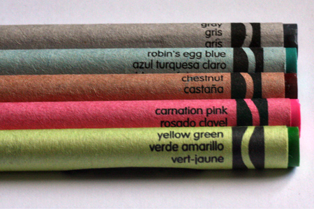
Here are the first five colors for the project.

5weeksw

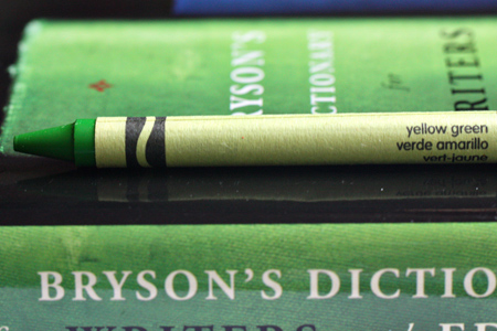
Week 1 was Yellow Green. There’s not much in my house that’s yellow green, but while I was holding the crayon I looked up on my bookshelf and found Bill Bryson’s “Dictionary for Writers and Editors.” It’s almost a perfect match.

YellowGreenBookw

Week 2 was Carnation Pink. I’ve had these tulips on my table for nearly a week. Another perfect match–even though they’re not carnations.

CarnationPinkTulipsw

Week 3 was Chesnut. This basket holds my 8X8 pads of paper.

ChesnutBasketw

Last week’s search was for Robin’s Egg Blue. I didn’t think there’d be much of that around here either, but was delighted to find some twine I just received from The Twinery that was Robin’s Egg Blue.

RobinsEggTwinew

As it turns out, I didn’t need to leave my studio to find any of these colors!

This week’s color is gray, and I’ll post it next week when the link goes up at Project 64. One of the things I think I’ll enjoy about these challenges is another chance to put the 60mm macro lens to use.


One Little Word–January

  • by

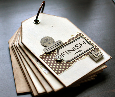
Rinda threw down a challenge earlier this month to create an art journal, book, or some method of keeping a record of your progress with your One Little Word. My word for 2011 is FINISH, and I am well aware that having some method of accountabilty helps me in any endeavor. Typically I made a book or a layout to document my One Little Word, but I’ve never done a monthly accounting. I’ve decided to join her, and created a tag book to record my progress.

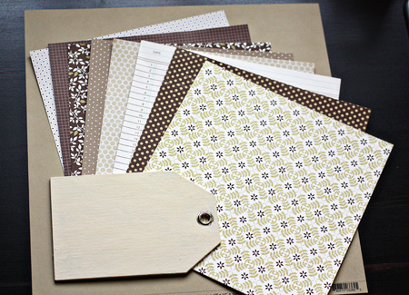
I had a set of chipboard tags from The Paper Source that I purchased for a project that was never finished. (Hah, thus my word for 2011!) I decided this was a perfect format for this project. I painted the tags with Making Memories Manila paint, and distressed the edges with Tim Holtz Walnut Stain ink. Then I chose some papers for the project. I decided to stick with Papertrey Ink papers since their colors remain consistent from one paper collection to the next. I chose a kraft cardstock and shades of brown, kraft, & cream with a bit of green mixed in for the patterned papers.

Supplies

Coverw

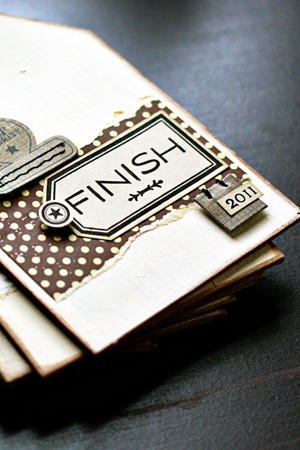
My second decision was to utilize my stamp collection rather than letter stickers. For the cover I stamped Papertrey’s Fillable Frame #9 and the word “finish” with the Fresh Alphabet. The 2011 came from Calendar Basics which I used to stamp all of the months as well as the little star detail (more about that later.) The tab and hanging tag are both from Basic Grey.

CoverClosew

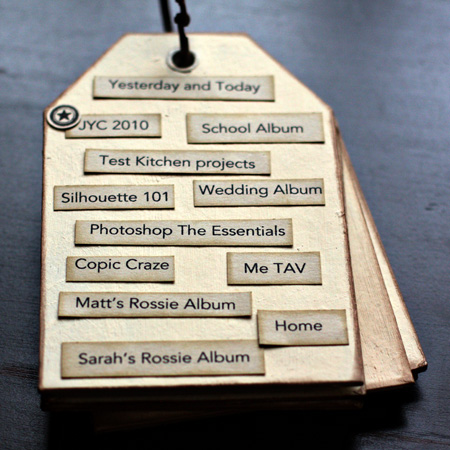
There are seven tags total. I’ll journal for each month on one side. For the back of the cover I typed up a list of projects I’d like to finish this year, cut them in strips and distressed the edges. Do I think I can complete all 12 projects? Probably not, but I think the list will help keep me focused this year. You can see one star next to JYC 2010 because I have finished that project. As I complete each project, a small star will be added next to the title.

ProjectPagew

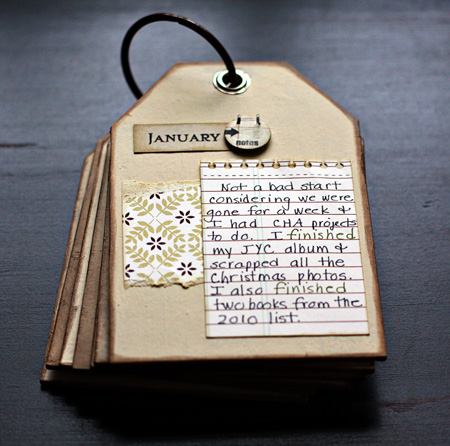
Januaryw

For the journaling I’ve decided to use Papertrey’s Spiral Notebook Page die and paper from their Library Ledger collection. It seems to be just the right size, and I’m trying to streamline this project as much as possible so it doesn’t become an unfinished project in the end. I also decided to change the color of my ink whenever I use the word “finish” as a way to accent the accomplishments. You can see I chose to add a comment about another activity as well as my papercraft projects.

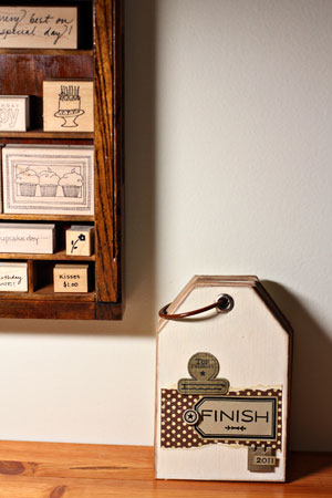
BookShelf2w

I found the perfect spot to display the tag book—on my table under my printer’s drawer that holds many of my wooden stamps. I’ll see it every day and will have a visual reminder of my focus for 2011. Thanks, Rinda! I’m not sure I would have done this without your prompting, and I’m glad I did.


Ced2011logo

I’m linking this post to Creative Every Day.


Team-up Thursday: Stacked

  • by


Teamup

“Stacked” was this week’s prompt for Team-up Thursday. I am always looking for ways to practice with my new macro lens so I piled up some Honey Nut Cheerios. I’m really happy with the focus on these, but Tracy says they’re ugly. So be it. I’m relatively new to manual focus so I don’t care if they’re ugly or not! Nancy’s stacked produce is courtesy of Wegmans food markets. One of the great advantages to living in Rochester is to be in the home city of one of the best food markets in the country. It’s something most of us don’t take for granted. “Thank goodness for Danny,” is not an uncommon remark! (Danny Wegman is the founder.)

StackedDiptych

Have a great day!

Sweet Shot Tuesday

  • by

Sweetshotbutton

I know it’s really Wednesday, but yesterday was the Papertrey Blog Hop so I waited until today to post my Sweet Shot Tuesday photo. It’s the same one I used last week for the Team-up Thurday diptych, but in color which I prefer.

TreeFencew

Highland Park Reservoir

Papertrey January Blog Hop

  • by

Bloghoplogo

As soon as I saw this month’s challenge I knew I wanted to participate so, for once, these cards were done early in anticipation of today’s blog hop. Here’s the challenge:

With the new year comes a clean slate along with many resolutions.  This month’s blog hop challenge involves you challenging yourself to use a Papertrey stamp set that has yet to see ink or even one that might be collecting a little dust!  Go through your stash and see what little used treasure it might hold.  If you are in need of inspiration for your chosen set, feel free to utilize the gallery posted in the side bar of each set’s sale page on our website, or go to the Previous Countdown page on Nicole’s blog where each set is organized by month of release.  2011 is the year where what’s old is new again!

My January order from Papertrey arrived the morning I sat down to create for the blog hop so I got to combine some infrequently inked stamps with some brand new never-inked stamps. This first card is my favorite of the three and has gone in the mail this morning to a friend who had a hip replacement yesterday.
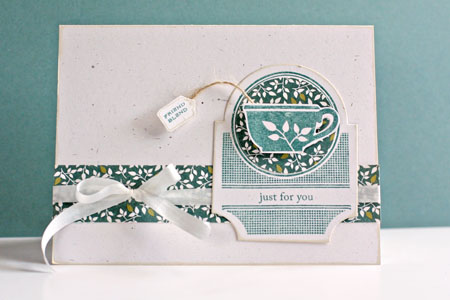
TeaTime
For this card I combined the Tea for Two Additions set with the new Mat Stack 3 collection. All other products are from Papertrey Ink as well.

The next card also combines a stamp set I purchased in December but hadn’t inked up with the new Tag Sale 3 die. The sentiment and image both come from the Make a Wish set. The flower stickers are from my stash. I bought them at Michael’s but have no idea who the manufacturer is. The card itself was created using the Grand Nestability Labels One die, cut, embossed, and folded in half.
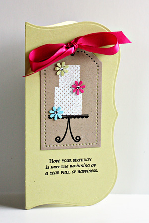
BDCakeTag
The last card isn’t my usual style. I love this dress form as it reminds me of my first creative endeavors as a seamstress. I started sewing when I was ten years old for the 4-H program and continued through my senior year in high school. For many, many years I made lots of clothes for myself, my husband, and the kids. Then fabric, buttons, patterns, and accessories became so expensive that it no longer made any sense. Now my sewing machine sees more papercrafting projects than anything else.
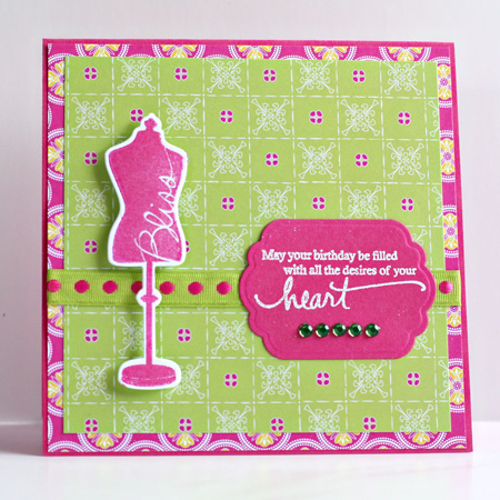
Heart'sDesire

I started out with the bright and cheerful papers from Cosmo Cricket’s DeLovely collection and went from there. I found that “perfect match” ribbon in my stash. The cardstock and ink are Raspberry Fizz and the stamp and sentiment are from Signature Series: Dress Form.

Well, I’m off to hop along on Nicole’s blog. There’s always a lot of inspiration to be had on a PIT Blog Hop!

Still here . . .

  • by

I’ve been busy creating a couple of projects for the Scrap-Mart blog in anticipation of the new releases at CHA this weekend. I was lucky enough to get a couple sets of the new Spellbiners Grand Nestabilities to play with and can’t wait to share them with you once CHA is underway and they’ve been posted on the Scrap-Mart blog. I’ve also been busy with Kim Klassen’s Photoshop the Essentials class. Like the earlier classes I’ve taken for free, this is wonderful. I’ve learned a lot in just two days of lessons even though she’s been covering material I have had some experience with. It’s going to take a lot of practice to make some of these skills automatic, but that’s what I hope to do.

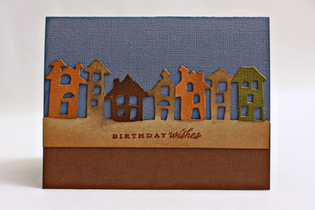
Here’s a card I created for the Scrap-Mart blog and sent to my adult nephew earlier this month. I love this Tim Holtz Alterations die and had a lot of fun playing with it. I die cut multiple images in different colored and textured papers and then cut out individual houses to layer on top of the kraft base. I added a little distress ink and a metallic embossed greeting.

Townscape
It was -5° this morning and just too cold to venture outside! I do have a church meeting tonight for which I am the secretary, but I’m going to reward myself with a stop at Starbuck’s on the way!
The Last of Christmas

  • by

I was just visiting Melissa’s blog where she has posted photos of her lovely Christmas Journal as well as some other great ideas for documenting your holiday. It reminded me that I have never posted the last of my Christmas layouts which I finished last week. I was really ready to put away all the Christmas papers and embellishments that were cluttering up my studio!

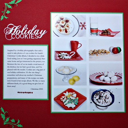
The first layout is one I did for the Scrap-Mart blog about the food styling session Matt and I had. First I arranged my photos in PSE 9. This time I didn’t use a prepared template since it was easy to get all the photos into a grid myself. I used my Silhouette to cut the title as welll as the corner embellishments for the layout. I used red pearls for the berries in the corners since red paper wouldn’t have shown up on the background. The layout came together so quickly. The rest of the patterned papers and the alpha are all from Girls Paperie collections.

HolidayCookies1
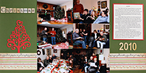
I printed about seventy photos from our Christmas celebrations this year and wanted to get them into the 2010 album. I picked six from Christmas Day that represented some of the highlights of the day and did a two page spread.

ChristmasLayout

All the papers are from Girls Paperie as well as the alpha. I used the Silhouette again to cut the gorgeous stylized tree and added silver and gold gems to it. I love that you can resize any of the images to exactly the size you need for a project. I didn’t include the journaling here since both layouts are summaries of information I shared on the blog previously.

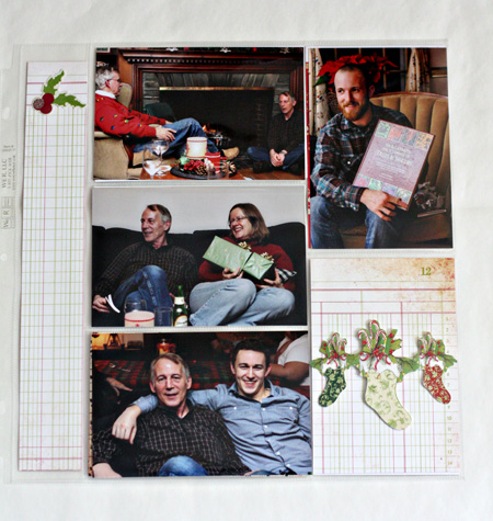
When I was in Atlanta, I made a trip to Archivers, the best scrapbook store I know. I picked up a variety of the WeRMemory Keepers Easy Scrapbook protectors. They come in a variety of sizes and make adding extra photos to your album so easy. Here are two of the six I put together. Some pages are all photos, but when I didn’t have enough photos to fit the design I used some patterned papers.

PhotoEasy1 PhotoEasy2
Melissa shared some information about using Christmas cards. The stocking embellishment here came off a Christmas card we received two years ago.