Skip to content

Journal Your Christmas 2010

  • by

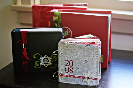
I’ve completed four Christmas journals and although each one is different, I love them all. Only the first one followed the prompts in Shimelle’s Journal Your Christmas class, and it’s the only one with a page for each day of December. After that I combined a variety of prompts or made up my own. Looking back at them, I’m so glad I kept track of the little things that made each holiday season a bit different. Each of my albums have been a different size and a different format, and I like that, too.

  ChristmasJournals

Every year I try to decide how I want to proceed. I’ve never really followed Ali Edward’s December Daily process, but her initial post really inspired me. Combined with Shimelle’s class (free every year after the first one), Jessica Sprague‘s notebook “Holidays in Hand” which I completed last year, and Tracey Clark’s upcoming class Picture the Holidays, I think I’m going with a December Daily format this year.

I’m also going to use the same set-up Ali showed on her blog:  transparencies followed by a journaling and photo page. I downloaded the journaling/photo pages over the weekend from Designer Digitals and will use them either digitally or print them out; probably a combination of both. I went through my Christmas stash and found a few transparencies as well as a few in other collections that should work well. Now I have my eye out for the rest I will need to purchase. A few years ago I purchased some lovely red chipboard which will be perfect for the cover. I need to get all of this put together so when we return from California (arriving here a few minutes after midnight on December 1) I’ll be ready to go.

Scrapbooking the Weekend

  • by

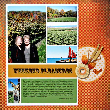
On our way to Canada, I stopped in my favorite stamp/scrapbook store in Buffalo. We don’t have anything like it in Rochester, so I’m always anxious to see what’s new. I picked up a Tim Holtz stamp set, a Hero Arts set of leaves, and a few papers and ribbons. I bought just one sheet of a Basic Grey Whiskers & Whiskers paper. It just called out to me for a fall layout, so yesterday I put together a quick layout of photos from our weekend in Canada.

   WeekendPleasuresW

I started with a digital template from Moon Ko which I’ve used in the past. I like the combination of landscape and portrait photos that it accommodates. Once I printed that out, I wanted some embellishment. I so envy people like Sian who seems to pull together the most wonderful collections of items into beautiful focal points on layouts. It’s not a natural process for me, so arranging the items on the journaling circle from my Scrapbook Circle kit took longer than doing the digital template. I’m happy with the final result, though. There’s a wooden ring with sticker from Sweetwater which has been in my stash for years, two leaves from Prima, a sticker from Jolee, and one of Studio Calico’s new rub-on birdies. I fell in love with them at CHA.

I finished taking the photos and writing my post for this weekend’s “Let’s Eat” Blog Hop. Are you ready?

Scrap-Mart Projects

  • by

I’ve had several projects go live on the Scrap-Mart blog, and I often forget to share them here as well.

BumperCropLO

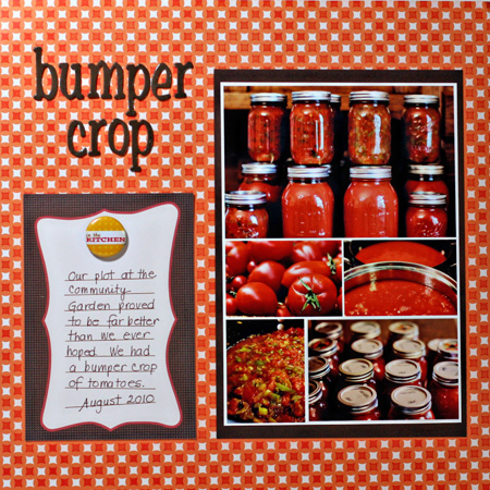
Sadly the bumper crop of tomatoes has ended, and we need to get over to the garden this week to clean it out. Our investment in the Community Garden plot was returned many times over this summer–both the financial and time investments.

SMApples

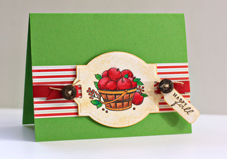
I love this “Autumn Blessings” stamp from Just-Rite. I colored it with Prisma colored pencils and then sponged some ink on the Scrap-Mart exclusive Nestability. It’s become one of my favorites. So many images seem to look good on it.

FarmersMarketLO

As usual, the layout looks a bit crooked in the photograph. I’ve been investigating some different options for photographing projects. Does anyone have a process (or product) that works for them? Our house is so dark I always need some artificial lighting. And I’d love to get more reliable results when taking photos of scrapbook pages that are too big to be scanned.

This layout uses new Jillibean papers from the Pasta Fagioli line which I love.


Gift Set

  • by

We made our annual trip to Niagara-on-the-Lake this weekend. As always we took in a play (The Ideal Husband, this year) at the Shaw Festival, visited some wineries (new ones this year; never made it to our old favorites), and had dinner with the couple who used to own the B&B we stay in who have become our dear friends. We had a glass of wine and delicious pate and cheese, with Pat and Ian before we went out to dinner so I wanted to take her a little gift for her hospitality.

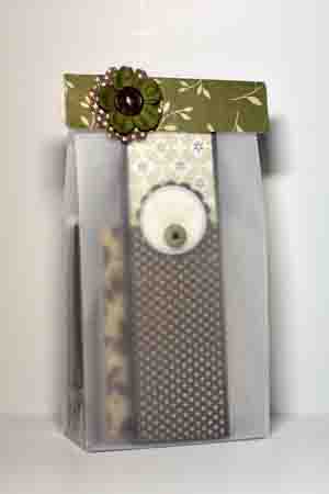
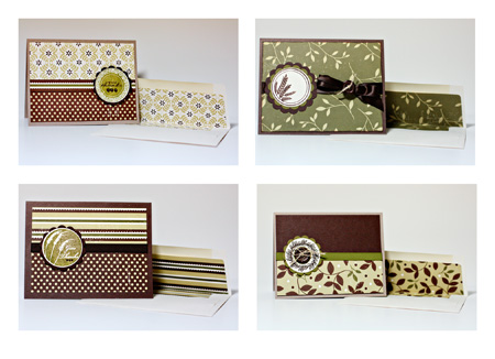
I started with a notepad I created in August and made four cards to go with it. One thing I love about Paptertrey Ink products is how easy it is to pull together a set like this. I chose the 2009 Autumn Tags stamp set and the Turning A New Leaf patterned paper pad. I added some twill, ribbon, and buttons (all Papertrey Ink), a few pearls, and stuck with a basic card design. I made envelope liners this time with the  liner die I picked up at the Papertrey booth during CHA. It really makes the set seem much more finished, and it’s so easy I think I’ll start doing this regularly. The notepad and cards fit in one of Papertrey’s large glassine bags perfectly, and I added a little topper to it with scraps from the project.

GiftPackage

CardCollage


A Card and Macro Fun

  • by

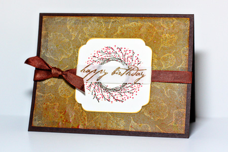
I have been getting some papercrafting done, but most of it is for the Scrap-Mart blog. I did finish a birthday card for a friend today that I can share here. I had a lot of fun with this one. I found an old piece of leaf-printed vellum that I knew would make a good background for a fall birthday card. First I covered it with Amber Clay chalk ink and rubbed it in with a tissue. Then I misted it with some Sunshine Glimmer Mist and a couple of shots of Studio Calico’s Mr. Huey Sunshine mist. Despite the same name, the two mists are quite different colors. I like the final effect.

NikkiBD

The wreath (Wreath for All Seasons by Papertrey) is overstamped with red and orange Brilliance inks which has a pearlescent glow to them that doesn’t show up in the photography. The sentiment is from Impress Rubber Stamps, and the ribbon is from my stash.

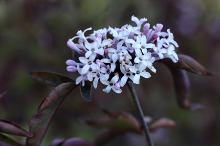
Today was lovely and the forecast for the next couple of days is for rain so I decided to take my camera to Highland Park and try out my new macro lens. I know I am going to like this lens a lot. For the first time out, I got a couple of decent shots. (And a lot more that went directly into iPhoto’s trash.) I’m going to have to work on sharper focus. I usually rely on automatic focus, but I think I’m going to have to make friends with manual. Here are three:

PurpleFlowersw

We  haven’t had a frost here yet, so there are still some pretty flowers in the park.

LeafRedPodsw

I love the light shining through the leaves’ veins in this one.

RedPodsw

The same tree, different focus. The bokeh is great with this lens.


10.10.10

  • by


101010

It’s not often that I post twice in one day, but the Shutter Sisters blog had a link today to a special web site set up especially for photos taken on 10.10.10. If you have a Flickr account (free and easy to set up if you don’t) you can add your photo to the pool of photos taken on this “most auspicious day.”  The photos can be added for the next ten days. The only requirement is that you took the photo today. You don’t have to have a Flickr account to look at them. Here’s the one I added. There will be more from our trip to Watkins Glen in a couple of days.

Poolw

Photo Field Trip

  • by

Friday, Tracy and I headed to Letchworth State Park to hike and take some photos. I had three objectives:  try out my tripod in the field, play with the color polarizer (which I’ve had for years, but have had little success with), and try out the neutral density filter (never used it before). Two of the three goals were met. I love the new tripod, and it’s getting easier to use. I use the 2 second self-timer with it, and that works like a charm. I had great success with the color polarizer. It was a perfect day for it. Sun coming from a good angle (that’s the key it turns out), and a beautiful blue sky with autumn colors. We ended up hiking part of the Fingerlakes Trail which is above the gorge so there really wasn’t much opportunity to try the neutral density filter. I might get a chance to day at Watkins Glen. So here are some shots from the trip. I ran the Pioneer Woman’s “Define and Sharp” on all of them. I didn’t need “Boost” since the color polorizer took care of all the saturation I would have needed. A couple of them needed a bit of adjusting with Levels.

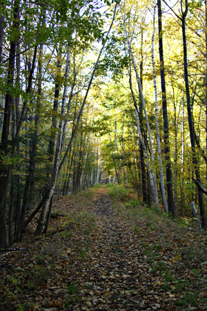
TrailFavew

The trail walking south.

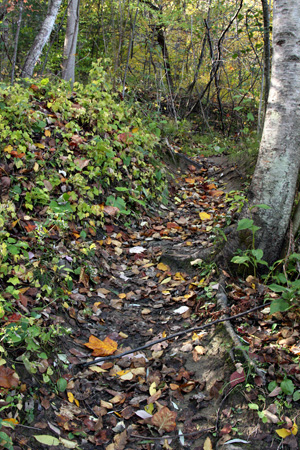
Trail1w

The trail coming back.

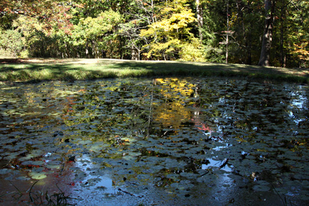
Reflectionw

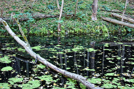
I loved the reflections here.

Trestle2w

The railroad trestle (still in use) built in 1873.

Trestlew

Another view

TrestleShadoww

And another; like the shadows here, too.

Waterfall1w

The falls

LeavesRockw

Pretty leaves on the trestle bridge

The photography posts on Darcy’s blog continue to be excellent. If you’re confused by the exposure triangle or unfamiliar with it, today’s post is wonderful. I’ve read a lot about this, and taken a couple of online courses, but almost every day I get another “aha” moment over there.

Kent Weakley had a fabulous post on why you should stop (or turn around and go back) for that shot. Being a girl from Kodak city, his analogy really hit home.

And my friend, Kat, has a wonderful post on photographic essays.

Hope you’re having a wonderful weekend! The weather here continues to be just perfect: sunny and just the right temperature. Great for walks and photos!

Banana Bread, the Internet, and Too Many Good Things

  • by

No photography projects today, but I’ve spent a lot of time on the internet the last couple of days. I was loaned a Silhouette (a digital die cutter) and because it didn’t come with directions on how to use it, I’ve had to download the user manual. I ended up printing most of it out since it’s impossible for me to work on the program and try to read the manual on a separate screen. It’s one time when a separate monitor would be nice. I wrote an entry for  Me: the Abridged Version today on the wonders of Google. It’s hard to imagine life without a search engine!

I’ve also been reading a lot of photography blogs found through The Sunday Creative links and from a Google search about neutral density filters. I’m learning a lot. Now the trick is to commit enough of it to memory to use it when I’m out with my camera. I got a shipping notice today that my new macro lens is on its way. I can’t wait to give it a try. It’s also supposed to be a great portrait lens. Maybe some of my friends will let me try it out this weekend.

It has rained steadily here for the last two days. I think we have another day of it before it starts to clear up a bit. We have a photo trip planned for Friday, dinner at friends’ house on Saturday, and a hike in Watkin’s Glen with friends planned for Sunday.  Monday, we’re off again with friends to do some wine tasting in the Finger Lakes. In addition to that, Mary and I have our first Arts & Lectures presentation on Thursday night. Thrity Umrigar is the first author to appear. I finished reading her most recent novel, The Weight of Heaven,  a week or so ago. I liked it a lot, although it had a devastating ending that I just wasn’t expecting. On Friday, Lynn, and I go to the first Rochester Pops Concert–the music of Ray Charles which I know I’ll enjoy!  So there won’t be much time for learning on the weekend! 

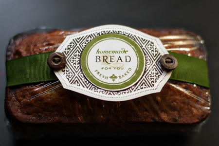
I did get one quick project done today. Tracy made a batch of banana bread and we wanted to take a loaf to friends of ours. It was a perfect excuse to get out my new Papertrey Ink set Everyday Treats and make a little tag for it. I know I’m going to get a lot of use out of this set.

Bread
If you look closely, you’ll see a little loaf of bread behind the word BREAD. Just love how that worked out. I used three different Tim Holtz Distress Inks:  Antique Linen, Walnut Stain, and Peeled Paint. Quick and easy!

The Sunday Creative: Nostalgia

  • by

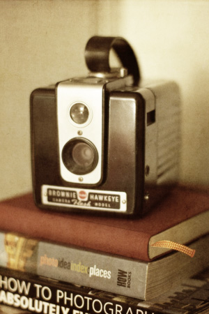
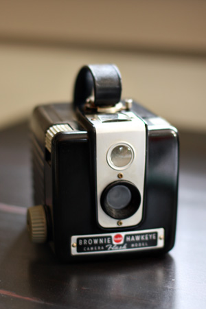
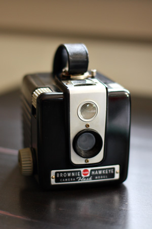
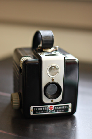
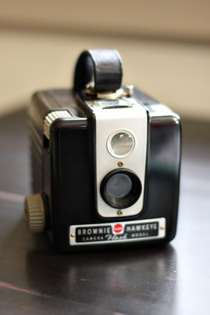
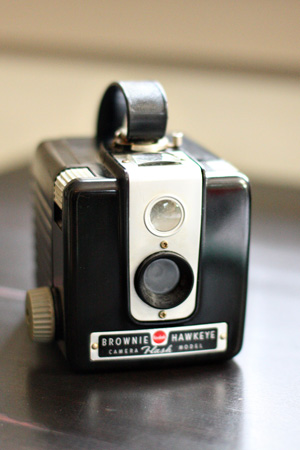
I’ve only played along with Sunday Creative once before, although I enjoy going through all the wonderful entries each week. This week’s prompt was “nostalgia,” and I had the perfect object to photograph. Just a week or so ago, I found a Kodak Brownie Hawkeye camera at an antique shop in Corning. This is the fourth vintage camera I’ve picked up, but this one is the first that has any meaning to me. My very first camera was a Kodak Brownie. How I wish I still had it! The first roll of film I ever remember taking was of Niagara Falls on a family trip. It was black & white film (of course) and even as a kid, I was dismayed when the film was developed to discover that nearly all the photographs looked exactly the same. It was many years before I learned to vary the composition of a subject. So here’s a look at my cute “new” Brownie, although regular blog readers will recognize it from yesterday’s post on ISO.

KodakBrownie 

Once again I played around with some textures in PSE. I used Kim Klassen’s Light Paper 4 at Soft Light, then Cinnamon at Soft Light, and finally decreased the saturation to -32.

Playing with ISO

  • by

Although I’ve read a good deal about ISO, shutter speed, and aperture (even whole books on one of the subjects), I’ve never read a better explanation of ISO than Darcy has on today’s 31 Days to a Better Photo series. She asked us to take the same photo starting at our lowest ISO and then doubling it while we watched the shutter speed. It’s a very rainy, cold day here, so I opted to take an indoor shot of the vintage Kodak Brownie I picked up a week ago. All the shots were taken at 2.0 aperture with my 50 mm lens. As expected with every increase in ISO there’s a corresponding increase in shutter speed.

ISO100
ISO 100, Shutter speed 1/10

ISO200
ISO 200, Shutter speed 120

ISO400
ISO 400, Shutter speed 1/40

ISO800
ISO 800, Shutter speed 1/60 (Inside on a gray day, this is the ISO I typically have to use if I want to hand hold my camera, which I did today.)

ISO1600
ISO 1600, Shutter speed 1/100  (With this ISO you typically see a lot of noise, although I don’t seem to be able to distinguish much on the computer. If I were to print this series, it might be much more noticeable.)

I’m enjoying these exercises even though I’ve done similar ones in the past for online courses. Every time I do a series of these, I understand the concepts better.

Playing with Shutter Speed & Studio Pics

  • by

Today’s post for 31 Days to a Better Photo dealt with shutter speed. It seems to me from my reading that most people understand shutter speed before they understand aperture. I had the opposite experience. Before I started shooting in manual this year, I almost always shot in aperture priority. Occasionally I would play with shutter speed, usually while shooting water in a fountain or a waterfall, but I rarely got what I hoped for. After today’s exercises I feel more comfortable with shutter speed, and know that one of the problems I’ve always had in the past is not using a tripod.

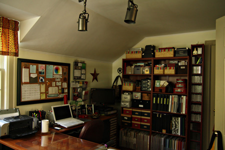
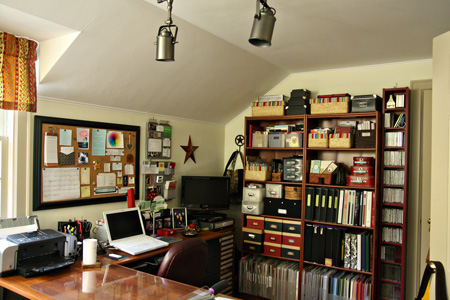
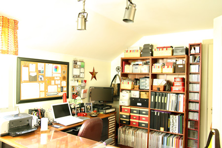
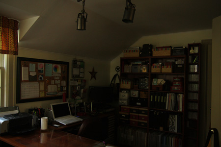
I’ve been planning a post about my new studio for a while, but have had trouble getting the shots I wanted, primarily because of the lights in the studio. Although this room has more light than my last one, our house is generally dark, and we need artificial light most of the time. Today I put the camera on the tripod, and practiced two techniques (in addition to changing shutter speed) that I picked up on Kent Weakley’s blog:  depressing the shutter button with almost no movement with your index finger, and using the self-timer set at 2 seconds. Although I got good results with both, I much prefer the self-timer. So here are the photos from the shutter speed experiment.
1:125_2.8w
Shutter speed 1/125

1:30_2.8w
Shutter speed 1/30

1:8_4.0w
Shutter speed 1/8

0.6_4.0w
Shutter speed 0.4

The best of the lot is #3, and I would never be able to get a sharp picuture hand holding the camera at that speed. Although the last photo is very washed out, it has an artsy feel to it that I don’t mind. These photos show the main work space in my new studio. The corner desk actually divides the room into two area. The TV in the corner in on a wooden stand Tracy made years ago to hold my wooden stamps. The shelves hold paper, supplies, notebooks, embellishments, alphas, and paper pads. Using lots of baskets maximizes the space there.

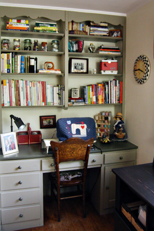
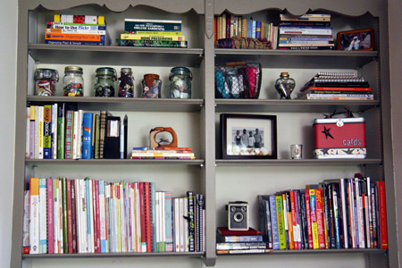
This room also has a built-in desk. I gathered all my books from around the house and brought them all into the studio so I have a shelf of books about scrapbooking/cardmaking, a shelf for photography, writing, computer manuals, and a few favorites. I also have room to display some photos and special treasures I’ve picked up in our travels. My sewing machine has been set up in this room for over a year. The drawers now house all of my sewing supplies as well as some office supplies.
SewingDeskw 

DeskBookshelvesw
At the same end of the room is a reading and die cutting station. I’ve had my Cuttlebug and dies in this room for nearly a year as well, but I purchased a lateral file that matches my desk to create a die cutting table. My Slice sits on top, and the Cuttlebug, dies, impression plates, and embossing folders are on the open shelves. In the file drawers are all my paper scraps filed by color, alpha stickers, and some patterned papers. In the corner is my wonderful red chair from LL Bean that folds out to create a single bed if needed.
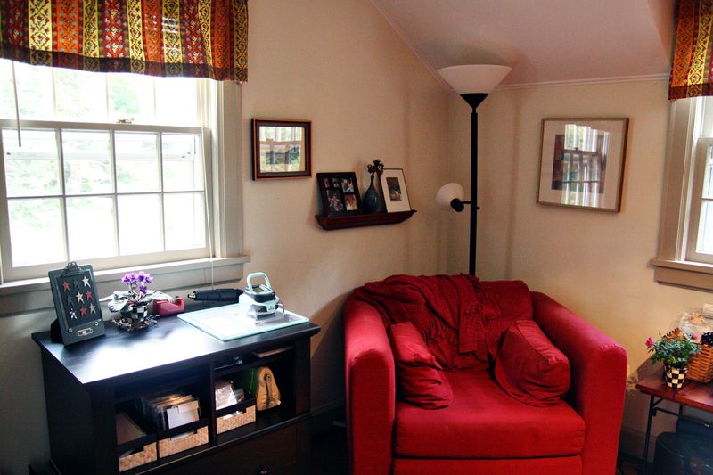
ReadingCorner
Behind my desk and between the door to the room and the closed door is my fold-up table from IKEA. It was one of the best $19 I ever spent. It’s mounted to be counter height so if I want to stand to put together a layout I can, but it doesn’t take up much room when collapsed against the wall. Above it is a printer’s drawer I refinished a year or so ago where I house most of my wooden sentiment stamps. The table isn’t centered under it because I wanted to be able to open the closet door when it’s up. I now have an Ott clamp light for the table, and keep it up most of the time.
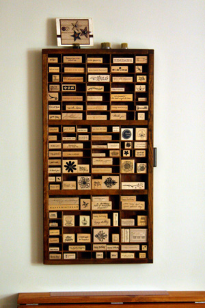
Printer'sDrawerw
Really, I can’t believe I fought this move for so long. I absolutely love everything about it. It’s so easy to find everything, and very quick to put away the terrible mess I always make when creating. The best part is that both Tracy and Matt come in here to visit much more frequently now. It really is a very inviting place.
World Card Making Day & Caardvarks C&S Challenge

  • by

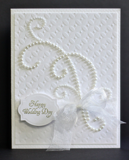
It’s been the second day where everything I do seems to take twice as long as I allotted. I needed a wedding card, so I did get one card made during World Card Making Day. This fits the Caardvarks Clean & Simple Challenge as well.

WeddingCard2


Supplies: Cardstock: from stash; Dies: Diamond Impression Plate
(PTI); Scrap-Mart Exclusive Square/Oval Nestability; Pearls: Zva
Creative; ribbon: Midori; Stamp: Delightful Dahlias (PTI)

Today for my photography project, I set up my new tripod and ball head. I think I’ll enjoy using it. I ended up getting the lighter of two tripods I considered, giving up some stability. I know myself well enough to know I’m not going to want to haul a heavy tripod out in the field. I also got out the neutral density filter and figured out how to get it on the camera. Friday we’re planning a little photography road trip so I can put some of this into practice.
I also spent too much time this morning reading photography tips and watching videos on Kent Weakley’s Blog. It is definitely worth checking out. His explanations are clear and his photography is wonderful. I particularly liked a series of five videos on getting sharper focus. I’ll be trying all of them soon, and the tips are good for any camera. Another great post was the Top 5 Reasons for Getting the Shot Now. Great practical advice here.

Green Leaves

  • by

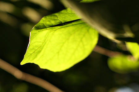
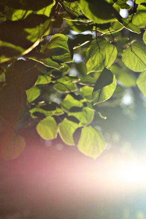
I know it’s fall, and there are lots of places where leaves have really turned color, but not yet on our street. I was sitting at the kitchen table after dinner tonight when, all of a sudden, the sun came out, striking the leaves on our red bud tree. I ran up and got my camera and took some shots. Looking at the LCD display, I didn’t think I had anything worth saving, but once I uploaded them to the computer there were a few I liked. I had my 50mm 1.4 lens on  the camera, set between 1.6 and 2.8 for all of these shots.
Leaf1w 


Leaves1w 


Leaf2w
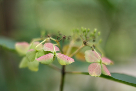
Right under the tree is a hydrangea bush, so while I was there . . .

Hydrangea1w
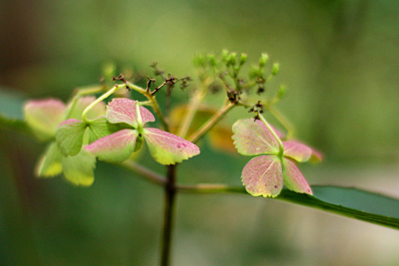
Here’s a very similar shot, but on this one I use the Pioneer Woman’s Boost action.

HydrangeaBoostw 

Although I decided not to take Picture Fall, I have decided that October will be Improve My Photography month. I just bought a new tripod and have ordered the Tamron 60mm macro lens since there is a huge rebate offer now until October 10th. This is the last of the lenses I’ve been wanting, and I almost ordered it this summer when the rebate was half what it is now. So glad I waited. I got an extra discount at Beach Camera as well, so I’m very pleased.

Through Lee’s blog, I found Darcy’s blog. Darcy is doing a 31 Days to a Better Photo series, which started today. Kim Klassen is also offering a free e-class on Photoshop Elements. You can find out about it and sign up here.  I’m going to do both, as well as finish watching the instructional videos on Lynda.com.  I also have a list of things I want to learn or relearn or practice this month. I’m going to post it as a way to hold myself  more accountable.

  • learn to set up and focus the camera quickly on the tripod
  • review and practice using Auto Exposure Bracketing
  • learn how to use back button focusing
  • try out Photomerge and Recompose on Photoshop Elements
  • learn how to use Gradient Maps on Photoshop Elements
  • practice using my neutral density filter which Tracy gave me over a year ago, but is still in the original packaging
  • practice using the circular polarizer
  • read Bryan Peterson’s book Understanding Close-up Photography and get out a try some of the techniques

I’ve also signed up for a “Day of Fall Photography” with two local professional photographers on the 31st. It was very affordable and includes a day of photography at Conesus Lake and Stony Brook State Park as well as  pre-trip and post-trip gatherings. I figure that will be the icing on the cake. I’ve really felt like I’ve been treading water (so to speak) with my photography and this all seems to have come together to encourage me to step it up for awhile.

Moxie Fab #2 & Papertrey Pixie Challenges

  • by

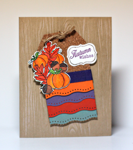
Here’s another card for the Moxie Fab Off-Set Scallop Challenge as well as for the Papertrey Pixies September challenge. As usual, I’m getting this in just under the wire for the second challenge! Pat’s inspiration piece was an ad from a Macy’s catalog. It was truly a challenge; so much going on here. 

September Challenge - Inspiration

Pat identified six Papertrey colors she saw in the ad: white, kraft, Ocean Tides, Terracotta Tile, Orange Zest, and Plum Pudding. There are, of course, florals, diamonds, and repeated patterns as well. I finally decided to go with just the colors. They aren’t ones I would typically put together, but I incorporated all of them and am pleased with the outcome.

AutumnWishes 

I started with a Kraft base, used the Woodgrain Impression Plate, and coated it with the Tim Holtz Antique Linen Distress Ink. The image, colored with Prisma colored pencils, and sentiment are from the Friendship Jar Fall Fillers. The cork tag came in one of my Scrapbook Circle kits. and the border punch is an EK Success punch. The purple twill from my stash is a bit more purple IRL.

Just Playing Around

  • by

I had some time today to play around, and started with some photos I took recently. I love the textured photos I see on some of the blogs, but haven’t come up with a lot I like when I try myself. Today I did. I’m quite happy with this photo.

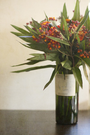
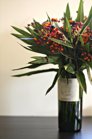
BottleFlowersLight4w
I bought this bouquet at the Ithaca Farmer’s Market on Saturday. I added Kim Klassen’s Light Paper 4 with a soft blending mode. Here’s the original:

OriginalBottlew

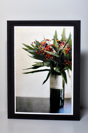
It made a nice card as well.

PhotoCardBottle 

There’s plenty of room to add a message directly to the photo, so I think I’ll try that as well. I purchased Kim’s e-book of Photoshop Recipes, and this texture was part of a preview pack she sent. I realized that I need to learn about Gradient Maps in PSE which I have never used. Tracy has a subscription to Lynda.com so I’ve started watching the PSE instructional videos there. I haven’t gotten to gradient maps, but I’ve learned quite a few new tricks in just a half an hour or so. The videos go for nearly 7 hours!! PSE 9.0 is coming out in November. They’ve added some very nice new features, so Tracy is going to upgrade it for me as a late birthday gift. He offered to buy the full Photoshop, but I know the learning curve there is greater than the time I want to spend on it. Hopefully, Lynda.com will do a video series on the new additions when 9.0 comes out.

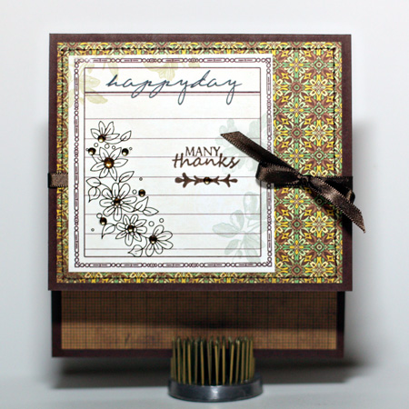
I also got inspired to make a card with some supplies I’ve had around for ages.

HappyDayw
I’ve had a pack of these Happy Day journaling cards from Webster’s Pages for ages, as well as the floral rub-on and gems from Basic Grey. The papers are also Basic Grey, the Origins line. I scored the card in the wrong place, but instead of starting over I just went with it and rather like the two layers. The sentiment is from Papertrey (Simply Stationery & Take Three: Summer) and the ribbon is from Paper Source.