Skip to content

Hocus Pocus

  • by

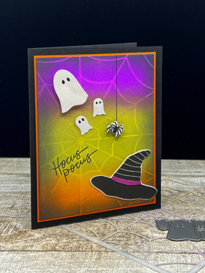
Saturday was World Cardmaking Day, and although there were no posts from me here or on Instagram, I was busy crafting on Saturday and Sunday. Many of the cards I finished may end up with blog reading friends, so I won’t post those until they’ve been received. Some others were Halloween cards, and I’m not sure who’s getting what. I do know who’s getting this Halloween card, and I’m pretty sure she isn’t reading my blog regularly. I’m entering it in two Halloween challenges today, though, so I’ll take my chances.

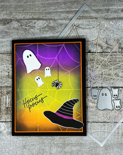
For once, I didn’t have anything other than the ink blending background in mind when I began. I used Wilted Violet, Twisted Citron, Carved Pumpkin and Spiced Marmalade for the ink blending, adding in some Black Soot around the edges.  Once that was done, I decided I wanted to add the Pretty Pink Posh “Spider Web” stencil to the mix, and added some more Distress Oxide inks over the top.

HocusPocus

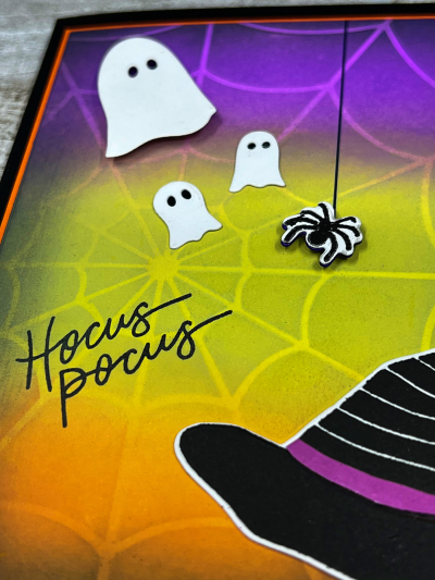
When that was finished, I started looking through my Halloween stamps and dies. I recently purchased a set from The Stamp Market, “Happy Halloween,” and used the witch’s hat, the spider, and the sentiment from that set.

HocusPocusClose

The three ghosts are from a Poppy Stamps die set I purchased years ago. I popped the largest of the ghosts and the spider up with dimensional tape after drawing a line with a permanent marker for the spider to crawl down.

HocusPocusFlat

I love the glow of the ink blended background. I’m entering this in two challenges: Just Us Girls:  Halloween, and The Paper Players:  Spooky.

JUGS Pp561

Summer Photography Scavenger Hunt: Final Link-up

  • by

I don’t often post twice in one day, but today the new Color Hues Challenge went up, and it’s also the final link-up to the Summer Photography Scavenger Hunt, kindly hosted by Mary-Lou. You can find my previous link-ups here and here. I managed to find all the items on the list as well as two of the alternates. No excuse for not having a photo of a local landmark; it just fell off my radar.

So here are the final photos.

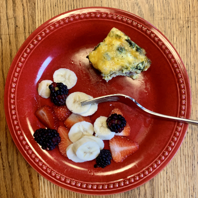
Breakfast

A Breakfast of Champions 

Not sure this qualifies as a breakfast of a champion, but it’s reliably my breakfast of choice: a No-carb egg bake that I make, cut in squares, and freeze with a selection of fruit.

TimeofDay2

Favorite Time of Day

I love evening, especially when we’re near the water and can capture the sunset. I’m quite sure we regularly have lovely sunsets in Rochester, but to capture them I need to be in the right place at the right time, which rarely happens. This was taken at Big Twin Lake in Michigan in August.

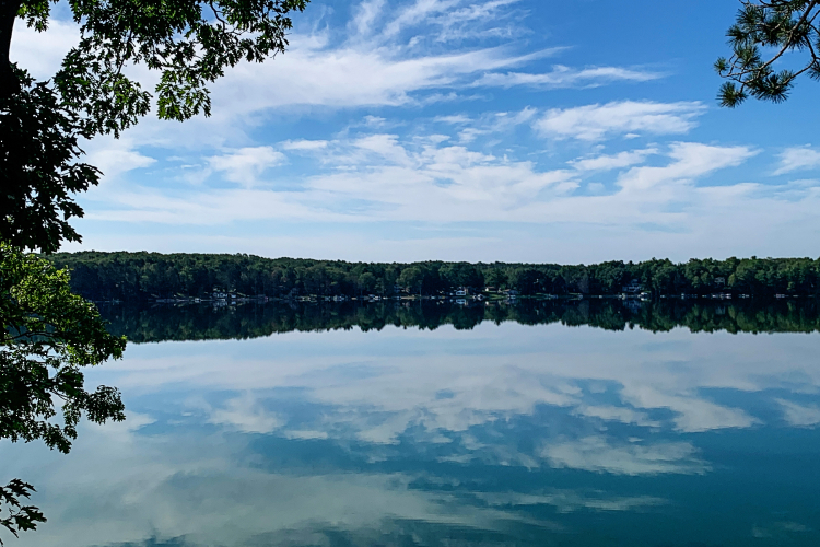
Clouds

Head in the Clouds (and in the water!)

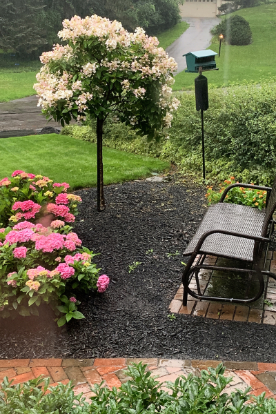
WindowView

Window Views

I had several window views, but decided on this one: the view from my craft room looking out at our front yard.

MarieKondoMoment

Your Marie Kondo Moment

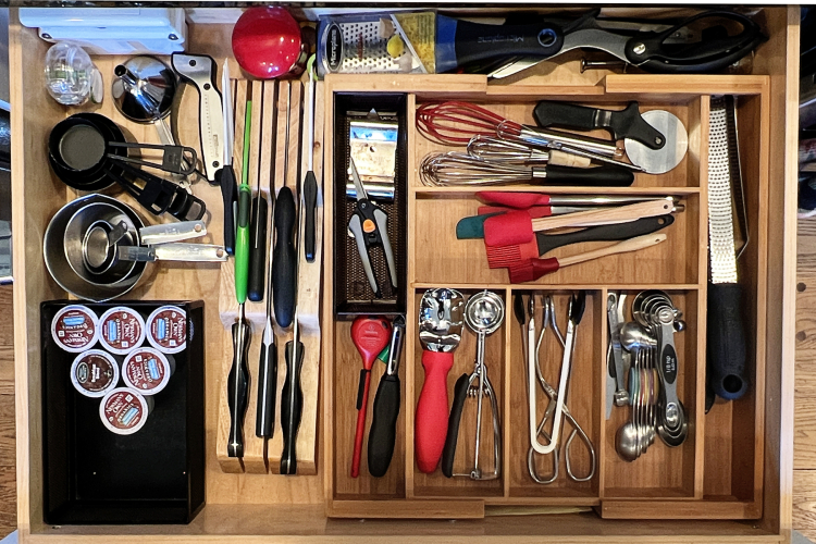
Sadly, I neglected to take a Before photo, but I’m proud to say that this photo was taken just this week, and the drawer was organized in early August. I think I finally came up with a system that works! Needless to say, there were a few items that left the house all together, and a few put away to see how often we really need them (Haven’t pulled any out yet.)

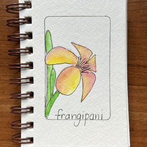
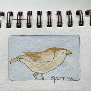
Doodle1 Doodle2

Your Best Doodle Art

I have a tiny sketchbook where I randomly choose things to draw and watercolor. I’ve gone through and created a frame on each page with a credit card which gives you an idea of its size.

Exit

An Exit

I’m quite sure if I’d been more attentive, I could have found a more creative response to this prompt, but it didn’t happen. I was alert enough to capture this in Traverse City, Michigan during the last day of our trip in August.

From the 80's

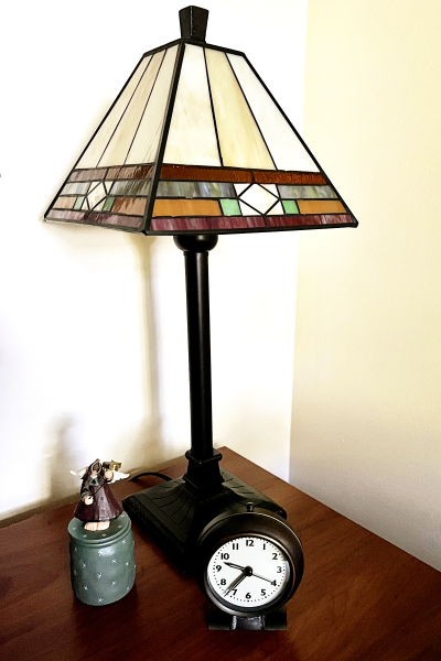
Decades of Sharing

Interestingly, this was the most difficult prompt for me. I can only be sure that these items are from the 80’s because all three moved with us from our previous house. We’ve lived in this house for 36 years now. (That seems totally amazing to me.)

And finally, my most beautiful landscape of the season. In fact, it’s not my favorite photo from the summer, but it’s one of the few that truly quality as a landscape–a result I’ll chalk up to the pandemic, and not much travel this summer. The cloud photo above might suffice as well. This view of Seneca Lake from the Boundary Breaks Winery was the last capture for the scavenger hunt, taken just last Saturday.

Landscape

Thanks, again, Mary-Lou for compiling the list and encouraging me to be on the lookout for opportunities to capture a slice of our lives.


Color Hues #27

  • by

We have the perfect color combo for the first of October’s Color Hues Challenge:  Orange and Green. There’s still a lot of green on the trees here, but each day we see a bit more color. I know there are lots of folks who are not a fan of orange, but it ranks up there in my top five color choices.

Color Hues #27-Anim_

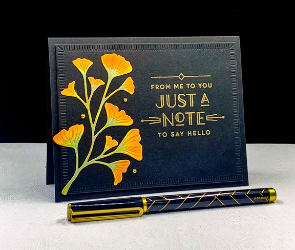
 I recently acquired The Greetery’s “Botanic-cut: Ginkgo” dies, and couldn’t wait to put them to use. I also used the new Greetery sentiment set: “Everyday Labels.” I love the font and the art-deco appeal of these sentiments. 

OrangeGreen2

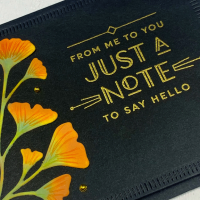
After die cutting the Gingko leaves, I used Spiced Marmalade, Carved Pumpkin, and Bundled Sage Distress Oxide inks to blend color onto the stems and leaves. I followed up with some Polychromos colored pencils for some detail.

OrangeGreen2Close

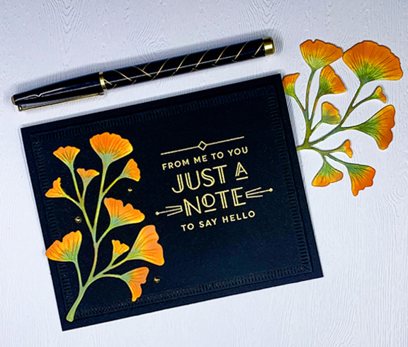
I die cut the largest of the “Crimped Frames” (also The Greetery) from black cardstock, embossed the sentiment in gold, and added the Ginkgo leaves.

OrangeGreen2Flat

I added three small gold pearls as a final accent after adding the framed piece with dimensional adhesive to a black card base.

I hope you’ll hop over to the Color Hues Challenge and join in the fun, checking out the cards made by my awesome Design Team members and the two Guest Designers, Jacinda and Marcia – the winners of the birthday challenge.

Nancy

Hannelie

Cindy

Julie

 Sheri

Kristie

Lindsey

Tracey


Celebrate: Autumn Challenges

  • by

I’m back with another CAS Autumn themed card. 

CH27

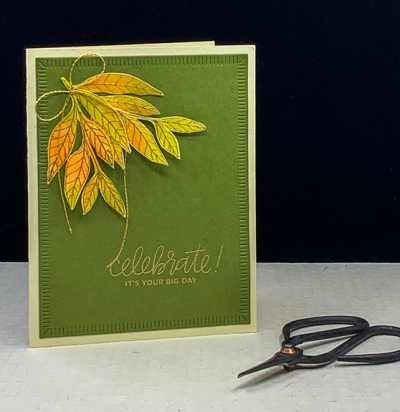
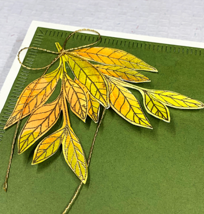
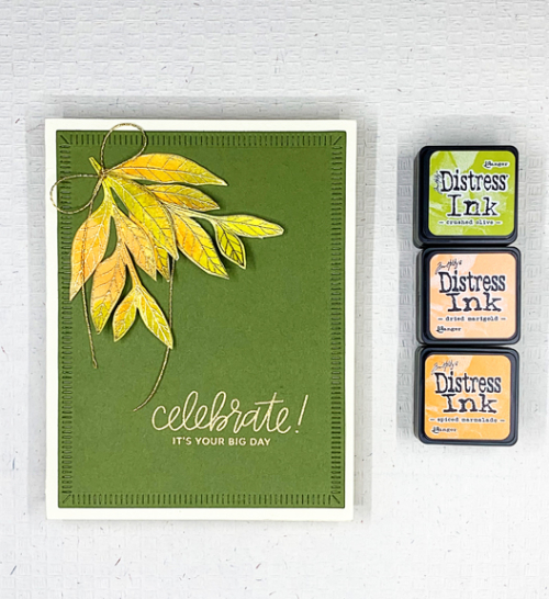
More leaves, this time from Papertrey Ink’s “Lovely Leaves” which has not had anywhere near enough love! I smooshed Distress Inks in Crushed Olive, Dried Marigold, and Spiced Marmelade on my glass mat, added a spritz of water and then laid down a piece of watercolor paper. Once it dried, I gold embossed the leaves and fussy cut them out.

CH27Close

The colors weren’t quite as bright as I wanted so I used a small paintbrush and added a bit more of the oranges to the leaves.  I used my well-loved “Crimped Frames” from The Greetery to die cut a piece of Gina K’s Asparagus cardstock. It’s become my favorite green. The sentiment from Pretty Pink Posh was embossed in gold in the lower right corner and I arranged the leaves in the upper right corner, leaving plenty of open space. I added thin gold bow and attached it to a cream card base. 

CH27Flat2

This is my first entry to the Addicted to CAS Challenge: Autumn, and my second entry into the Inspired By . . . Colorful Fall Challenge.

CAS Inspired By IB188 Colorful Fall August 23

A Perfect Saturday

  • by

Yesterday we made a trip to the Finger Lakes. It was clear and quite chilly when we left the house around 7:00. Our first stop was at the Mennonite market in Seneca Falls where we picked up our favorite brand of bacon, some pork chops, green beans, two blocks of cheese, and a 50# bag of bird seed. We had packed a cooler for the meats and cheese and headed to Ithaca to the Farmer’s Market.

On our way we stopped at Taughannock Falls to take a few photos. I have a new phone and wanted to try the camera. Most of these photos have had no editing other than being cropped to an appropriate size to print if I ever want to do that. It’s quite a bit better than my previous one which was three generations old.

IMG_0018ed

IMG_0013ed

It was our first trip to the Ithaca market since the pandemic began, and like many things, was a bit diminished. My biggest disappointment was the disappearance of my favorite bakery. Nonetheless, there were still gorgeous vegetables and flowers, and I did find a delicious cranberry orange scone for a mid-morning snack.
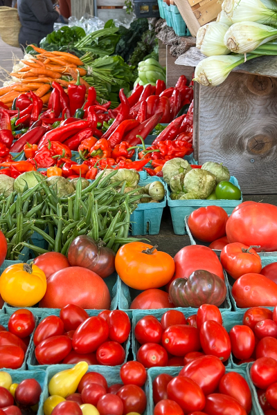
IMG_0035ed

IMG_0037ed

The market sits right at the end of Cayuga Lake, and the rowers were out in force on this beautiful morning. Both Cornell and Ithaca College have rowing teams as does the high school so I’m not sure who was out practicing.

IMG_0028ed

IMG_0032ed

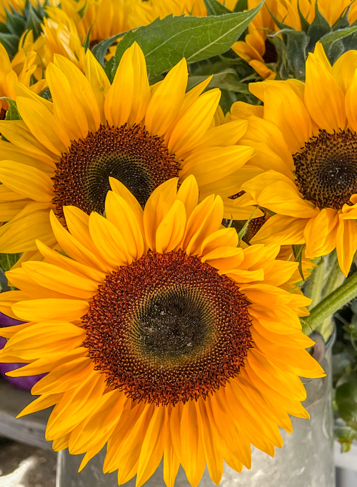
In addition to the sunflowers at the market, we found these on one of the rural roads we travel on the Finger Lakes.

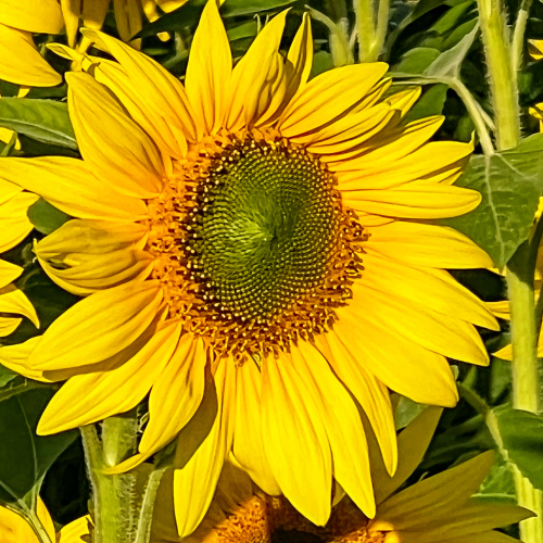
IMG_0003ed

IMG_0006ed

The primary reason for the trip was to pick up our fall allotment of wine at Boundary Breaks where we are members of the wine club. Not only do they make wonderful wine, the views are among the best on Seneca Lake.

IMG_0047ed

Although some of the grapes have been picked, there are still many left on the vines waiting for just the right time to harvest.
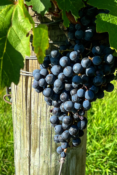
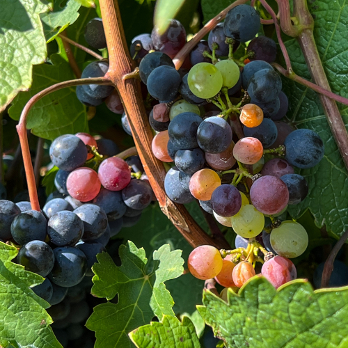
IMG_0041ed

IMG_0040ed

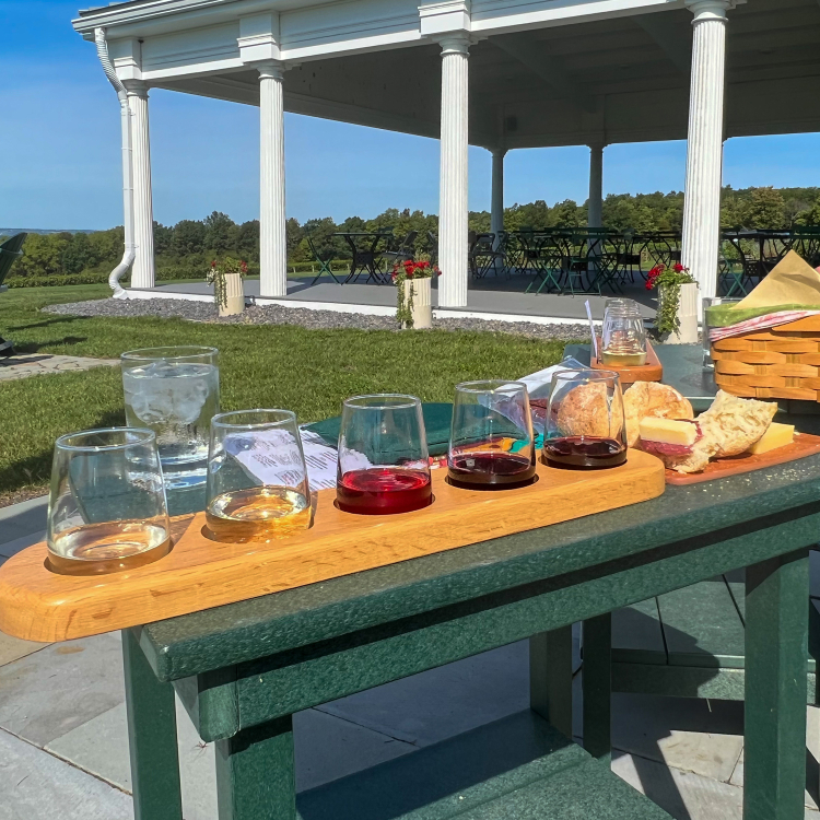
We arrived right at lunch time and enjoyed a wine tasting while we sat overlooking the lake.
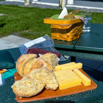
IMG_0054ed

IMG_0055ed

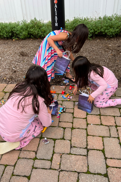
But that was not the end of the day! After arriving home around 2:00, we had just enough time to rest up before heading off to our granddaughter, Skylar’s, 10th birthday dinner. Skylar asked for a pajama party, but we were all assured it was an optional requirement. Even Ella, the seven year old, decided against it.

As always there was a piñata to break open.
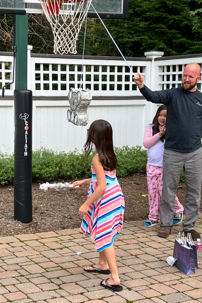
IMG_0060ed

IMG_0071ed

Then there were gifts to open and a delicious dinner ordered from Skylar’s favorite Korean restaurant. (The dumplings are amazing!) And finally cake.
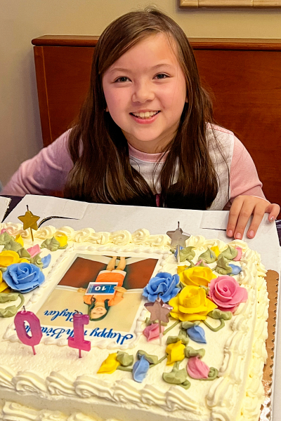
IMG_0102ed

If you’ve made it this far, thanks for hanging in there. I thought I’d share her birthday card as well. One night in August the girls arrived for dinner and needed to head home earlier than usual since they had been allowed to stay up late the night before to catch fireflies in a jar. I had recently purchased a couple of fun stamps and dies from The Greetery so knew exactly what I wanted to create.
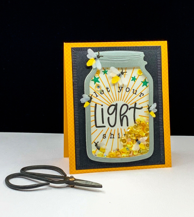
Light

Shaker cards are usually a hit and this one was so much fun to make.
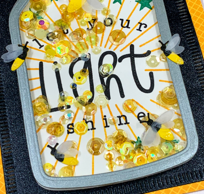
LightClose

I originally had three fireflies inside the jar, but the sequins kept getting stuck on their vellum wings, so I took the card apart and redid the stamping inside, moving all but one firefly to the outside of the jar.
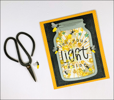
LightFlat

The sentiment is just perfect for a new fifth grader. Skylar had expressed an interest in Copic markers from watching some You Tube videos. I was pretty sure she didn’t want Copics, so I did some research while we were in Wisconsin. But instead of guessing what might work, I gave her another card last night with a promise of art supplies.
Colorful

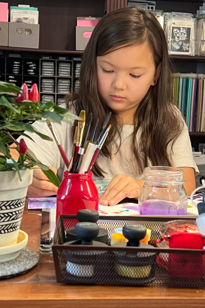
Today Skylar came over to play with my art supplies for a couple of hours. She tried out the Copics, the Tomboys, some watercolor markers, and some pan watercolors. In the end we ordered a set of alcohol markers that are less fussy than Copics and less expensive so she was able to get a good selection of colors. I gave her a few stamp sets, an ink pad, and a sketch book from my stash so she’ll have some things to play with when the markers arrive later this week.
IMG_0108ed

It’s been quite the lovely weekend! Hope yours was good as well.


Autumn Wishes

  • by

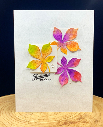
Getting back into the craft room has taken me longer than I hoped. Earlier this week I finished a very important birthday card which I’ll be sharing later this week. Today, however, I finally had time to make a card for several challenges all focused on fall colors. While we were in Wisconsin, an order from The Greetery arrived, and in that order was the “Curio: Autumn” collection of dies. I pulled it out this morning and die cut quite a collection of the leaves and other fall items. I pulled out my Altenew 36 pan watercolor set and painted them in a variety of colors. Today, you’ll see just three leaves, but I have an envelope with others that I hope you’ll also be seeing soon.

AutumnWishes

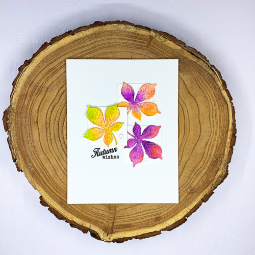
The design of this card comes from last week’s Freshly Made Sketches. It was designed by Cécile whose card designs are among my very favorites. I had hoped to get this card made in time to enter it in her challenge, but there was no way I could manage that. But I’m happy to adapt it here. The three squares were die cut with Ellen Hutson’s “Essential Dies: Squares.” Her Essential shape dies are among my most used dies. I adhered two of them directly to the card, and added dimensional tape to the third. The colorful leaves are from the Curio set and the sentiment from a very old Papertrey Ink set “Friendship Jar: Fall Fillers.” (Another good investment!)

AutumnWishesFlat

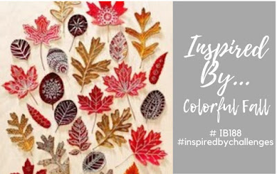
I’m entering this into four challenges all focusing on fall colors:  Inspired By: Colorful Fall, The Paper Players: CAS Fall Fun, and a second entry into Addicted to CAS: Leaf, and CAS Mix-up: Autumn Colors and Watercolor.

Inspired By IB188 Colorful Fall August 23Pp559

CASSeptember 2021


Color Hues #26: Purple and Pink

  • by

Time is flying by and it’s already the middle of September! I need it to slow down a bit, or find a way to add a few more hours to my day! Before we get to the new challenge, be sure to stop by the Color Hues Challenge site to see the winners of the first birthday party challenge! We had a wonderful gallery of cards, and it was not an easy task to choose the winners and runners-up.

The new Color Hues Challenge is Purple and Pink!

Color Hues26.001

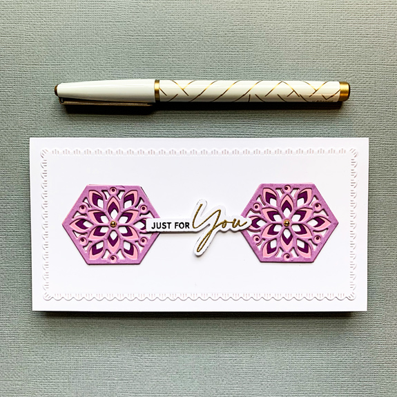
Purple and pink go together so well, I thought I’d have no trouble getting a card created. I first did a watercolored floral, but in the end, I decided the colors blended together so much it was hard to separate them. Then I acquired a couple of the Spellbinders “Large Die of the Month” dies, and found that they took care of the problem nicely. I ended up making two cards, one a CAS card (and the one I posted on the Color Hues site) and a more elaborate one which you’ll see here. 

P&P1

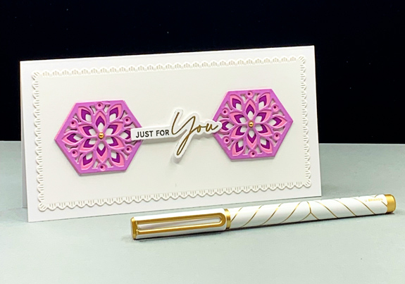
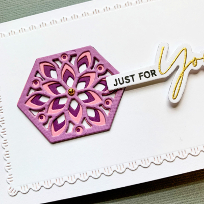
This card is a mini-slimline and uses dies from both Spellbinder sets: “Slimline Card Creator” and “Hex Kaleidoscope. To create the beautiful hexagon designs, I die cut each of three dies from three colors of card stock – two shades of purple and one pink. Once you line up the hexagons, you get this gorgeous design.

P&P1Close

The “Slimline Card Creator” comes with a set of dies in different sizes and in two designs–one simple stitched rectangle, and the scalloped border I used here. I added a simple gold gem to the centers. 

P&P1Flat

Once again, I found the perfect sentiment in The Ton’s “Easy Expressions: Birthday” set. There’s a bit of dimensional tape in the center to balance the dimension of the three die cuts.

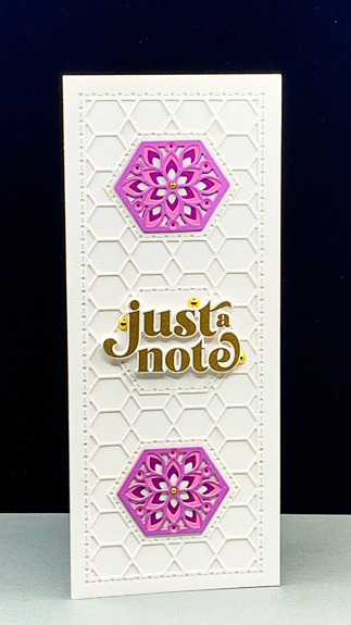
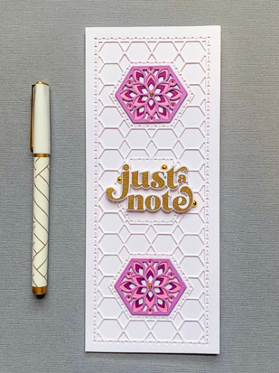
My second card is a true slimline card and I used the more ornate background die from the “Hex Kaleidoscope” set.

P&P2

Again, I chose the same design for the hexagon embellishments, but instead of using three of them, I used the center hexagon for my sentiment.

P&P2Close

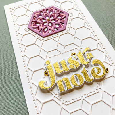
The sentiment from The Greetery’s “Opposites Attract” was gold embossed on white card and adhered with dimensional tape. I tucked three large gold gems around the sentiment, and small ones in the center of the hexagons.

P&P2Flat

One thing I like about the “Just a Note” sentiment is that it can serve as a lead-in to many inside sentiments from “Thinking of You” to “Wishing You a Happy Birthday” as does the sentiment “Just for You” on the first card. It’s good to have some flexibility for the cards in my stash.

As always, I hope you’ll join in the fun, and take a look at the wonderful creations from the Design Team and Guest Designer, Janet

Nancy

Hannelie

Cindy

Julie

 Sheri

Kristie

Lindsey

Tracey

I’m throwing one of these cards in the ring at Happy Little Stampers-Dies: Anything Goes, and in the gallery at Darnell’s NBUS gallery.

HLSDies NBUS

Brave!

  • by

The current challenge at Time Out is “Brave!”

TO 196

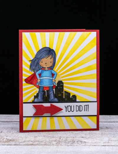
I have the perfect card for it made for one of my granddaughters when she gave up a persistent habit that she needed break. As we all know, breaking a habit is NOT an easy task, and even more difficult, I think, for a little one. We had a celebration, and this is the card I took.

Super

With four granddaughters, I was pretty sure I’d come up with a variety of reasons to use this fun My Favorite Things stamp, “You’re Super.” I started by blending bright yellow ink through the MFT’s “Radiating Rays” stencil on white cardstock and added it to a red card base. I stamped the Super Girl image on X-Press Blending paper, colored her with Copic markers and fussy cut it out. I also stamped the silhouette of the city on separate paper and again fussy cut it.

SuperFlat

Once I had arranged those pieces on the stenciled background I decided on a strip of white cardstock with a thin border of black for the sentiment. That gave our Super Hero a place to stand.  The sentiment was just perfect for the occasion, and I added a die cut arrow from Papertrey Ink’s “Get to the Point” dies. The card was a big hit, and I’m quite sure there’ll be other opportunities for a Super Girl stamp set.


Back to School

  • by

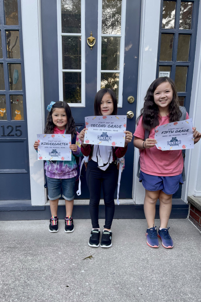
A very quick post to share a card I made for my three granddaughters who headed back to school this week after more than a year at home. They’re in Kindergarten, Second, and Fifth Grades this year. Yesterday was their first day and they were all enthusiastic about their first two days when they came for pizza tonight. 

BacktoSchool

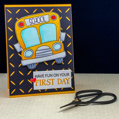
I love this (now retired) school bus stamp from Simon Says, and know at least one grandchild has seen it before. If these girls did, they didn’t remember it when I gave it to them on Wednesday. 

FirstDay

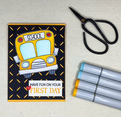
I used a Simon Says “Diamond Pattern” die for the background and added it to a Summer Sunrise card base–the perfect school bus color!

FirstDayFlat

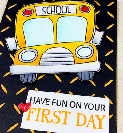
I colored the bus with Copic markers, and fussy cut it. The sentiment is also from the same Simon Says “School Bus Messages” set. I added a small puffy heart sticker to make a trio of red on the card.

FirstDayClose

I’m entering this in the Inspired By: Back to School Challenge–with the inspiration being, of course, the back to school theme rather than the photo.

Inspired By Back to School IB186 August 9


Autumn Colors

  • by

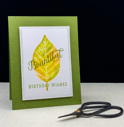
It’s beginning to cool down here, and our flowers (except the gorgeous dahlias) are beginning to fade. Another sign of autumn’s arrival is the number of card challenges focusing on nature, leaves, and autumn colors. Here’s my first (but probably not my last) autumn focused card.

Bountiful

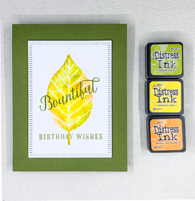
The beautiful leaf is from The Stamp Market’s “Large Leaf” stamp set. I positioned it in my Misti, and then applied the color directly to the stamp with some Distress Ink cubes, and lightly misted the stamp with water, and stamped it on Altenew’s watercolor paper which has become one of my favorites. 

BountifulClose

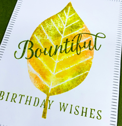
I love the way the inks blend together but the veins in the leaf remain distinct.

BountifulFlat

I die cut the stamped panel with The Greetery’s “Crimped Frame” and layered it on card base of Asparagus cardstock. The sentiment came from a Papertrey Ink Make-It-Market kit, “Color Pops: Autumn” which I haven’t used in a very long time. 

I’m entering this in three challenges: Addicted to CAS: Nature, CAS Mix-up: Watercolor & Autumn Colors, and Happy Little Stampers Watercolor: Anything Goes.

ATCAS Mix-upSeptember 2021 HLSWatercolor

Black & White Graphic Cards

  • by

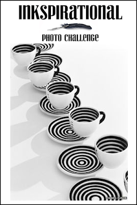
My inspiration for both cards today came from the Inkspirational: Challenges blog. You’ll see why my first idea wasn’t quite right, but I’m happy with both cards, and think they’ll be a good addition to my stash of masculine cards. Here’s the inspirational photo:

Challenge246

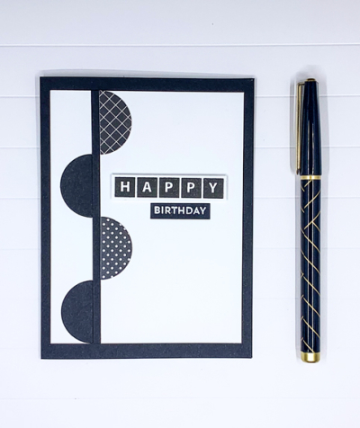
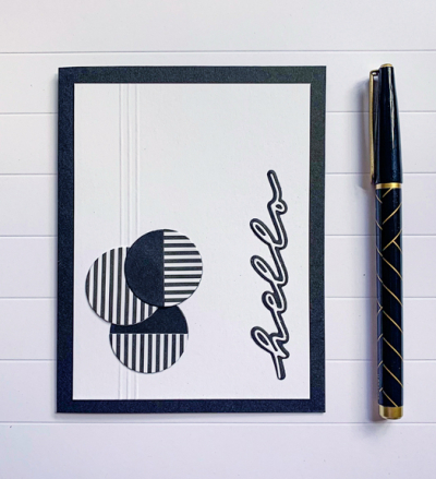
I’m a big fan of black and white cards so this photo called out to me. I also have the relatively new Simon Says “Geometric Builders: Circles” which I haven’t used so it seemed like perfect timing. I did not, however, have this photo in front of me when I created the first card.

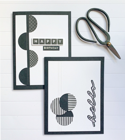
B&W2

Although I like the card, it’s clearly missing the stripes and there are half circles rather than whole circles. So today I made a second card more in keeping with the photo.

B&W1RCool

A better representation of the photo inspiration and I like this one, too. Photographing the scored lines, however, turned out to be a challenge, but I finally managed that. I couldn’t, however, seem to get consistent, good lighting without shadows this morning. I finally gave up so the card for the challenge could be posted before I leave for the afternoon.

B&WX2


The patterned papers for these cards are all from My Favorite Things. The sentiments on the first card were stamped with Papertrey Ink’s “Birthday Bash” set and MFT’s “Bitty Birthday Wishes.” The sentiment on the second card is from The Stamp Market’s “Handwritten Hello.”

We’ve been on the road every day this week going back and forth to the cottage Tracy’s family rents every summer on Honeoye Lake. After all the hot, humid days, we’ve got cool temperatures this week. Yesterday came close to chilly at the lake. The sun’s out today, though, so hopefully that will help. We’re trying to stay outside as much as possible and masking indoors since we’re being extremely vigilant about our behavior having five unvaccinated grandchildren. I must admit, it’s frustrating to return to this kind of restrictive behavior after having seen the light at the end of the tunnel earlier this summer. But until the more contagious variants disappear, it’s a necessary change.


Happy 1st Anniversary to the Color Hues Challenge

  • by

Despite the many challenges of 2021, the year is flying by, and here we are at the first anniversary of the Color Hues Challenge! To celebrate there are prizes this month—see below! The other great news is an addition to our Design Team: Tracey McNeely. Some of you may already be familiar with her beautiful work on her blog and for a variety of companies. We’re so lucky to add her to DT. Welcome, Tracey!

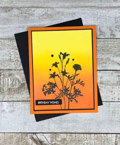
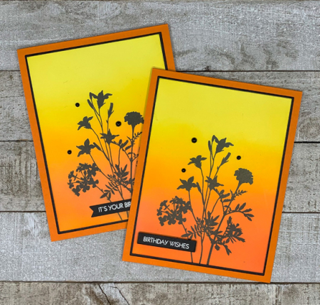
I was the lucky DT member who got to choose this month’s colors and my choices were Yellow and Orange–a good combination of a summer vibe (yellow) and the coming autumn (orange) for those of us where the seasons change. 

CH #25 Anim.

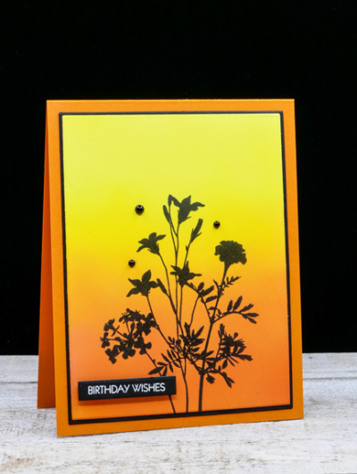
My card design is one I created quite some time ago. I never posted the card, and when I found it recently, I was amazed at how much my ink blending had improved since I’d created the first one. There’s no way I’d post the original card now, but I’m much happier with the ink blending this time around. I’m quite sure that in addition to practice, some new tools contributed to the improvement as well. I really like the Taylored Expressions ink blending brushes as well as the Altenew brushes—particularly the larger one. It took me awhile to invest in both brushes as they are more expensive than the ones I purchased originally.

YellowOrange2

I used a combination of Distress Oxide Inks for the background: Squeezed Lemonade, Mustard Seed, Carved Pumpkin, and Spiced Marmalade. I added a touch of Concord & 9th’s Marmalade ink which is a bit deeper to the very bottom of the panel. 
YellowOrangeFlat

I die cut the ink blended panel with the smaller of Gina K’s Master Layout dies, and stamped the floral silhouette is Obsidian Black (Altenew) from Gina K’s “Natural Silhouettes” set. Next was to use the larger of the dies in the layout set to cut a narrow frame of black. The sentiment is from Pink & Main’s “Special Day” set. Finally, it was all assembled and added to a card base of Orange Zest (Papertrey Ink.)

Since I had ink blended a couple of panels, I made a second card–it’s always good to have a stash of birthday cards!

2YellowOrange

To celebrate the Color Hues anniversary, there will be TWO winners chosen for this challenge both of whom will receive a $25 gift certificate to Simon Says! Hope you’ll join in the fun, and be sure to check out the DT and Guest Designer, Angie’s, card right here. And at each individual blog here:

 Nancy

Hannelie

Cindy

Julie

 Sheri

Kristie

Lindsey

Tracey


Altenew’s Pair a Flower Contest

  • by

Contest

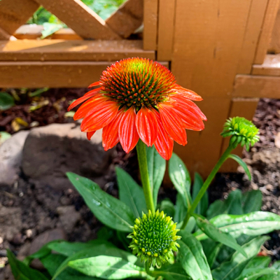
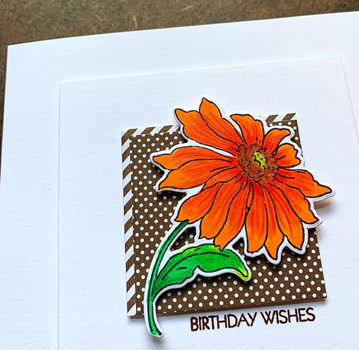
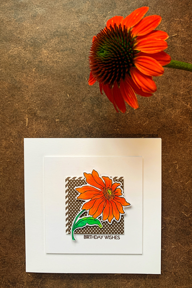
The time frame for Altenew’s Pair-a-Flower contest is narrowing, and I’ve had an idea for it for several weeks. Here are the details about the contest:  Challenge: Create a project with any Altenew floral design. Pair it with the same flower in real life or a similar floral design and photograph the two side-by-side. My initial idea was to take a photo of a coneflower at the garden center since none of mine came back this year, but when I was there on Saturday, I found this bright orange coneflower and brought it home. Hopefully, it will thrive along our new fence.

Coneflower

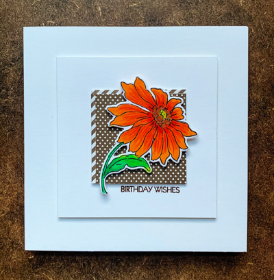
There are actually multiple blooms, but I focused this photo on just one bloom as a reference for coloring the Altenew: “Build-a-Flower: Coneflower.” Here’s the card by itself. It was colored with Copic markers and detail added using my Lyra Rembrandt colored pencils. I’ve had this set for years and years and rarely think to use it. Today neither the Polychromos or the Prisma colored pencils sets had a dark enough orange pencil. I do have a more extensive set of the Lyra’s and should remember to use it more often.

Card

CardClose2

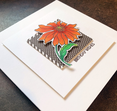
I added some dimension between each of the layers, using dimensional tape for some and extra layers of cardstock under the patterned paper square..

CardDimension

Here’s the photo of the card and the flower together which I’ll be posting on the Altenew Contest site.

Card&Flower


Tic-Tac-Toe

  • by

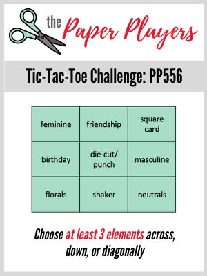
There is at least one card challenge out there that does a different Tic-Tac-Toe challenge each time. I’m alway curious about them, but somehow rarely participate. One of my favorite challenge sites, The Paper Players, has a Tic-Tac-Toe challenge this week. This is a weekly challenge, and I frequently miss those too. This time I was determined to play along.

Pp556

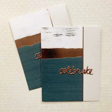
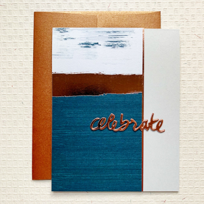
When I recently went through and purged nearly half of my 6X6 papers, I found some old favorites. One pack was a My Mind’s Eye set with gold accents which I loved when it came out. I found this blue and bronze combination which I thought would make a good masculine birthday card. I need two of them in September, and I chose the row across the middle: birthday/die-cut/masculine. 

Celebrate

The 6X6 paper gave me two 3″ pieces. I adhered it to the left side of the card, and used another piece of paper from the pack to die cut the word “celebrate” and cut a narrow strip of bronze metallic paper along the side. 

CelebrateX2

The die cut sentiment is from Papertrey Ink’s “Wet Paint II” set.

CelebrateFlat

Thanks for visiting. I hope you have a great week!


The Paper Players Sketch

  • by

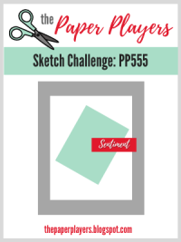
When thinking about creating a card, I rarely think to use a sketch. I’m usually more inspired by a photograph, a set of colors, a theme, or a design element. This time, however, when I saw the sketch on The Paper Players, I knew it would be perfect for a piece I colored as part of the 30 Day Coloring Challenge. Here’s the sketch:

Pp555

In a recent reorganization project (more on that to come later) I found some patterned papers I thought would go well with the small stamped piece I had created earlier. 

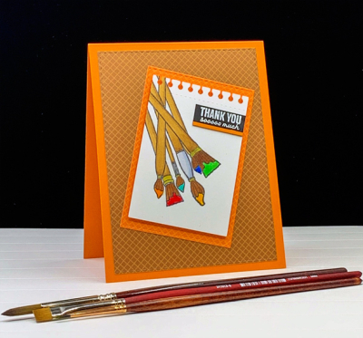
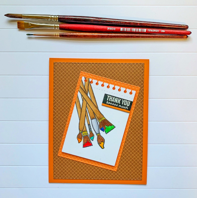
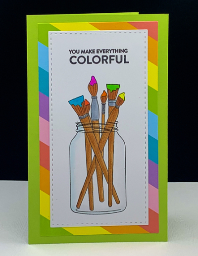
Paintbrushes

The paint brushes come from a very old Papertrey Ink set, “Friendship Jar Fillers.” The Friendship Jar sets have long been a favorite, and I come back to them over and over. This card is for my nine year old grandson who gave me two handmade gifts when he came to visit. He’s a budding artist, so the paintbrushes seemed appropriate. The patterned papers come from an older 6X6 pad by Sunny Studio, “Gingham Jewel Tones.”

PaintbrushesFlat

The paintbrushes were partially stamped to fit on the PTI die, “Spiral Notebook Page,” and colored with Copic markers. I used some Glossy Accents to add some dimension on the paint. The sentiment is from The Stamp Market. I embossed it on black and added a narrow cardstock strip to the bottom of it. 

My crafting time seems to get divided between my reorganization efforts and card making. Hoping to get more of both done this weekend.