Skip to content

Smile!

  • by

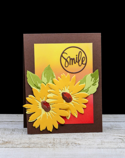
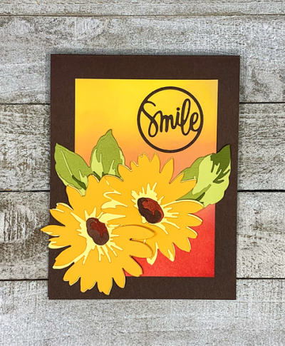
Thanks to a friend who cut and shared some of her daisies from the Altenew “Daisy Layering Set,” I have a card for the current The Flower Challenge—use a die. The entire card was created with dies.

Smile

The first step was to create an ink blended background for these pretty daisies. I added that to a Dark Chocolate (PTI) cardbase and then set about creating the daisies. 

SmileFlat

Getting the daisies and leaves arranged on the card took a bit longer than I expected. I wasn’t sure what to do about a sentiment, but found this “Smile Circle” from Simon Says which worked out perfectly. It was die cut from Dark Chocolate cardstock as well. 

It’s good to be back in the craft room. I’m in another purge and organize phase. Sometimes I think that’s as much a hobby as card making! But, in fact, I found a few things which inspired some cards. Off to link up with The Flower Challenge which ends this afternoon.

TFChallenge#59

Pretty in Pink

  • by

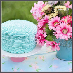
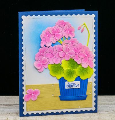
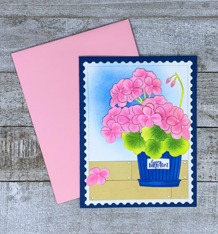
The pretty pink geraniums on today’s card were created for a blogging friend, but I wanted to be sure she received the card before I posted it. She’s a huge fan of pink so there was no choice about what color these geraniums would be. Luckily, the photo inspiration for AAA Birthday also features pink flowers.

AAA#28 #28 photo

When The Greetery introduced this most recent BotaniCut, I knew I would have lots of opportunities to use it. Geraniums come in so many colors, and they are a favorite of mine.

Geraniums

I added a soft ink blended background to one of The Greetery’s “Postal Frames” that matches the blue pot in the photograph, but my blue pot and the card base are a much brighter hue. I grounded the pot on some ink blended “Shiplap Builder” dies, also from The Greetery.

GeraniumFlat

The geraniums and the “Pretty Pot” die were all cut from Bristol Smooth cardstock and colored with Distress Oxide Inks. I added some details to the dies with Polychromos pencils. The cute sentiment and label is from an earlier set by The Greetery, “Market Baskets.” Betsy Veldman definitely excels in designing the most beautiful floral dies and containers. 

I always hope I’ll get some crafting done while we’re away. I managed to do a little watercoloring one morning, but it’s a bigger piece so I don’t think it will get finished until we get home. I do have a couple pieces I colored for the current 30 Day Coloring Challenge before I left, so hopefully I’ll get those posted in the next couple of days. Thanks for visiting!

Color Hues #24

  • by

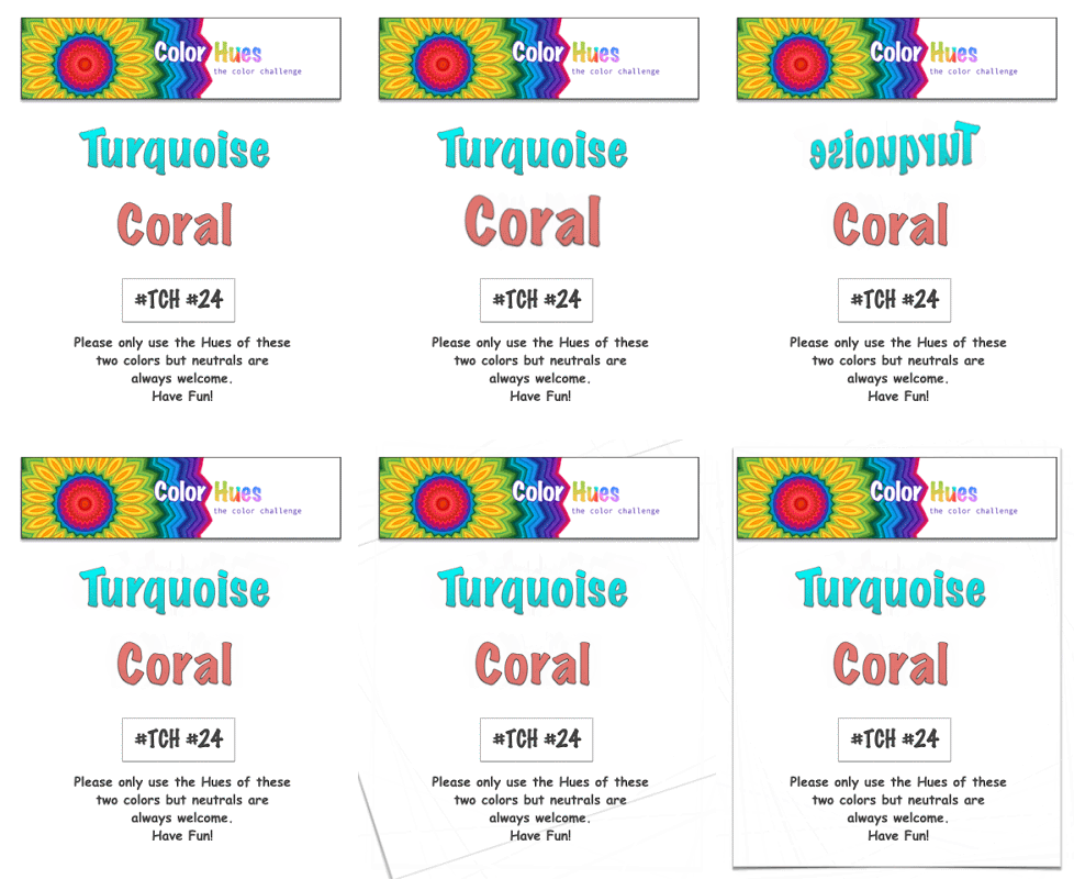
It’s a very vibrant color combo this time around at Color Hues:

Color Hues #24 Anim.

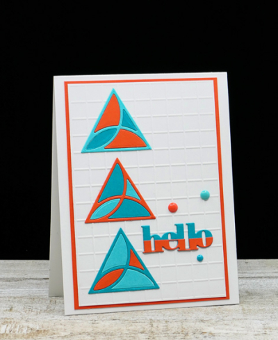
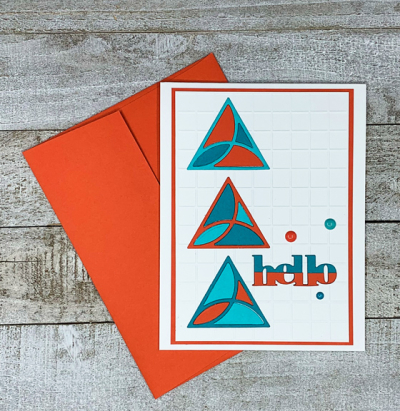
Coral is a tricky color. I “Googled” it to see what shades might come up–some look pretty orange, and my husband thought my choice was definitely orange. I, however, chose a Gina K cardstock called “Coral Reef” so I was able to defend my choice without question! For the turquoise, I chose two papers: Papertrey Ink’s “Hawaiian Shores” and Concord & 9th’s “Oceanside.” I have to thank Kristie Goulet, one of my DT teammates for the inspiration for this card. After seeing several different designs she created with the “Mosaic Tiles” die from Catherine Pooler, I had to order it. 

TurquoiseCoralDie

There must be hundreds of possibilities with this die set, and I love that it’s easily customized for males or females.

TurquoiseCoral

I dry embossed the background with an Alexandra Renke embossing folder, and die cut three sets of the Mosaic Tiles–one with each color. Then I had to decide which triangles I would use. The one above is one of my favorites, but you’re sure to see this die show up here again and again with different designs. 

TurquoiseCoralFlat

The sentiment is a Simon Says die that arrived with a kit. I die cut it twice, cutting the coral piece in half to create the half-and-half look. Amazingly, I found three enamel dots–one matching each three of the cardstocks I used to finish the card off.  

I hope you’ll take a look at the fantastic designs the DT and our Guest Designer, Linda Snodgrass, have created:

Nancy

Hannelie

Cindy

Julie

 Sheri

Kristie

Lindsey

And come join the fun!


Shades of Blue

  • by

I have another card I’ve colored for Kathy Racoosin’s 30 Day Coloring Challenge

30Day_challenge_Aug2021-01-3-768x769

And, for me, this is a late night post, but one of the two challenges looking for blues ends in just a few hours. First up is the Less Is More Challenge looking for Shades of Blue. The second challenge is Simon Says Wednesday Challenge: Summertime Blues. I’m also popping this in the CAS on Friday Challenge to use a Favorite Stamp.

ShadesOfBlue

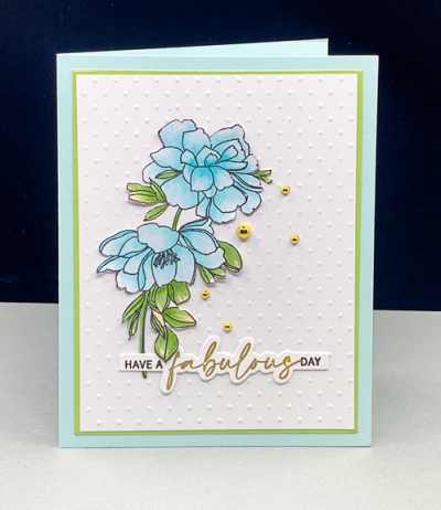
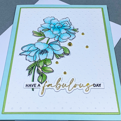
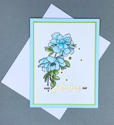
This is one of my favorite florals. It’s from Pinkfresh Studios–“Keep Going.” When I was fussy cutting it once again, I realized that investing in the die might be an appropriate purchase. I chose to color it with Copic Markers in soft blues and greens, adding some shadows with my Polychromos pencils.

ShadesOfBlueClose

After fussy cutting it, I added it to an embossed polka-dot white panel that was in my box of panels and die cuts that I’ve stashed away. I die cut a thin green layer with the Gina K Master Layout dies and added it to a light blue card base. 

ShadesOfBlueFlat

Once again the “Easy Expressions: Birthday” stamp from The Ton worked out perfectly. I tucked it under one of the leaves, and then added some gold gems from The Paper Studio. 

I’m just managing to keep up with the 30 Day Coloring Challenge, although I need to do a major catch-up post for Instagram. Today was the first day since Sarah and her family arrived that I managed to get in a full hour of crafting time. Tomorrow looks much less likely. If the weather’s good we’re headed to the zoo, then the beach for a picnic and a ride on the carousel, and finally pizza with friends for dinner. 


Summer Photography Scavenger Hunt: Round 2

  • by

It’s the mid-summer check-in for the Summer Photography Scavenger Hunt hosted by the lovely Mary-Lou at Patio Postcards. I have six more to share, which (by my count) leaves me with eight on the master list and one of the alternates to find before the end of September. 

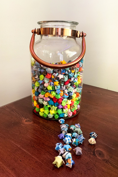
The first is the Art of the Fold. I take no credit for these folded stars. Sarah used to fold them while she watched a television show. At one point I thought she wanted to put them in a lamp base, but for now, this is a pretty cool decoration in her sewing room.

Artof the Fold

The Shape of Round:  I have three photos of two circular finds. The first is the inside dome in the Heinens Grocery Store in Cleveland. I have two views of it.

Circular1

Circular2

Next up is a very cool plaque in the Cuyahoga Valley National Park.

Circular3

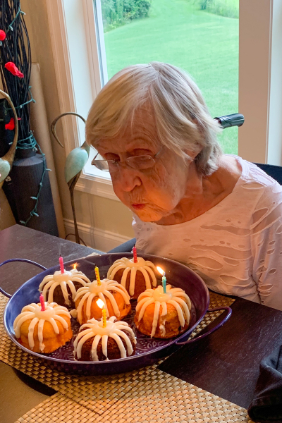
Finding something that was a cause for celebration was an easy one. Tracy’s mom turned 92 on the fifth of July. Dessert was six Nothing Bundt Cakes in a variety of flavors.

Celebration

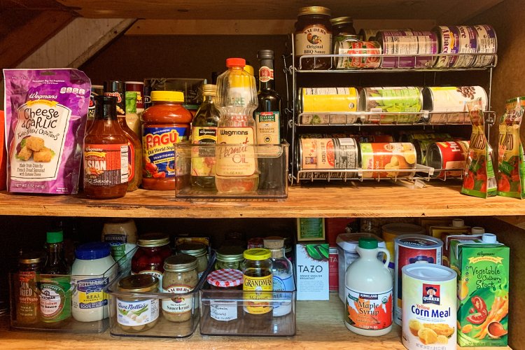
Inside Your Fridge or Cupboard. It’s a constant battle to keep our pantry organized. A few years ago we invested in some metal racks and baskets and some plastic boxesthat have really helped. This was our latest reorganization done last week.

InsidetheCupboard

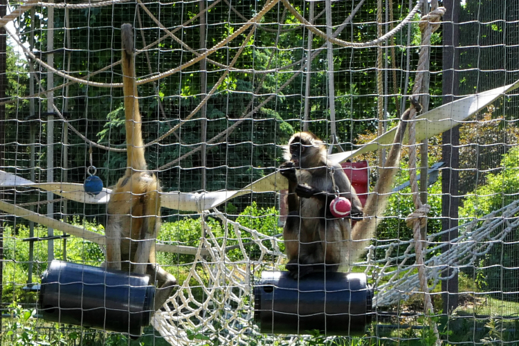
These Black-Handed Spider Monkeys at the Racine Zoo did exactly as I hoped they would do for the Upside Down, Right Side Up prompt.

UpsideDownRightsideUp

Next up is Steps, But Who’s Counting-also found at the Cuyahoga Valley National Park.

Steps

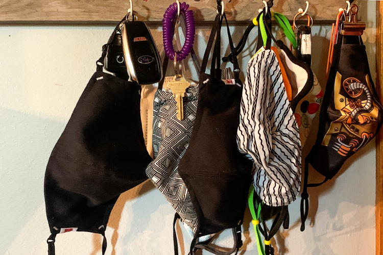
And lastly, one from the Alternates list—all the masks for COVID safety hanging on hooks at Sarah’s house. We have a few in our kitchen as well, although not quite the collection seen here. We’re back to wearing them almost everywhere again, even outside yesterday visiting family with a new baby. It’s hard to see an end in sight, although once the grandchildren are able to be vaccinated it will be a bit easier. We had hoped that might be available by September, but it’s looking more like November or December. It’s discouraging, to say the least.

COVIDSafety

Thanks again to Mary-Lou for hosting and creating the fun lists each summer.


Grateful

  • by

I’m participating in Kathy Racoosin’s 30 Coloring Challenge by doing just a little bit each day.

30Day_challenge_Aug2021-01-3-768x769

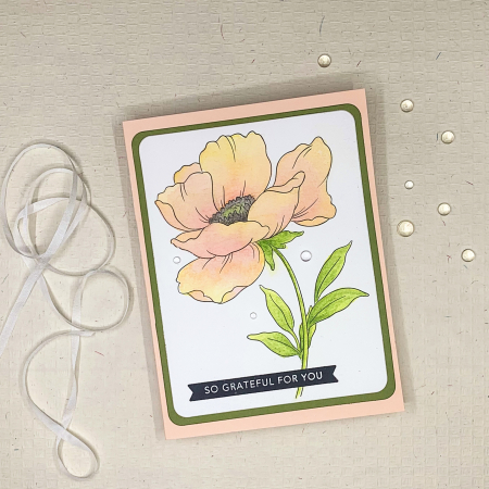
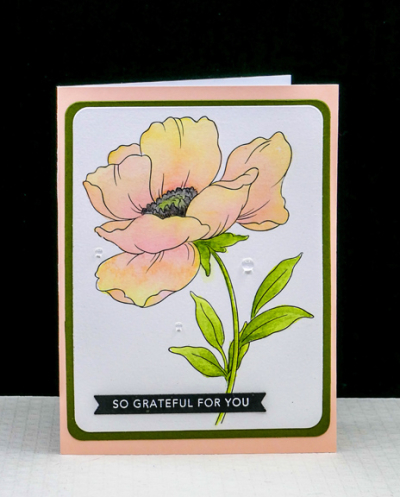
I’m focusing on watercoloring and adding new layers each day to deepen the colors. Patience is not always my virtue–especially when approaching watercolors. And that is a mistake. Letting each layer dry completely makes a huge difference. This card represents three days of coloring. I posted each day’s progress on Instagram, but after posting the finished card there, decided to add three raindrops to the card which I like. 

Floral1Flat

To expedite matters, I used a page from Altenew’s Watercolor Coloring Book. I also used Altenew’s 36 pan watercolors. 

Floral1

The images in the coloring book are larger than I’d like them to be, but I was able to die cut the floral and then a narrow frame with Hero Arts “Rounded Rectangles Infinity” dies. The frame is one of my favorite greens from Gina K called “Asparagus.” The card base is a “Pale Pink” from Memory Box which has a white interior–great for writing a thank you note. The sentiment strip was in my “already stamped and die cut” basket, and I’m not sure which of the many sentiment stamps I used for this one.

I’ve watercolored the past two days as well, but probably won’t share any of it here or on Instagram as I’m hoping to use it for a future Color Hues post. 

Need to get back to the cleaning and organizing I want completed before Sarah and her family arrive this weekend. We’re having absolutely perfect summer weather here. I hope it continues.

Happy Birthday, Sarah!

  • by

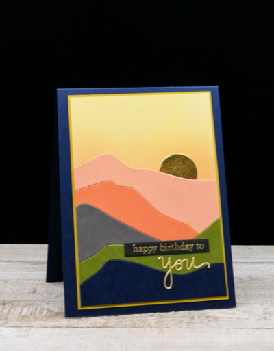
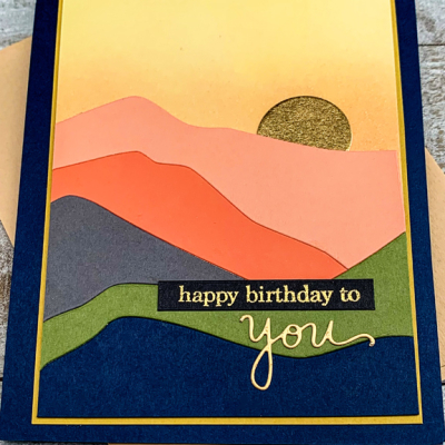
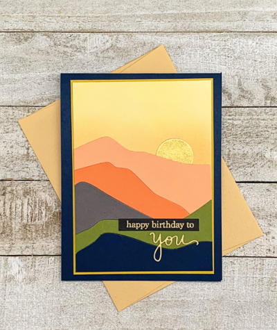
Sarah turns 41 today, and that fact is almost as perplexing as celebrating our 48th wedding anniversary. Sarah will get this card when she arrives here on Saturday with Adam, Caleb, and Hannah. They’ll be here a week, and then we’re all headed to a cottage on a lake in Michigan for a week. She doesn’t read my blog, so I’m not worried about her seeing the card online before she receives it. Even if she did, her day is so busy that’s it’s unlikely that she’d have time for blog reading anyway. Shortly after they return home, they’re moving to a “new” house. Actually, it’s a much older home in a lovely area in downtown Racine. It’s a much friendlier neighborhood with sidewalks, lots of kids nearby, and just a block and a half to Lake Michigan. It’s a good move for the kids—and for the adults who already have friends in the neighborhood. Getting ready for a move before a two-week vacation was not what they planned for when their vacation dates were set.

This card was inspired by (and is a very close CASe) of one by Carissa Wiley. It was created when Ellen Hutson released two new die sets–“Abstract Sunset” (which I used here) and “Abstract Mountain.” Most of the cardstock used is from Concord and 9th.

HBMountain

I’m hoping it will remind Sarah of her two summers working at The Ghost Ranch. She absolutely love it there, and we were lucky enough to visit her for a few days the first year she was there. If you click through to the link, be sure to click around so you can see some of the beautiful landscapes. Georgia O’Keefe lived at The Ghost Ranch for part of many years, and painted some of the landscapes.

HBMountainsClose

I love these colors together and chose a gold metallic paper for the moon (or sun depending on your inclination). Both the gold embossed sentiment and the die cut “you” are from Simon Says.

HBMountainFlat

I did some ink blending on the top die cut pieces but decided not to to any on the other layers. I made several of these cards, and they are all just a bit different. 

My blogging was erratic in July, and likely to be again in August as most of my time for the next two weeks will be spent with family and friends. I’m working on Kathy Racoosin’s 3o Day Coloring Challenge, so there’s likely to be a few new cards–as well as some for challenges if I can get some time in the craft room. The day to day posts for the challenge are beinf posted in my Instagram account. One of the options for the challenge is to do a little bit each day. So far I’ve done some watercoloring on a floral for the past two days, and expect to finish it tonight. 

Color Hues #23

  • by

July passed in a blur. We were away most of the first two weeks, and I’ve been recuperating from my fall for the last two weeks, but here we are at the beginning of August. August is likely to pass by in a blur as well since my daughter and her family will be here for a week, we’ll share a cottage on a lake in Michigan for a week, and then spend the last week traveling back and forth to a cottage in the Finger Lakes to spend time with Tracy’s family. Fortunately, I’m back in the craft room and playing with some new (as well as some old) products.

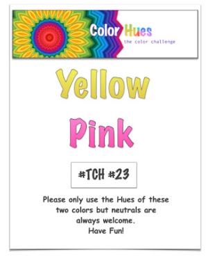
The new Color Hues combo is such a pretty one:

Color Hues23

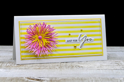
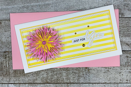
I knew right away I wanted to use my new Altenew “Classy Stripes” stencil which I saw Laurie Willison use during the recent Cardmakers Summit event. I already had some of the Ink to Paper’s “Into the Blooms II” dies cut from pink paper so it was just a matter of adding a yellow layer and doing some ink blending with my (also new) Detail Blending Brushes from Altenew. 

YellowPink

I settled on a mini-slimline format which I like a lot. Once I had the stenciled background prepared, I die cut a piece of it with one of the Pinkfresh “Mini Slimline Essentials” dies. I cut a narrow yellow border and then added it to a white cardbase.

YellowPinkFlat

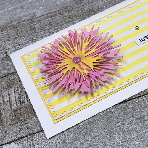
I shaped the floral pieces with the Tim Holtz “Shaping Kit,” (another new product,) added a pink enamel dot to the center, and adhered the flower to the card front with some dimensional tape. The sentiment is from The Ton’s “Easy Expressions Birthday” set stamped in black and embossed in gold. To pick up the gold accents, I added three gold dots from The Paper Studio. 

YellowPinkClose

I hope you’ll hop over to the Color Hues Challenge and join in the fun, checking out the cards made by my awesome Design Team members and our Guest Designer, Conil.


Nancy

Hannelie

Cindy

Julie

 Sheri

Kristie

Lindsey

Happy Anniversary!

  • by

Amazed at the number and amazed by my great good fortune–today is our 48th anniversary! The inside sentiment (shown below) says it all. We have a quiet day planned at home with dinner out at our favorite Mexican restaurant in Canandaigua which means  a walk along the lake afterwards I’m sure. 

TOWAnniversary

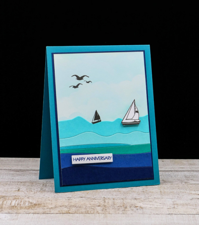
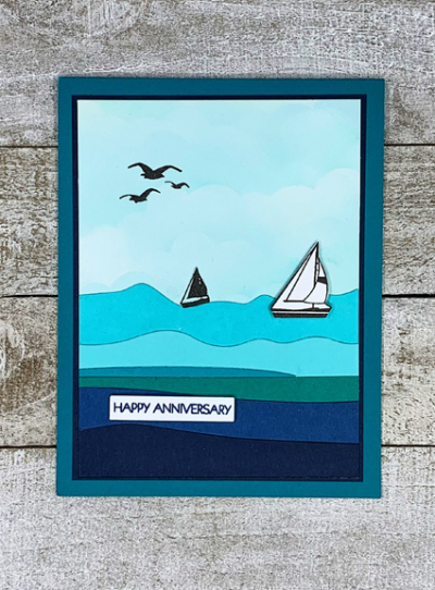
About a month ago, I ordered the Ellen Hutson “Abstract Sunset” and “Abstract Mountain” dies. I used the “Abstract Sunset” die here turning it into an ocean (or lake). The MFT Cloud stencil was used on the largest piece from the die, and I die cut the rest of the pieces from various blues found in my scrap folders. 

TOWAnniversaryFlat

The stamps are from W+9’s “Dockside” set. I fussy cut the two sailboats. The sentiment is from my fave Pink and Main “Special Day” set—today certainly is special!

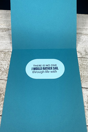
The inside sentiment is from the newer Papertrey Ink (Ink to Paper) set “Seas of Life,” and not only fits the theme of the card but expresses exactly how I feel about spending nearly half a century with one of the kindest, most loving men I know.

TOWInside

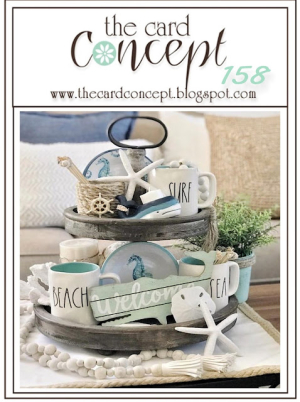
I’m entering this in the Card Concept Challenge:Long Summer Days–the inspiration is, of course, the nautical theme, but also the color scheme. It wasn’t as easy to decide on the design style this time, I think it’s closest to Clean and Layered–though most of the layers are flat. The description of the styles are here, and I’d love to know what others think!

TCC158 062321

Citrus Inspired

  • by

I’ve seen quite a few new stamps sets featuring citrus fruits and some lovely cards created with them, so I wasn’t surprised to see Happy Little Stampers CAS come up with this month’s challenge: Citrus and Zing.
HLSCAS

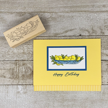
I don’t have much in the way of citrus stamps, but a wooden stamp with a lovely image of lemons in a bowl has survived my multiple purgings. It was one of the few things I watercolored while we were away. It’s taken me some time to get it onto a card–more about that at the end of the post.
Lemons

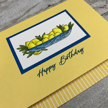
Finding a blue cardstock to match the blue watercolor I chose for the bowl turned out to be the most time consuming part of creating the card. I finally found a scrap in my scrap folder that worked perfectly. Luckily, I had an Altenew mini-ink pad that matched the blue as well for the sentiment.
LemonsClose

I have a stash of prefolded cards on my shelves and generally, that’s the first place I look when I need a card. This yellow was the perfect color and was folded leaving a border at the bottom. I found a piece of yellow-striped patterned paper that worked well there.

I’m also throwing this in the ring at Simon Says Monday Challenge: Food or Drink.

Last week after spending a week with Sarah and Adam, and two days exploring Cleveland and visiting with cousins, we drove to the Cuyahoga Valley National Park, about 30 minutes south of Cleveland. We spent the day exploring the park, taking photographs, and hiking. Our last hike of the day was at The Ledges. As we were hiking along, a woman emerged from two of the large rocks, and suggested we go inside. It was beautiful, and as I started climbing up a group of rocks, some folks started down the route. I stepped to my right to make room for them and my foot landed on a wet rock and down I went! I was able to walk back to the ranger’s table and get some ice, but my right shin was really scraped up. I’ve been keeping it elevated and icing it regularly but there hasn’t been a lot of improvement. 

Today I decided it was time to seek some medical attention. Luckily, it is not broken, but I’m going to have to continue with the elevation and icing. Sad to say, there’s not much beside reading and working on my laptop that can get done with one leg elevated! I have a huge list of ideas, and new stamps and dies to play with, but it’s going to be slow going. My brother-in-law recently commented that most of our health complaints are a result of “AR disease.” When I asked for a translation, he said it stood for “age-related.” The recovery from this might be, but the accident was clearly not. Could have happened in my 30’s! Mostly, now, I’m just annoyed.
 

Just Because

  • by

Whenever I travel I pack a few crafty items to create with while I’m gone. I rarely accomplish much, and this trip was no exception. I did a bit of watercoloring, but haven’t had time to do anything with it yet. It’s good to be back in the craft room, although the “to do” list is pretty long. There’s been a lot going on, both here and while we were away, and I hope to have a catch-up post written by the middle of next week. (I’m waiting for one of the big projects to be completed.)

For now, I have a card for the current Flower Challenge: Add Spots or Stripes.

TFChallenge#58


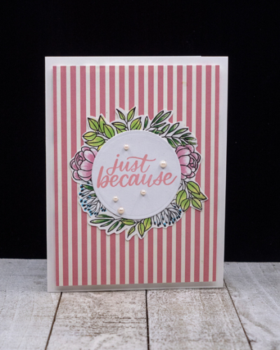
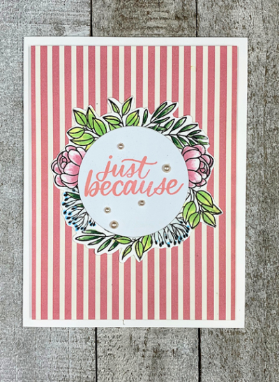
This was a quick card to create. All the stamps are from Simon Says “Leafy Frames,” a card kit set from some time ago. I stamped and colored the wreath with Copics, and then die cut a circle to hold the sentiment from the same set.

JustBecause

The pretty striped paper is from a Carta Bella pad, “Botanical Garden” which I added to a die cut panel slightly smaller than the card base and popped it out with some foam.

JustBecauseFlat

I added a few A Muse pearls and that was it. 

Hope your weekend is off to a good start. We’re expecting a lot of rain tomorrow, but we’ll have plenty of entertainment since the three girls are coming for the afternoon. We’ll be making cupcakes for Maddy’s fifth birthday celebration. She turned five while they were on Nantucket and we were in Wisconsin, so this is birthday dinner #2!

Color Hues #22

  • by

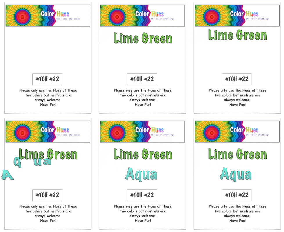
The Color Hues Challenge has a new duo for you:  Lime Green and Aqua.


ColorHues#22Anim

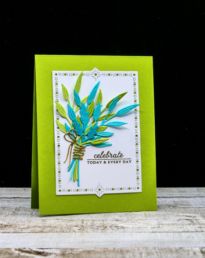
I love this bright and cheerful color combination, but it took me awhile to come up with a design I liked. As I often do, I turned to dies and ended up with The Greetery’s “Inside and Out Berry Branches.”
LimeGreenAqua

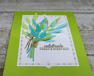
I die cut the branches in two shades of lime green and two shades of aqua, arranged them in a bouquet and “tied” them with a gold ribbon from the “Fit to Be Tied” collection, also from The Greetery. The next step was to find the right background and again The Greetery had the answer–a “Nordic Frame,” one of my favorites. 

LimeGreenAquaClose

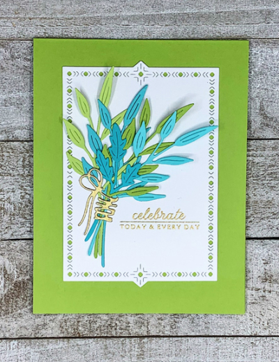
The sentiment from an old, and loved, set by Papertrey Ink “Autumn Abundance” was embossed in gold. Either lime green or aqua would have worked as a cardbase, but I liked the lime green better.

LimeGreenAquaFlat2

I hope you’ll hop over to the Color Hues Challenge and join in the fun, checking out the cards made by my awesome Design Team members, and our Guest Designer, Rosemary.


Nancy

Hannelie

Cindy

Julie

 Sheri

Kristie

Lindsey


Seize the Birthday–Framed, or Reversed Framed

  • by

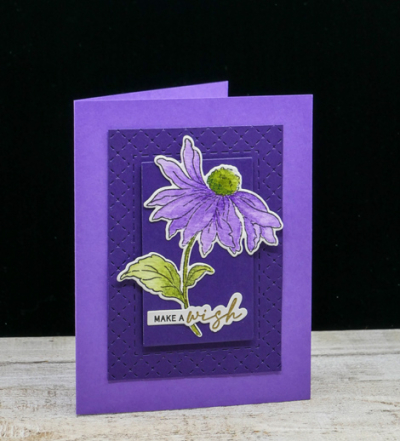
The topping at Seize the Birthday Challenge now is “Framed.” This pretty coneflower (again!) is definitely framed, but framed from behind the coneflower. I noted the same technique among some the designers for the challenge as well as some of the current entries. Even if it doesn’t qualify as “framed,” there’s always the option at Seize the Birthday to use the “Anything Goes” prompt. 

2021-07-08-Framed

This is the last of the Altenew Coneflowers that I watercolored a week or so ago. I didn’t want to post it until my friend received it for her birthday.

PurpleConeflower

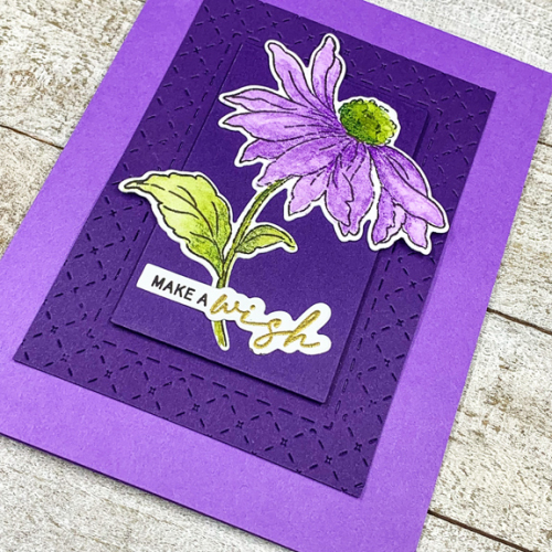
This is my favorite of the cards because of the framing which came about in a rather haphazard way. When I went to dry emboss Papertrey Ink’s “Border Bling: Tin Stiched” it slipped in the die cutting machine. I didn’t want to throw it out so I cut it down and then used the center piece to add some dimension for the coneflower.

PurpleClose

I added both to a card base of Amethyst Allure and then added the coneflower that had been die cut as well as another sentiment from The Ton’s “Easy Expressions: Birthday.” I’m quite sure I’ll cut down more of the Border Bling frames in the future. 

I’m throwing this in the Happy Little Stampers: Die Cuts and Watercolor Challenges, both of which are Anything Goes.

HLSWatercolor HLSDies

Just Us Girls: Word Week-Script

  • by

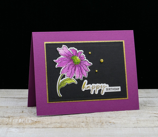
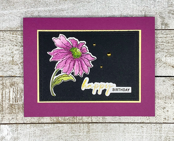
 A quick post to enter a card in the Just Us Girls current challenge: Script. Many of my favorite fonts are script, but my newest sentiment set from The Ton combines print with a lovely script that you can highlight thanks for The Ton’s innovative “grouped layering” stamps. You won’t be surprised to see another Altenew Coneflower, either. (There’s still one more to come.)

MagentaConeflower

This is one of the coneflowers I watercolored, using my Daniel Smith watercolors. The card base was created with a piece of cardstock that had already been cut. Sadly, I can’t find a match for it anywhere in my cardstock collection so I can’t tell you where it came from nor can I order any more of it! It’s  a little brighter than most of the magenta cardstock I own.

MagentaFlat

I do like these sentiments from The Ton, Easy Expressions: Birthday, and recently ordered “Easy Expressions,” which includes sentiments for many other occasions.  I added a thin gold mat and three gold embellishments to finish the card. 

I’m also entering this in the Happy Little Stampers: Watercolor challenge for July which is “Anything Goes.”

JUGS HLS Watercolor


Summer Photography Scavenger Hunt

  • by

I’ve been participating in the Summer Photography Scavenger Hunt for years now, and always enjoy it. This year I really need the motivation to get out there with my camera. I’m off to a relatively slow start. You can check in with the other participants at Mary-Lou’s blog, and join in if you’d like. The list (compliments of Mary-Lou) is right here.

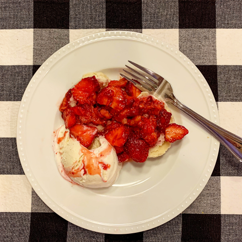
GuiltyPleasure

We might as well start with #16 – A Guilty Pleasure – and yes, it was, on several nights recently with fresh local strawberries.

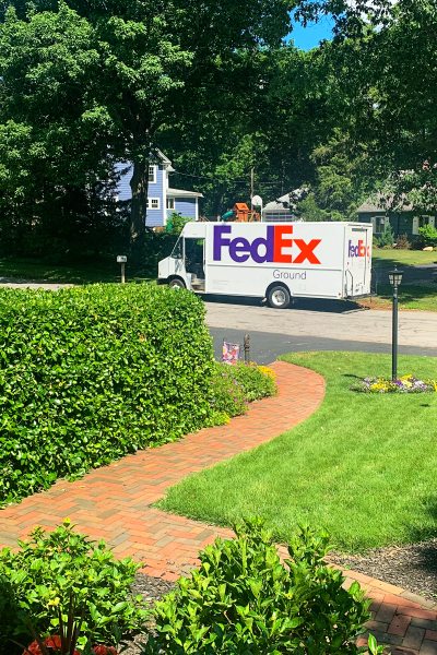
DeliveryTruck

A Delivery Truck – #10

This is a perfectly acceptable entry, but I really missed the boat when they delivered a new window to be installed in our kitchen! I just wasn’t thinking about the scavenger hunt!

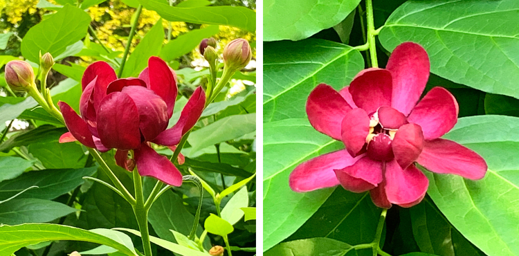
AphroditeDiptych

Aphrodite 

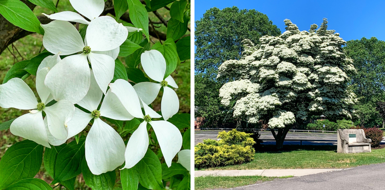
DogwoodDyptich

Dogwood
What’s in Bloom #7

Both of these plants have been gorgeous this year. The dogwoods are beginning to fade (or have faded), but the aphrodite will bloom all summer.

Tracy

Last, but definitely not least, is a photo that represents three of the items on the list: #3-Something That Represents Home, But Not the Building, #6-Something That Makes You Happy, and #9-Something Older Than You. I know that’s probably cheating, but we both got a chuckle out of thinking it up. I’m sure I can find other examples for some of those clues, but for now, he’s got me covered!