Skip to content

Happy Easter!

  • by

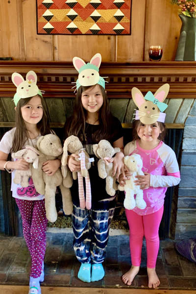
It’s a bright, sunny Easter and lots of fun to be in Wisconsin to celebrate. With the exception of last year, when we celebrated Easter alone, we are lucky to have had one set of grandchildren to celebrate with every year. This year, it’s Caleb and Hannah, although we miss seeing the three girls. Before we left Rochester, we celebrated with the three girls. They made some Easter headbands and some place cards for their dinner table (no photos!)
IMG_6287

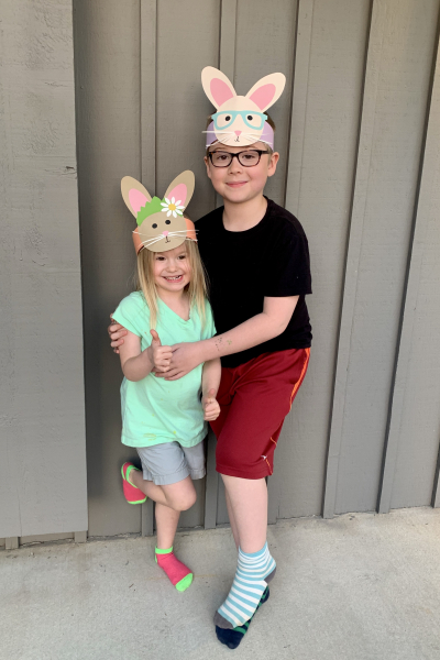
Yesterday, we did the same with Caleb and Hannah. We made an extra for their friend, Evie, who will be coming for dinner tonight with her mom and dad.
IMG_6345

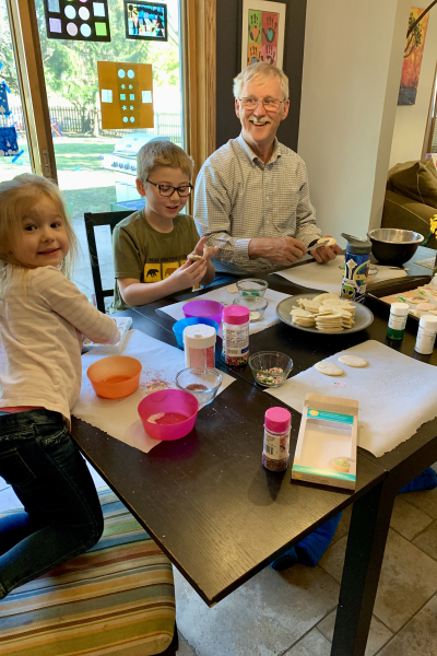
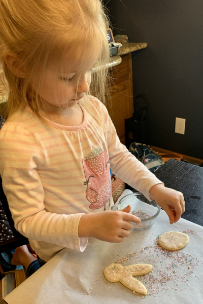
Hannah and I made Easter cookies Friday morning, and when Caleb got home we got busy decorating them.
IMG_6318 IMG_6322

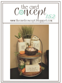
All five of the grandchildren’s Easter cards are very similar.  The Card Concept’s new challenge is “Celebrate Easter”-–perfect for these cards! Card Concepts asks you to classify your card design. I’d classify these as Clean and Layered.
TCC152 033121

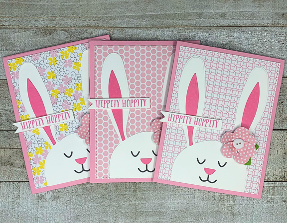
A friend loaned me a wonderful bunny die by Lil’ Inker called “Peek-a-Boo Bunny”, and I used it for all five grandchildren.
ThreeBunniesFlat

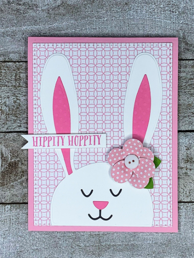
These are the card for the three girls in Rochester. The only difference is the patterned paper—all from my stash. The funky flowers are stickers that were also in my stash. 
BunnyWithFlowerFlat

The sentiment is from an older Papertrey Ink set, “Bunny Basket.”

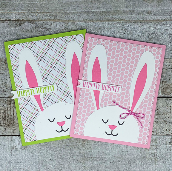
Similar, but not quite the same, here are the two for Caleb and Hannah.
TwoBunniesFlat

When I made these cards, I wasn’t sure we’d be able to travel over Easter, so I opted for a bow rather than a flower in case the card needed to go in the mail. I love the plaid paper on Caleb’s card and the bright green card seems more appropriate for a boy. 

If you celebrate Easter, I hope you’re having a lovely day! If not, I hope the sun is shining where you are, and you have some time to get out and enjoy it!


Color Hues #15

  • by

No matter the weather, by April 1, I’m ready for spring. This year we’ve been treated to very early signs of spring and I’m hoping a greener landscape is not far away. Today’s new challenge at Color Hues is sure to brighten your day, regardless of where you are in welcoming the new season.

Color Hues #15

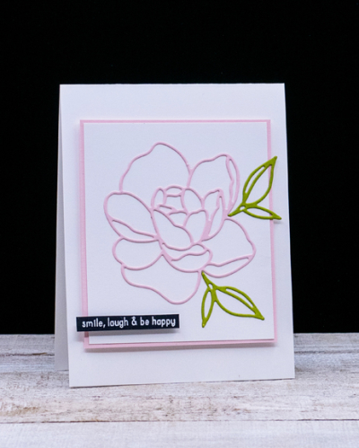
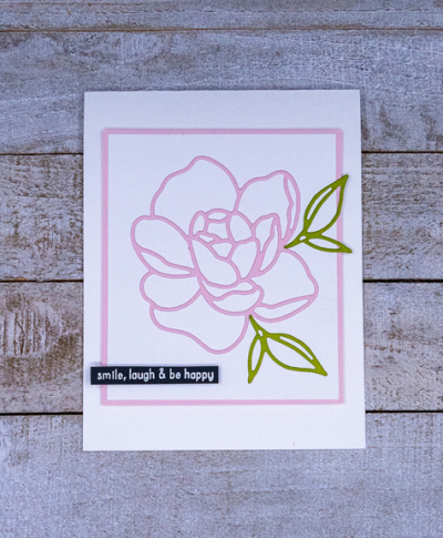
If you’ve followed me for very long, you know I’m partial to Clean and Simple designs. This card totally falls in that category. I’m not sure if I’ve ever created anything that was more Clean and Simple. This card more or less created itself. I die cut the floral from The Stamp Market’s “Fresh Floral Layering” die in Concord and 9th’s Ballet Slippers. Although this was made for inlaying the pieces of the floral, I knew as soon as I laid down the outline, that was all I was going to need.

PinkGreen

I then die cut the two leaves from a pieces green cardstock in my bits and pieces folder and added them to the floral on a piece of white cardstock. 

PinkGreenFlat

I cut a narrow border from the Ballet Slippers cardstock, and added dimensional tape to the back of the focal piece before adding it to a white card base. The sentiment, embossed in white on black cardstock is from Reverse Confetti’s “So Many Sentiments” set. 

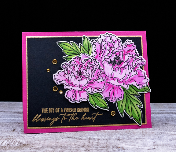
After I had created this card, I started playing around with the new-to-me coloring stencils by Pinkfresh Studios for their stamp set “Friendship Blooms.” And although I do like this card, it is definitely not CAS!

FriendJoy

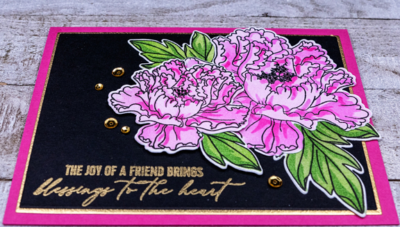
After die cutting the florals with the accompanying dies, I die cut two panels, one in black and one in gold, with Gina K’s Layering dies. I love the narrow border these dies create. The sentiment, embossed in gold, is also from “Friendship Blooms.” I layered everything onto a bright pink card base.

FriendJoyClose

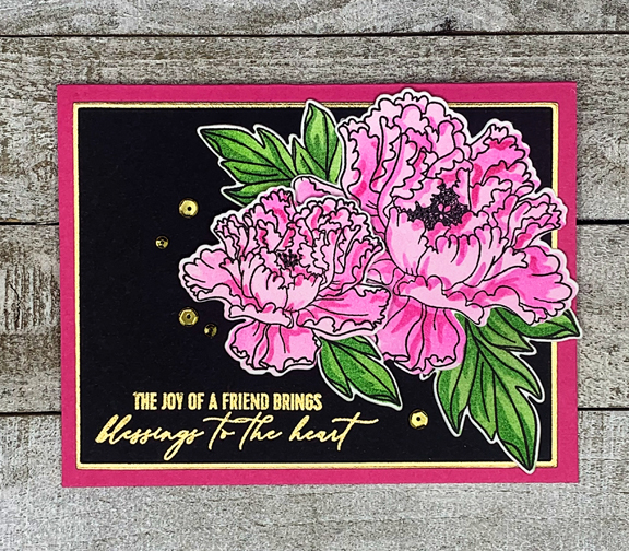
The final touch was the addition of some gold sequins.

FriendJoyFlat

Hop over to the Color Hues blog to see what the rest of the Design Team and our Guest Designer, Tenia, have come up with . . . and join in the fun!

 Nancy

Hannelie

Cindy

Julie

Sheri

Kristie

Lindsey


Birthday Butterfly

  • by

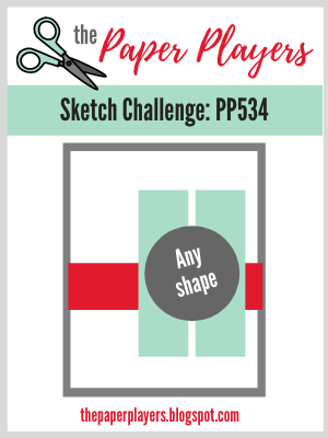
In the midst of packing to go away, I had an idea for the current Paper Players Sketch Challenge and I needed a birthday card. So this afternoon, I used my Paul Rubens metallic watercolors to create a “patterned” paper. After dinner, I had time to do the die cutting and assembly. Here’s the sketch:

Pp534

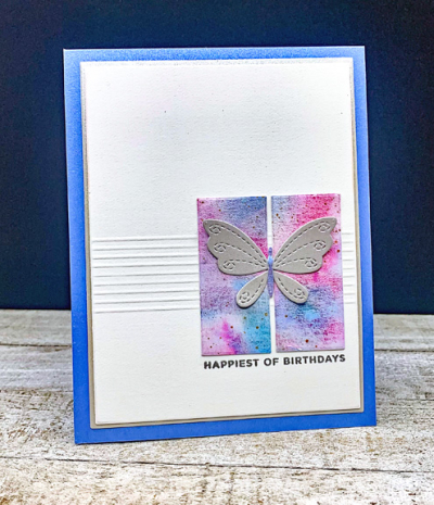
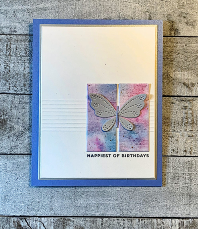
For the horizontal stripe on the sketch I decided to do a group of score lines. Photographing them at night turned out to be a bit of a challenge. I die cut two small rectangles from my watercolored paper with Ellen Hutson’s “Essential Rectangles” for the vertical shapes and used my favorite Gina K “Master Layout” dies to cut the focal piece and a thin border of metallic silver paper.

BDButterfly

I die cut the Simon Says “Stitched Butterfly” from silver metallic paper (so much prettier IRL than in the photograph.) The body of the butterfly was die cut from the watercolored paper as well. Finally I silver embossed the sentiment from The Stamp Market’s “Tons of Type.” The card base is a shimmer paper from Papertrey Ink.

BDButterflyFlat

I had to use a desk lamp to get the lighting right to show the score lines. If we weren’t leaving first thing in the morning, I’d be waiting until tomorrow to try again! I’m not sure if waiting until I get to Sarah’s would help or not, so I’m posting it as is!


Pretty Red Tulips

  • by

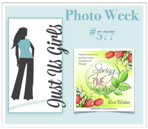
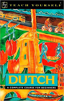
I’m a huge fan of women’s college basketball, and have spend a lot more time in front of the television this past week watching the NCAA tournament games. I’ve been following UConn for nearly 20 years, but enjoy watching many of the other teams as well. If the game’s not too exciting, I can craft at the same time, and yesterday I managed to finish a card for two challenges. The first is a photo inspiration from Just Us Girls with pretty red tulips. The other is the Librarian’s Challenge with the book cover from Teach Yourself Dutch. 

JUGSLibrarian

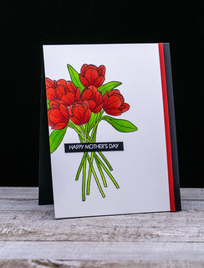
One of the prettiest tulips stamps I own is from an old Papertrey Ink favorite: “Friendship Jar Fillers: Spring.” I stamped it partially off the side and colored it with Copic markers.

Tulips

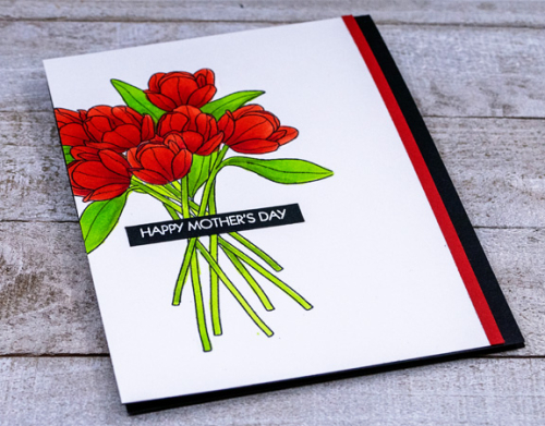
When I started I didn’t have any particular occasion in mind, but in looking at some pre-embossed sentiments, I found a Happy Mother’s Day from Pink and Main’s “Special Day” sentiment set. I try to make each of the mothers in our family a card so it’s good to have one in the stash.

RedTulipsAngled

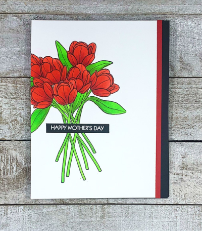
I didn’t think it needed any other embellishment, but did trim the stamped image down so that there was a border of black from the card base. Then I decided it needed a thin strip of red cardstock as a finishing touch. 

RedTulipsFlat

We’re busy organizing for an Easter trip to Sarah and Adam’s this week. It’s the first time we’ve been out of town since last September. We’ll be driving straight through on the way. Both Sarah and Adam have just their first vaccinations, so we still need to be very careful. We’re totally vaccinated now, with only the variants to worry about. That will keep us out of restaurants until it’s warm enough to eat outside, but we hope it’s safe to make a road trip.


You Make Life Bloom

  • by

This card was in my stash, but never blogged, and just recently sent to a good blogging friend in the past few days. Today is a great day to post it as we are just beginning a day-long weather alert with rain and very high winds. No tornadoes predicted, thankfully, as the southern part of the country is being hit hard by them. A friend’s daughter lives in Alabama, but so far they’ve escaped any damage. It’s going to be much cooler following this, and we’ll need to watch the nighttime temperatures as lots of the plants we planted last fall have started to emerge and/or bud. This is SO early for Rochester, and I’m grateful for the early spring. We have what we need to cover all the plants so hopefully they’ll survive this next (but probably not last) cold spell.

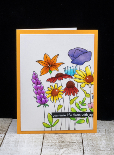
This card scream spring to me. The Simon Says “So Beautiful” stamp is one of their red rubber cling stamps, and they stamp so cleanly and crisply. I stamped it off to one side since the stamp covers more than an A2 card front.

FlowerGarden

I colored it with Copic markers and die cut it with Ellen Hutson “Essential Rectangles.”  

FlowerGardenClose

I added it to a Memory Box card. I love these cards because the inside is a bright white that makes writing or stamping a message so much easier. The sentiment, white embossed on black cardstock, is from Reverse Confetti’s “So Many Sentiments.”

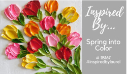
I’m throwing this into two challenges: Inspired By: Spring into Color, and Simon Says Wednesday Challenge with a Spring Mood Board. 

Inspired By Spring into ColorWednesdayblog-logo

Sadly, the mood board image won’t load in either Typepad or Photoshop Elements, so click through to the challenge to see it.

Four More Inchies

  • by

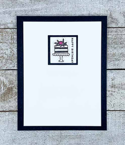
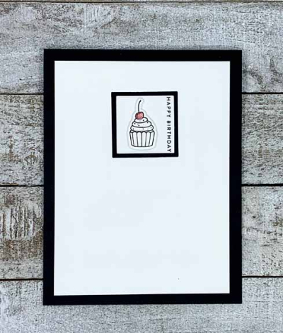
After creating this inchie card for a challenge, I wanted to see what other images from the Pinkfresh Studio Itty Bitty Elements might work as well. I found four more, and since there was no black and white challenge involved I did just a bit of spotlight coloring and/or a bit of glitter. 

CakeInchie

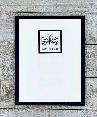
DragonflyInchie

Added just glitter to this one.

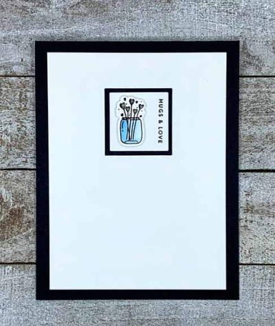
JarInchie

Glitter on the hearts here.

BDInchie

These clearly appeal to me as they couldn’t be much more clean and simple. It’s good to have a few more cards in the stash! 

Gorgeous weather here—60’s and maybe 70° one day—then back to the 40’s and 50’s, but no more 20’s in sight so I’m pretty happy with the forecast! Took a three mile walk yesterday and looking forward to another long walk today.
A Black and White Inchie

  • by

Years ago, “inchies” were a thing, and I still have a pack of them in a drawer. I’m hopping in at the last minute with a black and white inchie for AAA Cards.

#185

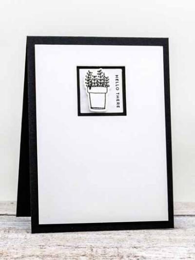
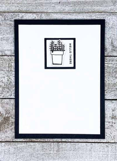
Rather than use a pre-made inchie, I die cut my own using Ellen Hutson’s Essential Rectangles die. It cuts an opening as well as a frame which worked perfectly for this card. I popped up the card front with dimensional tape, and then adhered the inchie in the center of the opening. The pot of flowers was also popped up with dimensional tape.

Inchie

Of course, I pulled out another NBUS stamp and die set. This one’s from Pinkfresh Studios, Itty Bitty Elements, and I’ve had it for well over a year. I’ve had lots of ideas for using the images (all very small and quite diverse) but never managed to execute any of them. 

InchieFlat

The Tiny Words stamp set from Simon Says provided the perfectly sized sentiment for an inchie. Adding it to a black card and allowing the framing from the inchie die finished off this very CAS card. I’m thinking I’ll make a few more with some of the other images, but I need to link this up quickly as the challenge ends tomorrow. And sending yet again another card to NBUS!

NBUS


Easter Blessings

  • by

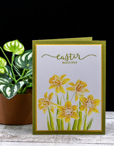
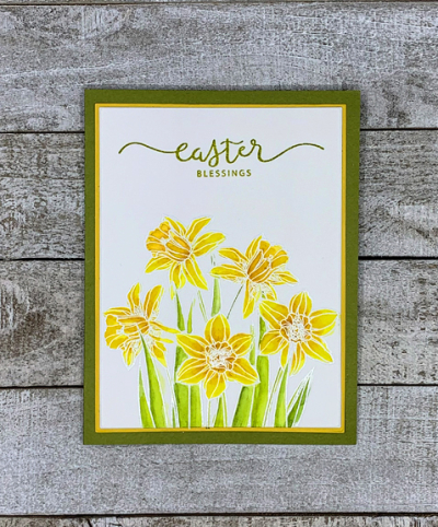
The last purchase I made before committing to a buying freeze until I used my NBUS that had literally piled up was the most recent Gina K kit. They are a great value and this one focused on flowers which I use over and over again. It took quite some time for the kit to arrive, but it came this week and I was excited to start with this lovely image of daffodils. Although they are definitely one of my favorite flowers, I didn’t have a single set with daffodils. I decided I wanted to use watercolors and stamped the daffodils twice—once with black ink and then white embossed them. I chose the white embossed ones to start with.

EasterBlessings

One of the issues I’ve always had with white embossed images on white watercolor paper is being able to see the outlines clearly. Tracy gave me a slant board for Christmas, and it worked perfectly. The work is just at just the right angle so it’s easy to see. There are clips to hold the paper and it’s magnetic so I used magnets on the bottom of the paper to hold it steady.

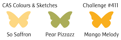
Recently I’ve gone back to my Daniel Smith paints in a palette I set up years ago. Of all the watercolors I own, they are the best quality and the more I use them the better I get at mixing just the colors I want. I chose my color palette from the CAS Colours and Sketches Challenge which seemed just perfect for daffodils.

411

The sentiment is also from the Easter Blessings set. I love the elegant font. Once the watercoloring was done, I did a bit of shading with Polychromos pencils, stamped the sentiment and die cut it with the smaller layer from Gina K’s Master Layout set. Then I used the larger layer to die cut a saffron layer and added it to a green card base.

EasterBlessingFlat2a

Since we’ll be away for Easter, I’ll be sending this to my mother-in-law. I’m thinking that nearly everyone in Tracy’s family will have had both vaccinations by Easter, and may be able to gather for the first time in over a year. We’ll be in Wisconsin with my daughter and her family. 

I’m also sending this card to the Happy Little Stampers: Watercolor (Anything Goes) and NBUS.

HLS NBUS

Color Hues #14

  • by

The new challenge at Color Hues is really versatile. Neutrals can be added as well as gold or silver.

CHBlackWhite#14

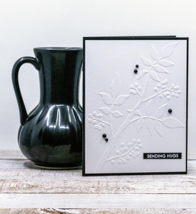
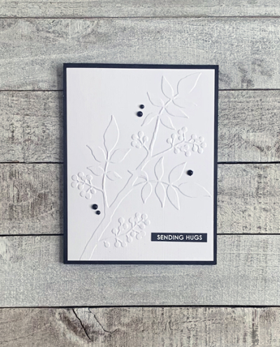
This is one of those cards that just “came to be.” I had a card completed for this challenge, but about a week or so ago, I was in another organize and purge mood. In the process I came upon the card front which was embossed with a beautiful embossing folder by Alexandra Renke.

White:Black

As soon as I saw it I knew it would make a perfect CAS card for this challenge. I added it to a black card base and used a sentiment strip from my stash.

WhiteBlackFlat

I debated for a bit about embellishments, but finally decided on some small black pearls from AMuse which have been in my stash forever. I’m pretty sure I’ll use this design again. It’s very versatile. I can see it as a birthday card, an anniversary card, a thank you note, and even a sympathy card. 

I hope you’ll hop over to the Color Hues Challenge and join in the fun, checking out the cards made by my awesome Design Team members and our Guest Designer, Shawna.

Nancy

Hannelie

Cindy

Julie

Sheri

Kristie

Lindsey


Floral Focus

  • by

A colleague of mine complained once she retired that she was bored, and told a mutual friend not to be in any hurry to leave her job. It’s so far from my reality that I’m amazed by it every time I think of it. Even with all the time at home because of the pandemic, I am rarely, if ever, bored. Right now, I’m running out of time to do all the things I want to do, and to learn all the things I want to learn. I spent a couple of hours today working on the introductory lessons to the Sketching Now Foundations course. I enrolled in it years ago, and was in over my head. I wish I could say I’ve made lots of progress since then, but some of the concepts are still a struggle. And then, of course, I’m also trying to work through using all my unused stamps. That is a LOT more fun! 

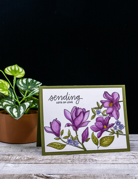
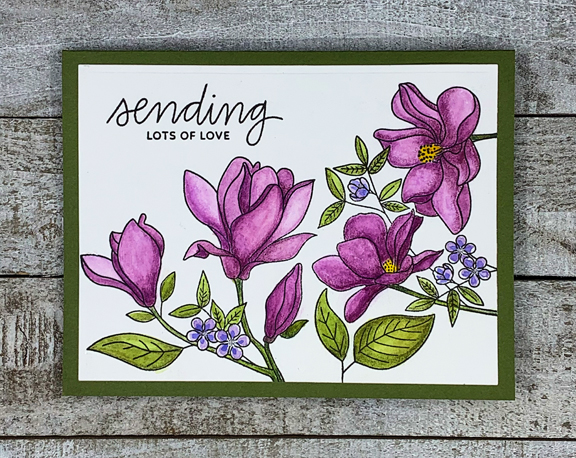
The card today is a beautiful floral, called Floral Focus by My Favorite Things. I don’t own the dies, but I’ve seen cards made with this stamp where they’ve separated the floral and used only a portion of it. It is one stamp, however, so that’s how I used it. I pulled out my  Daniel Smith watercolors to color it, and chose Shades of Purple again for The Flower Challenge.

FloralFocus

I did the watercoloring on Saturday night, and on Sunday added shading with four different Polychromos pencils. 

FloralFocusFlat

The sentiment is from “Everyday Greetings” by Pretty Pink Posh. I gave thought to adding a few sequins, but decided it really didn’t need any, so just added the panel to a green card base. The challenge at Happy Little Stampers Watercolor is Anything Goes so I’m adding this to that challenge as well.

TFChallenge#54 HLS

Spring Flowers

  • by

We had a brief, two day, taste of Spring this week, and it was wonderful. Today is sunny, but cold and windy again. Pretty typical for March. There are several challenges out there calling for Spring cards, so I pulled out of my NBUS box a stamp and die set, “Blooms and Buds” by Reverse Confetti that I’ve had for way too long. It almost got put into the “Donated” bag last week, but I’m glad I pulled out. Sometime guilt works well . . . 

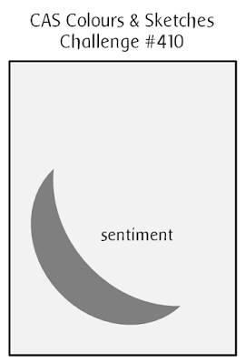
I started with a sketch from CAS Colours and Sketches:

C&S410

After stamping and die cutting, I arranged my flowers in the lower left-hand corner of a piece of white cardstock, but it felt too plain so decided to run it through my die cut machine with a Taylored Expression embossing folder. That’s the Trend Challenge for Just Us Girls this week:

JUGS

SpringFlowers

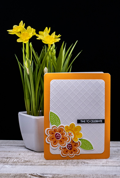
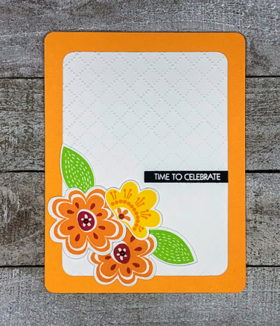
I rounded the corners of the floral piece as well as an orange Memory Box card before putting them together. The last touch was to add a sentiment strip from Pink and Main and some tiny pearls to the center of the flowers. 

SpringFlowersFlat

The Reverse Confetti Stock Your Stash challenge is Spring as is the challenge at CAS on Friday. Sending this card their way as well.

Three of a Kind and Shades of Purple

  • by

When I saw the challenge at Happy Little Stampers CAS for Three of a Kind, I immediately thought of a MFT’s stencil in my collection. Then The Flower Challenge showed up with a Shades of Purple challenge and that was that! Happy Little Stampers Stencil: Anything Goes also works!

Purple

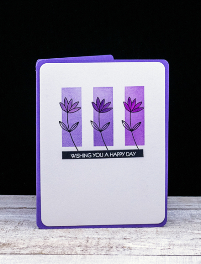
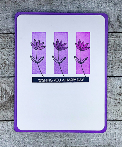
I started by taping off the bottom portion of the stencil as I wanted smaller rectangles. Then I chose three Altenew purple inks–Lavender, Deep Iris, and Midnight Violet and ink blended them through the stencil. I found just the perfectly sized flower in Pinkfresh Studio’s Fleur 2 stamp set and stamped it with Altenew’s Obsidian ink.

PurpleFlat2

I smooshed a bit of each ink on my glass mat, and used a small paint brush to color in the petals of each flower. The sentiment is from Special Day by Pink & Main. It’s becoming one of my favorite sentiment sets. I rounded the corners of my stamped piece as well as the corners of an Amethyst Allure card base and added the focal piece to the card. It’s definitely a CAS card, and a design that would work well with different colors and different small stamps.

March 2021 CAS TFChallenge#54HLS Stencil Challenge (1)

An Inspired Rainbow Critter Card

  • by

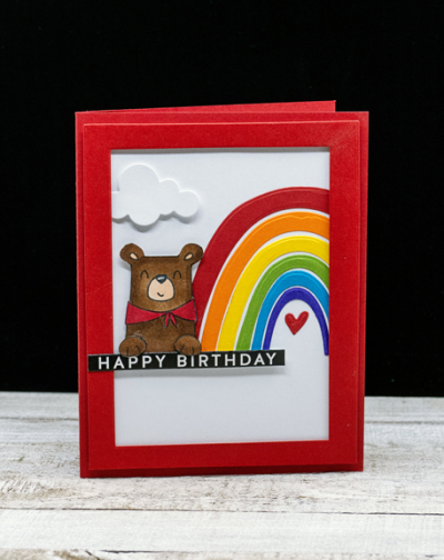
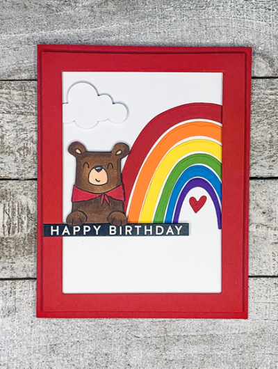
Not long ago, I watched Therese create a couple of cute cards using a rainbow stamp from Ellen Hutson and a collaborative stamp with Ellen Hutson and Avery Elle. I had both stamp sets so I pinned it to my Pinterest board for kids. My CASE is similar, but I chose to use a die from The Stamp Market for my rainbow in an effort to use another product that had been sitting in my stash. I had already colored one of the critters from The Peek-a-Boo Pals Camp Wanna Stamp set so I set about creating the card. 

HBBear

After attaching the rainbow to white cardstock, I added it to a red cardbase. The die cut cloud is from Papertrey Ink, and both the cloud and the cute bear are adhered with dimensional tape. I created a red frame using two of Ellen Hutson’s Essential Rectangle dies and then added that to the panel.

HBBearFlat

The sentiment is a preprinted one from Simon Says. After attaching it, I added the bear’s paws so he appears to be holding the greeting.

I’m entering the card in two challenges:  Just Us Girls: Animals and Addicted to CAS where the challenge is also Animals. It’s my second entry to both challenges—so unusual!

JUGS Addicted

This card’s all set for a very cute little girl who will be turning four next month. 

Wish Big

  • by

It’s not often that I can create a card for four challenges, but it’s the luck of the Irish in this case. St. Patrick’s Day is coming and all four challenges feature some aspect of the traditions surrounding St. Patrick’s Day. Luckily for me I have two birthdays to celebrate–one on the day itself and another on the 18th.

Here are the challenges:

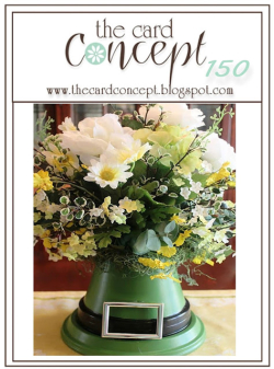
TCC150 030321

The Card Concept Challenge is a photo inspiration: I’m picking up on the hat (St. Patrick’s Day) and the green for my card.
As usual, it fits their category “Clean and Simple.”

Week 385 - Luck

CASology’s challenge is Luck, and my card features four-leaf clovers, definitely a sign of luck!

JUGS

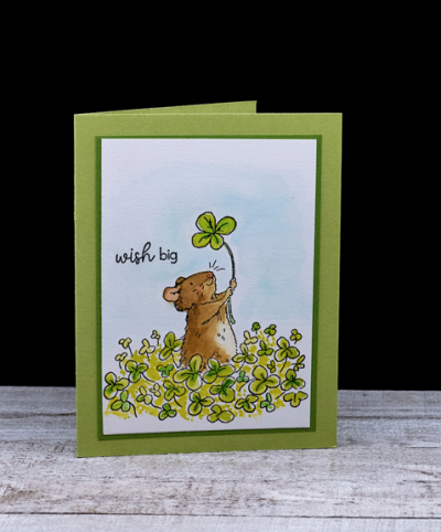
At JUGS, the challenge is Animals, and I’ve yet another Anita Jeram cutie holding the four-leaf clover.

2021-03-04-3ShadesOfGreen

It’s been awhile since I’ve played with Seize the Birthday, and yes, there are three shades of green created with three green Karin watercolor markers.

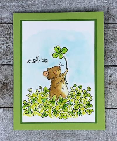
So finally, the card itself. As I said it features another of the Anita Jeram illustrations from the Colorado Craft Company. Knowing I had St. Patrick’s Day cards to create, it was a must-have. 

WishBig

I stamped the design on Altenew watercolor paper and colored it with Karin brush markers. The sentiment is from Papertrey Ink’s Ways to Say: Birthday.

WishBigFlat

I wanted a narrow frame of traditional St. Patrick’s green (New Leaf from PTI) and then added it to a card base created with Green Parakeet (PTI).

I hope the luck of the Irish is with you today!


Celebrate!

  • by

The current challenge at The Paper Players is a sketch challenge, and one that appealed to me. At Addicted to CAS the challenge is “Animals,” and I thought I could combine an image from another of my unused/new stamp sets and get a birthday card into the stash.

Pp530 Addicted

Earlier I shared one of the stamps from Colorado Crafts illustrated by Anita Jeram. This is another of her darling images.

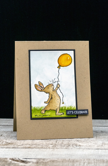
BDBunny

Her illustrations cry out for watercolors so I got out my Daniel Smith watercolors and created a bit of a background as well as coloring the bunny and his/her balloon. 

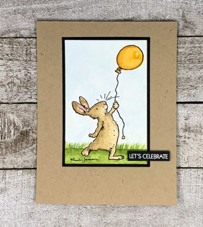
BDBunnyFlat

I kept the rest simple; a narrow black frame and a white embossed sentiment from Pink and Main. Typically, a CAS card calls for white space, but I’m a believer that it can also be colored space as well! 

The sun is shining here, and I hope it’s the same for you!