Skip to content

CAS Christmas

  • by

The Paper Players have a challenge that is right up my alley: CAS Christmas! I’m running close to the end of the challenge, but we were in Wisconsin for ten days helping Sarah while Adam was away for a week. 

PP716

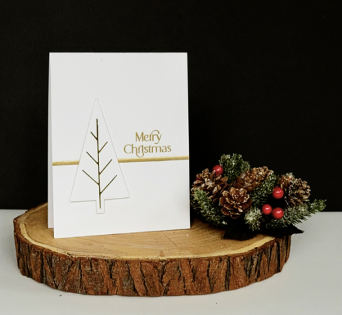
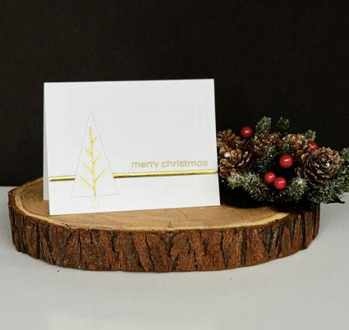
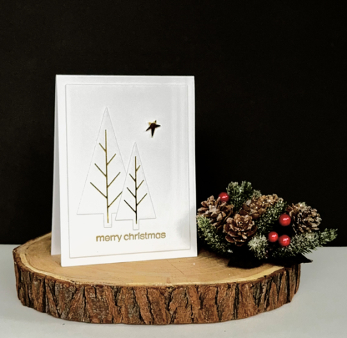
I purchased the foiling plate and dies for these Triangle Trees from Waffle Flower last year, and never got around to using them. They are perfect for a CAS Christmas card, but they are definitely a challenge to photograph. I have three variations on the theme:

OneTreePor

This one has an embossed gold sentiment from The Greetery’s Tagged Elegance.

OneTreeLS

The sentiment here is also from The Greetery, Sentiment Suite: Christmas.

TwoTreesPor

Just the same as above with two trees and a gold star punched with a very old punch and bumped out with a bit of dimensional tape.

I was happy to be in Wisconsin, and enjoyed being with Sarah, Caleb, and Hannah, but have to admit being away for 10 days in November puts a time crunch on getting ready for the holidays. I only have to provide pies for the Thanksgiving dinner, but Christmas looms in the not too distant future, and I am NOT at all prepared!


Color Hues #99

  • by

It’s mid-November (where does the time go?) and Marcia has a wonderful color combination on the Color Hues Blog for the next two weeks: Pink and Aqua.

CH #99-Pink and Aqua.001

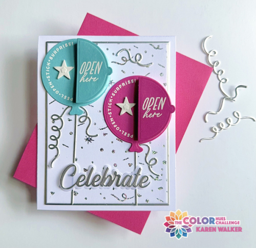
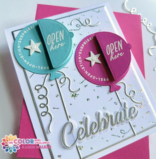
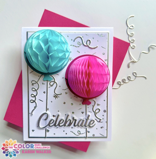
These colors were perfect for the Hey, Honeycomb Balloons, by The Greetery. I started out with The Greetery Ticker Tape hot foil plate foiled with Silver Holographic Facets by Spellbinders.

CH95Closed

For my hues of Pink and Aqua, I matched the cardstock to the colors of two of the Honeycomb Balls: Party. After die cutting the balloons, I white embossed sentiments from the Hey Honeycomb Sentiments on each balloon. 

CH95Close

I die cut some streamers, the balloon strings, and the sentiment from Pinkfresh Studio from silver metallic cardstock. Before arranging everything, I die cut the main panel and a panel of silver cardstock with Gina K’s Master Layout #1, and attached them to a white cardbase. The white stars on the balloons are actually die cut from double-sided adhesive. Once the top layer is pulled off here’s the final card.

CH95Open

I knew these products would make a very festive card, and I’m quite sure I’ll be using up my supply of honeycomb balls for a variety of cards.

You’ll find lots of inspiration on the Color Hues blog, where you’ll find great cards created by our special guest, Teresa, and our very creative new Design Team member, Bonnie Klass!


Festive Friends

  • by

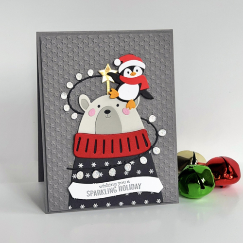
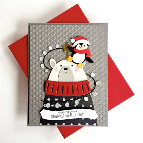
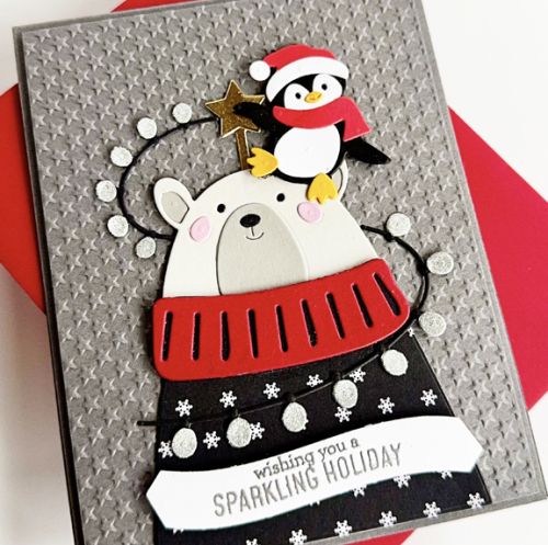
I’ve done a pretty good job resisting all the new holiday stamps and die cuts that have been released this year. I did break down and purchase the Festive Friends die cuts from Spellbinders. It was the October Die of the Month Club set so it was a great value. I just could not resist this cute bear wrapped in lights and his happy penguin friend. This is the first card, but it definitely won’t be the last.

Friends

I die cut most of the pieces from scraps of card stock. The bear’s sweater was die cut with some patterned paper in my stash (no longer sure of the manufacturer,) 

FriendsFlat

The background was created with Lifestyle Craft’s tiny star embossing folder on gray cardstock. I added some dimension between it and the card base. The bulbs for the strings of light were die cut from silver glitter paper. 

FriendsClose

The star was die cut from gold metallic paper. All that glitter and gold led me to the Sparkling Holiday sentiment banner from Pinkfresh Studio which I embossed in silver.

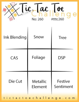
I’m sending this off to the current Tic Tac Toe Challenge, where I went across the bottom row: Die Cut, Metallic Element, Festive Sentiment.

Tttc-challenge-board-260-copy

Color Hues 98

  • by

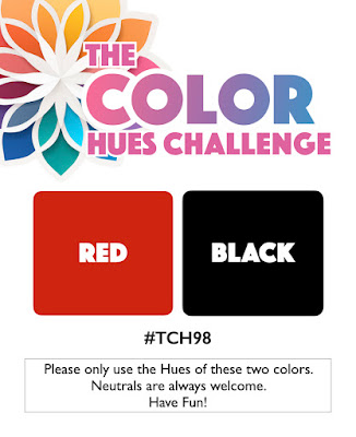
It’s my turn to be the hostess and to choose the colors for the new Color Hues Challenge:

CH #98 Red and Black.001

If you’ve followed me for some time, you aren’t surprised by this choice. Red and Black are two of my favorite color combinations. I often choose them when making masculine cards, but I also love them for Christmas cards. Since my stash of Christmas cards is very limited (and time is running short), I chose Christmas as my theme for this challenge.

CH98

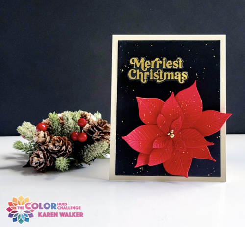
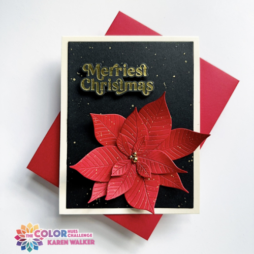
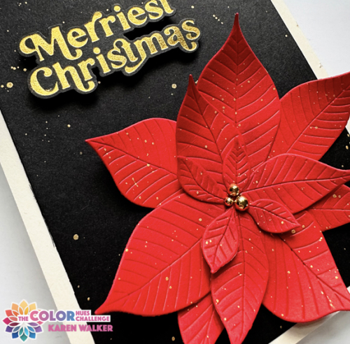
I pulled out my favorite poinsettia die: Altenew’s 3D P0insettia. I die cut it from Gina K’s Red Hot cardstock-one of the most vibrant reds in my collection. I found the background paper in my stash of card fronts that I created but never used. It was splattered with gold, so I used the Gansai Tambi Starry Night watercolors to splatter the poinsettia as well. I finished it with three small Pinkfresh Studio Gold Pearls. 

CH98Flat

Then I added the panel to a cream card base. The sentiment from Pinkfresh Studio’s Hot Foil Perfect Sentiments: Holiday was also in an envelope of premade sentiments. Having these premade panels and sentiments makes card making a bit faster. Since it’s more time consuming to get out my hot foil machine, when I do, I make multiples and stash them away.

CH98Close

I hope this color combo inspires you to join us at the Color Hues Blog. Whether you choose a holiday card or another theme, we’d love to see you in our gallery. There’s always lots of inspiration on the Color Hues Blog to get you started!

Woodblock Wednesday-October

  • by

It’s the last Wednesday–and nearly the last day–of October, so time for Woodblock Wednesday.

Featured-woodblock-Wednesday-graphic-copy-1

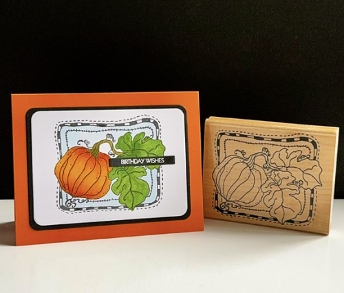
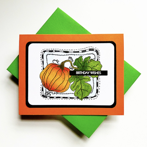
This month I chose one of my favorite autumn stamps of any kind, Annette Watkin’s Pumpkin Harvest. It’s one of the few woodblocks that I’ve always used with some kind of regularity. 

WoodblockWed

This time I brought out the Copic markers. It’s been awhile and it took a few tries before I got the hang of it again. Using X-Press Blending cardstock made a huge difference. 

WWFlat

Once I finished coloring, I die cut the stamped panel and a black framing panel with Hero Arts Infinity Rounded Rectangles which I added to a card base of Orange Zest by Papertrey Ink. The white embossed sentiment is from Pink and Mains Special Day set. 

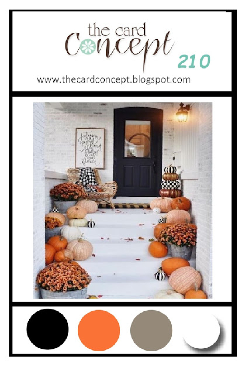
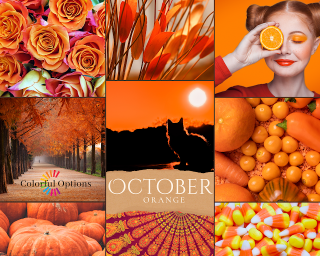
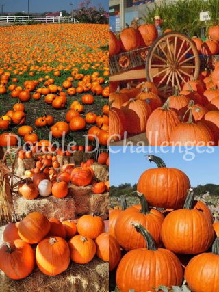
Thanks, always, to Amy Tsuruta, for hosting this fun challenge every month. There are three other challenges with pumpkin themes this month so the card is off to: The Card Concept: Pumpkin Season, Colorful Options: Orange, and Double D: Use a Pumpkin.

TCC210 Oct24October 2024 Colorful OptionsDDPhoto


Autumn Tags

  • by

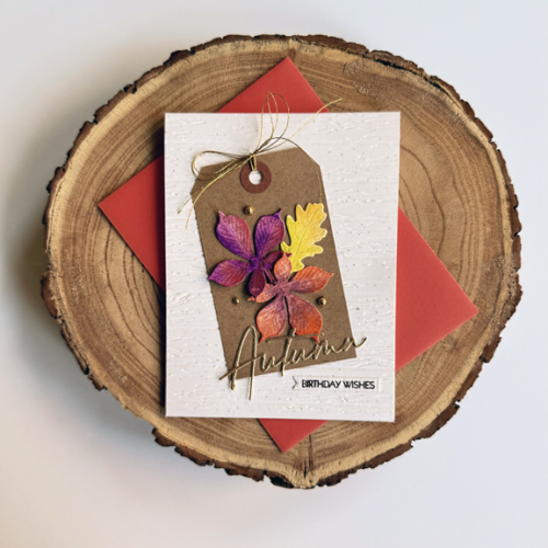
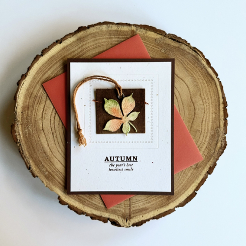
The Paper Players have a fun challenge-Clean and Simple: Add a Tag! I’ve always enjoyed making cards with tags so I wanted to play along. Since I need quite a few November birthday cards, I chose an autumn theme for both of my cards. 

I organize my stamps by theme so I have all my autumn stamps and dies in one place. When I flipped through them, I found some beautiful leaves that I had already colored from The Greetery’s Curio Autumn Findings so I started there. I also have a pretty large collection of pre-made tags–all of which are years old. I picked out two different ones.

The first card uses a pretty standard dark kraft tag, and I arranged three of the leaves on it, adding a die cut sentiment in gold from The Greetery that I also found in the box. For the background, I chose a piece of Papertrey Ink’s Rustic White cardstock and ran it through the die cutting machine with Altenew’s Deck Plank 3-D Embossing Folder.  I stamped the sub-sentiment from Pink and Main’s Special Day stamps in Dark Chocolate ink on a tag cut from the same cardstock. Adding a double bow from Altenew’s metallic threads and a few gold pearls from Pinkfresh Studio finished off the card. 

FallTag1

Although I would classify the first card as Clean & Simple, the second card is a much more Clean & Simple design. I have no idea where I picked up this tag, but I just love it, and it was perfect for a autumn card. I used two dies from Spellbinders’ Essential Squares die and embossed them on another piece of Rustic White cardstock. I adhered the leaf with very thin dimensional tape, and stamped the sentiment from Gossamer Blue in Dark Chocolate ink. That stamp dates back to my scrapbooking days when I often purchased a monthly kit from a company. I don’t think anything besides this stamp set has survived the multiple purges I’ve done since I quit scrapbooking. I trimmed that panel down and added it to a card base of Dark Chocolate (Papertrey Ink.) The autumn light is already causing problems with photographs. I couldn’t get a sharp close-up photo for either card this afternoon. If you click on the photo, it will enlarge it a bit so the details are clearer.

FallTag2

These cards are off to The Paper Players as well as Inkspirational where the challenge is Seasonal.

PP712Inkspirational


Happy Halloween

  • by

It’s been taking longer than I expected to get my mojo back after our fabulous trip to Northern Italy, but I have managed to get all the Halloween cards completed that I need for my grandchildren. Not unexpectedly, there are a couple challenges looking for Halloween cards, two of which end today so I thought I’d best get busy and write the blog post. (Oops! Missed the deadline on one of these.)

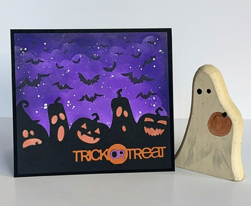
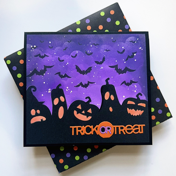
The first card was created for my twelve year-old grandson. I thought he’d like the eerie feel to this stamp and stencil set by Taylored Expressions called Halloween Scene.

HalloweenBats

I used some purple Distress Oxide inks and the My Favorite Things Clouds stencil to create the sky, adding some silver metallic ink splatters before stamping the bats. The stamp set comes in two parts, the jack-0-lanterns on the bottom and the sky with the bats for the top half of the card.  There’s a stencil for adding the orange glow to the jack-o-lanterns. The sentiment is a die cut one from Papertrey Ink, Tricky Trio.

HalloweenBatsFlat

The card ended up being 6X6, so I got out some Halloween paper left over from my scrapbook days, my Envelope Punch Board, and created an envelope for it. Hannah’s card was created for an earlier Color Hues Challenge, and both of the cards went in a padded envelope to Wisconsin. Last year, I mailed both cards on the same day, but Caleb’s card didn’t arrive until two weeks after Halloween. Now the cards get mailed together in the same envelope.

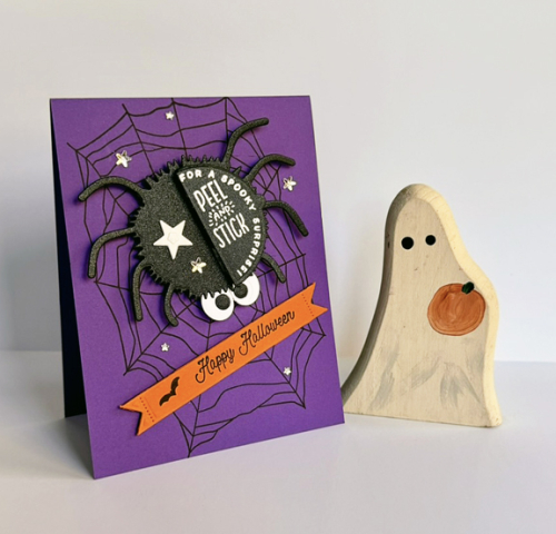
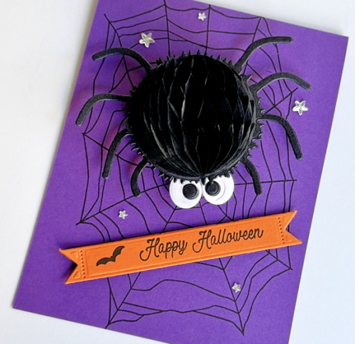
I made three of the next card for the three girls here. They like getting the same card, and I know they’ll be happy with this interactive one. Skylar’s birthday card in September used some the The Greetery’s honeycomb balls, and all three girls loved it. 

HalloweenSpider

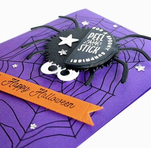
The web in the background was stamped with Papertrey Ink’s Caught in the Web stamp. All the rest of the products are from The Greetery. I used a double layer of dimensional tape to made the spider pop off the card.

HalloweenSpiderClose

The sentiment is from the Hey, Honeycomb Sentiments and stamped on a Tear Strip Banner die. The directions for creating the spider’s body were from the Hey Honeycomb Halloween sentiment set. The final touch was to add a few rhinestone stars to the background. 

HalloweenSpiderOpen

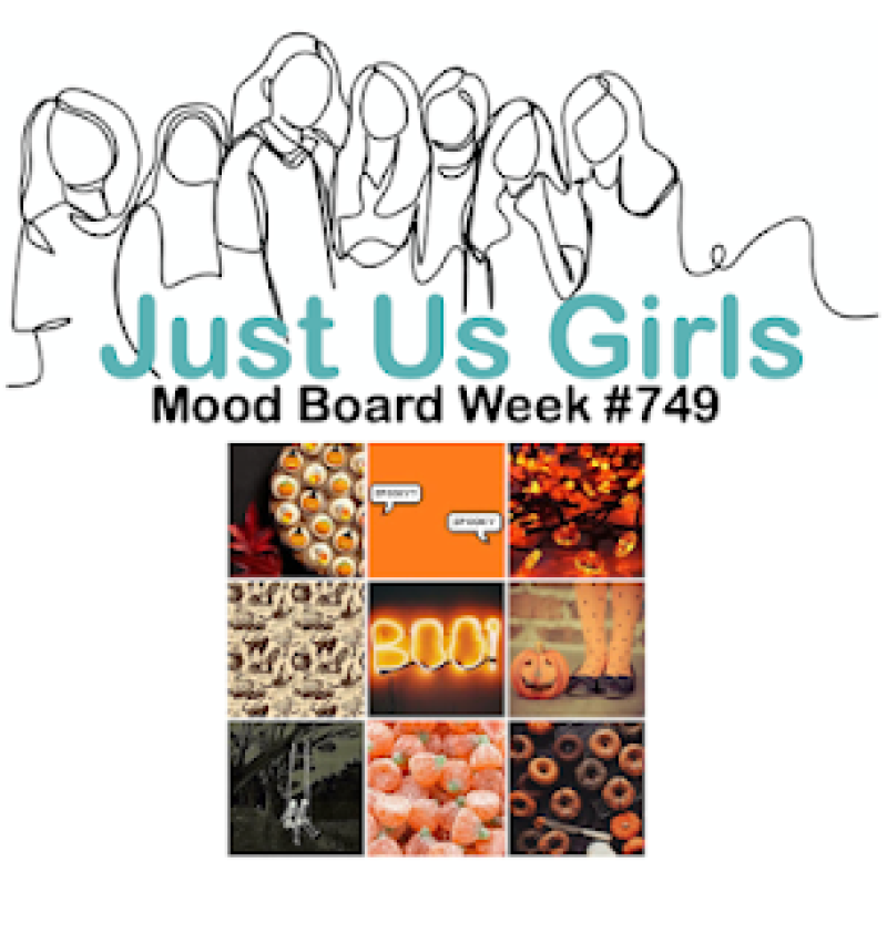
These cards are off to Just Us Girls who have a fabulous Halloween moodboard this week. 

 JUGS


Beautiful Washi

  • by

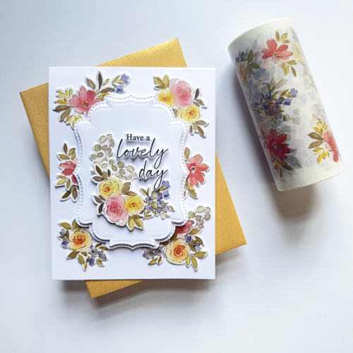
Pinkfresh Studio has some of the most beautiful Washi tape. I’ve ordered a couple of sets and have received the complete suites a couple of times for big events. This summer’s Create and Connect event featured a gorgeous Washi tape designed and watercolored by Dawy Woleslagle. I followed along with the video for her second card, and when I was finished I was a bit puzzled because I didn’t like it as much as I thought I would. Pinkfresh sends a wonderful book with directions and photographs of the cards that will be made in class in addition to Make and Takes by other designers. I had looked at the card in the book and liked it a lot. When Dawn created it in class she added a lot more floral pieces to the frame, and it was too much for me. I took my card apart and put it back together again so it’s very similar (but not identical) to the one in the book.

LovelyDay

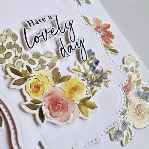
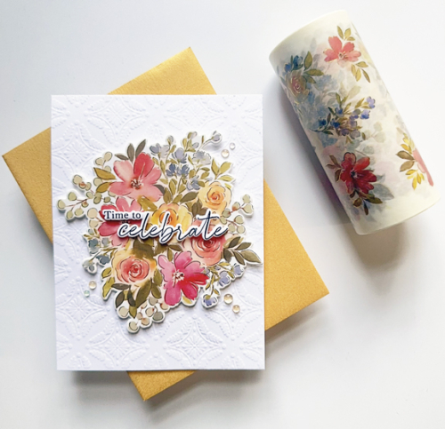
In addition to the Washi tape and coordinating dies, there is also a stamp and stencils. I’ve yet to try those, but am quite sure you’ll see some eventually. It was hard to capture the beautiful foiling in this Washi, but this photos catches a bit of it.

LovelyClose

The sentiment here is part of the stamp set, and the dies cut out the sentiments which I love. This sentiment and the floral are on another of the products for the class. When I first saw the Dotted Fancy Frames I wasn’t sure if I’d like them. But when layered together as they are here, I’m very fond of them.

The next card is simpler and, not surprisingly, a design I came up with when I ended up with three of the large florals from the Washi Tape on my desk.

Washi

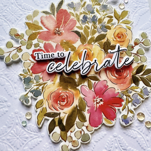
I found an already embossed Honey Bee Winter Gems card front in my stash. I know it says winter but when done white on white, I think it works with these pretty flowers as well. This card could not be simpler or quicker. I added the large image with some thin dimensional tape and another sentiment from the stamp set.

WashiClose

I also added a few of the Iridescent Dew Drops that were also part of the event kit. 

I’m getting these posted just under the wire for the Pinkfresh World Card Making Day Challenge. I was in Italy for WCMD, but am happy to have these completed before the challenge ends. 


Color Hues 97

  • by

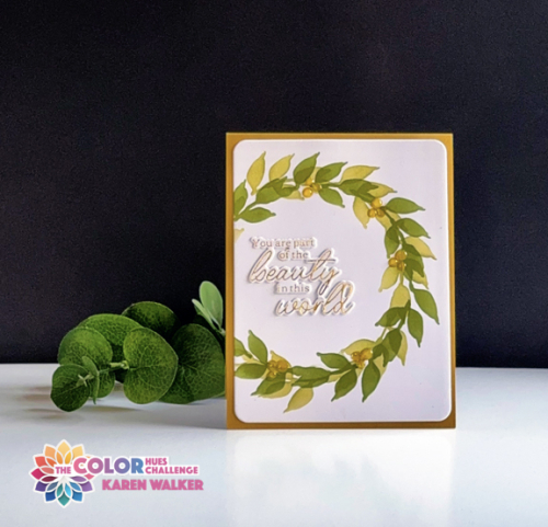
Julie P’s Color Hues combo is so inspiring this time around. I love the Olive and Mustard combination and was able to put another NBUS stencil to work.

CH #97 Olive and Mustard.001

Altenew’s Wonderful Wreath has been sitting in the NBUS box for far too long. It’s a very easy stencil to use, and I used Papertrey Ink’s Ripe Avocado for one layer, and after rotating the stencil a bit added a second layer of leaves with Gina K’s Asparagus ink–two of my favorite greens. The mustard berries were hard to see even when I used a heavy had with Concord and 9th’s Honeycomb ink so I added some Nuvo Crystal Glaze to each berry for a bit of dimension. 


CH97_2

The main panel was die cut with Hero Art’s Rounded Rectangles (before adding the Nuvo glaze), and the sentiment is from Pinkfresh Studio’s Betterpress Plate, Favorite Things Sentiments, foiled in gold.

These are such pretty fall colors, and I hope you’ll be inspired to join us in the Color Hues Gallery. There’s lots of inspiration there so take a look!

Color Hues #96

  • by

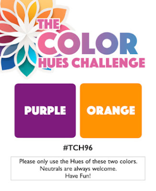
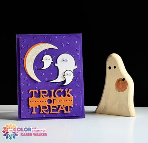
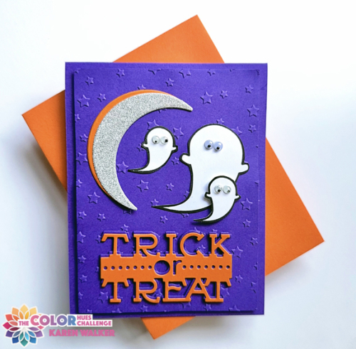
Julie B’s choice, Purple and Orange, for the first of October Color Hues Challenge sent me right off to find my Halloween die cuts. 

CH #96 Purple and Orange.001

CH96_2

I reached for my favorite purple (Simon Says’ Royal Purple) and orange (Papertrey Ink’s Orange Zest) cardstock. Most of these images were die cut two or three years ago when I got together with two friends and used some of their Halloween dies. I die cut enough that I’ve used some of those for the last two Halloweens, and still have some left for more cards this year and next! All of the dies are from Papertrey Ink. The sentiment is from the Tricky Trio die cuts, and is no longer available. I layered three sentiment together, two purple and then the orange slightly offset. 

CH96Flat

The sparkly moon is from the Boo Black Cat and the three ghosts were stamped and die cut from Ghost and Ghoulies. I love their tiny googlie eyes that I found in my stash. Once I arranged them, I decided the card definitely needed something more, so cut a panel of purple and then used Spellbinder’s Stargazer embossing folder–just what it needed.

I’ll need a few more Halloween cards, but it’s good to have one on hand early. I hope you’ll join us in the gallery of the Color Hues Challenge. You’ll find plenty of inspiration from the Design Team there. 

Clean and Simple Florals

  • by

Knowing full well I’d be away when the latest Pinkfresh Studio Create & Connect event took place, I signed up anyway. The truth is I have a terrible time keeping up with the live videos. And too frequently, the card the designer is sharing is a bit over the top for my taste. By doing it this way, I could watch the videos and make some decision about what and how to create with the (always) fun product that comes with the class. 

In addition, I can watch the videos in any order I want. This time I started with a cling stamp, stencil, and die called Modern Botanicals. I colored two sets of the florals, knowing I want to eventually create the first card Kristina Werner designed for her class. For one set, however, I decided to make three CAS cards, using a variety of precut card fronts and dies I had in my stash.
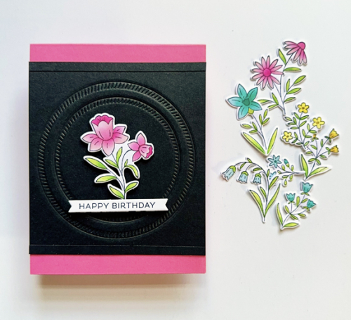
PinkFloral

The black piece was dry embossed with The Greetery Crimped Circle dies. I thought I was going to use it on a previous card, but ended up putting it in my envelope of card fronts instead. I trimmed off the top and bottom and added a thin strip of black cardstock as a border, and added it to a bright pink card base. All the florals are from Modern Botanicals. The sentiment is a Betterpress one from Spellbinders’ Always and Forever Sentiment Strips.

PinkFloralClose

The background for the next card was die cut and given to me by a friend several years ago, and I’m just now finding the perfect use for it. It’s Scalloped Stackers: Medium from Papertrey Ink.
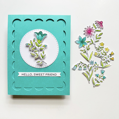
TealFloral

Teal isn’t a color I often choose, but it was perfect for this floral. I added a Stitched Circle from Simon Says and a another Betterpress sentiment from Always and Forever Sentiment Strips. I added some dimensional tape to it before adding it to the circle.
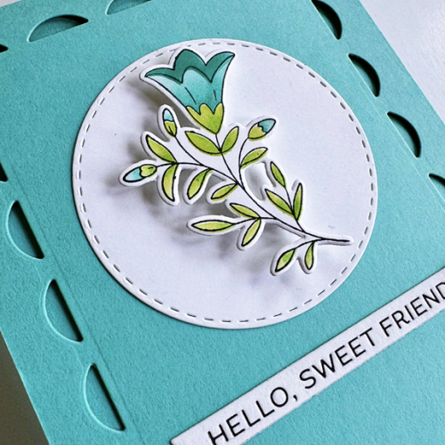
TealFloralClose

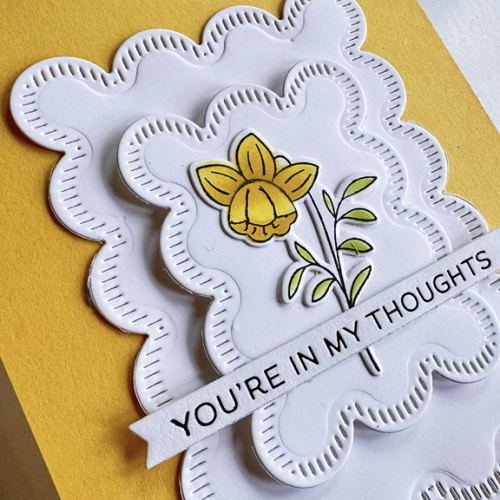
The last card uses some Stitched Scallops from The Greetery. A friend loaned these dies to me, and I die cut a good stack of them in several colors. It didn’t take me long to find a use for these.
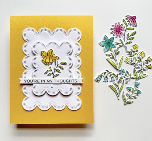
YellowFloral

This sentiment, too, came from the same Betterpress plate by Spellbinders. I added some thin dimensional tape to the smaller Stitched Scallop for a little interest. I gave thought to embellishing all three with some pearls or enamel dots but in the end, decided I liked them as is. (Easier to mail, as well.)
YellowFloralClose

I’m sending these off to The Flower Challenge: Include a Stamped Image.
FlowerChallenge

We’re off on our next adventure tomorrow. I have a group of posts written, and depending on my time and internet access, I may get a few posted. For sure the next Color Hues Challenge will go live on October 1. I gave some thought to totally getting off the internet while we were away until Tracy asked me how many emails I thought I’d have on my return. I shuddered at the thought. I’m taking my iPad so I can read my Kindle books on the flights, but because I usually use a laptop, I’m not terribly adept at using the iPad for much other than reading. 


Just A Note

  • by

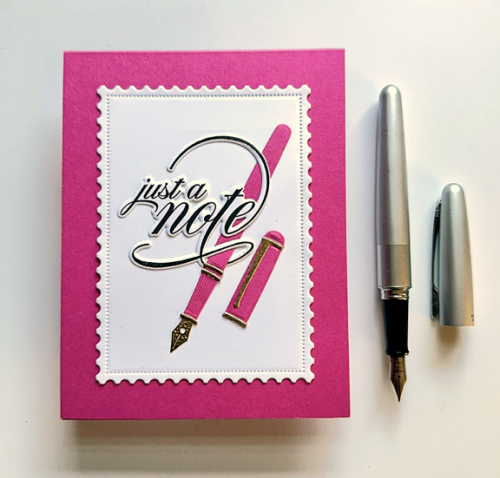
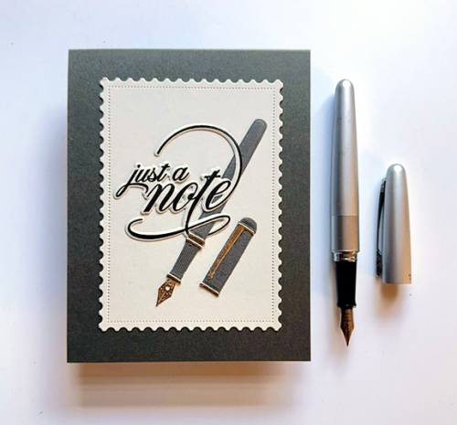
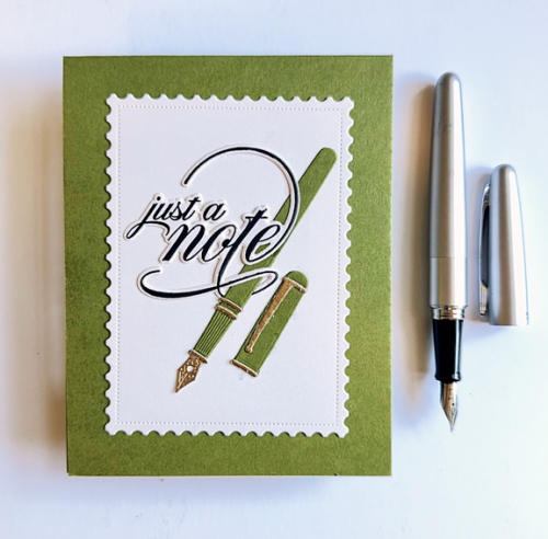
Yesterday I had time to create a card for three different challenges. The first is Addicted to CAS: Just a Note, and as soon as I saw the challenge I knew what I wanted to do. Then I realized that the card fit both Freshly Made Sketches and the Word Power challenges. I’ve never played along with the Word Power Challenge, so I was happy to finally have a card where the focus was on the words. This makes my second post for the day, but the Freshly Made Sketches Challenge ends today, so I couldn’t wait. 

The card was created with just dies from The Greetery. I had already die cut and assembled some of the pens from the Pen Pal die, and I also had precut several panels from the Postal Frame die. All I needed to do was the stamp and die cut the fabulous sentiment from Scripted Sentiments.

NotePink

NotePinkClose

I liked this one so much I found two more assembled pens and created masculine cards with those. 

NoteGray

GreenNote


What I really like about these cards are all the sub-sentiments that are included in Scripted Sentiments which means I can use these for birthdays, anniversaries, or encouragement cards–to name a few. I’m quite sure I’ll come back to this design in the future. 

AddictedFMS Final 653-001WordChallenge Badge


Blue and Pink for Color Hues 95

  • by

Cindy has a great color combo for us on the Color Hues Blog this round: 

Color Hues #95 Blue and Pink.001

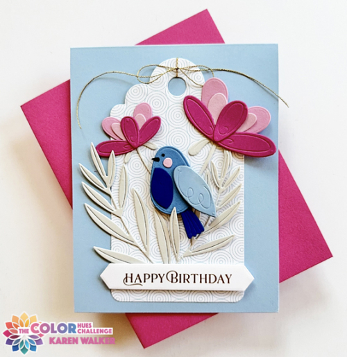
I pulled out two new products (NBUS) from Alex Syberia: Garden Tweets and Signature Tags for my card, and I’m really happy with how it came out.

CH95

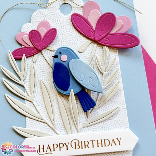
I chose two Papertrey Ink papers for the main blues: Blueberry Sky and Spring Rain. The foliage was die cut with one of my favorite neutrals: Soft Stone. The pinks all came from my scrap box as most of the die cut pieces were very small. After assembling the bird and flowers, I arranged them on one of the two large tags from the Signature Tags set cut from a piece of patterned paper in an older My Favorite Things paper pad, Road Tripper. I like the subtle light blue pattern which adds some interest but doesn’t detract from the main images.

CH95Close

After tying a bow with gold thread from Altenew, I added a sentiment that was hot foiled in gold with Spellbinders Better Press Plate, Fancy Sentiment Strips. I used some dimensional tape under the sentiment strip, and adhered the tag to a card base of Spring Rain cardstock. 

There’s always a lot of inspiration from our Guest Designer and the Design Team at the Color Hues Blog, so hop over and see what might inspire you to join us in the gallery.

This is off to Darnell’s NBUS Challenge.


With Sympathy

  • by

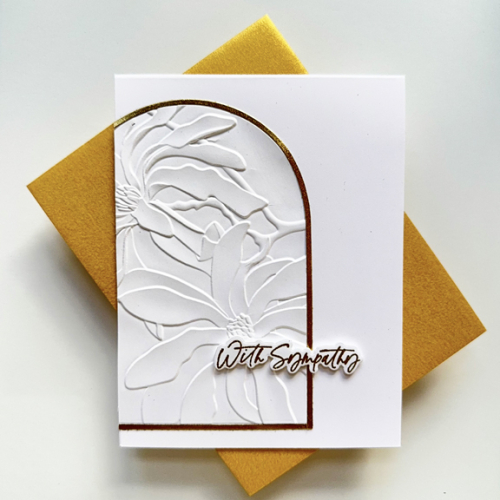
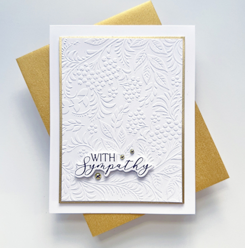
I don’t tend to make sympathy cards ahead, so when I need one in a hurry I head to my envelope of card fronts or embossed panels. This time I found two pieces I had previously embossed with embossing folders, so made two cards. Now I have one in the stash.

Sympathy2

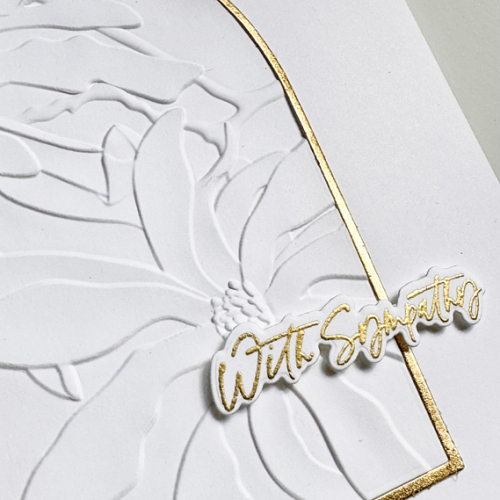
Altenew’s Magnolia Ballerina 3D Embossing Folder is so beautiful, it needs no embellishment. I decide to off set the oval and trimmed off the excess.Then I added a simple die cut sentiment from The Greetery’s All Occasion Script Sentiments which I embossed in gold.

Sympathy2Close

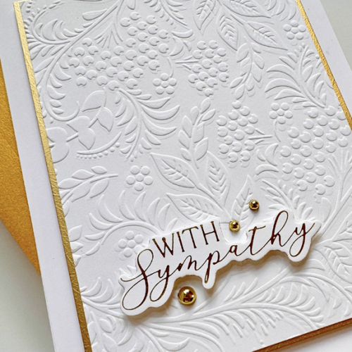
Gina K’s Tapestry Embossing Folder is also beautiful. I cut down the panel, and added a narrow gold border and then used dimensional tape to add it to a white card base. For this card I used an already gold foiled sentiment from Spellbinders, You Are Everything set. I did add three gold pearls from Pinkfresh Studio.

Sympathy1

SympathyClose

These will be two more entries into the Can You Handle the Pressure Challenge and I’m also adding them to the AAA Card Challenge that’s looking for CAS sympathy or get well cards. 

IMG_7017 AAA273

Just Because

  • by

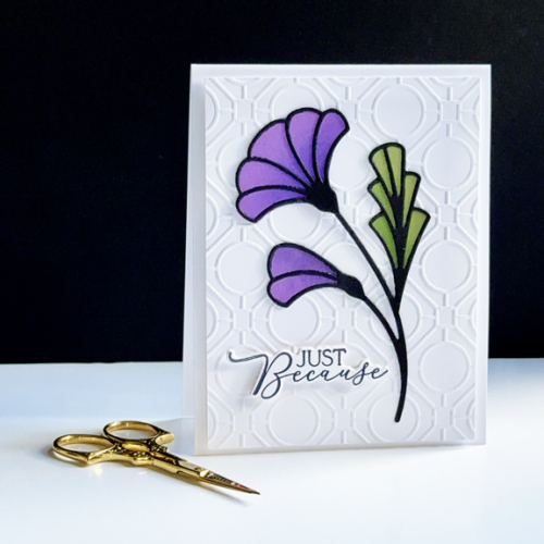
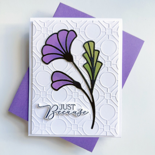
My blogging friend, Darnell, posted a card using Altenew’s Streamlined Sprig die for her I.D.E.A.S. project–D is for dies. When I saw it, I told her I’d try to get a card up that week, but it’s taken longer than I anticipated. But looking at the current challenges I saw two that might help me get this die into use. Time Out Challenges: Friendship or Encouragement, and Can You Handle the Pressure? I’m not using the Optional Leaves theme, but it’s always using an embossing folder. I had one of those in my NBUS box along with the Altenew die. 

JustBecause

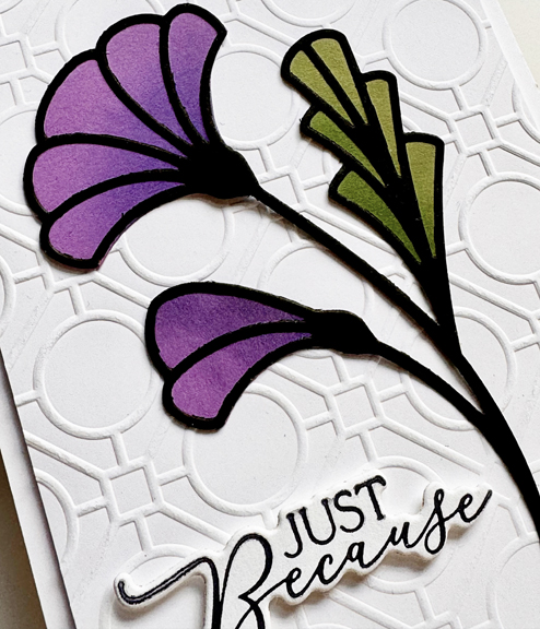
I have to admit I just love this die. The die includes the stem and outline but separate die for the fillers behind. I chose my colors from scraps in my scrap box, and did some ink blending for dimension.

JustBecauseFlat

The graphic nature of the embossing folder (Spellbinders’ Geo Screen) was just perfect for this stylized flower. 

JustBecauseClose

The sentiment is a Betterpress one also from Spellbinders, You Are Everything.
TO271IMG_7017NBUS

Hope you are having a day filled with sunshine! It’s cool here, but very bright and likely to warm up by the afternoon.