Skip to content

Red, White, and Blue

  • by

Happy 4th of July! I’m grateful every single day for the freedoms I have living here. It’s an extra-special day for us because we’re celebrating my mother-in-law’s 85th birthday today. Tomorrow is the actual day, but everyone is coming here for dinner and then we’re headed to Canandaigua to board the Canandaigua Lady for a tour on the lake and to watch the fireworks. It’s quite cool here this morning, but clear and sunny!

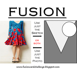
I have three red, white, and blue cards to share. I’m entering all three cards in the Fusion Challenge this week:  Red, White, and Blue. The last one fits both the color and the sketch challenge.
Fusion copy

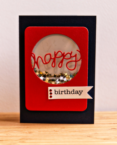
The first is the birthday card for Ellie. Once I created the anniversary cards here, I knew this die would make an awesome shaker card. I ended up taking the first card apart and redoing it. I folded a piece of clear cardstock, sealed two sides with Washi tape, and dumped the star sequins inside. Then I sealed the top when I adhered the white background. It makes for a much flatter and neater card.
HB

The die cut and sentiment are both Papertrey Ink, and the cardstock is Simon Says Lipstick Red and Soft Navy. I think I found the stars at Michaels, but it was awhile ago. 
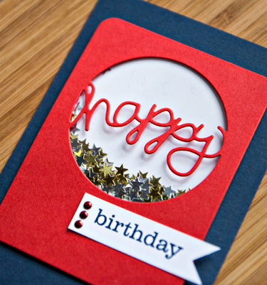
HBClose

I’m entering this one in the Simon Says Wednesday Challenge:  Shake It, and Virginia’s Die Cut challenge.
Wednesdayblog-logo

V. V. Challenge #5 (2)

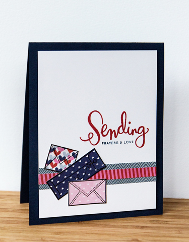
The next two cards use the July Simon Says Card Kit. This kit is going to get a lot of use! The first one is for friends who received some tough news this week. We’re hoping it will all work out, but I wanted to get a card of encouragement out to them ASAP.
SendingPrayers

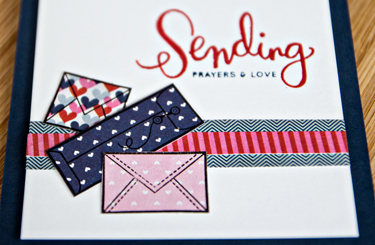
Absolutely everything on this card came from the kit. I love all the patterned papers, and managed to get five of them on this card!
PrayersClose

Even the inside message came from the kit.
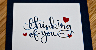
PrayersInside

The last card was inspired by the Fusion Sketch and this card by Shari Carroll. 
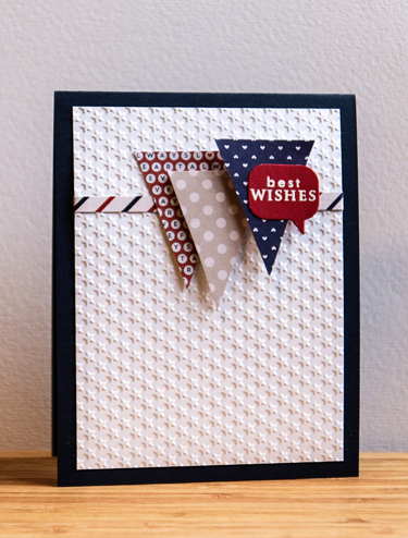
BestWishes

More yummy patterned papers from the kit, as well as a Lifestyle Crafts embossing folder (never used before) and a die cut from Papertrey’s “Bubble Talk” with an embossed sentiment from PTI’s “Faux Ribbon” (one of my oldest PTI sets).
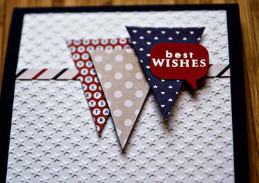
BestWishesClose

If you’re celebrating today, I hope it’s a wonderful and safe holiday!
Zoom In, Zoom Out: Week 27

  • by

One of the many things that seemed to get off track during June was regular exercise. About a week ago, I got back to more regular walking, and I’m in the process of finding a new personal trainer to set up a weight-lifting routine for me. My previous trainer has left the gym we belong to, so that hasn’t helped much either.

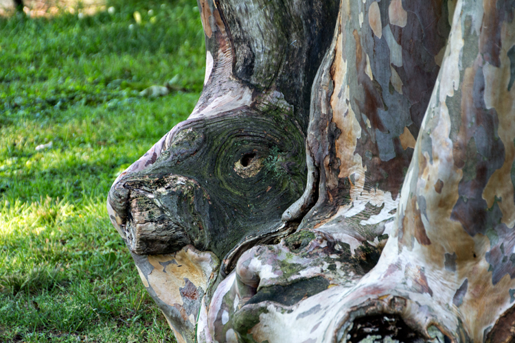
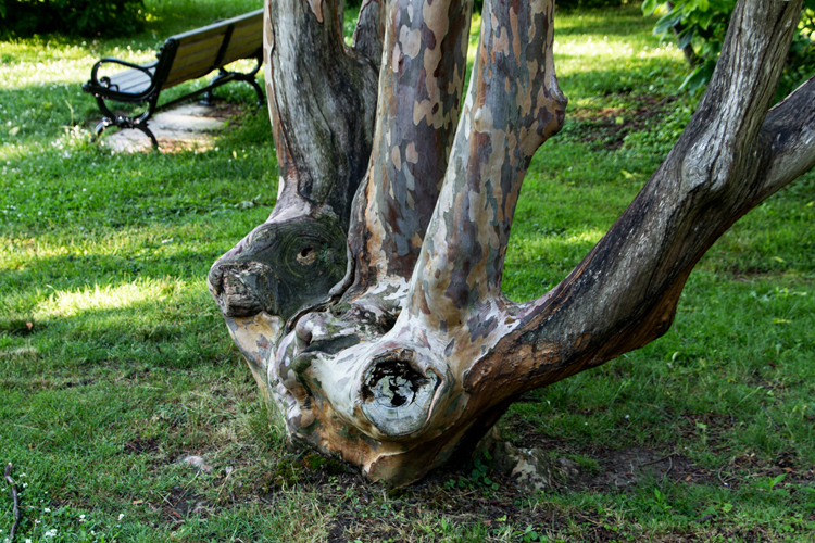
When I walk I always have my iPhone and use an app called Runkeeper to track the time and distance. Thus I always have a camera as well. The other day we were walking through Highland Park—a regular route for us—and I looked over to see this tree.

IMG_5311ed_blog

I immediately saw a lioness’ head. Tracy thinks it looks more like a rabbit. What do you see?

IMG_5312ed_blog

Linking up with Helena’s Zoom In, Zoom Out meme here.

Project Life: OLW & March

  • by

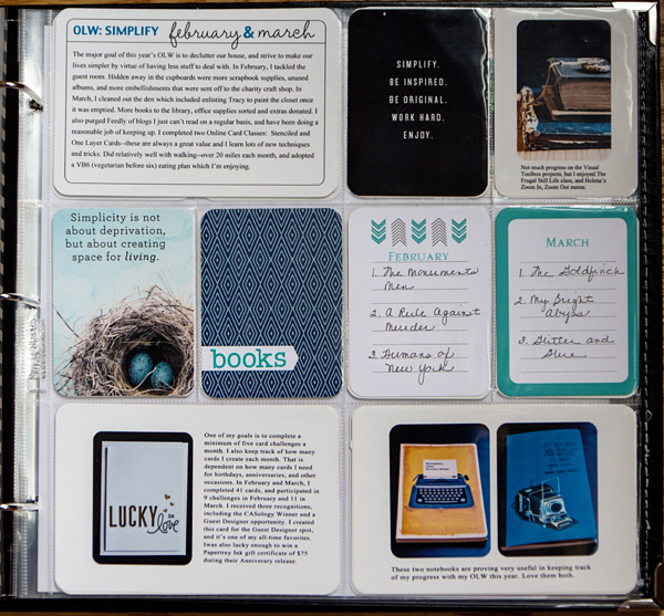
Thanks to keeping a daily log and maintaining my Lightroom files, catching up on my Project Life pages isn’t too difficult. I found some time to get back to it recently, and although it’s not a particularly fast process, I’m beginning to find one that works pretty well for me. I neglected to add anything about my One Little Word on my February pages, so decided to start with a page devoted to both February and March.

OLW

I think I’ll stick with Tracy Larsen’s Simply White templates. I like the clean look and it’s easy to pop the photos in the templates instead of having to resize them for the different pockets. The two quote cards came from pins here and here. The three 3X4 cards in the middle are all from a Cocoa Daisy Project Life kit, and the perfect little stickers (“books”) is a Basic Grey alpha that I’m pretty sure came with the same kit. I stamped the names of the months with Papertrey Ink’s “Calendar Basics” stamps.

OLWJournaling

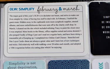
This is a Cathy Zielske Basic Journalers card along with a couple of her “Months and Days” brushes. I know quite a few people who keep track of their progress with their OLW through Ali Edward’s course on Big Picture Classes, but this seems like enough for me.

Lucky

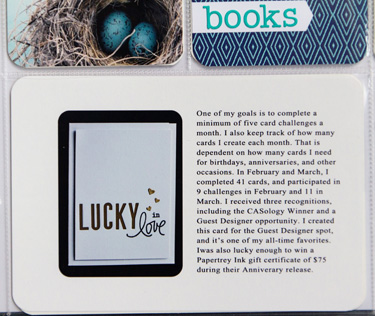
One of the things I like to do is keep track of the cards I make each month. I used to keep track of layouts as well, but now that I’m doing pocket pages, I’ve stopped worrying about that. I also wanted to remember my lucky win at Papertrey Ink.

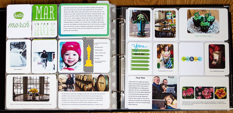
MarchFull

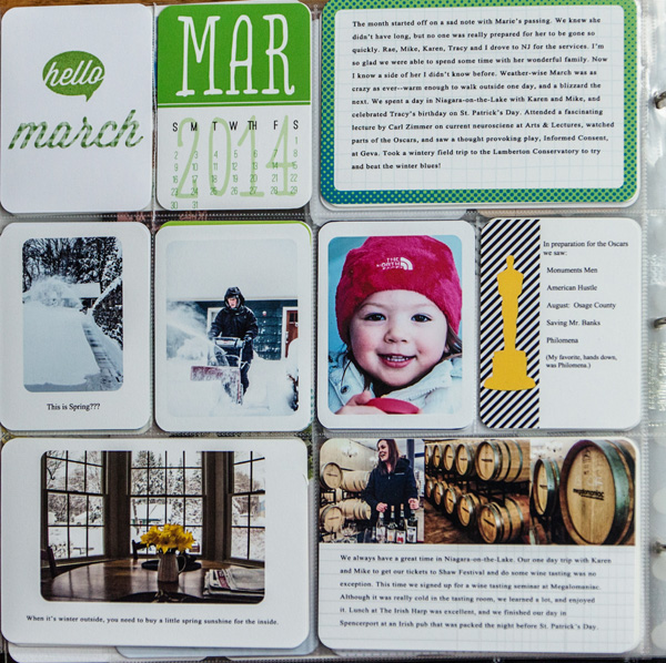
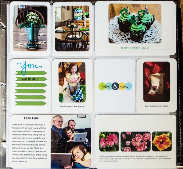
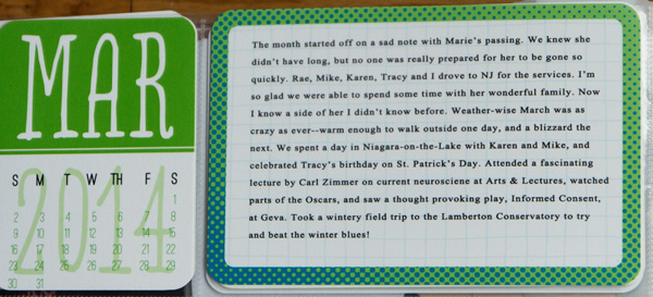
March ended up being a two page spread. The title card was created with Monthly Moments stamps and die from Papertrey Ink, and the calendar is from a digital file by Katie Pertiet that I recolored. I lowered the opacity of the year. My digital skills are pretty basic, so I’m always quite pleased with myself when I remember to do something like that! The journaling card is also a digital file by Splendid Finn that I printed out. I love the little Oscars card where I typed up a list of all the films we saw prior to the awards. It was a freebie at Laura Kate is Crafty. I also used two of Cathy Zielske’s “Tiny Templates” to create the photo collage and journaling about our trip to Niagara-on-the-Lake, and my love of Face Time.

March1

March2

Here’s a closer look at the journaling for March:

MarchJournaling

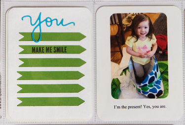
And my favorite hand-made card for the month created with Papertrey Ink’s “A Few Pointers” die, and Simon Says “You” stamp set and die.

You

Everytime I finish a Project Life page, I’m so glad I started this process. I’ve started with the pages for April, but need to find some concentrated time to finish them up. Here we are at the end of June (just how did that happen?), so I’m still three months behind!


Welcome, Baby!
  • by

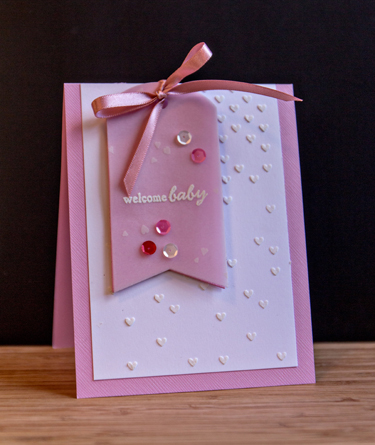
I’m back with a card for The Card Concept challenge site. The current challenge is “Oh, Baby!” and I needed a baby card for good friends who just had an adorable baby girl.

Baby

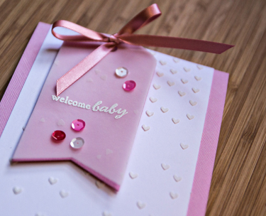
I had a lot of fun creating this card. I started by applying embossing paste with  Simon Says “Falling Hearts” stencil. While that was drying I die cut two tags with Papertrey Ink’s Tag Sale #5, one from the Bazzil pink cardstock and one from a vellum that is also embossed with tiny hearts. The sentiment is from PTI’s “Fillable Frames: Addition 2.” I tied a Paper Source pink ribbon to the tag and adhered everything to the card base. The gorgeous sequins are new ones from Pretty Pink Posh. This fits the Card Concept category “Clean and Layered.”

BabyClose

I combined sentiments from Avery Elle’s “Oh, Happy Day!” and Simon Says “Favorite Flowers” for the inside greeting. I just love how they work together.

BabyInside

I’m also linking this to Simon Says Work It Wednesday Challenge: “Create & Share.”

Workitwedbanner

Less Is More: Watercolour

  • by

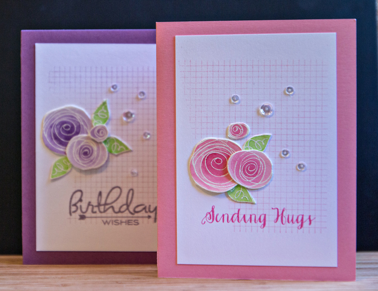
It’s not often that I publish two posts on the same day, but today is the last day of Less Is More’s Watercolour challenge, and I have two cards I’d like to share. They were both made with the stamps from the Simon Says June Card Kit, “Favorite Flowers.” One is a birthday card for a blogging friend across the Big Pond, and the other for a friend who is facing some very hard times right now. 

CardPair

I stamped and white embossed the whimsical flowers on Tim Holtz’s watercolor paper, then watercolored them with my Peerless watercolors. They are quickly becoming my favorite watercolors. After cutting out the flowers and leaves, I partially inked the grid stamp (A Stamp in the Hand) on Neenah white cardstock, and stamped the sentiments.

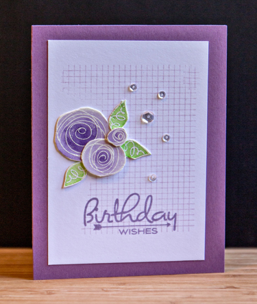
BDWishes

I chose Plum Pudding paper and inks for this one (Papertrey Ink), and stamped a sentiment from Papertrey’s “Birthday Style.”  Then I arranged the flowers and the Pretty Pink Posh sequins.

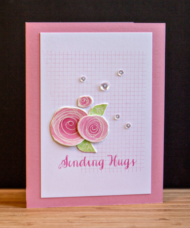
SendingHugs

The cardstock for this card came from my stash, but is most likely Bazzill. The sentiment is from a relatively new Simon Says set called “Friendship Messages.” I love the font. One requirement for the Less is More challenge is to leave plenty of white space. I think the subtle grid pattern qualifies for white space. 

I’m also linking these up to the Simon Says Work It Wednesday blog.

Workitwedbanner


Happy Anniversary & Two Challenges

  • by

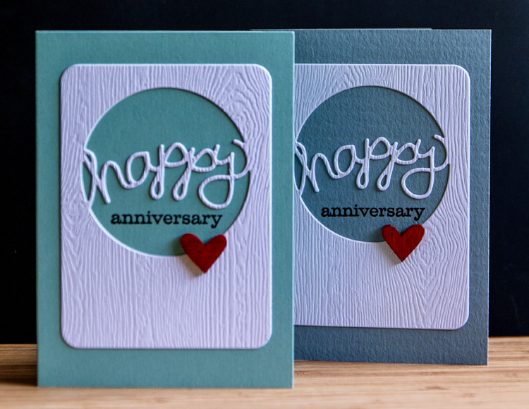
My dear friends celebrated their 66th anniversary yesterday. They no longer live in the same building (but are at the same facility) so this year I made an anniversary card for both of them to have in their rooms. 

AnniversaryCards

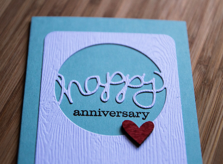
I was anxious to put this new die from Papertrey Ink to work, and I’m sure it’s going to get a lot of use. I love the simplicity of it, and the accompanying stamps make it very versatile. I die cut it from Simon Say’s woodgrain cardstock and added the wood veneer heart, colored with a Copic marker so I could enter them in the CAS-ology Challenge this week:  Wood.

Here’s a closer look.

AnniversaryClose

Week 101 - Wood

I’m also linking up to the Simon Says Wednesday Challenge:  Anything Goes.

Wednesdayblog-logo

Zoom In, Zoom Out: Week 26

  • by

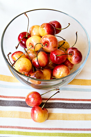
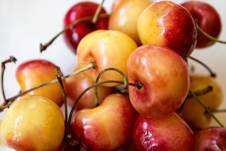
It’s hard to believe the year is half over. I have no idea what’s happened to the month of June! Keeping up with Helena’s meme is one of the goals I’ve managed to keep up with and enjoyed all year. Last week a friend introduced me to white (also known as Rainier) cherries. Evidently they’re only available for a couple of weeks. I’ve never been a big fan of cherries, but Tracy and I both love these. I’m hoping there are still some available this weekend when I go back to the grocery store.
IMG_5306ed_blog


IMG_5308ed_blog

Not only do I love summer for the fresh and local fruits and vegetables, but also for the opportunity to try new fruits and vegetables as well. You can check out other ZIZO pairings right here at Helena’s blog. 

Papertrey Ink June Blog Hop

  • by

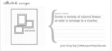
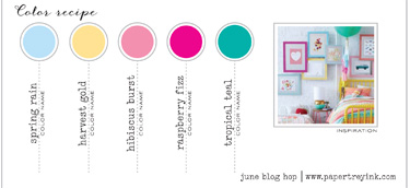
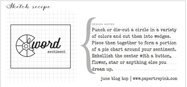
The inspiration for Papertrey Ink’s June Blog Hop was a photo, sketch, and color challenge. This was the way Nicole described it:

You can choose to work with any of the ideas above or use other components of the inspiration photo to jump start your creation.  Have fun with it and challenge yourself to work outside of your comfort zone!

I created three cards, using each of the sketches, and combined one of the sketches with one of the downloadable color combinations. In my ongoing attempt to use stamps that haven’t seen enough (or any) love, each card uses at least one stamp or die that I’ve never used before.

Here’s the first sketch and the color inspiration.

Sketch1

ColorInspiration

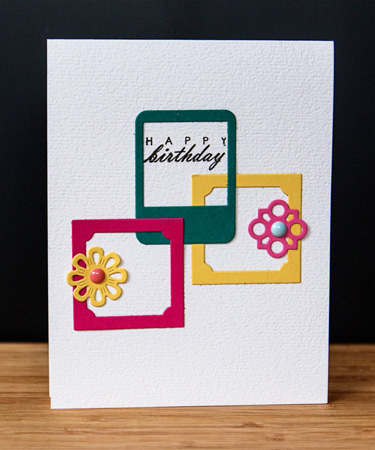
And my interpretation:

Card 1

This color combination is definitely not in my comfort zone (nor is trying to combine five different colors on one card.) I began by die cutting frames from Framed Out #1 and Framed Out #12 as well as a collection of flowers from Button Stacks II. (The Button Stacks II dies are my unused item.) I took a little liberty with the sketch and stamped the sentiment from “Fillable Frame #4 inside one of the frames. The Spring Rain color was added with the enamel dot from MME. The rest of the colors were die cut from the corresponding paper in the inspiration piece.

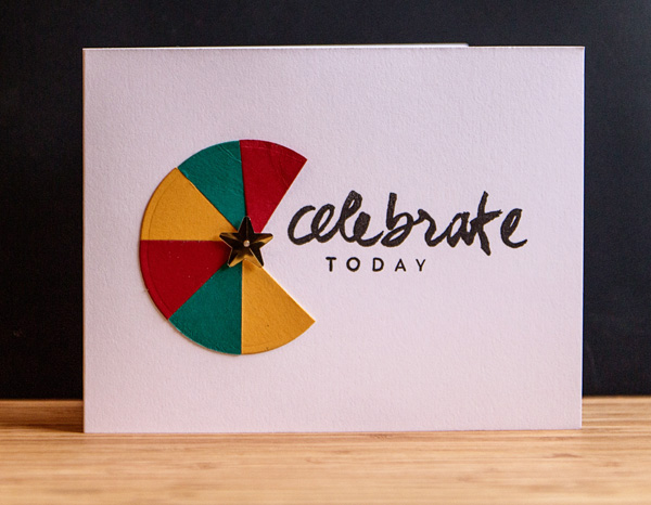
For the second card I used a sketch, but choose my own colors from a pile of scraps laying on my desk waiting to be filed into the scrap paper folders.

Sketch3

Card2

I used a Nestability Small Circles die to cut the circles from Pure Poppy, Tropical Teal, and Summer Sunrise. The star is from Impress, and the sentiment is from another unused (but new) stamp set “Wet Paint II.”

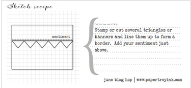
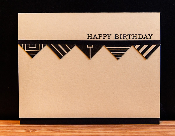
The last card is my personal favorite (CAS design), and a masculine one, to boot! I used this sketch:

Sketch2

Card3

I started by stamping a variety of the”Square Prints” designs on Fine Linen cardstock. I’ve owned the “Square Prints” set since it came out, and don’t believe I’ve ever used it. Liked it when I bought it, and I still do. I cut each square on the diagonal and mounted the resulting triangles under a thin strip of True Black cardstock. The sentiment is from “Botanical Prints.”

I’m linking up all three cards to the Simon Says Monday Challenge to use products we ought to use more often. True, true, true.

Mon-challenge-badge_zps05647c53

I was hoping to link up to the blog post this morning, but either TypePad or my internet service were being disagreeable. So now I’m off to check out the inspiration linked here.

Summer Scavenger Hunt: Part 2

  • by

When I traveled to Detroit last weekend, I had my traveling companions on the lookout for the scavenger hunt items I needed. We found a few, and they had a great idea for one of the items I thought would be the hardest. One of the things I love about this project is how easily my friends and traveling companions jump into the project helping me find just the right photo.

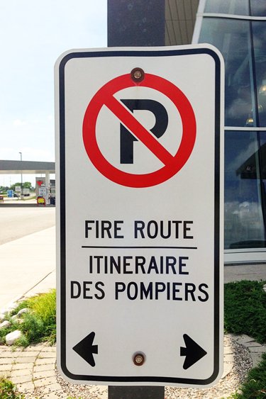
#16 on the list is “a sign in a language other than English. The first one we encountered was in Canada at a rest stop.

IMG_6201ed_blog

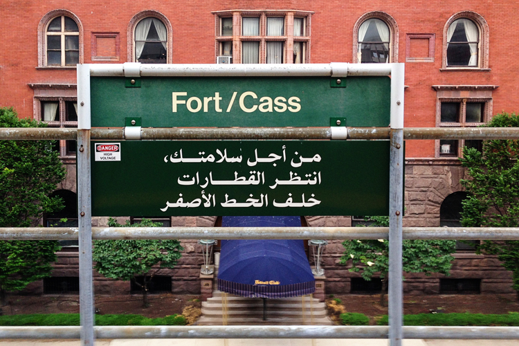
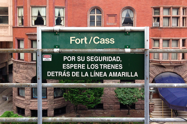
But then when traveling on the People Mover in Detroit one evening on our way to the Fort St. Presbyterian Church,we found even better signs side by side.

IMG_6222ed_blog

IMG_6224ed_blog

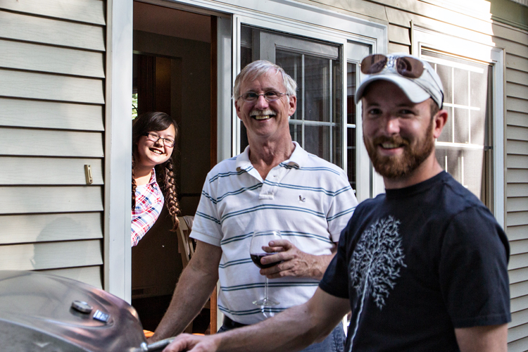
I thought #10, a photo bomb (someone found lurking in the background of a photo) would be another difficult find. But Betsy’s niece popped her head into a photo I was taking of Matt and Tracy on Father’s Day. I think Nadia was surprised to find out I was HAPPY to see her in the photo!

IMG_5212ed_blog

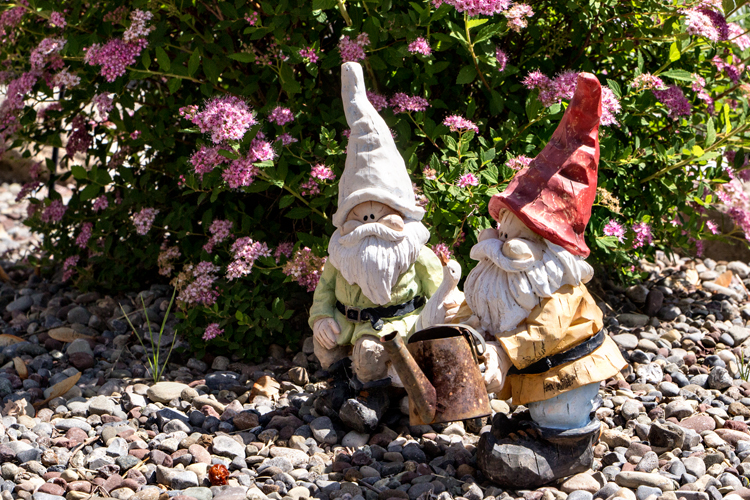
I knew I’d have another entry for #2:  a garden gnome, since my mother-in-law discovered her neighbor’s garden gnomes. Now I have some in a garden setting. (And they’re a lot cuter than the ones I found at Wegmans.)

IMG_5256ed_blog

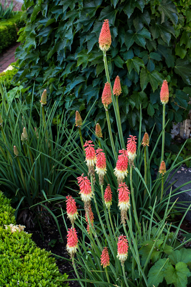
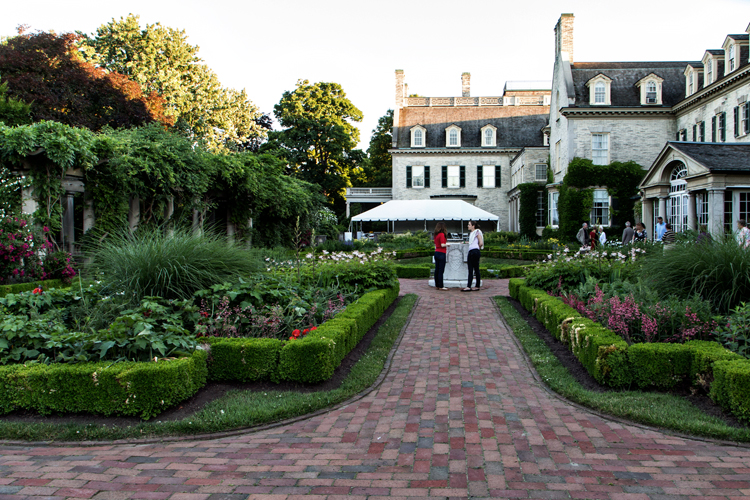
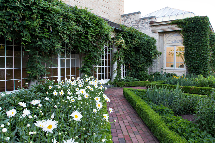
I took some photos with my iPhone (the signs were also taken with my phone) of a public garden (#19) a few blocks from our house. I have them in my SmugMug album, but I’m sharing the beautiful public gardens at The George Eastman House here.

IMG_5245ed_blog

IMG_5244ed_blog

IMG_5247ed_blog

IMG_5248ed_blog 

And one of my favorites from the evening, taken as I walked back into the galleries. 

IMG_5250ed_blog

You can find more information about Rinda’s Summer Scavenger Hunt right here. It’s never too late to join in. The hunt continues until the last day of summer. I’ve finally added Rinda’s graphic to my sidebar with a link to all my Summer Scavenger Hunt photos in my Smug Mug album.


Sweet Pea

  • by

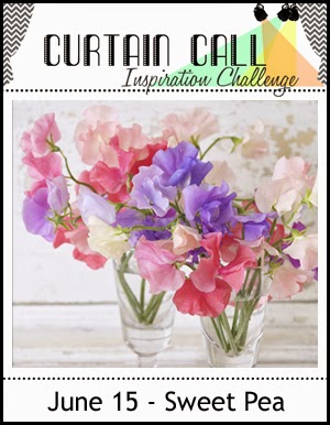
One of my goals this year is to try to use all the stamps in my collection. Truthfully, it will probably take me more than a year, but I’m making progress. As soon as I saw the current challenge at Curtain Call, I knew I had the perfect stamp, and one that hasn’t seen much use.

Sweet pea edited

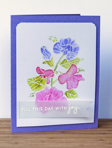
Papertrey Ink had a series of stamps several years ago called Year of the Flower. I only purchased two of the twelve, but one of them was “Sweet Pea.”

SweetPea

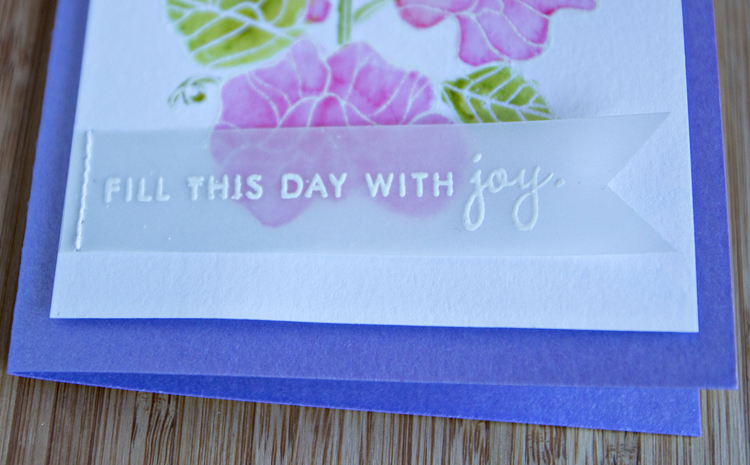
I’m also entering the card into the Less Is More challlenge:  Watercolour. It’s a relatively new challenge for me, but one I see frequently on my inspiration journeys around the internet. The cardstock base is a beautiful shimmer one from Papertrey Ink, but it’s not showing up well in photographs. The sentiment is also from the Year of the Flower:  Sweet Pea, embossed in white on vellum and stitched down. 

SweetPeaClose

Usually I have a receipient in mind when I make a card, but this one originated with the challenge call. It’s nice to have a few cards in the file when I need one but don’t have the time to create one.

Happy Retirement

  • by

It’s that time of year, and two people I’ve worked with are retiring in June. The first is the program secretary at the Presbytery office. Jan has been a huge help to me during the six years I’ve served on Presbytery committees, and especially the three years I was chair of one of the committees. A group of us took her out to dinner a week or so ago, and I made this card for her.

Retirement

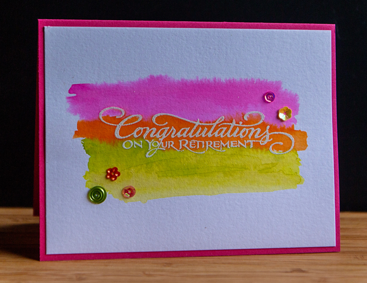
Embossing and then doing a watercolor wash is becoming a favorite (and quick to do) technique. This time I used Dylusion sprays. I dipped my brush into the spray and applied it to the watercolor paper. I love how bright (almost neon) they are. The sentiment is an old wooden stamp by PSX. It’s been in my collection for a very long time. The assortment of sequins came in a kit, but I’m not sure which one. I’m entering this card in the Less Is More challenge:  Watercolour.

LIM for blinkie

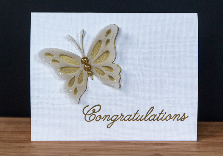
The second card is for our Assistant Music Director at our church. I was on the hiring committe that chose Chris nineteen years ago! My original idea for this card didn’t work out, but the end result is one of my favorites in quite some time. Totally CAS, but elegant.

ButterflyCongrats

I almost didn’t purchase the “Life is Beautiful” stamps and die from Papertrey Ink, but they are already a favorite. The sentiment is from a Papertrey set, “Congratulations,” that I’ve never used before, but it was the perfect size and font.

ButterflyCongratsClose

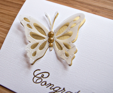
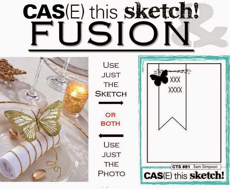
Here you can see the beautiful vellum, streaked with silver glitter from Cosmo Cricket’s “Simple Surfaces” paper pack. The glittery enamel dots are from MME. The gold paper has been in my stash for a long time. This is the perfect card for the Fusion part of the CAS(E) this Sketch collaboration this week.

CTS_Fusion

I’m also entering both cards in the Simon Says Monday Challenge:  Anything Goes.

Mon-challenge-badge_zps05647c53


Zoom In, Zoom Out: Scenes from Detroit

  • by

I spent three exhausting days in Detroit over the weekend. Went to bed WAY too late all three nights, and was on the go most of every day. The moderator election did not turn out the way we hoped, but the experience of attending the Presbyterian General Assembly was definitely a good one—and a learning experience as well. I got to know some members of my congregation much better, and met some really wonderful people from all over the country.

The first of the Zoom In, Zoom Out photos is another pick for Rinda’s Summer Scavenger hunt:  an urban scene. This is the Ren Center in downtown Detroit. We were staying at the Marriot there.

IMG_6208ed_blog

IMG_6210ed_blog

IMG_6212ed_blog

One way to get to the COLA Center from our hotel was to walk down Jefferson Ave. The first two shots above were taken on Jefferson Ave. The other way was along the river walk and the last photo above and the next two were taken along the river.

IMG_6220ed_blog

IMG_6218ed_blog

You can join in at Helena’s Zoom In, Zoom Out meme anytime, and you can check out the other photos right here.

We’re going out to dinner with friends tonight and then to the Members Only party to see the new Lewis Hine exhibition at the George Eastman House. The opening parties are one of the perks of being a member. There are light refreshments, live music, and a chance to see the exhibits prior to the public opening. Although I have one set of photos for Rinda’s scavenger hunt for a public garden, I’m hoping to get some good ones tonight at the George Eastman House gardens. The light should be perfect!

Happy Father’s Day

  • by

Today is Father’s Day in the US, and I know three of the greatest dads around. My husband, my son, and my son-in-law couldn’t be more conscientious, loving, and devoted fathers. Watching them with their child(ren) is such a joy, and the love they give is returned in kind. I’ll be home from Detroit in time to celebrate with Tracy at Matt and Betsy’s house for dinner. 

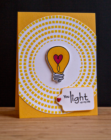
Light

This one, needless to say, is for Tracy. Most of the products on the card are from the Simon Says April Card Kit. The stencil is from Crafter’s Workshop. I added bright yellow acrylic paint to some transluscent embossing paste. Before I layered on the embossing paste, I did cut a circle mask to save the spot in the middle for the light bulb from “Watts Up” by Simon Says. None of the sentiments in the set were quite what I was looking for, but after searching through my collection I found the perfect one from an old Unity stamp set, “Shine On.”

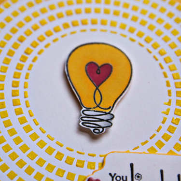
LightClose

A closer look at the dimension created with the embossing paste.

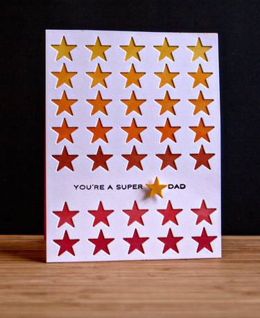
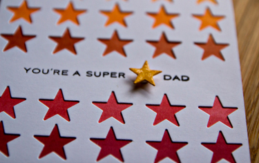
SuperStarDad

I was excited to finally get out this cover plate die (Simple Stars) by Papertrey Ink for Matt’s card. I colored the cardbase with Copic markers to create the ombre stripes behind the stars. The sentiment comes from an older Papertrey set “Star Prints.”

StarDadClose

I added some glossy accents to accent the sentiment star.

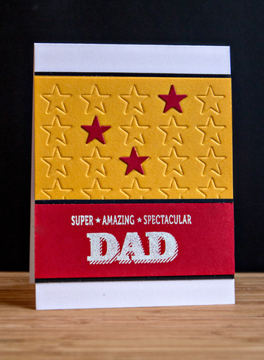
AmazingDad

I used the Simple Stars cover plate to emboss the top portion of Adam’s card. The sentiment is from WPlus9’s “Super Star” set. It appears that set is no longer available so I’m glad I bought it when it was released several years ago. This might be the third Father’s Day that it’s seen action, and all three of the inside sentiments were stamped with the Happy Father’s Day sentiment from that set.

All three cards use Simon Says “Sunshine” and “Lipstick Red” cardstocks as well as Papertrey Ink’s Select White.

Happy Father’s Day to all the great dads who make such a difference in their children’s lives!

One Photo & Twenty Words

  • by

I love Abi’s meme “One Photo & Twenty Words” and have a fun photo for it. I’ll try to get this linked up when I’m away, but I may not be able to manage it until I get home on Sunday.

IMG_4917ed_blog

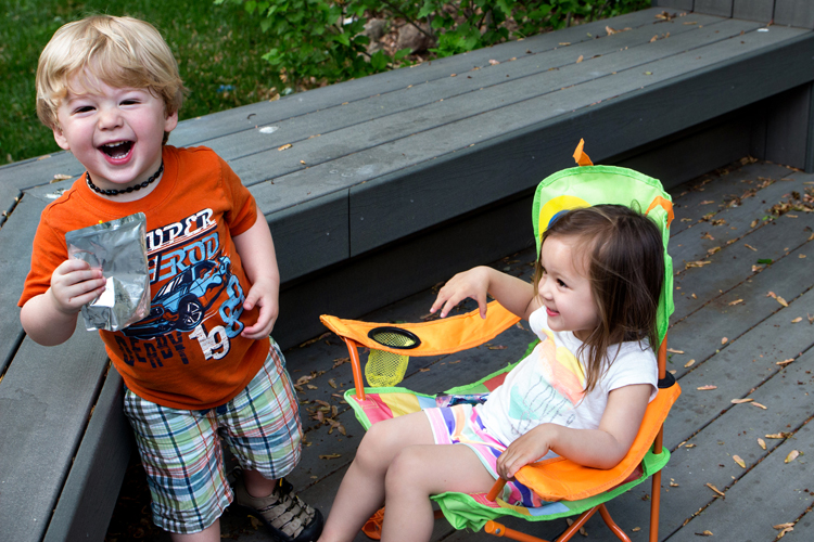
Just three months apart, but separated by 620 miles,
these two-year olds enjoy every minute of their time together.