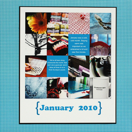
Here’s my layout summary for January. I used the color picker in PSE to color the text squares, and didn’t realize quite how bright it was until I printed it. I was unwilling to use the ink it would take to redo it, so went through my stash and found this equally bright graph paper from Paper Loft. The photo template is one of Cathy Z’s from Designer Digitals. It’s definitely not me, but done. I do like the format, though, mostly photos but a bit of journaling about our month.

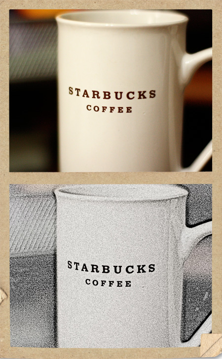
I played around with some textures and blending modes this weekend, so for this week, I’m sharing the original and the altered photo. For the first one I used an Antique Paper action and then a black and white tint. I rather like it.
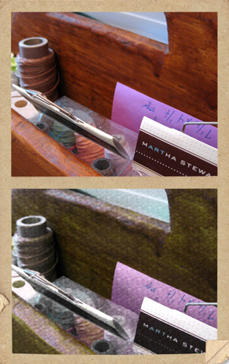
For the second one I used the pencil sketch action in PSE and adjusted the contrast. It turned the photo into a drawing. I think it’s a technique I could use for a transfer or maybe for a card.

At any rate, it was fun to play around.

I’m loving the antique paper action, too. And I love using grids, so I’m a fan of your January layout 🙂
I love to play with textures on photos – I have not had enough opportunity to do so this year – save that activity for a rainy day …. they are few and far between at the moment!
I think the summary page turned out beautifully and the colour is striking – energetic for your dreary winter days. Are you using this format as a page divider and then making more pages for the project or, are you slipping a summary page into the regular album?
Those are very cool effects!
Rinda
Love seeing what you’re playing with. The sketch effect is cute and I like the antique paper action too. Well done on getting your pages made and I look forward to seeing the rest throughout the year.
Amy, for now I’m putting the summary layouts in the current album. I may change my mind eventually. Last year I started a separate album for 365 layouts, but it’s a 8.5X11 album.
Comments are closed.