
Let me tell you how excited I was to see that my photo for indigo was the winner last week on Project 64! Totally unexpected and totally delightful! I had lots to choose from last week, but this week was a different story.
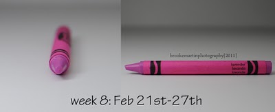
This is lavender, although almost no one I’ve talked to this week would give this pinkish crayon that label. When I went to the box of crayons to look for my idea of lavender, I pulled out wisteria. Perhaps purple mountain majesty would be close, or even mauvelous. This seems way too pink, and it’s a strange pink. I’ve carried the crayon around all week again.
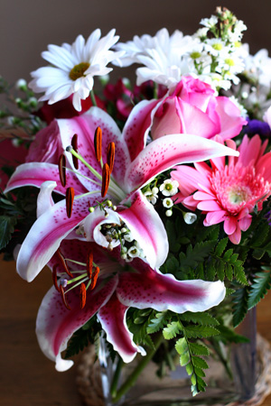
As it turns out I was staring at some lavender all week without it registering. Several of the flowers in my Valentine’s Day Bouquet are very close. By the time I realized it the flowers were fading, but I had taken an earlier photo.
Then Saturday night as we were leaving to go to dinner at friends, I noticed the cap to the Woolite for Dark Clothes.
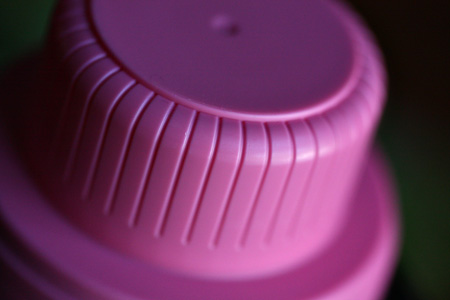
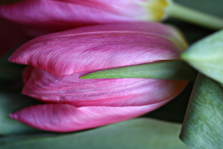
It’s nearly a perfect match. But my favorite is the tulips I bought for the kitchen table. And yes, I held the crayon next to them in the grocery store. I wonder what people think . . .
Today is Matt’s birthday. Happy Birthday to one of the kindest, nicest men I know. He’s . . .
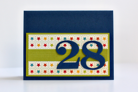
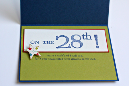
Cardstock: Simply Chartreuse & Pure Poppy (PTI), navy from stash; patterned paper: “Campfire” (October Afternoon); dies: Numbers (PTI); stamps: Big Birthday Wishes (PTI), Williamsburg Numbers and Punctuation (Technique Tuesday); star punch; Chamomile Tea Dye ink (PTI)
This is beautiful and a wonderful masculine card. I love the sentiment on the inside, too.
I must admit,Karen…..that is certainly not my idea of lavender either!!It’s a very pretty colour though,and shows so well in the flower photo.
Hope Matt has a great birthday.
Love Matt’s card…give him my birthday best wishes.
I find this color challenge to be most interesting. Surely
going through this exercise has made you even more observant.
Maybe crayola got it wrong?! Everyone I know would consider lavender to be a very lightish pastel purple, NOT pink. Although I do love those tulips!
Happy Birthday Matt! 🙂
Karen, I have not been to check the Project 64 website – congratulations, I am not surprised one of your shots was so popular.
Well, I failed miserably in the lavender stakes this week as you know, and, I went with the plant rather than the coloured crayon. Today I particularly like the shot of the tulip, I like the different perspective and teamed with the green it is a really soothing image.
Congratulations Karen! A very well deserved win!
Belated happy birthday Matt, hope you had a great birthday! x
The flowers are beautiful! I love that you took the crayon to the store. 🙂
Congrats! Your photo was lovely and so deserving.
Love, love the shot of the cap to the laundry detergent – this project really has you thinking outside the box (I know, totally bad unintentional pun)
I think you found some great matches to Lavender! I too carry the crayon and a scrap piece of paper with the color and match it to random things in the store! I love that card too! Thanks for linking up with project64!
Definitely the tulips! Love the color and angle you shot.
Thanks for commenting on my Project 64 photos. I also think that lavender should be more purple and had to pick a few crayons ‘out of the box’ before I picked the one labled lavender. I recognized your woolite cap right away! Lovely pictures for the challenge!
Great card! Congratulations on the award – very well deserved.
Rinda
Some great shots! The tulips definately have the same shade as the crayon ( I agree that it certainly was not my idea of lavendar). I love that this project makes us relook at colours.
Loving your birthday card! And the tulip photo is my fav – since that’s my fav flower, lol!
LOL I can see you standing there in the grocery store with a crayon in one hand! Funny! Loved your flower shot!
I love the tulip shot so much! I had to laugh at when you wrote you brought your crayon to the store! LOL! 🙂
Comments are closed.