
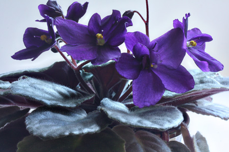
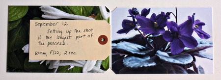
The color for Project 64 last week was Blue Violet. I thought I had captured a few, but when I uploaded the photos, only the violet from my study window was the right color.
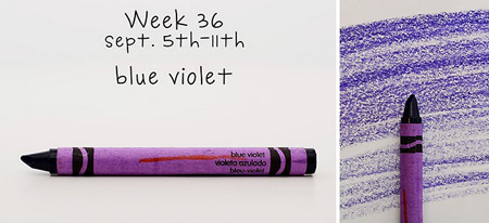
As you can see, the color of the wrapper isn’t exactly the color of the crayon. In the sunlight my violet more closely matches the wrapper, but away from the sun it is a good match, I think, for the crayon color. The blues and violets seem the hardest to match up. So here’s this week’s link-up:
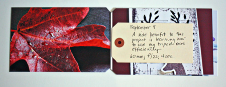
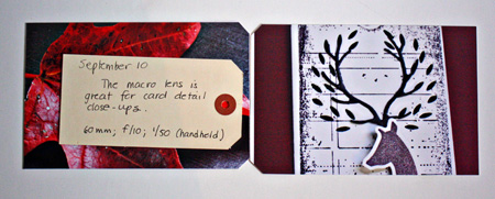
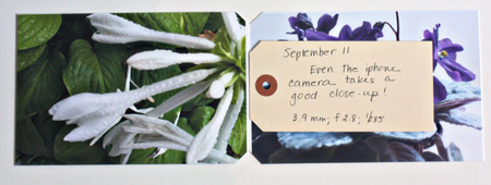
Next, are four more pages in my LSNED album, the above photo being one of the photos.
Off to the dentist and two more appointments!
I’ve found macro really good for card close ups as well…in fact I often use macro for the complete card….it just seems to give a much sharper picture.
Great tip on the card close-ups!
Rinda
I’m loving that you are sharing your tips with us as you learn.
Best of luck at the dentist. I’m off there too!
I love violets, but can’t grow them to save my soul. Love your shots and the color is perfect.
So much beauty
So good to see what you are learning. All the pictures are gorgeous Karen and the colour match is prefect. I can’t seem to get back to P64…
I love the macro setting on my point and shoot, it is really fantastic and much better than what I can get with my dSLR lenses – I’ve been using it quite a bit recently too.
I have really lost my way with P64 as well, I am impressed with your ability to keep with it and how close you have come each week!
Comments are closed.